Sophia Kim Looking Outwards – 08 – Sec C

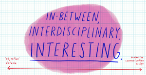
Stefanie Posavec is a communications designer who moved from Denver, Colorado to London, UK in 2004. Posavec’s works focus on non-traditional representations of data. Posavec received her bachelors degree in graphic design at Colorado State University and master degree in communications design at Central Saint Martins (CSM) College of Art and Design in London. Breaking the strict barriers of data and design, Posavec describes her work to fuse and fall in between the lines of “dataviz” and communications design.

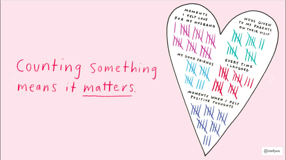
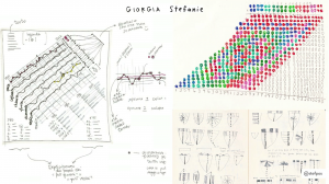
Posavec does not actually code her work,  but does prefer to work with data in a hand-crafted way. I admire how she loves to work with data and personalizes the information by visualizing it. I appreciate how she fuses her skills in communications design and her passion for data to create tactical information and interactive design. As a communications designer, I see her style and goals to communicate social/word issues well to the common people. During her EyeO talk in 2018, I liked how she made her presentation flow well, mainly because of the visuals she used to assist her talk. Also, the way she talks during the presentation flowed very well, and I admire how used no filler words.


Among all her works, I really liked the “Air Transformed: Better with Data Society Commission” project, because she was able to communicate the issues of air pollution in London using data, design, and 3D printing. Also, I really like how she was able to approach this issue, which people do not take more seriously, by making her products wearable.

AirTransformed7.jpg

AirTransformed10.jpg

Vicky Zhou – Looking Outwards – 08

Mouna Andraos is a co-founder of Daily Tousles Jours — a design studio that explores storytelling and collaboration of environments through technology. Mouna’s studio is based in Montreal, and she holds a Masters degree from New York University’s Interactive Telecommunications Program (ITP), and a Bachelors degree from Concordia University, In addition to running her design studio, she is also currently teaching at Concordia University and UQAM’s École de Design.

The works of Daily Tousles Jours utilizes many forms of technology, such as sensors, phones, real-time and interactive data, and physical prototypes to encourage and facilitate collaboration and performance in public spaces. For example, one of their best known works is “21 Balançoires”, which is set up yearly in Quartier des Spectacles in Montreal. “21 Balançoires” is a row of 21 swings that span down a popular sidewalk in the middle of the city. Each swing plays a different note when in motion, and thus a melody is created when several people are collaboratively swinging together. I really admire this sort of interactive installation because it encourages users of all ages, demographics, backgrounds, etc. to come together and create an experience that would never be able to be created alone.

Throughout their presentation, Mouna and Melissa Mongiat provide thorough definitions for words at the start of major concepts and/or ideas they present, and also provide a lot of interesting videos and visualizations of what their projects encompass. I feel like these are effective in communicating their ideas, especially since their projects often touch upon several different thresholds, mediums, and materials.

Daily Tousles Jours Website

Looking Outwards – 08

Project EYJAFJALLAJÖKULL (2010)

Lemercier is a French artist that studies and focuses his works on our perception of light projection in space. His projection performance, some of them live, have been seen throughout the world starting in 2006. He has an interest in physical structions along with light mapping. He founded a visual label, AntiVJ, with a partner in 2008; and has kept it going until 2013.  He then founded a new studio in Brussels, which focused on development and research of installations and experiments using light projection in space. His past works include working for Mutek, a music festival in which he worked with stage design, Flying Lotus and Portishead’s Adrian Utley – both whom are artists, and others. Starting in 2010, Lemercier focused more on installations and gallery work. From then, his works/projects have been exhibited at the China Museum of Digital Art, The Sundance Film Festival, and the Art Basel Miami.

Joanie Lemercier relates to his audience by including his process/initial works throughout his talk/videos. The audience is able to follow how he got to his next iterations/prototypes and the direction he takes next. His works fascinate me because he uses light as a medium and space as a canvas. I have never thought of using light as a medium before, but more of a tool/accessory. I really admired his thoughts and his process works, especially the ones shown on his twitter because they are raw and offers me fresh perspectives on material and tools. When he drew landscapes initially, he knew that something was missing. He was inspired by real time and space events of certain moments and used light to give it more living qualities and dynamics through moving projections.

Eye of Festival – Joanie Lemercier: Vimeo video shown above

Joanie Lemercier: A brief introduction on the eye of festival website

Lemercier’s Twitter: Click to see additional images of his projects

Nimbes Project: A teaser video showcasing Nimbes, an audiovisual piece.

Nimbes: Link to project

Dani Delgado Looking Outwards – 08

One of James Paterson’s projects – a VR model of a tree that grows with sound. He created it to express how ridiculous you can look while be immersed in a VR world.

The person I chose to hear speak is James Paterson, a Montreal based software developer who has deep roots in drawing and animation (a background which heavily manifests within his work). Inspired by the sci fi books he read in his youth, he is immensely interested in spatial and interactive computational art.

In the past, Paterson has used his art as a way to express his thoughts and emotions, allowing his mind to travel where it wanted to and draw in a stream of conscious style as a way of therapy (He explained this a lot within his lecture, and it did strike me as a very memorable and useful way of coping with anxiety). From this, he began to generate these seemingly random doodles and rendered them using 3D software to create experimental artwork. This opened the door for him to partner with the Google Creative Lab and create Norman – a 3D drawing and animating software created through JavaScript and used by using Oculus Rift VR gear.

A screen capture of a Norman made animation. This was made with only VR gear

This project is absolutely mind blowing for me – the concept of drawing in 3D seems to be complex and out of reach, however, to be able to step into a drawing or an animation that you made and interact with it must be such a visceral experience that I one day hope to experience it.

Despite having created such amazing things, during his lecture he kept a very conversational tone and explained things in a way that even I, someone with limited CS experience, could fully understand and engage with him. I feel like this is an important skill to have in any situation of conceptual sharing and I wish to apply it to my presentations as well.

His website: https://normanvr.com

Above: video of his lecture.

Emily Zhou – Looking Outwards – 08

Adam Harvey is an artist and researcher based in Berlin. His works focuses on the societal impacts of networked data analysis technologies and computer vision and counter-surveillance in particular. Adam graduated from the Interactive Telecommunications Program at New York University (2010) and previously studied engineering and photojournalism at the Pennsylvania State University.


The Electromagnet Spectrum of Counter/Surveillance – Adam Harvey, Eyeo 2014

Being a strong advocate of privacy and freedom of expression, his body of work is mainly comprised of various soft and hard counter-surveillance technologies. My favourite project of his is the Privacy Gift Shop––a pop-up store at the New Museum that sells counter-surveillance items developed by Harvey. A product example is the OFF Pocket––a faraday cage phone case that blocks all wireless signals (e.g. tracking, eavesdropping) from reaching your phone. I admire this project because he brings technological social concerns to the forefront in a creative and engaging way.

OFF Pocket V1

In his talk, Adam begins by defining the terms “surveillance” and “privacy”. He shows examples of their importance and scope of impact. I think this was extremely powerful in framing the rest of his talk, especially when it came to his own work and contributions in pro-privacy and anti-surveillance.

Jamie Dorst Looking Outward 08

This week I watched the Eyeo talk from Moritz Stefaner. Stefaner is a German data visualization specialist. He studied Cognitive Science at the University of Osnabrueck) and Interface Design at the University of Applied Sciences Potsdam. He describes himself as a “truth and beauty operator,” as a reference to his skills balancing aesthetics and analytics.

Moritz Stefaner’s talk at the Eyeo Festival 2011

I wasn’t expecting his talk to be as interesting as it was. He used a lot of humor and was casual with his audience, which I liked. I think it made it a lot easier to pay attention, and made it feel more interactive even though it was just him talking the whole time. Even though there were times when he stumbled, he continued to go with the flow and not let that slow him down, which I think is a really effective presentation strategy–especially since it’s rare that you give a flawless presentation.

He has a lot of projects involving visualization of large-scale human activity. One of my favorites of his is called Multiplicity. This project looked at social media, and how pictures posted represent the place they were posted at. He looked for similar pictures–if it’s possible for two people to take the same picture–similar outfits, similar actions, etc. I thought it was interesting that you could see what most people present the place as, what it is to them, and how that compares to how you see it normally.

A video demonstrating how Multiplicity works

KadeStewart-LookingOutwards-08

A screencap from Posavec’s 2018 talk that emphasizes qualitative data and Posavec’s hand-drawn style

Hailing from Denver and currently living in London, Stefanie Posavec is artist and designer who focuses on data that is more qualitative than quantitative/computational. That is not to say that her data visualization is uninformative, as the project below is chock-full of information. I love that no matter what data she collects, she finds it important. This is apparent all over her work, from the picture above that appeared in her talk at Eyeo 2018 to her postcards-turned-book-turned-MoMA collection called Dear Data.

Data visualization done by Posavec from an album by OK GO that led to the album’s art

Posavec’s style of presentation is very conservative, treating every piece of her work equally. This is mirrored in her work, as she says that she strives to treat each piece of process with the same importance as the final product. Her slides are not touched up for presentation, but are often just raw drawings of random bits of data. This is inspiring to me as I value the iterative process of creating, but I really struggle to treat everything as important like the final product. The idea that everything matters, from bits of data collected to the thrown out ideas to the final presentation that you give, is substantial and makes the creative process much more interesting in my eyes.


Stefanie Posavec’s 2018 Talk – Anoraks and the Analogue

Stefanie Posavec’s Website

Audrey Zheng – Looking Outwards -08

ROBOTIC VOICE ACTIVATED WORD KICKING MACHINE

The physical part of the piece consists of four bells of baritone horns, tubing, microphone, speakers, a mechanical foot and a projector. The software is written in openFrameworks.

When the software starts, it launches a web browser and creates a WebSocket connection to it. When someone starts speaking, the software sends a message to the browser to tell it to start speech recognition. Once the person finishes speaking, the browser sends words back as text back over the WebSocket connection. Each word is then added to a Box2D physics simulation as a series of rectangles linked together with springs. There’s a mesh for each letter and shadows are created in GLSL with a shadow map.

When a word is near the foot, the computer sends a message to an Arduino telling it to kick. The foot is actuated with a linear actuator driven by a Pololu Dual VNH5019 Motor Driver Shield. There is also a foot polygon in the physics simulation. Every time the mechanical foot starts to kick, the virtual foot in the physics engine is animated with a timeline that has been matched to the actual movement of the mechanical foot.

Neil Mendoza – Neil’s work uses digital and mechanical technologies to bring inanimate objects and spaces to life. Using this medium, he explores the absurd, the humorous, the futile and the surreal. He has an MA in math and computer science from Oxford University and an MFA in design media art from UCLA.

Neil is very accomplished: He has created digital artworks and installations for a wide range of clients including Accenture, Adidas, AntiVJ, Arcade Studios, Audi, Bentley, Brother, Burton Snowboards, Doritos, Ford, Guild LA, HTC, Jason Bruges Studio, LCF, The Light Surgeons, Moving Brands, New Angle, Nokia, Nuit Sonores, O2, Orange, Poke, Swatch, Universal Everything, Wieden & Kennedy and Wired Magazine. He was also a co-founder of is this good?

I first saw his work at The Festival of the Impossible in San Francisco. The festival of the Impossible is an event that celebrates artists who are pushing past the boundaries of Reality. The event features many brand new works in new media, including AR/VR. It’s inspirational to see the rise of new creative technologists and the blurring of medias and genres.


Kyle Leve-LO-Week-08

Jake Barton is one of the founders of the company Local Projects which is a media-design firm for museums and public spaces. Barton’s company has worked on various projects around the world such as the Beijing 2008 Olympics, media designs for the New York City Visitors Information Center, and the World Trade Center. However, the video that I watched discusses his project titled “Like Falling in Love.” Throughout his discussion, Barton talks about the different ways people view things especially if it is for the first time. This translates into what Local Projects does in that it strives to create an atmosphere that all people can find comforting and enjoyable. Barton mentions how artwork is a language used to communicate a message and an atmosphere to people. I feel that this can be applied to all forms of art. No matter the art form, whether it be music, design, architecture or anything else, it strives to convey a certain feeling or emotion. One slide that was shown in the presentation that caught my attention was the quote “Styles change but human emotions are timeless and universal.” This quote inspires me to continue down my path, because as a musician, even though job opportunities look bleak, there will always be human emotions and there will always be an audience that wants to feel something.

https://vimeo.com/channels/eyeo2012

http://localprojects.com/about


Gallery One, found at the Cleveland Museum of Art, is an interactive project conducted my Local Projects that made the art exhibit more technological and interactive.

Alice Fang – Looking Outwards – 08

Eyeo 2014 – Mike Bostock from Eyeo Festival on Vimeo.

Mike Bostock is a data-visualization specialist, and was an interactive graphics designer for The New You Times. He is also a developer of D3.js, which is a javascript library that is used for visualizing data. He graduated in 2000 with a BSE in computer science from Princeton University.

Many of the projects on his portfolio website are visualizations of data for The New York Times, with topics ranging from “Mapping every Path to the N.F.L Playoffs” to “Drought and Deluge in the Lower 48.” He combines his interest and passion for interactive visualization and animation with his knowledge of coding, to create very visually compelling images that aim to make learning and teaching abstract concepts more intuitive. I admire the simplicity in a lot of its work, and the consideration he has for human factors, like how people intake and react to the information, something which translates in his presentation as well.

Visualization of QuickSort, from his Eyeo Talk in 2014
His presentation on “Visualizing Algorithms” helped me understand different types of sorting algorithms through quick animation, in a way that just looking at code would have made difficult. He also addresses some tricky questions: how much visualization is too much, to the point where it overwhelms the viewer? I think his work is very applicable to design, where similar considerations have to be made about the best way to communicate ideas.