I chose Rani Randell’s Looking Outwards 1 about Angela Washko’s interactive artwork titled “The Game”. This piece is a dating simulation video game which tackles examines public opinion concerning behavioral patterns and limited gender classifications such as female exploitation, sexism, homophobia and misogyny. The interactive video game came from years of research on “dating coaching” and “pick up artists,” such as Roosh V who wrote a book for men on how to pursue sex with women. I like this work because it is an interesting and empowering way of approaching this problem of misogynistic behavior in a male dominated world. I agree with Rani when she says that Angela’s piece “explores a future in which women can rebel against unwanted male attention and have more agency in a virtual world.” The virtual world is male dominated and toxic hypermasculinity where sexist, misogynist, homophobic and other intolerant behaviors are encouraged.Through her work, she initiates and creates new forums for discussions about feminism in spaces most hostile toward it.
Category: LookingOutwards-09
Xindi Lyu-Looking Outwards 09
The rendering video by Alex Roman
While scrolling through my peer’s looking outwards blog posts, my attention was drawn by Xiaoying Meng’s post about photo-realistic renderings generated by computational algorithms. I generally agree with Xiaoying that the renderings done by Alex Roman is not only exquisitely detailed and realistic but also beautifully displayed with an artistic effect that is nearly impossible to be produced by pure photography. The algorithm mainly simulated the textures, the volume, as well as the light and atmosphere in this project. What’s critical about this simulation is that this algorithm is also able to simulate the behavior of the materials under certain circumstances of lighting, while also the lights themselves were generated accurately according to climate and time settings in the software, displayed as different intensities and different colors as it is in real life. What also is interesting about this computational rendering is that the “viewer” can be positioned at any any location with out the physical restraints, which is why lot of the best renderings have their incredible angles of viewing.
MirandaLuong-LookingOutwards-09
I will be reviewing Veronica Wang’s project review of Intr(e)Scapes, a landscape installation piece that can sense and react to visitors’ movement with reactive LED-based animations. Built in 2015 by SHO Architecture, Intr(e)Scapes is an installation that takes advantage of natural elements. I personally enjoy the project greatly. As someone who grew up in a crowded city without a lot of nature, this project was the perfect combination of both the natural and human-generated. I personally think it would fit great in where I grew up. As for Veronica’s analysis of the project, I think she did a stellar job. I could not agree with her more in her interpretation of the analysis as playful, tangible, and sensorial in effect. In fact, there is little to none that I disagree with as I think she’s done a neutral analysis that keeps to the facts. The one comment that I have of the project, overall, is that I think it would have been nice to incorporate further natural elements. The project uses artificial stalks that attempt to mimic natural grass and I would have thought it be more interesting if more natural elements were incorporated-perhaps real grass.
A video of the project installed in Georgetown (2015).
An image of the project on site at Georgetown’s Business Improvement GLOW conference.
JasonZhu-LookingOutwards-09
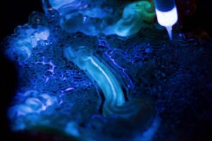
This week, I reviewed Rachel Lee’s Week 3 Assignment, Mushtari. A collaborative work by MIT Media Labs and Stratasys, Mushtari is a wearable that mimics biological growth patterns. I thought the project was both insightful and intriguing. I agree with much of Rachel’s commentary. I think she hit the nail on the head when she said that living Mushtari allows for “existing biological structures to take place naturally and respects its processes. Adding to that thought, I think the piece brings much attention to not only the natural elements that permeate our daily lives, but the elements that are unseen. In taking such a unique approach, I think the piece really distinguishes itself from similar projects at a micro scale. The one part of Rachel’s commentary that I took issue with is when she discusses how the project harnesses biological processes and adapts them for greater human use in a non destructive way. While the same thoughts are reiterated in the official MIT posting, I do not see eye to eye on the non destructive aspect of the project.
Video of the project by MIT Media Labs

Closeup of some of the elements in the wearable from Living Mushtari
Rjpark – Looking Outwards 09

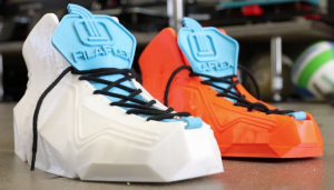
3D Printed Flexible Shoes
My peer’s looking outwards was about 3D printing, specifically 3D printing flexible shoes. My peer stated that he thinks it’s interesting how practical 3D printing has become and how it could help create other useful every day life things in the future. I agree with my peer in that it is amazing how 3D printing has turned into a process for the creation of even the simplest, most practical objects. In addition, it could possibly replace other methods of creating useful products we use in our daily lives and be more efficient/save raw material utilization.
But, even though it seems like 3D printing’s becoming more popular and being used more often, I wonder if it’s worth to use it to create practical daily life objects. When I watched the video about the shoes (link below), I saw that the shoes weren’t exactly fulfilling its purpose properly. They seemed to be made of material that’s either too hard or too flexible, making them too rigid/uncomfortable or not sturdy enough. It made me think about whether it’s worth it to use 3D printing for a product this practical, when it can’t do its job as well as the shoes we have now. The only time I think 3D printing practical objects might really be useful for is when we’re trying to create products of minimal productivity for people who can’t afford the best version of that object, similar to one laptop per child. As a result, I think it really depends on efficiency of 3D printing practical objects, the audience its targeted at, and how much better the 3D printed object is from the current one.
Sharon Yang Looking Outwards 09
Among the looking outwards projects by peers, I find Kevin (Riordan)’s Week 5 post very fascinating. I agree with Kevin on that I find the project amazing as it makes a highly intricate art work of very high quality, comparable to those in animated movies with two commonly used tools, python and maya. It is admirable how Caballer has developed the project in a way that allows to control extreme details. The project is able to demonstrate various facial and body structures, enabling expressions to be displayed. The body structure reflects the real structure of an animal; each eyeball, each eyelid, and each individual muscle on the eye are all separated, allowing the movements to be autonomous. These movements are delicately manipulated to show hundreds of different expressions and to display natural speech. The algorithm of allowing such details to be shown is joint-based system over a coordinate plane, which is a relatively simple algorithm for such a sophisticated work.
3D Troglodita Rig project by Sergi Caballer in 2012
Link to the original work: http://www.cgmeetup.net/home/troglodita-rig-demo-by-sergi-caballer/
Link to Kevin’s post: https://courses.ideate.cmu.edu/15-104/f2018/2018/09/27/kevin-riordan-looking-outwards-05-section-c/
Xiaoying Meng – Looking Outwards 09
I am looking at Lan Wei’s Looking Outwards 4 Sound Art. It is about FUSE*FACTORY’s installation Multiverse. I do agree with Lan Wei that the visual and sound effects working together, making the piece very powerful. I think other than making people “think about life and the universe using their own imagination”, the piece also creates a contrast between the massive universe and the tiny existence that we are. I would argue that the piece almost requires the viewer to be alone with no one else present. FUSE*FACTORY mentioned that the sound is also generated by a digital system. Both the sound and visuals are real-time, nonrepeating, just like the universe. One can argue that the randomness in this piece perfectly represents the multiverse. The sound effect in this piece makes it more engaging and powerful.
Nina Yoo- Looking Outwards- 09
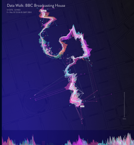
Stefanie Posavec,Frank Swainn, Daniel Jones– Phantom Terrains- 2014
Kat Hua – Looking Outwards – 07

Kat Hua’s post on week 7 for looking outwards was a report on the abstract visualization from the work of Phantom Terrains by Frank Swain, Stefanie Posavec, and Daniel Jones. I had only looked at acstract work that had apurpose of manipulating different data such as math equations or preset numbers, but it was interesting to see the way people would abstractly represent the data from something such as the internet data. I agree with Kat on her admiration of the project and how the project’s purpose was to present the data of streaming wireless data surges from our everyday lives. What I can add to it is that I liked out they had an abstract view of the data, but also a more commonly known set of data which is the sound waves, which helps the viewers to read the data better.
Kevin Riordan Looking Outwards-09 Section C
Video Demonstration of the Three Desserts
I found Sharon’s Looking Outwards 04 post very interesting. She talked about how the creator wanted to add a new dimension to food and meals. I found the most interesting of the three projects to be the edible robotics embedded in a dessert, and think this has the most applications. I feel that the project focused too much on tying art into it, and I feel this could have valuable practical applications. For example, the idea of edible robotics is something that should definitely be explored further. Though this idea is very interesting, I think that further projects into this area could do much more imaginative and visually cooler stuff than this. I agree with Sharon that tying food and art together in this way is very cool though.
Sharon’s Post: https://courses.ideate.cmu.edu/15-104/f2018/2018/09/20/sharon-yang-looking-outwards-04/
Yoo Jin Shin-LookingOutwards-09
Prismverse
I came across Yingyang’s post and was introduced to Chris Cheung’s Prismverse (2017) exhibition. The thumbnail of the video was enough to capture my attention—it looks like a scene from some sci-fi, futuristic movie with the chrome geometric patterns on the black floor. I love how the colors transition and how the light and water effects actually make it seem like you’re inside a diamond. It was so unexpected that this project is part of Dr.Jart+, which I was already familiar with as a skincare brand. After looking up the product that this was designed for, I thought it would have been nice if at least some part of the packaging reflected this eye-catching exhibition.
![[OLD FALL 2018] 15-104 • Introduction to Computing for Creative Practice](../../../../wp-content/uploads/2020/08/stop-banner.png)
