Rachel Lee Looking Outwards 09

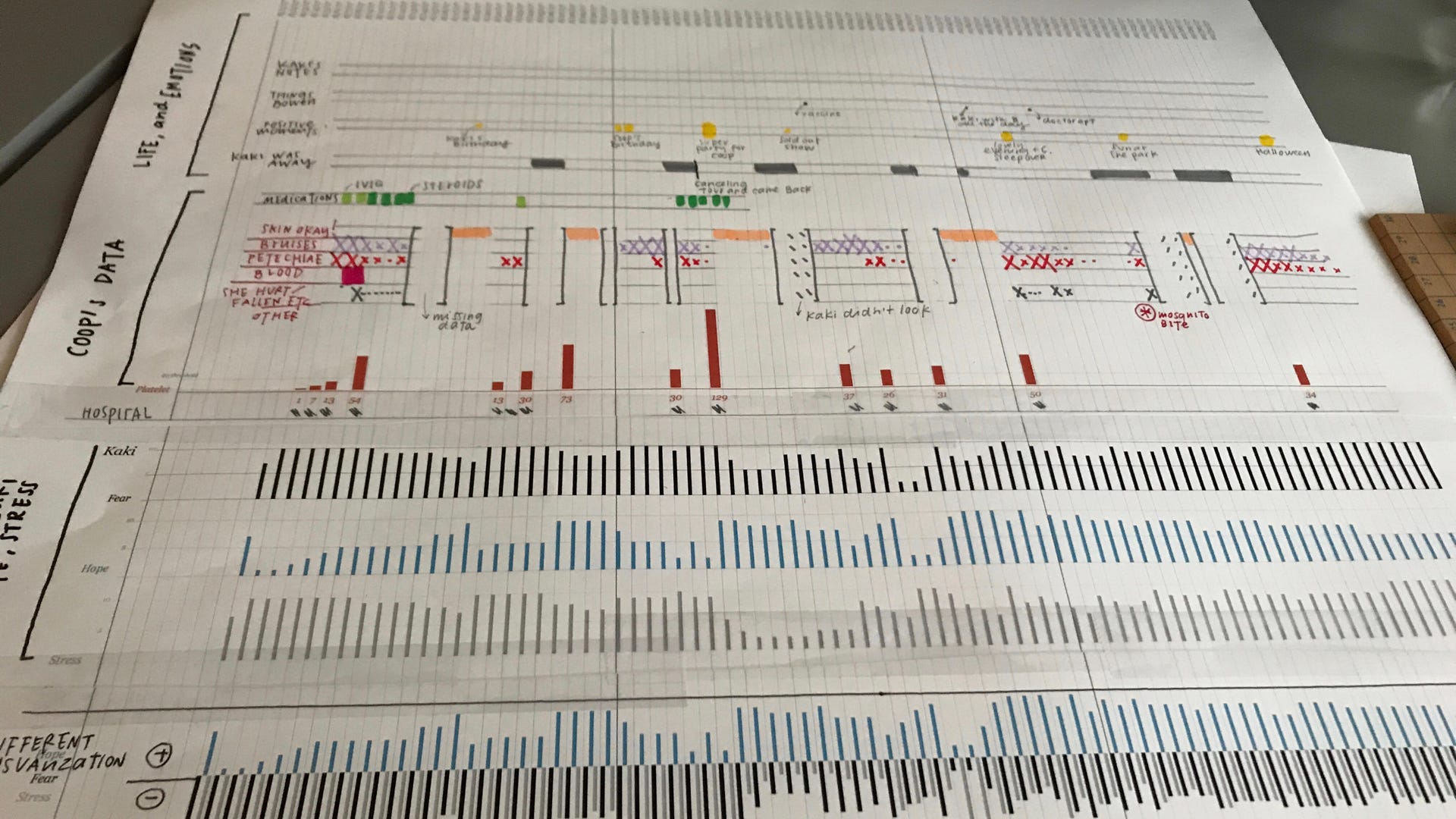
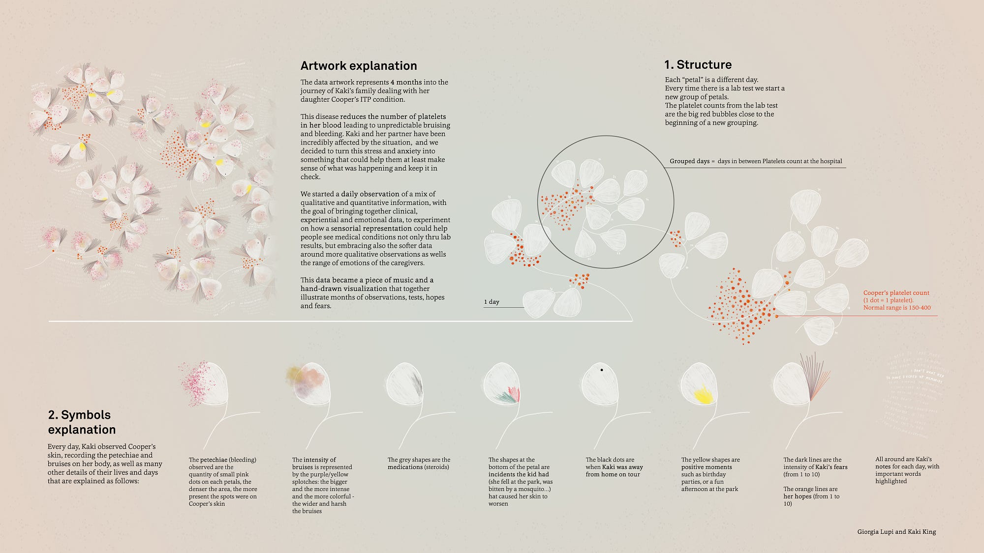
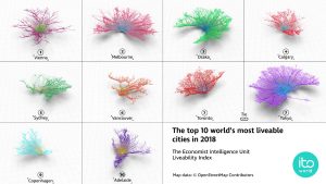
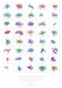
 This week, I have decided to review Jenny Hu’s Week 7 Looking Outwards on Giorgia Lupi and Kaki King’s project titled ‘Bruises: The Data We Don’t See‘ (2017). I decided to review project because last week, I reviewed a few projects by Lupi and really enjoyed how she is able to humanise data and convey it in a visceral way. I really enjoyed Jenny’s note about how the creators of this project tied in the sensorial and emotional experience of documenting Kaki’s child’s journey with the ITP condition, as it makes the user feel a lot more connected and be able to empathise with the patient. Further, something I admired about this project was how Lupi and King began the project by hand documenting symptoms and moods by hand via charts and interviews, but were able to piece the information together in a fluid timeline that was sensitive to the context at hand via digital animation. Something else that I found especially visceral about this project was the motif chosen– the white flowers and hand written annotations created a delicate quality, that allowed for the symbols exploration to supplement with a truthful transcription of the pockets of pain and pleasures of the journey. Finally, I love how the animation of the piece (how the petals, text and symbol embellishments fade onto the screen) fills in a ghostly shell, and helps viewers to understand that the child’s journey is every changing and not static, filled with both highs and lows, thus conveying an important piece of the emotional journey while also allowing for artistic direction to occur.

Initial data visualisation work that was translated digitally
Key of symbols used throughout the video


Alice Fang – Looking Outwards – 09

I was looking through Looking Outwards and Jason’s Looking Outwards 07 caught my eye because of the simple little grid.

The grid that caught my eye
Screenshot of possible simulations of my life

This project by Nathan Yau simulates causes of death and related mortality rates. I agree with the assessment that the simplicity of conveying complex data is very successful in this project, and that interaction is balanced nicely with customization or individualization. It’s a little strange to think about though, because it compares the individualization to a general population of other simulated individualizations. My first reaction to seeing this chart was how low the mortality rate is for majority of a person’s lifespan, compared to what I assumed it would be; at 70 years old, the Asian female population has only a 9% mortality rate, which is shocking considering all of the negative stats and information that we retain from media. Similarly, Nathan Yau’s other visualizations on life and death are equally as intriguing, although I think this project is the easiest to understand.

Jamie Dorst Looking Outward 09

As I was browsing past Looking Outward posts, this one by Liz Maday about the 9/11 memorial caught my eye. I had no idea that the names on the memorial were organized in such a thoughtful and calculated way. The project was done by Jer Thorp, and he created an algorithm that would cluster names based on adjacency and relationships.

The 9/11 Memorial
A visualization of the clustering algorithm


Liz mentioned that she thought “this is an amazing example of how a program is able to reflect very human emotions and intentions while also utilizing a precision and complexity that is above human ability,” and I completely agree. I think it’s amazing that we are able to use technology to determine such personal connections, and create something so meaningful. Before seeing this project, I never imagined that something like this was possible–I never thought relationships between humans could be computed in any way.

Curran Zhang- Looking Outwards- 9

For this week’s Looking Outwards, I found an interesting art piece founded by Shirley Chen. Created by Refik Anadol Studio, the project is called “Melted Memories”.

The main concept of the art piece was to use cognitive controls to create an artwork from our memories. By collecting brain waves and extracting the data, abstract and organic pieces of art are created.  This method allows people to have a physical representation of something that is intangible. The memory used to create the art piece was to be a piece of memory from childhood. This would allow different users to have a specific piece of art that is distinct.

Depiction of One Memory From an Individual

I agree with Shirley that this art piece is an amazing piece to help illustrate something that is non-tangible. By doing so, the usage of different computational methods can help enhance this field of art expression.

Extracting Data From Brain Waves


Melting Memories – Drawing neural mechanisms of cognitive control

Kyle Leve-LO-Week-09

A previous report that I looked at that I found interesting was Sara Frankel’s Week 3 Looking Outwards about the first 3D printed violin. As she said, “This project harmonizes the art of code and music together.” I found it amazing that someone was able to play something made by a machine with just as much emotion and expression as a man-made instrument. However, I also noticed some different aspects in the tone of the 3D-printed violin that makes it have its own unique sound. I noticed there were even instances where I thought a guitar was playing! Many different algorithms were put into the fabrication of this instrument, and the machine had to be programmed to act like a human was making the instrument. I find this project very inspirational because it demonstrates the many different mediums of music, and that music can be played in many different fashions.

The world’s first 3D printed violin (from Sara’s Looking Outwards)

Jonathan Liang – Looking Outwards – 09

                        is it coral or is it a city?

Coral Cities is a project by Craig Taylor that visualizes cities in a unique way. Cities are usually mapped by their buildings, streets, and popular nodes; however, Taylor wanted to show how liveable a city is. He used raw data (such as crime rate, education, political stability, traffic, etc.) to generate a geo-spatial analysis of cities today, visualized as these coral structures.

This post by fellow architecture student Curran Zhang really stood out to me because of the emphasis in our field for mapping. We have been taught to try to find unique ways to map raw data, and Craig Taylor’s Coral Cities really offers a unique representation that could be interpreted in many different ways.


                             international cities


https://towardsdatascience.com/coral-cities-an-ito-design-lab-concept-c01a3f4a2722

Emily Zhou – Looking Outwards – 09

This week, I looked at a MIT Media Lab project on voxel-printing for digital fabrication that was originally reviewed here by Julie Choi.

Reconstructed living human lung tissue on a microfluidic device.

A voxel represents a value on a regular grid in three-dimensional space. Given that understanding, I am fascinated by how this unit can be used to create sculptural works of art. I agree that the most interesting part lies in the data focused physical visualization. I think that the artistic decisions in coordinating colours, as well as selecting a topic of data largely contributes to the beauty of each final piece.

Close-up of data physicalization of the human brain; visualizes bundles of axons.

On the technical side, the program repurposes a multimaterial voxel-printing method that is most often associated with scientific imaging. I find this to be an extremely innovative way to derive new artistic modes. As mentioned in the original review, MIT Media Lab is focusing on advancing 3D printing technology so no titles are given to the works. But, I hope the see this style of media make its way into the art world.

Erin Fuller – LookingOutwards-09

I found Jenni Lee’s Looking Outward for week seven, which was focused on computational information visualization. She chose to exam the project titled, “The Creatures of Prometheus – Generative Visualisation of Beethoven’s Ballet with Houdini” by Simon Russell. The project visualizes how Bethoven’s 1801 Ballet is conducted in a symphony orchestra.

The Creatures of Prometheus – Generative Visualisation of Beethoven’s Ballet with Houdini” by Simon Russell, (2017)

I think this piece is not only beautiful in terms of execution, but because of how well it communicates the information, it also could be used as an educational piece. I remember in elementary school going on a field trip every year to the Naples Philharmonic and that was pretty much my only exposure to chamber music, albeit still a lot of exposure. For those who do not have the opportunity to have that experience, this visualization is a fantastic way, in a much more modern approach than traditional music education, to show how orchestras work and are put together.

Shirley Chen-Looking Outwards-09

Meandering River is an project that tried to capture the gradual changes and movements of our world rather than just one single snapshot. Based on the sound generated from the river, Onformative used a custom-written algorithm that reinterprets fluctuating river patterns in order to translate the subtle changes in our nature to a visual effect. For me it is very fascinating that they visualized something that is subtle, gradual, easy-to-ignore but certainly happening in our world using computing method. Also, it is fascinating that their ability to deal with the sound data and other senses that are not sight related but eventually visualize these data. For them, art is not a still snapshot of one moment, but a mutative testimony of time, space, and nature.


Meandering River


Details of the Surface


Details of the Surface

The other project they did for sound is the Unnamed Soundsculpture. This moving sound sculpture is based on the recorded motion data of a dancer. They used 3 different Microsoft Kinect cameras and recorded the movement into 3d pointclouds that were synced and exported as one large data set. The final visual effect produced is that particles moving and forming shapes according to the movement of the dancer, which coordinated with the music.

Unnamed Soundsculpture
https://onformative.com/work/unnamed-soundsculpture
Onformative’s Website
https://onformative.com/work

Carley Johnson Looking Outwards 09

https://www.tokyoweekender.com/2018/06/a-world-first-mori-building-digital-art-museum-team-lab-borderless-opens-in-tokyo/

The Mori Building Digital Art Museum. Tokyo, Japan. Opened on June 21st, 2018. Mori Building in collaboration with digital art collective teamLab.

Katherine wrote her very first Looking Outward post about this museum, which claims to be the new era of museums. One that is digital, technical, and immersive. Truly, one large installation of art as opposed to what you might call a normal gallery.

The colors and light displays in particular are truly magical. Even the photos of the exhibit feel completely immersive and sensual. It makes me want to go and interact with it. The original Looking Outward post featured mostly quotes from the article about this piece, which stated that the piece is more an “experience” than it is a “medium”. This whole exhibit raises an interesting question- is this a museum? An installation? An experience? Some sort of playground? When the line gets blurred between passive exhibits and interaction, what does the art become? And is this a new wave of curating art into museums, so that they are more attractive to a public audience? Or is this a new segment of art altogether? I’m unsure, but I’d state definitely that this piece hangs closer to an interactive installation art piece than anything else.