Greg Borenstein‘s work is quirky and fun, utilizing lofty technology to bring tokens of enjoyment to life. One of these is Ten Seconds, a short game that involves your player ball jumping around trying buy more time for the game by attempting to obtain collectibles, while also avoiding hazards. Containing one interesting and “perpetual” mechanic, this game has the same spirit as the likes of Temple Run, Flappy Bird, and Tiny Wings, “toilet games” as I like to call them, capable of keeping one amused for the duration of a sit, but also having the potential to be competitive and give tryhards a challenge. This is the type of game I’d aspire my own project to be, though it does not have a “perpetual” mechanic. I wish to emulate the clean style and effective sound design of the game, though I wish Mr. Greg would remove gravity from the game and maybe add more depth to the levels, so that it would almost be like an exploration campaign rather than a boxed and contained experience.
Category: LookingOutwards-12
Audrey Zheng – Looking Outwards – 12

This is an audio visualizer created by Willian Justen, Luis Henrique, and Marcio Ribeiro that I found on github. Music visualization, a feature found in electronic music visualizers and media player software, generates animated imagery based on a piece of music. The imagery is usually generated and rendered in real time and in a way synchronized with the music as it is played.
View the page here.
I enjoyed this project because it was cathartic just looking at the page. I liked how the low, loud beats corresponded to larger ellipses forming on the screen. From a artistic standpoint, the project is aesthetically pleasing and calming.
This is a weather visualizer made by George Edmonds. This is rather simple in execution, the site simply fetches the weather data and then chooses from a set of hardcoded icecreams to visualize. Still, I thought it was a fun idea.
Looking Outwards 12 – Min Lee
I am interested in creating an visual representation with audio, much like how Ren Yuan does in her project Sorting. Using Processing, she sorted copious amounts of data and created visual and audio aids to pair with the data actual data being sorted. In Studio Antimateria’s Shape in Scapes, a similar use of data visualization is at work, with students’ architectural projects at three different locations are being abstractly demonstrated. Although I believe that the visual and audio representations were added as aids for the user’s fascination in watching the project, I believe they play just as important roles in making the user interested in otherwise a very confusing experience. For my project, I also wanted to create some visual and audio accompaniment to some third factor.
Sources:
Sorting – Visualisation, sortification and sonification of an algorithm
Shape in Scapes – Transporting architecture into audio-video performance
Katherine Hua – Looking Outwards – 12
“Funky Forest” by Theo Watson and Emily Gobeille (2007)
Yoo Jin Shin-LookingOutwards-12
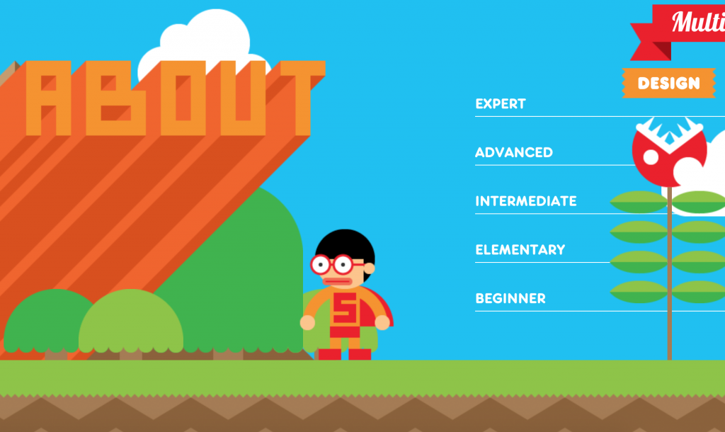
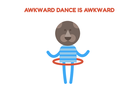
The first project is an interactive resume by Robby Leonardi. It’s colorful, fun, and highly interactive. The user scrolls up or down to move the figure through Robby’s resume. It really shows off the designer’s personality. One thing is that there is no link to a portfolio of his actual works/projects.
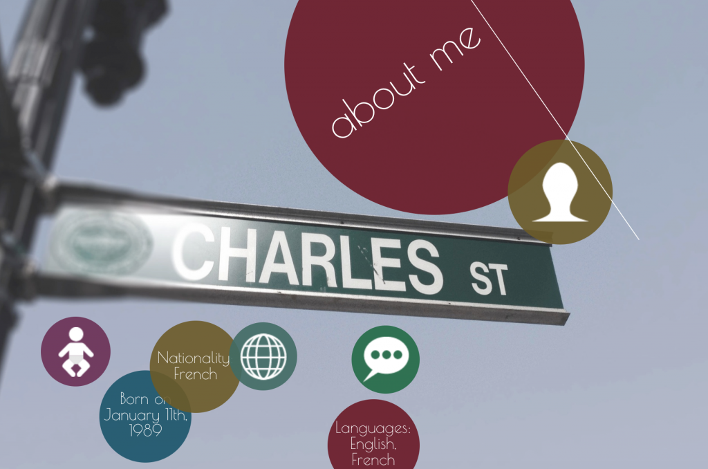
The second project is another online resume by Charles Richard. Similarly, the user scrolls up or down to navigate through Charles’s resume. However, this project uses more muted colors. One thing I noticed is that he uses circles throughout his project so it’s difficult to tell at a glance which ones are buttons and which ones are simply for aesthetics. Overall, I think both of these projects are fun, interactive ways to display one’s resume.
Lingfan Jiang – Looking Outwards 12
For this week’s looking outwards, I am going to write about two projects that I found inspiring for my final project.
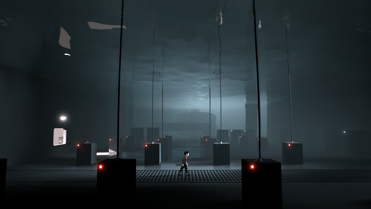
“Inside” is one of my favorite games. It is a puzzle-platformer adventure game developed and published by Playdead in 2016. The player controls a boy in a dystopic world, solving environmental puzzles and avoiding death.
The second project that I found interesting is called “Minicade” by Chloe Varelidi who is an indie game designer/ developer. (year unknown) It is a mobile web-app that makes it super easy way to create games with your friends while learning to code along the way. Each person can add a link to one or more games to a custom playlist and instantly play them as one massive game. Here are three examples. 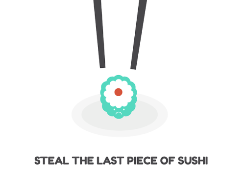
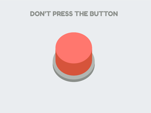
Comparing the two games I showed above, the most impressive aspect for “Inside” is that the game does not have any written clues that tell you how to play this game, but since the controls of the game are very easy, players are still able to enjoy the game. As for the “Minicade”, different from other Arcade Mode games, the players are able to customize the games themselves which let people learn while playing games.
For the shortcomings of “inside”, since there are no guidance systems in the game, players tend to depend on other people’s successful strategies if they are stuck in the game. It would potentially spoil the gaming experience. As for Minicade, since the number of games is still limited. Players might be tired of the games really easily.
Alessandra Fleck-Looking Outwards-12
For my final project I want to engage in an augmented reality application that uses a webcam to change one’s background setting. One project that I found integrating p5js into an augmented reality platform was a project called Kalopsia.
Kalopsia utilizes similar scripts used for facial recognition with a webcam to project Japanese-inspired drawings. However, in this application, the AR becomes more a tool for sculpting and detailing.
The second project I looked at was created for a company called VariousWays, and utilizes ar.js to create the augmented reality effect. In the short video it can be seen how an artist who wants to hand out their business card, can integrate a brief example of their work without having to hand out a full portfolio.
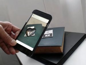
Overall, the purpose of both projects traces back to the desire to bring another dimension to how we perceive our surroundings. Where the project Kalopsia seeks to bring beauty to regular objects, whereas the augmented reality business cards seek to augment the impact of a card, by bringing interactivity to it. However, both projects seek to bring an interesting detail to an everyday object/object that might be perceived in 2D but with 3D notions, become far more expressive. One aspect that I think could be further integrated into both projects is some form of application or connection of the AR image to a social media platform or other users. That way the AR doesnt just work on one scale.
More Information:
Project Kalopsia (http://www.zeitgeistbot.com/blog/kalopsia-is-an-augmented-reality-interactive-generative-art-project/)
Business Card Augmented Reality (http://www.zeitgeistbot.com/blog/augmented-reality-business-card/)
Kai Zhang-Looking Outwards-12
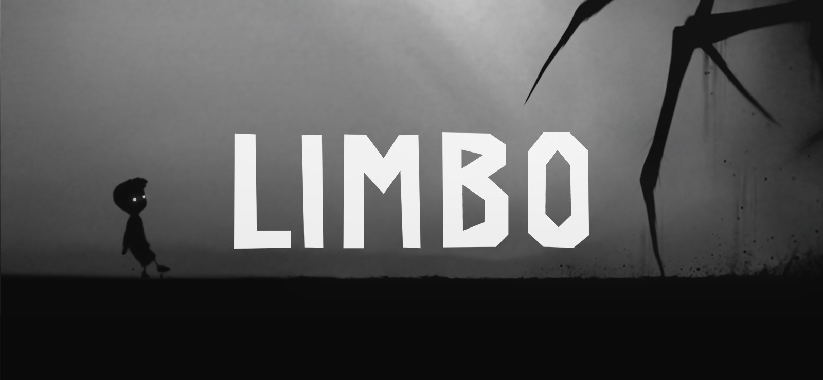
For this weeks Looking Outwards, I’m to show two examples of the platform games that’s going to be helpful as for some inspiration for the project. First of which is called Limbo, which is puzzle-platform video game developed by independent studio Playdead, available on both mobile and PC platforms. In the game, the player guides an unnamed boy through dangerous environments and traps as he searches for his sister. The developer built the game’s puzzles expecting the player to fail before finding the correct solution. Playdead called the style of play “trial and death”, and used gruesome imagery for the boy’s deaths to steer the player from unworkable solutions.
I really enjoyed playing this game, not only because its unique gameplay experience, but also the aesthetic choices of the scenes, characters and objects, that make the game really go well with its atmosphere. There’s very limited use of color, in fact, there nearly isn’t any other color than black and white in this game. All the objects are made up by silhouettes, which is very appealing to me.
Here is a YouTube video for the game trailer from the developer.

Another game is called Subway Surfers, an endless runner mobile game co-developed by Kiloo and SYBO Games, private companies based in Denmark, which is available on all mobile platforms and PC. Players take the role of young graffiti artists who, upon being caught in the act of applying graffiti to a metro railway site, run down railroad tracks to escape from an inspector and his dog. As they run, they grab gold coins out of the air while simultaneously dodging collisions with trains and other objects, and can also jump on top of the trains to evade capture. Special events, such as the Weekly Hunt, can result in in-game rewards and characters.
Here’s a gameplay video on YouTube.
From the gameplay, we can see the play navigate the runner using mouse positions, while in mobile game it’s using swiping gestures. As people develop games, they have to think about the best way people control their subjects – mouse, controller, keyboard, or their fingers. So I believe we should think about how we can use different kinds of interaction techniques to develop the game so it works best with the current platform.
Also the game comes with reward system, which also accompanies with sound effects, as they usually provide some more positive feedback as people are playing the game. Perhaps we can also incorporate that in the game we are going to develop.
Yingyang Zhou-LookingOutwards-12
I look specifically for the visual presentation of sound effect (audiovisual art) which I’ll design for my final project. I found many interesting art work related in generative art realm. One of them I apprecited is the work of Leander Herzog.


For this project, sound will be automatically played but you can interact with it too, as you clicked, different rythm of same sound effect will be played, it is amazing because it makes you wondering the connection of the sound and visual effect.
https://leanderherzog.ch/bdakfgi/
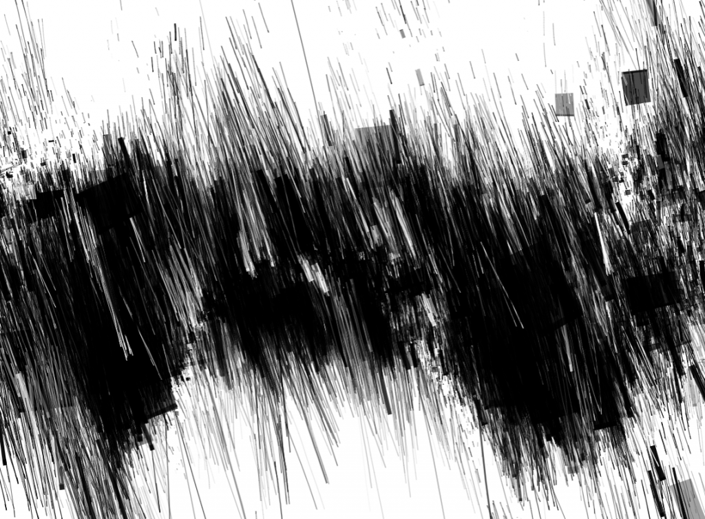
https://leanderherzog.ch/rain/
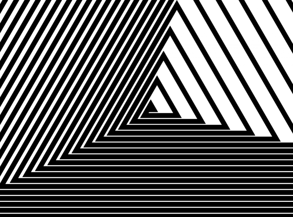
This project is not related to sound but still interested to me because the strong effect of perpective changing as your mouse move, possibly similiar element could be applied to my final project.
https://leanderherzog.ch/shader/#
Another artist that interest me is Tina Frank.
http://www.tinafrank.net/audiovisual-art/vergence/
The description of this project:
“This 6,5-minute long video of Tina Frank focuses on the threshold of spatial perception. Like a chromographic pendulum yellow-black patterns contract, unfold and overlap. They evoke rapid speed mementos of Brion Gysin’s Dreamachines aswell as Tony Conrad’s The Flicker or of Gestalt Theory from the early 20th century. After an induction period of some minutes the viewer can no longer tell if what he sees are afterimages from the color space or if these psychedelic visions are part of the videosequence.
This experience is intensified by the four-channel-soundtrack from Florian Hecker. Dynamic pulsating rhythms bring narrative cartesian coordinates from front, back, left and right into a permanent oscillation. Binaural stereophonic and quadrophonic arrangements add up to an acoustic whole which consolidates a timebased déjà vu together with an acoustic déjà entendu.”
I’m interested in the layersof sound it display and yet the visual is simple but enough to show the relation of the sound.
Looking Outwards 12-Project Priors and Precursors-Veronica
For this week’s looking outwards, I decided to look at the works from Chloe Varelidi(http://varelidi.com) and Kaho Abe(http://kahoabe.net/portfolio). They are both new media artists and game designers working with a variety of mediums and often produce projects that are a mix of digital and physical artifacts.
Chloe Varelidi is the founder of Humans Who Play, a design firm that uses play as educational and creative tools. What really inspires me about her work is that she could always manage to bridge that creative gap and make coding easily accessible to everyone. In her projects there are also always a physical artifact to help understand the coding work that’s going on behind the scenes, and makes the process of play more meaningful and informative.
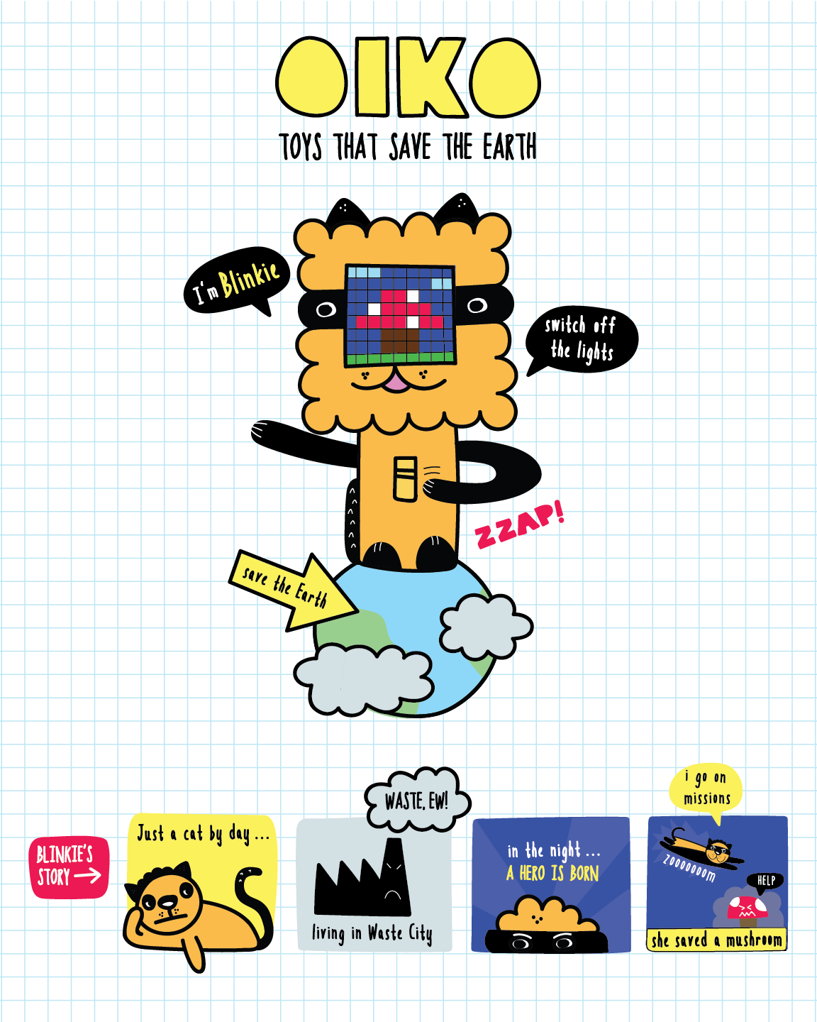
Oiko is a project created for younger kids to learn about environmental and energy saving strategies by reminding them to turn off the lights. She managed to make the process fun and playful rather than tedious.
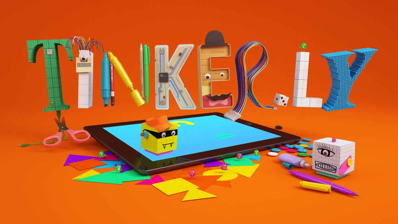
Tinkerly is a project to foster creativity, with a digital interface on an ipad that can be combined with physical paper models to create avatars and scenes for children.
Kaho Abe is an American Japanese artist focusing on designing for social interactions and experiences that enhance the relationship between people. Previously a fashion designer, her interest in wearable technology and game design combined to create projects that engage behaviors, gestures, and custom controllers.
Her animation Window Vistas is a generative landscape video that documents her travel on a train. I am hoping to do something similar for my final project and learning from her how she created 3D-looking landscape elements.
Hit Me! is a wearable game device that engages two players and speculators, and tests for their agility, strength, and ability to take quick snapshots. The interactive headpiece has a button and camera that connects wirelessly to a screen. The objective is to hit the opponent’s button, and then take a snapshot of them using your own camera.
Hit Me! (2011) from Kaho A on Vimeo.
Both artists’ work are inspiring, especially how they made digital artifacts tangible and accessible to everyone. Although it would be hard for me to incorporate physical artifacts in my final project, I was inspired by their style, method and intent for their project to be educational and informative.
![[OLD FALL 2018] 15-104 • Introduction to Computing for Creative Practice](../../../../wp-content/uploads/2020/08/stop-banner.png)