Victoria Reiter-Looking Outwards-02

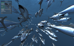
“Galapagos” by Karl Sims, 1997

A project I find extremely interesting is one titles “Galápagos” by Karl Sims, produced in 1997. Sims attended MIT and earned a degree in life sciences, then continued on to earn a graduate degree in visual studies from MIT’s Media Lab. He combines these areas of study very gracefully in his installation.

Twelve monitors with weight-sensitive pads of Karl Sims’ installation “Galapagos,” exhibited in the InterCommunication Center, Tokyo, 1997-2000.

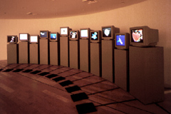
Sims’ installation “Galapagos” seeks to mimic the process of evolution through natural selection through a combination of computer-generated code and human interaction. Twelve monitors are set up, each with a foot pad in front. Each screen displays a very simple “creature” generated by code. The exhibition viewers are invited to step on the foot pad of whichever creature they find the most visually appealing, and the creatures not “selected” by the viewers disappear, and from the remaining creatures a new generation is produced using code to create random variations in such aspects as size, movement, color, number of arms, etc. As the process continues on, the creatures “evolve” to be more and more complex.

Top left creature is the “parent,” and the eleven remaining boxes demonstrate possible variations of offspring
Top left is parent, eleven others are possible variations of offspring

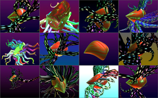
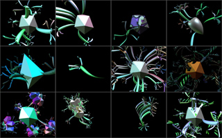
I would assume that this code contains many variables which are randomly assigned values in response to the weight of a person standing on the foot pad (much like how a code can respond to such things as a mouse click or a key being pressed on the keyboard). This concept clearly reflects Sims’ background, as he studied biological development, and integrated this into his master in visual studies, thus turning a scientific concept into interactive art.

This work inspires me, because it seems as though oftentimes there is a stark distinction between nature and computer science. Sims was able to bridge this gap by writing code which behaves the way nature behaves, in a way making empirical a concept that seems so vast and out of the hands of human control.

Link to full information about “Galapagos” here.
Link to further reading about the project as reviewed by Art New England and Wired also included.

Tanvi Harkare – Looking Outwards – 02

A project that I really liked is the Digital Type Wall that was created for Monotype, and then exhibited in the Metropolitan Wharf in London, UK in November of 2012. The exhibition and print design were created by the SEA design team, and the installation concept and code were created by Marcin Ignac and the Variable team. The project was created in collaboration with the Pencil to Pixel exhibition to help show how typography has changed through the years. There are over 6,000 different combinations that can be shown based off the animation that creates it, and it takes typography from over hundreds of fonts. The custom software was created using a Plask framework which creates the animation that chooses the specific fonts to display. Based off the video that I saw about the project, I assume there is a library of characters that this software goes through and creates an animation to display them in a random order.

 I find this project interesting because of the variety of fonts that it displays. Because of this workflow, its engaging for all audience types and provides a unique experience. I think if the exhibit were more interactive, it would be more successful in helping to engage the audience further. Additionally, it seems that the project currently is just displaying the characters in a grid-like format. Although this creates a clean look which is easy to understand and look at, it would be interesting if the letters formed into something else, like a symbol or object. For more information about this project, visit the website here

Kade Stewart-LookingOutwards-02

Marcin Ignac, Every Day of My Life (2012)

Marcin Ignac completes a lot of projects that focus on data visualization. Whether that’s data from an Internet of Things, from the stock market, or even from his dad’s workouts, Ignac finds a creative way to model the data. In “Every Day of My Life,” Ignac used an app called Tapper to track his foremost running app at all times of the day, every day, for two and a half years. He then visualized the data using Plask, separating each program into a specific color and each day into a band. The project should be consumed from top to bottom.

What I admire most about Ignac’s work, and specifically what I admire about this project, is that the work is something I would consider art at the end, but does not come from that. The usage of different programs is not meant to be artistic, and yet, Ignac takes it and makes art. In addition, the art holds onto the meaning – if I were to look at dark spots, I could probably guess where the holiday season slowed his work. This algorithm was probably pretty simple, assigning colors and arranging them chronologically. This simple yet meaningful project embodies Ignac’s style of grounding his work in the very real world of data.

Marcin Ignac

Shirley Chen-Looking Outwards-02

A Berlin-based photographer Polina Efremova found a unique type of datamosh glitch by accidentally running a new video player on a very old PC. As the videos play on the player, glitches come up and she captured these moments as screenshots and turned these scenes into photographs, producing a series of photographs called “Destruction”. It is interesting that this special type of photography is discovered by accident, and the moments that she captures cannot be reproduced again. The randomness and fault generated by the software configuration eventually lead to an unexpectedly, uncontrollable and unique result. Although the glitch effect can be produced artificially nowadays, I think the most valuable thing from her experience is that new type of art or new method of generating art can be found at some interesting moments in our life, and we need to learn how to find and capture them. Computer is a tool for us to process artworks, but it also can be a generator of art that lead to an unexpected result.


Photograph Produced by Polina Running New Video Player on a Old PC


Photograph Series:”Destruction”

Original Source:
https://creators.vice.com/en_us/article/zmmwk4/polina-efremova-glitched-out-photos-vintage-pc

Min Jun Kim- Looking Outwards 2

This project is called ‘Immersive: Playing with Fauna’ by Dr. WooHoo! While looking for generative art, I was immediately drawn by the person’s name. I don’t know if that is his actual legal name or his pseudo name, but I just thought that it was a great choice in a marketing standpoint. The art is very unique and innovative to say the least- It is an immersive art experience where an audience can interact with the visual fauna that is floating around. Even though it is in equilibrium when untouched for a while, it enters a dynamic dance engaged by people. I admire the fact that it is so unique yet refined and has great reaction time with minimal latency. It is difficult for interactive software to be so detailed and intricate while having little latency.
I suppose that the algorithms that are in play for this piece involve two parts, one for standard behavior when in equilibrium, and one that is called when there is a stimulus. I felt that the function that is called is very similar to mouseX and mouseY except with camera coordinates. I think that the artist’s true genius (artistic sensibilities) comes into play when he is able to convey fun and excitement into an artform.

Source Link: https://www.behance.net/gallery/44562239/Immersive-Playing-with-Fauna

Sarah Yae LookingOutwards2 Section B

“Boil Up: Realtime Feeding Frenzy” (2013) is created by Robert Hodgin. His work can be explored on:

http://roberthodgin.com/portfolio/work/boil-up/

Hodgin’s animation installation of the sea and fish pattern amazed me. Although the audience receives a single experience,  there were so many procedural layers involved to create it. Hodgin had to break down his project into multiple steps, which added onto each other. For example, his first step would be the formation of bait by observing group behavior, then he would introduce the smaller predators.

The algorithm that generated the work was apparently “GPU-based” and his work was to be displayed via 4 projectors in a cylindrical room.

Hodgins’s artistic sensibilities manifested in his algorithm when he had to code the design of the fish as well as the sea, to make them look realistic.

Tuna model in “Boil Up: Realtime Feeding Frenzy

Yoo Jin Shin-Project-01-Face

Portrait

// Yoo Jin Shin
// Section B
// yoojins@andrew.cmu.edu
// Project-01

function setup() {
    createCanvas(600, 600);
    background("#fff0f2");
    //text("p5.min.js vers 0.5.12 test.", 10, 15);
}

function draw() {
    // hair
    noStroke();
    fill("#362f2d");
    ellipse(300, 300, 400, 540);
    rect(100, 300, 400, 300 )

    // face
    noStroke();
    fill("#ffe1c0");
    ellipse(300, 250, 320, 350);

    // mouth
    stroke('#222222');
    strokeWeight(4);
    arc(300, 300, 130, 140, TWO_PI, PI);

    // ears
    noStroke();
    ellipse(150, 250, 80, 100);

    // earrings
    noStroke();
    fill("#ff9900");
    ellipse(144, 300, 20, 30);
    fill("#cc6600");
    ellipse(144, 300, 20, 20);
    rect(120, 210, 12, 12, 3);
    rect(115, 224, 10, 10, 3);

    // eyes
    noStroke();
    fill('#222222');
    ellipse(230, 240, 70, 77);
    ellipse(370, 240, 70, 77);
    fill(255);
    ellipse(220, 220, 20, 20);
    ellipse(380, 220, 20, 20);

    // eyelashes
    stroke('#222222');
    strokeWeight(2.5);
    line(200, 200, 210, 210);
    line(193, 210, 203, 220);

    // bangs
    noStroke();
    fill("#362f2d");    
    triangle(130, 200, 170, 200, 260, 50);
    triangle(115, 200, 150, 200, 260, 50);

    // shirt
    noStroke();
    fill("#000066");
    arc(300, 600, 370, 280, PI, TWO_PI);

    // neck
    fill("#ffe1c0");
    rect(260, 400, 80, 63);
    triangle(260, 463, 300, 500, 340, 463);

}

It seems like a long journey to get to the point in which coding this portrait with Javascript will be faster than creating it with Photoshop.

Alessandra Fleck – Looking Outwards – 01

One project that I think communicates effective interaction between the user and program, while still maintaining a prominent message, is the “Funky Forest” installation in the Singapore Art Museum. Funky Forest is an interactive ecosystem that grows and moves to the motions of those who visit and interact with it. It is part of a series of interactive play spaces that has been developed over the course of a couple of years. The installation utilizes projections and animations, then takes it to the next step by allowing the visitor have a kinetic impact on the projections movement. Those who interact with the installation have the chance to impact the forest by planting seeds, and direct water with some of the tangible items on set such as pillow logs.

The interactive projection begins to insert itself onto the floor, as children play with the flow of the water coming off the waterfall. 

Created by Design/IO, Funky Forest utilizes a stereoscopic camera/ kinect to detect the movements of those visiting the installation and send the information to a software program the firm developed that translates the action of the visitor to the motion of the animation.

In the image above, children play with the projection on the wall. As they wave their arms, trees begin to grow. 

Beyond just being an installation that is whimsical and intriguing for those who visit it, the design and bright animations seek to bring to light the idea of environmental conservation and growth. I think that this project hold much potential in transforming the concept of the modern day classroom, into a 360 degree interactive space, where the interactivity and responsiveness of the program influence/teach the student.

Find out more about the project at the link below:

http://design-io.com/projects/FunkyForestSAM/

https://www.commarts.com/features/design-i-o


Looking Outwards-01 Intr(e)Scapes light art exhibition-Veronica Wang

Intr(ə)Scapes @ Georgetown GLOW 2015 from SHO Architecture on Vimeo.

The Interscapes project is a landscape installation piece that senses people’s movement with an infrared sensor and signals the RGB LED system to react to visitors’ movements with a responsive lighting animation. The acrylic stalks mimic the movement and light-weightedness of swaying prairie grasses and embody “the kinetic energies and latent forces present within the environment”. I found it interesting how this piece was inspired by nature and is bridging technology with nature by mimicking/ recreating experiences. The responsive lighting also provides a playful, tangible and sensorial effect.

The team that designed this piece does a lot of interactive new media installations and parametric architectural design. On this project, they used custom software and hardware to achieve the infrared imaging system and responsive effect. They have previously designed similar installations at both the ACADIA exhibition and Harvard University.

Yoo Jin Shin-LookingOutwards-01

Piano Stairs

Piano Stairs in Stockholm, Sweden

How can we promote more people to be healthy and opt for the stairs, as opposed to less active modes like the escalator? To tackle such problems, Wolkswagen started an initiative called “The Fun Theory” in 2009, focused on nudging people’s behaviors for the better by making the activity irresistibly fun.

One of their projects, the Piano Stairs, is aimed at the question posed above. A team installed the piano stairs overnight in the Odenplan subway in Stockholm, Sweden using sensors and sound actuators. Not only is the stairwell visually appealing, but it also functions like an oversized piano! Each level of stairs corresponds to a note on the piano and it plays as someone steps on a key. In fact, “through the interactive steps the staircase successfully persuaded and motivated 66% more people to use the stairs instead of the escalator throughout the day.”

I think it’s fascinating that making such a small change in the interaction can influence some people to triumph over their laziness and tendency for convenience. It would be interesting to see other installations using this approach to promote a healthier lifestyle, and observe whether these changes can have longterm, lasting effects in the users.

To see the Piano Stairs in action, click here.