Han Yu Looking Outwards 09

I found Min Jun Kim’s Looking Outwards 7 very interesting. He talked about a data visualization project called Shifting Causes of Death. Nathan Yau, creator of this project, used D3.js to show how causes of death changed over the years, across sex and age groups. You can see the different causes of death shifting up and down as years go by. For example, death of HIV gradually fell out the rankings as years go by but death of intentional self-harm is slowly climbing up over the years. I agree with what Min Jun said in his post that Nathan Yau managed to present “a vast amount of information in such a limited space and does it elegantly”. Just by looking at the gradually shifting data visualization, you can tell what’s the most cited causes of death and which cause is becoming increasingly common.

A screenshot of Nathan Yau’s Shifting Causes of Death at year 2011.

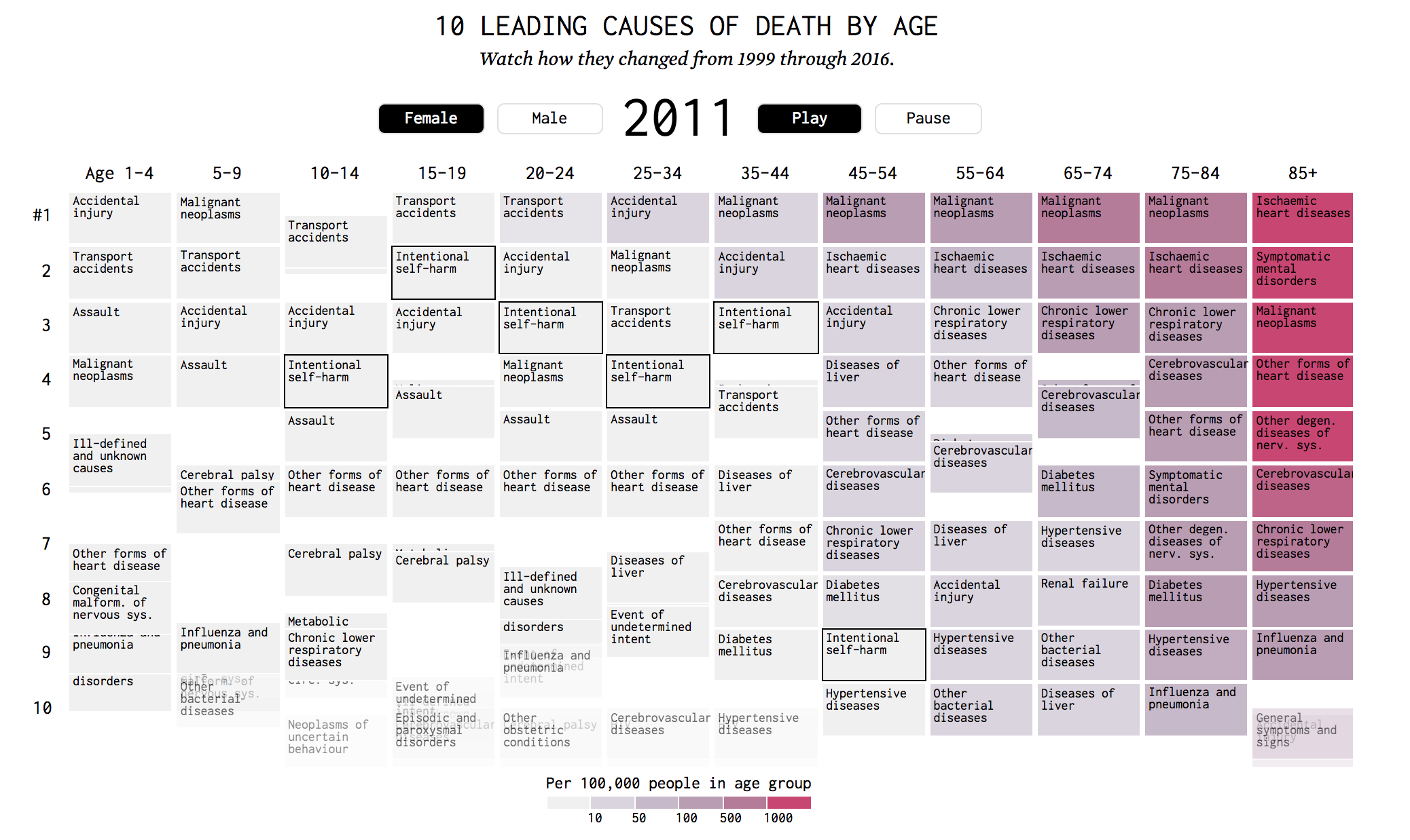
I also agree what Min Jun commented on the algorithm that is used to create this project. He said that a counting variable locates the data and a sorting algorithm that restores the structure of the graph each year. Adding on to his point, I think there also might be a overall mapping function that assigns different hues of red to each box of death cause based on the data processed earlier. Overall, I think this project is artistically crafted and successful to convey the information it contains.

Looking Outwards 09 – John Legelis

While browsing previous week’s looking outwards responses, I stumbled upon Jessica’s article from Week 7 on data visualizations. She chose to write about a New York Times Graph that displays how different demographics spend their time throughout the day.

A still photo of the interactive New York Times graph representing how time is spent by different demographics

I agree that the creator’s artistic touch was manifested in the composition and intrinsic complexity of the data being represented. Though the graph doesn’t look extraordinarily eye catching, the data it represents is fascinating and the way it has been organized makes it intuitive to understand. It is difficult to have the results displayed in a data visualization obvious at first glance. As more facets are added to the data, the more information and variables must be squished into one visual, and things can get messy. The creator of this visualization elegantly combined a huge amount of data in a way that can be understood immediately.

Lan Wei-LookingOutwards-09

Cylindrical Mesh Topologies
Hyper-Toroidal Deep Surface

The works are shown in the exhibition ‘Textile Morphologies'(2013)  showcasing the doctoral work of Sean Ahlquist. And the original post is from Sophia Kim in Section C. I agree with her the impression of molecules and I did more background research after reading her post.

At first, what fascinates me of the project was the designer making use of the inner tension between objects to create forms. I felt the technological as well as the aesthetic thinkings behind the artwork. After further research, I’m even more interested because of the spatial potention of it. What presented in the exhibition was actually prototypes of tactile interfaces and environments for developing motor skills and social interaction in children with autism. I regarded the work as ‘art’ at the first glance but suddenly the scientific thinkings and profund meaning behind unveil before my eyes. I think computational tools play very important roles in the design process in analyzing the relationship between the form and effects on human such as visuality and touchability and also the integration of the forms and other technologies such as projection.

Children playing with the installation
Form analysis

The project

Textile Morphologies

LookingOutwards-03 Sophia Kim-Sec C

Yoo Jin Shin-LookingOutwards-08

Meejin Yoon

Meejin Yoon is a current professor and department head of architecture at MIT. She received her bachelor of architecture at Cornell and master of architecture in urban design at Harvard. She is also the co-founder of two studios in Boston. A lot of Yoon’s work focuses on interactive public space projects “that bridge issues of technology and play in the public sphere.” Yoon seems to smoothly and effectively blend the appropriate technology and architecture that align with the specific purpose and context of each project. The visuals that she uses in her presentation are mostly full-sized images, animations of the designs, and videos of her works in action. The transitions are smooth and she gives off an overall humble impression.

Collier Memorial, MIT

Out of all her projects, I really admire her “Collier Memorial” in memory of Sean Collier, an officer who was shot in the MIT campus immediately following the Boston Marathon bombings. Yoon initially had a lot of reservation because she was not used to dealing with metaphors and meaning in contemporary architecture. However, she successfully synthesized the ideas that were submitted from the open call, took the essence of these ideas, and produced a meaningful, beautiful memorial through a long, iterative process.

John Legelis – Looking Outwards 08 Eyeo

Professor Meejin Yoon is the head of the architecture department at the Massachusetts Institute of Technology and she is the first woman to hold this post. She was born in Seoul, Korea and lived and studied in the United States. She has degrees from Cornell and Harvard in urban architecture.

Yoon’s work has often revolved around lighting and the impacts of light pollution  on the environment. I am personally supportive of these types of projects because I believe that as society has become more nocturnal, we need to be conscious of our impacts on the environment in non-obvious ways such as light pollution. Her particular work on projects in boston (my hometown) are very inspiring due to their benefits seen to the public space.

Design Competition Winner for Boston Bridge by Meejin Yoon

In her presentation Yoon rarely if ever had slides with text on them. Instead when she was using her slideshow to accompany her talk, she showed visuals that went along with what she was talking about. This caused the listener to not only pay attention to what Yoon was saying, but also created attention grabbing slides that kept the listener engaged. This method of presenting caused Yoon to be a key part of the presentation instead of simply a reader for the slides.

Han Yu Looking Outwards 08

Kate Hollenbach is an artist, programmer and educator based in Los Angeles. She works for Oblong Industries during the time she gave the speech at INSTINT. Oblong is a Los Angeles based company founded in 2006 that dedicates in designing interfaces and building gestural interactions. Hollenbach was the former director of Design and Computation at Oblong and under her leadership, Oblong came up with several groundbreaking products truly pioneered in the gestural interaction industry, which the company and many believed is the future of computers.

Oblong’s first project “Tamper” was commissioned by the university museum of Cal State. It is an interface that uses multiple surfaces to do different tasks and users can use gestures to browse through different video clips displayed at the museum. The project requires users to wear gloves that have reflective markers on them which is captured by the many cameras installed in the display room. The project was a success and fueled Oblong to continue their endeavors in gestural interactions.

Kate Hollenbach’s speech at INSTINT 2014 where she displayes “Temper” at 04:35.

Mezzanine is the flagship product of Oblong that realizes conference room collaboration through building a multi-screen environment. Users can embed multiple video and sources from their own computers on the screens around the room and even project them to virtual locations.  I really admire the organic aspect of Mezzanine where every interactive elements feel natural. The creators of Mezzanine utilizes animations and other tools to maximize the power of gestural interactions and make users comfortable with the new technology.

An introduction of Mezzanine by Oblong.

Lan Wei-LookingOutwards-08

The lecture is given by James Paterson, a Montreal-based artist and coder who dedicates to explore the intersection of animation, art and code. James is interested in the boundary between reality and virtuality, which is also the main topic of the lecture. His projects cover a wide domain, which includes art direction, VR & AR and animation.

This lecture interests me because it unveils new possibilities for artists in creating things. Animation is not about something that just happens in computers any more, but things that can merge with everyday life and blur the boundary between real life and virtuality. The work I admire the most of James is created by a tool he created called Norman, which enables him to create 3D animation easily with only lines. In the later part of the lecture, there is even examples that Norman being integrated with real-world scenes. I totally think the tool gives drawings a new life.

James presents his work clearly by dividing his works into different categories and talking about one category at one time. This is an useful presenting method that I can learn from the lecture.

James Paterson’s website:

http://presstube.com/hello/

Jessica Timczyk – Looking Outwards 08

Zach Lieberman is an American new media artist and computer programmer, he received an MFA of Design and Technology from Parson’s School of Design. He is based in New York City and describes himself as an artist that creates with code, focusing on interactive and experimental drawing and animation tools. Most of his work involves these abstract drawing tools and interactive animations and environments in performances. I really like the artists’ work because the interactive aspect of it allows people who interact with it to become the “performer” themselves.  One of his projects that I admire the most is the Eyewriter project. It is a very low cost and open source hardware tool that allows people to draw with their eyes. I found this one the most inspiring because it was originally created for a paralyzed graffiti artist so that he could draw graffiti with his eyes even after being paralyzed. What I admire most about how Zach Lieberman works is how all or most of the projects he create are not only artistic and beautiful but also contain real applications that are still useful and many times help people that sometimes wouldn’t otherwise be able to create their own art.

While he is presenting his work, he not only gives a demo of how it works, but then also goes on to explain why he created this thing and his process in getting there. He as well additionally gives examples to other applications of the technology he created, which is useful in seeing other applications. I think this would be helpful if I were presenting my own work to convey that what I’m presenting is not constrained to the form that it is presented in currently, but can also be used in other ways and applications.

Eyeo2012 – Zach Lieberman from Eyeo Festival on Vimeo.


A video showing the Eyewriter and how it is used and works.

Lan Wei-Project -07-Curves

my-sketch.js

//Lan Wei
//Section D
//lanw@andrew.cmu.edu
//Project-07

function setup() {
    createCanvas(450, 450);
    strokeWeight(2);
    noFill();
}

//http://mathworld.wolfram.com/LogarithmicSpiral.html
var nPoints = 1000;
function draw() {
    background(0);
    push();
    var red = map(mouseX, 0, width, 255, 0);
    var green = map(mouseX, 0, width, 20, 150);
    var blue = map(mouseX, 0, width, 0, 150)
    var col = color(red, green, blue); //change the color
    stroke(col);
    translate(mouseX, mouseY); //draw  with the mouse
    logarithmicSpiral();
    pop();
    push();//another logarithmicSpiral
    var red = map(mouseX, 0, width, 0, 200);
    var green = map(mouseX, 0, width, 100, 50);
    var blue = map(mouseY, 0, width, 0, 150)
    var col = color(red, green, blue); //change the color
    stroke(col);
    translate(width - mouseX, height - mouseY); //draw  with the mouse
    logarithmicSpiral();
    pop();
    stroke(255);
}

function logarithmicSpiral(){
    var a = 0.1;
    var b = 0.1;
    beginShape();
    for (var i = 0; i < nPoints; i++) {
        var t = map(i, 0, nPoints, - 16 * PI, 8 * PI);
        var x = 1000 * a * cos(t) * pow(Math.E, b * t);
        var y = 1000 * a * sin(t) * pow(Math.E, b * t);
        vertex(x, y);
        rotate(atan(mouseY/mouseX)); //rotate with the tangent of the mouse
    }
    endShape();
}

In the project I try to create rotating spirals that change angles and color with mouse movement. I struggled with it at first, having problems figuring out the relationships between the parameters. But finally it works.

Yoo Jin Shin-Project-07-Curves

Place mouse on canvas!

// Yoo Jin Shin
// Section D
// yoojins@andrew.cmu.edu
// Project-07-Curves


function setup() {
    createCanvas(480, 480);
}

function draw() {
	background(255);

	// Stroke color and weight based on mouseX
	var R = map(mouseX, 0, width, 170, 250);
	var W = map(mouseX, 0, width, 0.3, 1.5);

	push();
	translate(mouseX, mouseY);

	// Gray shadow curve properties
	stroke(240);
	strokeWeight(4); 
	drawCurve2();

	// Colored curve properties
	stroke(R, 200, 200);
	strokeWeight(W);
	drawCurve1();

	pop();
}

// Hypocycloid Pedal Curve (HPC)
function drawCurve1() { 
	var x;
	var y;
	var t = PI;
	var a = map(mouseX, 0, width, 0, 200);
	var n = map(mouseY, 0, height, 0, 10);

	beginShape();
		for(var i = 0; i < width; i++) {
			// HPC equations from Wolfram
			x = a * ((n - 1) * cos(t) + cos((n - 1) * t)) / n
			y = a * ((n - 1) * sin(t) - sin((n - 1) * t)) / n
			vertex(x, y);
			t += 1.3;
		}
	endShape();
}

// HPC Gray Shadow
function drawCurve2() { 
	var x;
	var y;
	var t = PI;
	var a = map(mouseX, 0, width, 0, 200);
	var n = map(mouseY, 0, height, 0, 10);

	beginShape();
		for(var i = 0; i < width; i++) {
			// Same as Curve1, but shifted slightly left/down
			x = a * ((n - 1) * cos(t) + cos((n - 1) * t)) / n - 5;
			y = a * ((n - 1) * sin(t) - sin((n - 1) * t)) / n - 5;
			vertex(x, y);
			t += 1.3;
		}
	endShape();
}

I looked through several different curves on the Wolfram website and ended up choosing the Hypocycloid Pedal Curve. I really liked the range of patterns that it produced when I mapped its properties to the mouse position. I decided to also gradually alter the color and stroke weight (based on the position) for more variety. I tried creating more depth by adding a slightly shifted and faded duplicate of the colored curve, similar to a shadow. Few of the different curves are shown below: