Jessica Timczyk – Project 07 – Curves

Curves

// Jessica Timczyk
// Section D
// jtimczyk@andrew.cmu.edu
// Project-07-Curves

// Global Variables
var z;
var colorR;
var colorG;
var colorB;


function setup() {
    createCanvas(480, 480);
    z = -width / 4;
}

function draw() {
    background(255, 215, 250);
    translate(width / 2, height / 2, z);
    rotate(map(mouseX, 0, width, 0, TWO_PI)); // allow curve to rotate
    colorR = map(mouseY, 0, height, 0, 100); // variables for color transition
    colorG = map(mouseY, 0, height, 70, 100);
    colorB = map(mouseY, 0, height, 100, 220);
    drawLoxodrome(0.4, map(mouseX, 0, 400, 0, 480)); // draw curves and change size as mouse moves
}

function drawLoxodrome(b, scal) { // equations for drawing the curves of the loxodrome
    for (var a = 0.4; a < 4; a += 0.2) {
        noStroke();
        fill(colorR, colorG, colorB); // fill of the curves change
        beginShape(QUAD_STRIP); // establish the begining of the curve shape
        var w = 0.1 / sqrt(a + 1);
        for (var t = -20; t < 20; t += 0.1) {
            var q = 4 + a * a * exp(2 * b * t);
            vertex(scal * 4 * a * exp( b * t) * cos(t) / q, scal * 4 * a * exp( b * t) * sin(t) / q);
            var c = a + w;
            q = 4 + c * c * exp(2 * b * t);
            vertex(scal * 4 * c * exp(b * t) * cos(t) / q, scal * 4 * c * exp(b * t) * sin(t) / q);
        }
        endShape();
    }
}

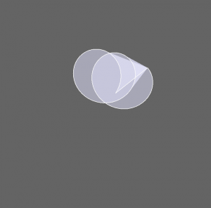
I really enjoyed doing this project, it allowed me to experiment with a bunch of different curves and shapes. Although it took a while to decide what shape to do and as well figure out the different equations and what each one does, the ending results are very interesting and intricate curves. I liked being able to manipulate and explore what each of the different parameters control. After messing with the different variables and trying to change different ones with the movements of the mouse, I  decided on having the mouse movement control the scale of the shape rather than one of the other parameters so that it would keep the main structure of the curve intact as it moved. Overall, I really enjoyed this project because it allowed me to explore more things and aspects of the code than other previous projects have allowed us.

Han Yu Project 07 Curves

sketch

// Han Yu
// Section D
// hyu1@andrew.cmu.edu
// Project 07

var nPoints = 200;

function setup() {
    createCanvas(400, 400, WEBGL); // create a 3D canvas
    frameRate(100);
}

function draw() {
    background(100);   
    fill(250); 
    rotateZ(millis() / 8000);
    stroke(250);    
    drawFlower();
}

function drawFlower() {
    // http://mathworld.wolfram.com/Slinky.html   
    var x;
    var y;
    var z;
    // variables inside the formula
    var p = constrain((mouseX / width), 0.0, 400);
    var q = constrain((mouseY / height), 0.0, 400.0);
    
    fill(200, 200, 255, 100.5);
    beginShape();
    stroke(250);
    for (var i = 0; i < nPoints; i++) {
        var t = map(i, 0, nPoints, 0, TWO_PI);
        
        // Flower(slinky):
        x = (PI+100*cos(10*q*t))*cos(t);
        y = (PI+100*cos(10*q*t))*sin(t);
        z = 1/2*p*t + 100*sin(10*p*t);    

        vertex(x, y, z);
    }
    endShape(CLOSE);
}

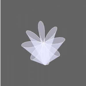
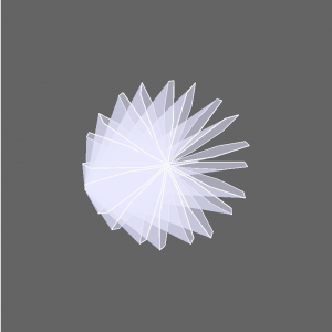
I used a slinky curve for my project. A slinky curve is a space curve which consists of a spiral wound around a helix. I altered it in order to show the formation of a flower. Overall I found this project is helpful with familiar with 3D plane and curves. Below are some screenshots of different stages of my project.

Start stage. Mouse at top left corner.
Flower in formation.
Final stage complex flower. Mouse at bottom right corner.

Yoo Jin Shin-LookingOutwards-07

eCloud

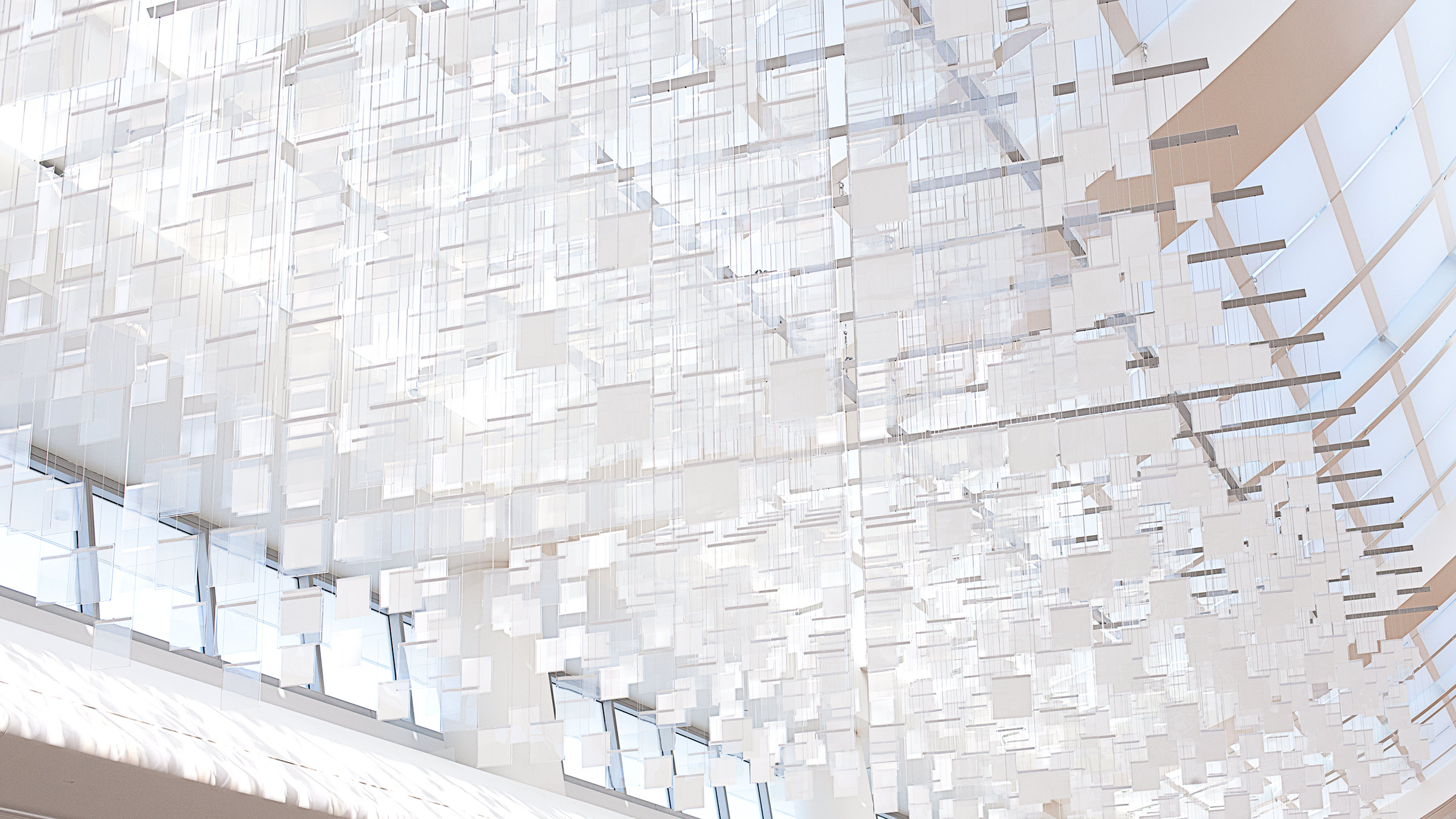
eCloud (2010), San Jose International Airport

ECloud (2010) is “a dynamic sculpture inspired by the volume and behavior of an idealized cloud.” It was designed by Aaron Koblin, Dan Goods, and Niki Hafermaas and is currently handing above in the San Jose International Airport. The tiles’ opacity updates periodically by real time weather data from around the world. The algorithm seems to take in values like sky weather, temperature, wind speed, direction, humidity, and visibility to produce the tile patterns and opacities. I love the simplicity of this installation and how it almost resembles indoor clouds. I think it’s a cool way to abstractly depict clouds and would be looking above if I were to come across this on my way around the airport.

Lan Wei-LookingOutwards-07

The project’s name is ‘Mesmerizing flight visualizations over 24 hour periods’ and it’s created by NATS, an air traffic control services provider. It is not produced by an artist as an artwork but it did provide me with a fanscinating new way of looking at the sky.

As a student of design, it is often required to produce good-looking drawings that contain information. But I feel most of them a waste of time since the raw data is as clear as the visualized version. There are only two kinds of information visualization that I find meaningful: information that is ‘dynamic’ and information that can have interaction with. This project falls into the first category.  For this project, even looking at the screenshot the dynamic flow of it can be felt.

In technical aspects, I think arrays in P5js can do similiar things by putting data of different flight courses in different arrays.

https://thekidshouldseethis.com/post/flight-visualizations-over-24-hour-periods

http://moebio.com/exomap/viewsofthesky/2/

(This link is an example of visualization of information that can have interaction with)

Jessica Timczyk – Looking Outwards 07

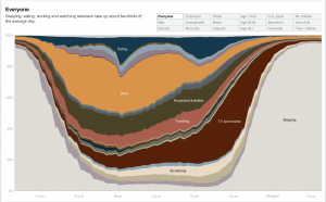
A visual of a chart of the amount of time on average people spend doing different things in one day.

Created by Amanda Cox in 2011, this graph shows how different groups spend their day, broken down by different activities. Within the graph, you can select different groups and demographics to see the differences in how different groups of people spend their day. I find this data extremely interesting because it allows us to see how the activities change based on the group that you are looking at. It provides us a way to compare these different demographic groups that I have never thought of before. Although I am not sure how the artist accomplished this work algorithmically, I suppose that they gathered the data by asking a random selection of people from these different groups how they spend their day over a certain period of time. The creator’s artistic sensibilities are reflected in the final work through her choice of colors and the form in which the graph was displayed, for changing the type of graph used to display the data could easily change how it is perceived.

Looking Outwards – 07 John Legelis

Ingrid Burrington is an artist/scientist from New York City and the creator of the book Networks of New York . This project involved surveying New York’s infrastructure and researching the different networks that make up all its components. The research was compiled into a book that beautifully displays to the reader the networks that make up New York City.


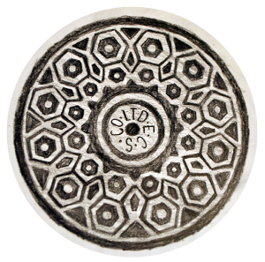
Manhole Depiction from Networks of New York

This manhole drawing is one of many described ports to the physical internet. This particular manhole is part of the Empire City Subway Network.

Ingrid likely discovered all this information by simply observing her surroundings and then inquiring with the right experts to gain further detailed information. I admire this project because of its thoroughness and its unique angle on everyday objects. Ingrid’s obviously technical background applied to the physical world creates an outcome that portrays the ordinary as excitingly interconnected.

Han Yu Looking Outwards 07

The information visualization project I found is called the Drought Monitor. It is a project by Pitch Interactive, an data visualization studio that presents data using the latest technology interactively. Their clients include some of the most acclaimed companies from multiple industries like Dow Jones, Wall Street Journal, Facebook and General Motors.

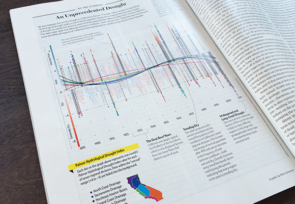
An Unprecedented Drought by Pitch Interactive in the 2015 issue of Scientific American.

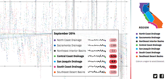
The Drought Monitor was first started as a commissioned project paid by Scientific American in 2015. In that one of year’s issues, there was a graph of the frequency of unprecedented droughts in California. The graph plots data from the Palmer Hydrological Drought Index and highlights outlying points outside the general trend lines so the overall amount of unprecedented climates was clearly presented. In 2018, Pitch Interactive recreated the website and put data of California air moisture from 1895 to 2018. The graph follows the same design as the one in 2015 but becomes very interactive with viewers. Just by moving the cursor along the axis, data of general trend lines of each California region and specific data location is clearly presented. I am very impressed by the skillful application of information visualization by Pitch Interactive as it has made complex data instantly readable to any kinds of audience.

Screenshot of the interactive website Drought Monitor created by Pitch Interactive in 2018.

Lan Wei-Project-03

my-sketch.js

//Lan Wei
//Section D
//lanw@andrew.cmu.edu
//Project-03

var starXArray = [];
var starYArray = [];
var starRArray = [];

function setup() {
    createCanvas(450, 450);
    noStroke();
    for (var i = 0; i < 200; i ++){
        var starR = random(0.5, 2);
        var starX = random(0, 2 * width);
        var starY = random(0, 2 * height/3);
        ellipse(starX, starY, starR, starR); // stars
        starXArray.push(starX);
        starYArray.push(starY); //store the positions of the stars in arrays
        starRArray.push(starR); //store the size of the stars
        print(starXArray);
    }
}

function draw() {
    background(5, 5, 32);
    fill(136, 3, 11);
    rect(0, 2 * height/3, width, height/3); //lower part of the city scene

    //stars
    for (var i = 0; i < 200; i ++){
        fill(150);
        ellipse(starXArray[i] - mouseX/7, starYArray[i], starRArray[i], starRArray[i]);
    }

    // buildings
    push();
    fill(136, 3, 11);
    rect(-mouseX/2, 200, 50, 150);
    rect(50-mouseX/2, 270, 30, 150);
    rect(80-mouseX/2, 230, 70, 150);
    rect(150-mouseX/2, 280, 90, 150);
    rect(240-mouseX/2, 250, 50, 150);
    rect(290-mouseX/2, 190, 50, 150);
    rect(340-mouseX/2, 230, 20, 150);
    rect(400-mouseX/2, 200, 50, 150);
    rect(450-mouseX/2, 270, 30, 150);
    rect(480-mouseX/2, 230, 70, 150);
    rect(550-mouseX/2, 280, 90, 150);
    rect(640-mouseX/2, 250, 50, 150);
    rect(690-mouseX/2, 190, 50, 150);
    rect(740-mouseX/2, 230, 20, 150);
    pop();

    //roller coaster
    for (var x = 0; x < 5 * width/8; x += 0.1){ // the less thriller part
        var xInSin = map(x, 0, width, 0, 4 * PI);
        var y = 50 * sin(xInSin) + height/2 + 50;
        fill(255);
        ellipse (x, y, 1, 1);
        if (x % 20 <= 0.1){ //vertical structure
            push();
            stroke(200);
            strokeWeight(1);
            line(x, height, x, y);
            pop();
        }
    }
    for (var x = 5 * width/8; x < width; x += 0.1){ //the thriller part
        var xInSin = map(x, 0, width, 0, 4 * PI);
        var y = 100 * sin(xInSin) + height/2;
        ellipse (x, y, 1, 1);
        if (x % 20 <= 0.1){ //vertical structure
            push();
            stroke(200);
            strokeWeight(1);
            line(x, height, x, y);
            pop();
        }
    }

    //carriage
    if (mouseX < 5 * width/8){
        y = 50 * sin(xInSin) + height/2 + 50;
        fill(255, 255, 0);
        var fakeX = map(mouseX, 0, width, 0, 4 * PI);
        var rectY = 50 * sin(fakeX) + height/2 + 50
        push();
        rectMode(CENTER);
        var ang = asin(sin(fakeX + PI/2));
        translate(mouseX, rectY);
        rotate(ang);
        rect(0, 0, 20, 10);
        pop();
    }
    if (mouseX >= 5 * width/8){
        y = 100 * sin(xInSin) + height/2;
        fill(255, 255, 0);
        var fakeX = map(mouseX, 0, width, 0, 4 * PI);
        var rectY = 100 * sin(fakeX) + height/2;
        push();
        rectMode(CENTER);
        var ang = asin(sin(fakeX + PI/2));
        translate(mouseX, rectY);
        rotate(ang);
        rect(0, 0, 20, 10);
        pop();
    }
}

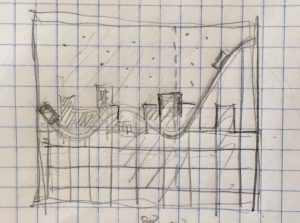
I trird to make a scene of roller coaster at night, with the stars in the sky and buildings far away. The stars, buildings and roller coaster should move with different speeds (and probably different directions) with mouse moving. The hardest part is to make the roller coaster move along its track. The process is very fun.

sketch

Lan Wei-Looking Outwards-03

Design Miami Pavilions: Flotsam & Jetsam

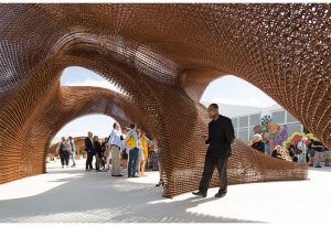
The project was designed by SHoP Architects in 2016.  What is amazing about the project is the completely digital design and the 100% 3D-printing. As a designer, I feel very excited about the power of machine to achieve what human cannot achieve, which sets free designer’s imagination and has potential to bring more exciting works to our physical world. As an architecture student, I was tortured by endless repetitive work in design process but now I believe computational fabrication will take all the job in the future and designers can focus on the intellectual work.

The material used in the prpavilion is carbon fiber, which has both high strength and the flexibility and thus can be used in 3D printing. The design can be achieved using Rhino and Grasshopper. Another thinking of mine is that the design can be integrated with ecological features such as having plants in its structure.

The view inside of the pavilion

http://www.shoparc.com/projects/design-miami-flotsam-jetsam/

Han Yu Looking Outwards 06

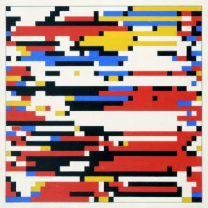
Hiroshi Kawano, Design 3-1: Color Markov Chain Pattern, 1964

Hiroshi Kawano is a Japanese artist pioneered in the field of generative art. He was one of the first generative artists who believed the possibly of using a computer to program artistic works. Color Markov Chain Pattern was one of Hiroshi’s most famous work. It was created in 1964 after Hiroshi was inspired by the writings of the German philosopher Max Bense who wrote about the using scientific metrics to program beauty. This piece of work was also referred as the digital mondrians. Hiroshi wrote computer programs with complex mathematical algorithms involve random processes because although he set the rules for picture, he wasn’t able to pin down the actual result without printing. Hiroshi masterfully mixed subjective randomness with computational randomness together in his works. In the early sixties when computers were still giant machines that takes up a whole room, Hiroshi was the first to think it as a medium to create art. His works truly pioneered in the field of computational art and influenced many later works.