Julia Nishizaki – Looking Outwards 01

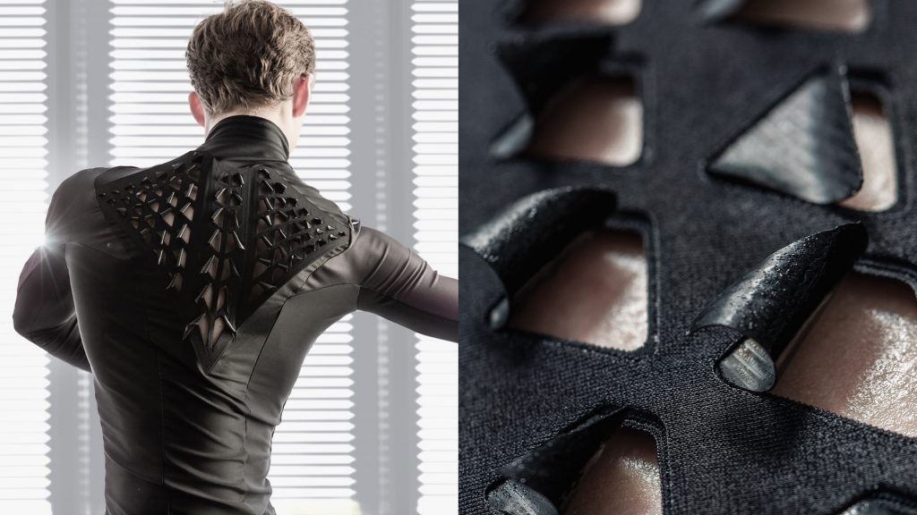
Second Skin hydro-reactive fabric by MIT

The project I chose to write about is bioLogic’s Second Skin, a line of sportswear the reacts to sweat and body heat, causing small flaps of fabric to peel back, so that sweat can evaporate. BioLogic, a team of 8 researchers in the Tangible Media Group at MIT Media Lab, embedded the bacteria, Bacillus Subtilis Natto, which naturally expands and contracts in relation to moisture, into Second Skin’ fabric. I was introduced to Second Skin in an e-textiles course I took last year, and while this isn’t a coding or electronics based work, I was really inspired by the meaningful, effortless interactions between the dancers and their “living garments.” I really admire this project not just because of how the transformations of the fabric help to regulate the athletes’ body temperatures and improve their performances, but also because it visualizes the work and effort of the athletes in a very tangible and elegant manner, elevating the experience.

Other projects at this lab that utilize the bacteria in a similar manner include tea bags with indicators that unfurl when the tea is ready, and lamps that expand and change from the heat of the light bulbs inside.

Second Skin, created by the research team, bioLogic, in the Tangible Media Group at MIT Media Lab

Sydney Salamy: Looking Outwards-01

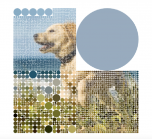
The project I chose is called “Visualization” by Λ B H I N Λ V . K R on OpenProcessing. The project starts with a cute picture of a golden retriever puppy running on a beach. When you run your mouse over the picture it turns into four circles with the color of their background. If you keep going over the circles they get smaller and smaller, and this causes the details in the photo to come back out. The end result is the same picture, except with a more mosaic look to it.

I admire how the creator was able to take such a simple idea and make it interesting. Despite the fact that you are just running your mouse to make circles smaller, it is somehow entertaining. It is satisfying to watch as the picture comes back, and also satisfying to shrink the circles, almost like popping bubbles, except more interesting because you are rewarded with the cute face of a dog. The interactive element is especially great because it allows the user to influence how they want the piece to look. They could leave part of the piece un-popped, pick a certain color to pop, etc. This allows the user to add a personal touch to the end result. I admire these aspects of the project because they are not only entertaining, but also show that a person doesn’t have to code a whole complicated piece to make something interesting, they can have a very simple idea and still be successful.

  • Only one person seemed to be involved in creating the project. I’m not exactly sure how long it took him to create his piece. I looked at the dates of the works before and after and it seems like he posts about three to four different pieces-one per day-and then there will be a gap, then another cluster of posts. I’m guessing he makes a bunch in advance and then posts them all at a time over the span of a couple days. The gaps between these clusters seem to be about three weeks to a month, so I think it took him about one to two weeks to create that single post (although this is just a guess).
  • The software he used seemed to be “off-the-shelf”. OpenProcessing is a very public/easy-to-access site, and the code he wrote didn’t seem like anything out of the ordinary. His project doesn’t look like something he would need custom software for.
  • I don’t know any specific works he might have been inspired by. However, many of his previous works included a variety of colors and shapes, and are user-interactive. Also, looking at his “Hearts” section you can see that the works he liked also fit into this category. “Visualization” also fits this description, so it seems he has a type of work he likes to create.
  • Since the work is interactive, entertaining, and visually appealing, I could see the artist possibly working in the gaming industry since coding and creativity are demanded there. Not so much complicated games but more leaning towards ones you would find in the App store for your phone. Like maybe one level would be the dog-bubble piece and then the next would be something different but using the same concepts and ideas throughout. I could imagine a game where you would start out with the four big bubbles, and then would have to guess what the image was while trying to pop the least amount of bubbles. He could also create gifs and/or short and interactive animations for websites.
  • Λ B H I N Λ V . K R.“Visualization.” OpenProcessing, 2015.

Video And Picture Below

DogOPvid5smol

Photo of “Visualization” by Λ B H I N Λ V . K R

Cathy Dong – Looking Outwards 01

This project is named “Breath of Light,” designed by Preciosa Group. The particular piece was displayed in Milan Design Week.

This project is named “Breath of Light,” designed by Czech lighting specialist, Preciosa Group. The particular piece was displayed in Milan Design Week 2018.

“Breath of Light” injects life into the traditional concept of a chandelier. The visitors interact with the art piece and become part of the display. Simply sharing a breath, they create a lighting and music effect. Therefore, it becomes something more than just a beautiful lighting device, but a social tool. When interacting with the design piece, they also work together to explore the different lighting possibilities.

Technically, the design has over 1000 individual opal crystal bubbles. Special sensors are installed in different corners of the project. The idea is developed based on the company’s generations of designers’ creativity since 1548. The number of designers and workers behind this art piece is unknown, but we know that the creative director is Michael Vasku. They are inspired by historical chandeliers and contemporary pendants. I am inspired to create more interactive lighting devices, furniture, and building parts in the future.

source:

https://www.preciosalighting.com/news-detail/discover-the-breath-of-light

CJ Walsh – Looking Outwards 01

The project I chose to focus on is the ICD/ITKE Research Pavilion from 2015-16. The pavilion is part of a series meant to show the potential of computational design and different practices of fabrication within the world of architecture. The use of computational models to create a space is what initially drew to me to this project, as a designer studying environments the creation of spaces excites me. Another very significant factor that I love about this project is that the structure is based on research into biological structures in sea urchins and sand dollars.

The team consisted of researchers, students, biologists, architects and engineers. They were inspired by previous research on the structure of sea urchins and other creatures that identified key structures and patterns that allowed for light-weight forms. Using photos and microscopic imagery, the team was able to translate these structure into large scale pieces that could be assembled into a larger structure.

An interesting factor in the project was the use of robotic sewing to assemble the pieces. It is the first project of its kind to use sewing techniques on wooden fabrications at a large architectural scale. Custom software was created so that the robots could efficiently complete the task of sewing and securing all 151 segments together in the arrangement designer by the researchers.

I think that one of the really inspiring parts of this project is that it is part of a series that seeks to promote the use of computational models and practices into the design of physical spaces. It enables the researchers to think outside of the box into what could be a potential form and inspires other creators to begin experimenting with these media to create new and exciting projects that combine computational programming and architecture/environments design.

Source: Institute for Computational Design + University of Stuttgart

Xu Xu – Looking Outwards – 01

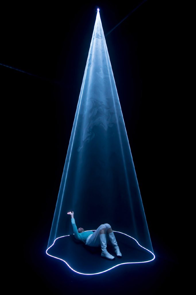
The audiovisual installation AURA by Nick Verstand (a contemporary artist who researches the boundary between the immaterial and material world, and strives to create art that breaks down social boundaries) presents the experimenters’ emotions visually as light compostions in various forms and shapes. The intensity and colour of the forms are translated from brain waves, heart rate variability, and galvanic skin responses of the experimenters, which are collected through wearable biosensors. These emotional cues are being processed and analyzed by the system and derived into visible light. Through influences of musical compositions, the lights would respond to the changes of one’s emotions.This installation tributes to artist Anthony Mccall, who intends to explore light as a medium. Through these series of transformations, AURA provides a possibility for people to have a better understanding of themselves and their emotions through colours and intensities. Quoting the website of AURA, “the installation symbolises the materialisation of (internal) metaphysical space into (external) physical space.” This installation allows the resulting experiences to be a co-creation of the experimenters and artists, and generates a hypnotizing visual experience for the mind.

Crystal Xue- LookingOutwards-01

The Art of Feeling-turning brainwaves into paintings

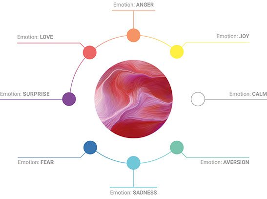
This is an amazing project done by Random Quark for Saatchi & Saatchi Wellness showing an amazing form of art that reflects one’s feelings with the help of technology. Different colors represent different emotions, for example, the color red represents love, etc. Then the brainwaves are recorded by GEE headsets and processed to generate complex patterns.

I personally found this project very inspiring because it is a very creative approach to visualize something intangible and hard to depict like emotions. Even though this project was based on the need for promoting mental health wellbeings, there are definitely opportunities to draw the inspiration and turn something else into a creative art form. This is also a multi-disciplinary way to build bridges between scientists, programmers, and artists to work collectively and produce something that general public are able to understand.

Ghalya Alsanea LookingOutwards-01: OLD NAVY SELFIEBRATION

OLD NAVY SELFIEBRATION by Deeplocal

This video explains the mechanisms and inspiration behind the Selfiebration installation.

This project by Deeplocal, a firm based in Pittsburgh, helped Old Navy celebrate their birthday by rendering fans’ selfies on a massive display made of 1,000 balloon “pixels”. I specifically choose this project because of the way people interact with the display. It is really cool how your face gets to literally be part of the display, while using balloons to extenuate that this is, in fact, a celebration. In addition the size of the display makes it disruptive in a way that even if it’s not your face projected, you still interact with the display. Also, the idea of using “selfies” in to attract an audience is very smart due to the large presence of selfies in media today. All in all, they knew their audience, the message was clear, the interaction was easy, and most importantly it was pleasant and fun for all parties involved.

Adding to that, even though it seems like a simple idea in concept, the project is highly innovative in the sense that they invented custom-engineered balloons for this specific project. In my opinion, executing simplicity in a design is harder than complexity.

Close up of the engineered inflatable balloon display.

The balloons, divided among 16 identical “balloon boxes,” inflated simultaneously with each capture, thanks to almost five miles of wiring and a pneumatic valving system built by Deeplocal engineers, explains CEO Nathan Martin.

The device is capable of showing two selfies a minute. Concept through creation to going live took just eight weeks.

The team consisted of a mix of about 20 artists, engineers, and designers.

Links:

https://www.deeplocal.com/projects/selfiebration.html

DeepLocal machine turns selfies into 15-foot balloon portraits


Stefanie Suk – Looking Outwards – 01

Bit.Fall Installation in Incheon Airport

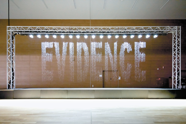
Bit.Fall, designed by an artist Julius Popp, is a computerized art installation that releases water droplets at specific intervals to create words extracted from the internet’s current stream of trending topics. In this installation, computer program plays a key role in filtering keywords based on a statistical algorithm from the current newsfeed, then transferring the information to the control unit to create droplets at specific times. This installation caught my attention as it combines both nature (through gravity to make the water drops fall) and culture (through news feed for social attention) into a single piece of artwork. What I admire the most about Bit.Fall is the strange correlation between water, a natural medium, and word, a cultural information, combined together to create a single collaborative installation. This project can further inspire the art and values of combination between nature and men.

Bit.Fall Installation in MONA

Bo Yang- LookingOutwards-01


I was play Electronic Organ when I was in undergraduate university in China. This instrument is very popular among children because it contains thousands of sounds in one instrument.

The first electronic organ made by an American named Thaddeus Cahill in 1904. Until now, YAMAHA is the biggest company producing this instrument.

Electronic Organ seems like a harpsichord, piano size but has a foot-keyboard. Electronic Organ is a modern electronic keyboard instrument which combines high technology. It originates from classical pipe organ and is similar to the structure of the classical pipe organ. But the electronic organ has its own musical form, which is just like a music synthesizer but need a performer to run the whole organ. It contains thousands of instruments inside one electronic organ and it can show symphony when performer plays it. Even I play this instrument for 8 years, I still do not know how does it run. All the information online is about teach how to play it but no one to show how can produce one.

From my experience, the electronic organ function just likes the music synthesizer but more than one. It can process thousands of instruments in one time.

However, the sound of this instrument is not very adjective sometimes. It’s like fake not true. It inspire me to learn more about computing music and what is computing music. I love my instrument and I wandering maybe I can do more about this project. Like, making this instrument become more productive or making the sounds more adjective. Then chamber music can just need one instrument not a lot of instruments.

Alec Albright – Looking Outwards – 01

Demo and tutorial of SICKTRICKS by creator Bo Tembunkiart

SICKTRICKS is an interactive video game for the sport of tricking, which is an aesthetic blend of martial arts, gymnastics, and break-dancing. It was a project created nearly three years ago by CMU student Bo Tembunkiart. Though this project was created from scratch, it did utilize the Autodesk Maya application for 3-D interactivity in order to allow for more realistic movements and responses by the avatar.

The project was not as inspired by one particular work as it was inspired by the lack thereof. As tricking is a somewhat new, relatively small sport, the creator wished to create a video game for the tricking community, entering a space that has not been widely explored before. In this way, it offers a new area of potential study for the video game world, expanding the awareness of tricking at the same time.

I admire this project because not only does it explore a new realm of video games, but it also is wildly impressive to me that such a game was able to be created from scratch in just one semester. It is exciting for me to see that you can create new content even if there is no template, so long as you’re willing to work hard enough for it. This project was certainly outside the box, and that to me is definitely inspiring.