Danny Cho-LookingOutwards-01

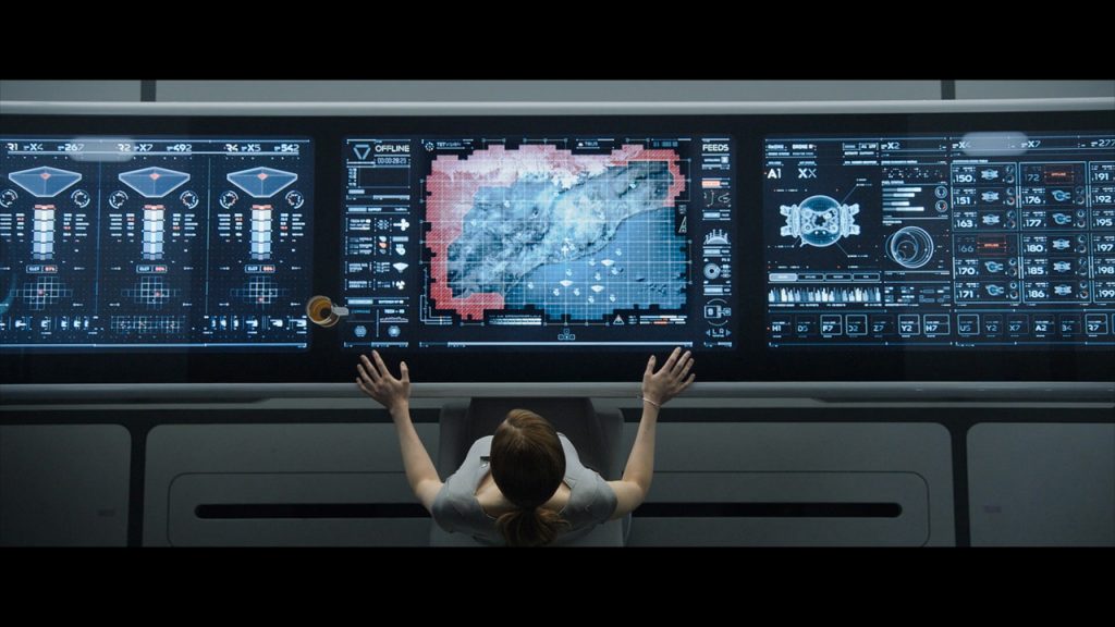
A screenshot from the movie “Oblivion”

When I see interfaces from sources such as sci-fi movies like Iron Man, or Oblivion, it always excites me and makes me want to create something similar. My favorite designer regarding this topic is Gmunk (Bradley G Munkowitz). He uses mixture of Cinema 4D, After Effects, and other softwares to create mind blowing animations. Such graphics really catch the attention of the audience by generating futuristic atmosphere as well as help us imagine ourselves in the position of the characters that are using the interface.

Above is the UI of Bubbleship. Bubbleship is a paramount vehicle in the movie. Gmunk’s stated that it was the most researched graphic task, trying to imitate the actual functional data that currently exists in the combat aircraft interfaces as well as modernizing its aesthetics. I genuinely appreciate the works that someone put in much considerations to crafting it to very details, though it’s not required to do so. 

Such as HUD above, I have been using softwares such as After Effects myself to replicate such interfaces, but have not been able to create an actual interaction. I look forward to learn how to create digital interactions that reacts to the user’s movement and actions, with a behavior more than just a pre-directed script.

Yoshi Torralva-Looking Outwards-01

ID Tags

Pentagram’s newest design partner, Giorgia Lupi, is at the forefront of furthering data-driven design as an essential pillar to design methods. Throughout Lupi’s career, she has used data as the foundation to nurture empathy towards important issues surrounding politics, technology, health, and above all, forging impactful human interactions.

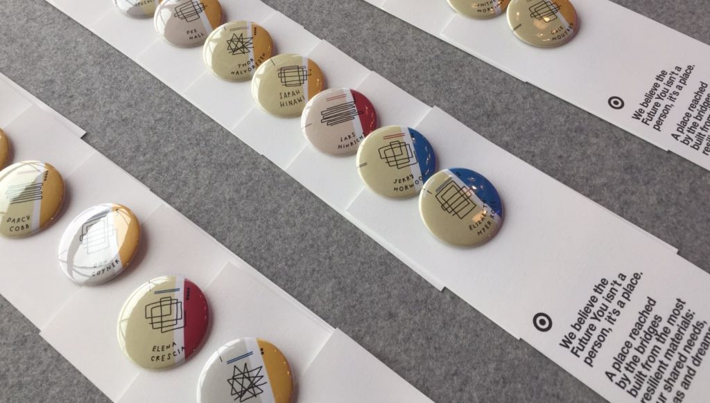
TED conferences are renowned for showcasing inspiring speakers that span all over the world. When one is privileged with the opportunity to attend an event, it lends itself numerous networking opportunities. For many, the process of becoming comfortable with networking is often a hurdle. What Giorgia Lupi accomplishes is making the barrier to transgress from surface-level introduction to meaningful conversations easier through generative conference ID tags. This project included Giorgia Lupi and David Stark Design for Targets interaction space at the 2017 TED Conference in Vancouver. A timespan of the development process is not provided, but I would predict it took a couple of months.

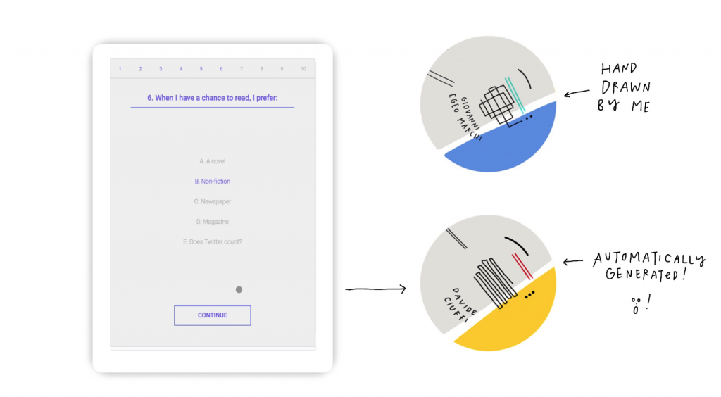
App developed to generate ID tags instead of hand drawing them.

Giorgia Lupi creates a system of different hand-drawn symbols, colors, and accents that identified someone’s personality or interests. Although these ID’s provide personability to a tag, it would be lengthy to replicate. Lupi decided to implement her hand-drawn style into an app that auto-generated the ID after filling out a survey. The app itself uses a stock Google Material design to input the person’s data. However, visual elements are of separate layers to that morph at the end of the survey. It would have been nice for these visual elements to be computer-generated as it could be replicated at other conferences. These data-driven ID tags are inspired by physical ID labels and added fabric ribbons that might supply information like location and name. What this tag does is employ visualized data to allow for more interactions among participants. Giorgia Lupi sets the framework for ID’s to become more diverse in information through an auto-generative ID system. An intervention like this sets the standard for other conferences and corporate companies to create ID systems that nurture insightful relationships right after the first hello.

Ellan Suder-LookingOutwards-01

Gameplay summary of from Engadget.

One of my current favorite video games is Breath of the Wild from Nintendo’s Legend of Zelda series, a nonlinear and open world action-adventure game. It’s the first game of its kind in the series and inspired by other open-worlds such as Skyrim. Besides the beautiful visuals, it’s just a really fun game to play.

I can’t claim to know much about game systems, but I’ve heard how BOTW’s physics system has impressed many. The game was built in a modified version of the Havok Physics Engine. The game developers had to work to create a new physics engine that was consistent across the game world and worked logically without negatively affecting gameplay. (One of the game developers recounts a time where during testing, he entered an area only to find that all the objects normally there had been blown away by the wind.) The engine rewards exploration and experimentation. ‘For instance, in Breath of the Wild you might have a puzzle where making use of the physics, there’ll be various ways you can solve that puzzle’ (Aonuma, series producer).

As well as being a new direction for Zelda, the game is a popular innovation on the open-world genre because it simplifies the needless complexity of similar games in its genre and introduces new ways to interact with the environment. Instead of following a list of to-do list of quests, the players are allowed to focus on the expansive world and direct themselves. I really admire how they were able to create a game that encourages the players to move all across the map and gives them almost complete freedom. BOTW’s greatest success was in capturing the spirit of adventuring into the wild.

Xiaoyu Kang – Looking Outward – 01


shiseido ginza

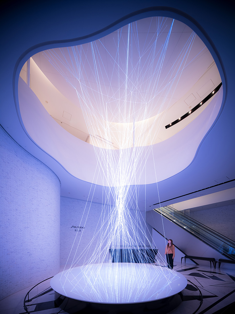
WOW inc. is a design studio based in Tokyo. One of their most astonishing project is an installation art series that is created in the Shiseido Ginza building in Tokyo as a part of the promotion for Shiseido’s new products. The installation was inspired by the concept of neuroscience and is created to be interactable. 

The installation itself is divided into two parts. The first installation combines technology with a newly developed fiber material to create rays of light that runs nine meters long vertically. Around 150 fibers with a 9 millimeter diameter was attached in total to create the installation. The light on fibers used are controllable by touch, thus creating a visual effect that mimics the transmission of sensory nerves.

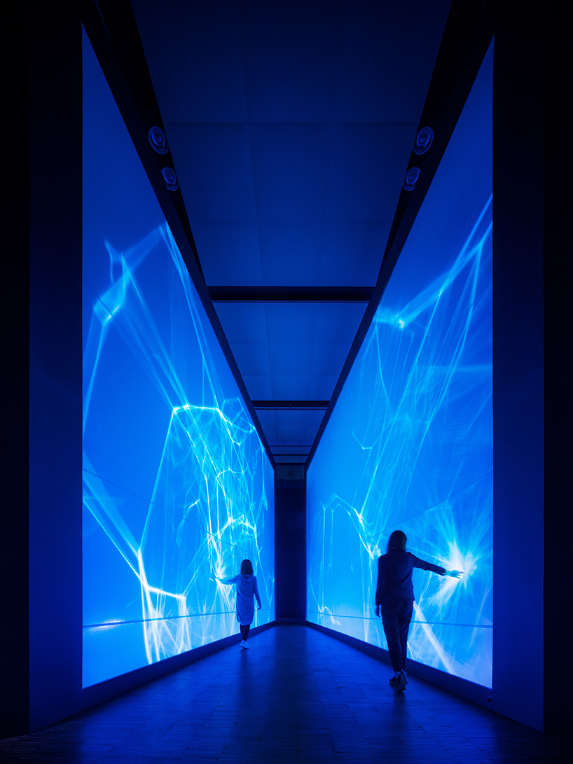
The second part of the installation is a wall made by stretchable fibers that also responds to the touch of the visitors. By touching the wall, the visitors are suppose to feel connected to the activeness of the nerve cells.

shiseido ginza

Min Ji Kim Kim – Looking Outwards – 01

A video by creator Ken Kawamoto introducing the tempescope and its functionality.

A few years ago, I discovered this video while scrolling through my Facebook feed. I was fascinated by the idea that this object could not only serve an aesthetic purpose as house decor but also a functional one to remind one, for example, to take their umbrella because it’s raining.

Tempescope is essentially a clear case that visually displays weather conditions using a custom app. You can either set your location or manually choose whatever effect you want. Creator Ken Kawamoto built the first prototype in 2012 using the Objective-C and C++ programs after wanting to experience the Okinawa weather from his living room. In 2013, he created an open source version (available on GitHub) so other people could reproduce the tempescope at home.

After receiving a lot of attention from multiple media outlets, Kawamoto recruited a team of five people to create a retail version of the prototype and a funding campaign was initiated on Indiegogo. Although it received substantial attention, the campaign ultimately did not reach its funding goal and as of now, the project seems to be at a halt with no further development plans.

You can learn more about the tempescope here.

Mari Kubota – Looking Outwards – 01

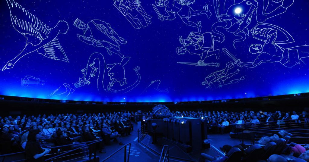
The Hayden Planetarium at the American Museum of Natural History in New York City is run using a software the museum developed over almost 20 years called the Digital Universe Atlas. The Digital Universe Atlas was created with the collaboration of a Swedish Company, SCISS, who developed a similar software called Uniview. The software was programmed using the Partiview data visualization engine designed by Stuart Levy. Using data from national and international organizations, the Digital Universe visually conveys information about Earth, every known star, satellite, and planet all the way to the known universe to scale.

Hayden Planetarium by the American Museum of Natural History

This allows the user to understand the astronomical distance and scale of the universe and everything inside it. Though the software is mainly used for planetariums for show, you can also download the software and navigate through the solar system, the milky-way galaxy, and the constellations yourself. This interactive and educational software brings the universe into perspective and where we stand in the universe.  


Claire Lee – Looking Outwards – 01

Cell by Keiichi Matsuda and James Alliban is an interactive art installation that uses Xbox Kinect technology to trace viewers across the screen by adding tags taken from social media to their form, until their entire screen “self” is comprised of lines of text that seem to simultaneously represent everything and nothing at all. I found this project to be fascinating because of its technological advancement in the interactive art field and its piercing social commentary.

The piece provokes a lot of thought about how we construct our sense of self in the new digital world. It seems to be asking the question: do we put ourselves into social media, or does social media put itself into us?

Cell at Audi CIty Beijing in December 2013.

In collaboration with Microsoft and the openFrameworks community, the creators of this installation pioneered a new method of making interactive displays by building a new code library that supports Kinect for Windows. This code is on an open-source platform, so it is bound to inspire many future projects as well.

James Alliban & Keiichi Matsuda: Cell, Interactive Installation 2011

lee chu – looking outwards 01

The Pardall Tunnel, at UC Santa Barbara, had originally been an ordinary central passageway into Isla Vista, the main housing area for SB students. A tragedy in 2014 ended in the death of six SB students, and a year later as tribute to the lives lost, the tunnel lit up blue.

The tunnel now has LED strips lining its length, as well as motion sensors which trigger the lights as pedestrians and bikes make their way in and out of campus. Kim Yasuda, an art professor at SB, along with Marcos Novak of the Media Arts and Technology program were behind this project which now not only brings meaning, but also entertainment and excitement to a mundane trek to school. I had recently been to the Pardall Tunnel, and the lights seem to have only white LEDs and could benefit from a hardware upgrade.

source and extra info c:

Katrina Hu – Looking Outwards – 01

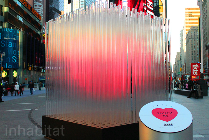
Times Square Heart Sculpture

The interactive Times Square Heart Sculpture

The Times Square Heart Sculpture, designed by the Bjarke Ingels Group, has a red heart hovering within a cube made with 400 glass rods. The heart grows brighter with more people touching the activation pad. The piece is very effective, and reflects the vibrant energy that flows throughout New York City.

I was inspired by the way it helps build community and inclusivity. The creators were very successful because it encourages people passing by to come together to light up the heart. Many people were involved in the creation of the project, including structural engineers and lighting experts to help with the LED technology. The project also works to encourage green technology, leading the way to a more environmentally friendly and sustainable future.

A passerby pressing the activation pad

Jai Sawkar – Looking Outwards – 01

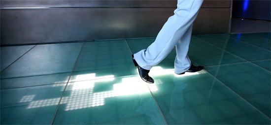
Sensacell’s Interactive Floor Shows Trail of LED Footprints

This is Sensacell’s New Interactive Floor. Currently installed in part of the Comunitat Valenciana in Spain, this interactive floor lights up as you walk along it; the lights then slowly fade away as you move further from the spot. The installation has over 1,000 interactive modules, each using weight sensors and an LED lighting system to fulfill the piece. Sensacall is a small, interactive lighting design and manufacturing company based out of Thailand, and their work is geared towards architects & designers to be used in public spaces. All this is done to provide a more memorable experience for users.

It always interests me when designers and programmers alike strive to innovate mundane systems to be more engaging to everyday people, and this is something I would love to work with in the future. Moreover, the interest of merging the two different fields, design, and computing, to make a piece of art adds a new dynamic to the installation as a whole; this merge is the reason I am taking 104, and I believe there is a lot that can be fostered through these terms.

https://www.engadget.com/2008/08/13/video-sensacells-interactive-floor-shows-trail-of-led-footprin/