Nawon Choi— Looking Outward 01


“The Smithsonian’s design museum goes high tech” by The Verge

The New Cooper Hewitt Experience

The Cooper Hewitt Smithsonian Design Museum’s interactive pen and tabletop experience left a deep impression on me when I first experienced it.

I was inspired by the way it augmented a typical museum experience by personalizing each visitor’s journey throughout the galleries. While there are many features of this unique project, one of the key computational/interactive art moments is the Immersion Room. This room takes inspiration from the museum’s own permanent wallpaper collection, and transforms the way people experience it. In the Immersion Room, visitors can not only digitally project wallpapers from the Museum’s collection, but also draw and display their own creations on the wall. When visitors draw on the tabletop interface using their pen, their drawing is projected on the walls in real-time.


Demo of the Immersion Room

Many different teams were involved in ideating, designing, and developing this experience. It integrates existing products, such as Sistelnetworks’ “vWand”, which have been re-engineered to fit the specific needs of the museum. I admire the way this project not only challenges the traditional museum experience, but also opens up the possibility for other industries/organizations, such as schools, to utilize these interactive technologies to enhance or radically change the way people experience and learn new things.

Claire Yoon- LookingOutwards-01

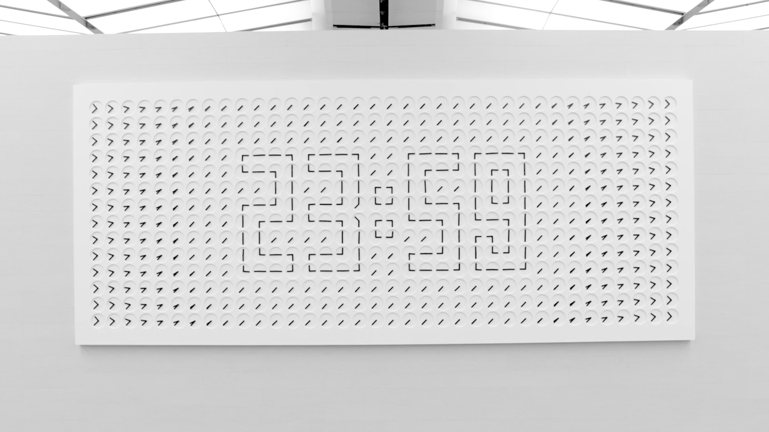
A Million Times at Changi Airport Singapore by Humans since 1982: A clock and kinetic artwork with 504 interconnected clocks, one of the world's biggest art installations of its kind.

A Million times at Changi is a functioning clock that I encountered at Changi Airport after visiting Singapore for vacation that represents the concept of time. This is not only a clock but also a kinetic sculpture that was developed by Humans Since 1982, which is a Stockholm-based artist collective, in 2014.

This art piece is made up of 504 clock-faces with hour and minute hands that have been programmed to spin in various directions to create a series of synchronized designers and patterns that change multiple times throughout the day. It represents the abstract concept of time passing by while also reporting real time.

Video:Changi Airport

Looking Outward 01

One cool project that really inspires me is the Bach Harmonizer Doodler. As some may already know, it is an online application that lets you input any two bar melody of your choice and it will harmonize it using Bach’s chorales as reference.

This project was made by the Google Magenta and Google PAIR teams so there were likely many people who worked on it. To create it, they used a machine learning software to teach the AI to recognize patterns in between 306 of Bach’s chorales.

Google was likely inspired to do this by other AI-based “mini-game” projects, one that comes to mind is Akinator in which by you answering minimal questions, the software can guess any character you are thinking of.

While the software of the harmonizer is still far from perfect (if you have taken a harmony course at CMU you know), it is a cool step in computer generated music. As a composer myself, the concept of AI writing its own music is a little frightening but also extremely fascinating. This project inspires me to work harder at my art as to not be outdone by the growth of software such as this.

Bach Harmonizer Doodler

Monica Chang – Looking Outwards 01

Eclipse is a “Creative Digital Agency” formed by a team of 6 individuals based in Benevento, Italy who explore the processes and development of new UI/UX, Web and Graphic design.

This website is composed of many different computational designs that allow the viewer to really interact with the website and the information that is provided in a very playful and creative way. For instance, the very first page within the website introduces the viewer by inviting them to use his/her mouse to draw across the screen causing words to flow behind the moving mouse. What is also interesting about this front page is that the size of the words also vary based on the pressure put on the mousepad of a laptop. With this, it shows the amount of thought and effort put into the composition of this website.

Drawing intro page.

My favorite section of this website is their navigation page.

Navigation page.

What really drew to this website was the various designs and interactive art planted within it that not only attracted me towards traveling further into the website but also really absorbing the information as to their purpose and their goals. They encourage people to look for opportunities to create new designs and ideas to share with the world around us. It inspires me to look into more ways to developing my own ideas towards web design and explore my own senses towards programming.

Aaron Lee-LookingOutwards-01

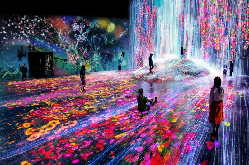
Images: teamLab

teamLab Borderless is known to be the world-leading digital art collective lab consisted of not just engineers but also architects and artists. Like their name suggests, the team seeks for border-less communication between different genre of fields in order to create an transcending experience in the realm of media art. This project is inspiring since it breaks the traditional relationship between media art and space. Here, media art itself is an architecture. The project overcomes flat screens and challenges uneven surfaces and objects as possible medium in future. Its only limitation seems to be the safety issue. Considering many of the visitors are children and family, projected illusion might sometimes cause an accident. Although intentional, many visitors actually gets disoriented in this exhibition. Interestingly, the creator says that they were more inspired by the beauty of nature and sense of the organic more than anything else. The project proofs that the media art is ultimately about human experience and emotions not just special effects.

Video:teamLab

Taisei Manheim- Looking Outward – 01

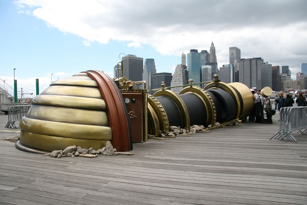
The Teletroscope as seen from the New York City side.

The interactive project that I chose was The Teletroscope, an installation during the summer of 2008 in London and New York City by Paul St. George, an artist that is based in London.  Near Tower Bridge in London and similarly positioned by the Brooklyn Bridge in New York were identical telescopes that allowed people to watch those on the other side in real time. These giant telescopes were huge and angled into the ground as to almost give the impression that there was a literal tunnel from London to New York City in which you could see those on the other side.  It was based on a Victorian engineer’s idea of connecting London and New York through a series of lenses and mirrors. This illusion of a giant tunnel under the Atlantic Ocean was made possible by broadband internet cable that transmitted video images between the two venues at a high speed. Paul St. George couldn’t complete this project by himself so he got help from the British arts organization Artichoke.  They loved the project’s idea and thought it would be easy to make, but it ended up costing $787,000.  Historically, the idea of the teletroscope helped to fuel the ideas of technologies, such as TV and the internet and even when this installation was made in 2008, video calling people around the world was not nearly as common as it is now today.

Paul Greenway – Looking Outwards – 01 – Section A

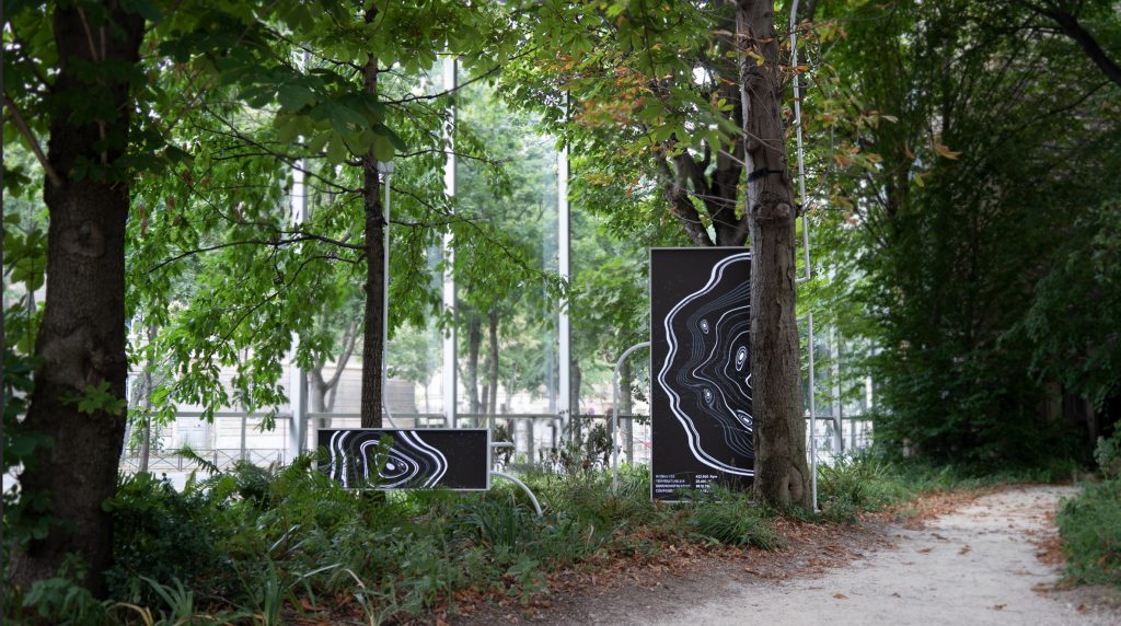
Displays that visualize the effects of climate change on nature

This project is a collaboration between artist Thijs Biersteker and scientist Stefano Mancuso that showcases the effects of climate change on nature by using realtime environmental data. Located in the Foundation Cartier in Paris, the installation is composed of multiple displays which present the data as rings of trees with a new ring being generated every second to show the long terms effects of the collected data related to climate change. I thought this project was interesting because of the way it was able to convey the long term effects of climate change in a clear and simple way. By utilizing software to convert the raw environmental data into visible tree rings, the project manages to present relevant information that would otherwise be hard to visualize in an engaging and dynamic way. A project like this shows the possibilities for future installations that combine software and visual representation to create unique experiences.

Video of SYMBIOSIA by Thijs Biersteker and Stefano Mancuso

Austin Garcia – Looking Outwards – 01 – Section C

Virtual Nature by Toyo Ito Architects

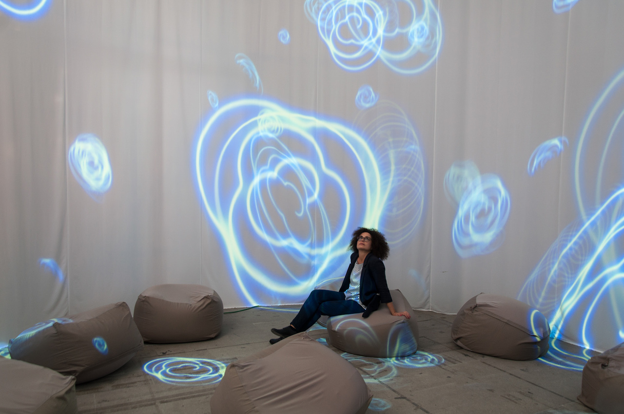
I had the opportunity to visit the 2019 Venice Architecture Biennale this past year. The overall concept for the Biennale was that of ‘Freespace’ – defined by the Biennale committee as architectural space that was given back to the community, back to humanity and freed for new opportunity. I was particularly inspired by Toyo Ito’s “Virtual Nature” installation while exploring the Arsenale exhibition hall. In this installation, Toyo Ito removed a part of the space by encircling it in an opaque curtain with a single entrance. Projected along the interior wall of this curtain were many technologically generated renders of wave forms. visible from all directions on the many beanbags lining the floor, the visual intricacy of these computer generated wave forms gave a feeling of serenity and tranquility like that of being under the sea.

Through understanding of people and what spaces we enjoy, nature and its connection to us all, and technology with its infinite versatility and adaptability, Toyo Ito created a space that suggests a future where these three subjects mesh beyond what we currently can imagine.

Toyo Ito Biennale Web Entry

Chelsea Fan-Looking Outwards-01

Helen Wilde creates ocean landscapes through on 3D embroidery hoops. She uses colors and shapes that resemble plant life from around the world. Her work ranges from large hoops to small hand-sized hoops. Wilde creates her embroidery hoops solo and uses online resources like Instagram and Etsy to promote and sell her work. Her recent line of hoops was inspired by the “Tropical Modernism of Sri Lanka”.

I find this project admirable because of its uniqueness and intricacy. However, because of the fine detail, each embroidery is quite pricey. Therefore meaning it is not affordable to all, even if it is desired. On that note, because it is so unique and intricate, I do believe Wilde created a product that is beautiful and probably desired by others.

https://www.thisiscolossal.com/2019/08/embroideries-by-helen-wilde/
Image of Ocean Inspired Embroidery Hoop by Helen Wilde
https://www.brwnpaperbag.com/2018/02/12/helen-wilde-embroidery-art/
Image of Terrarium Inspired Embroidery Hoop by Helen Wilde

Helen Wilde Botanical Design Embroidery Hoops video can be viewed at the bottom of her Etsy shop. Link: https://www.etsy.com/nz/shop/ovobloom

SooA Kim: Looking Outwards-1

Light Barrier Third Edition, 2016 by Kimchi and Chips

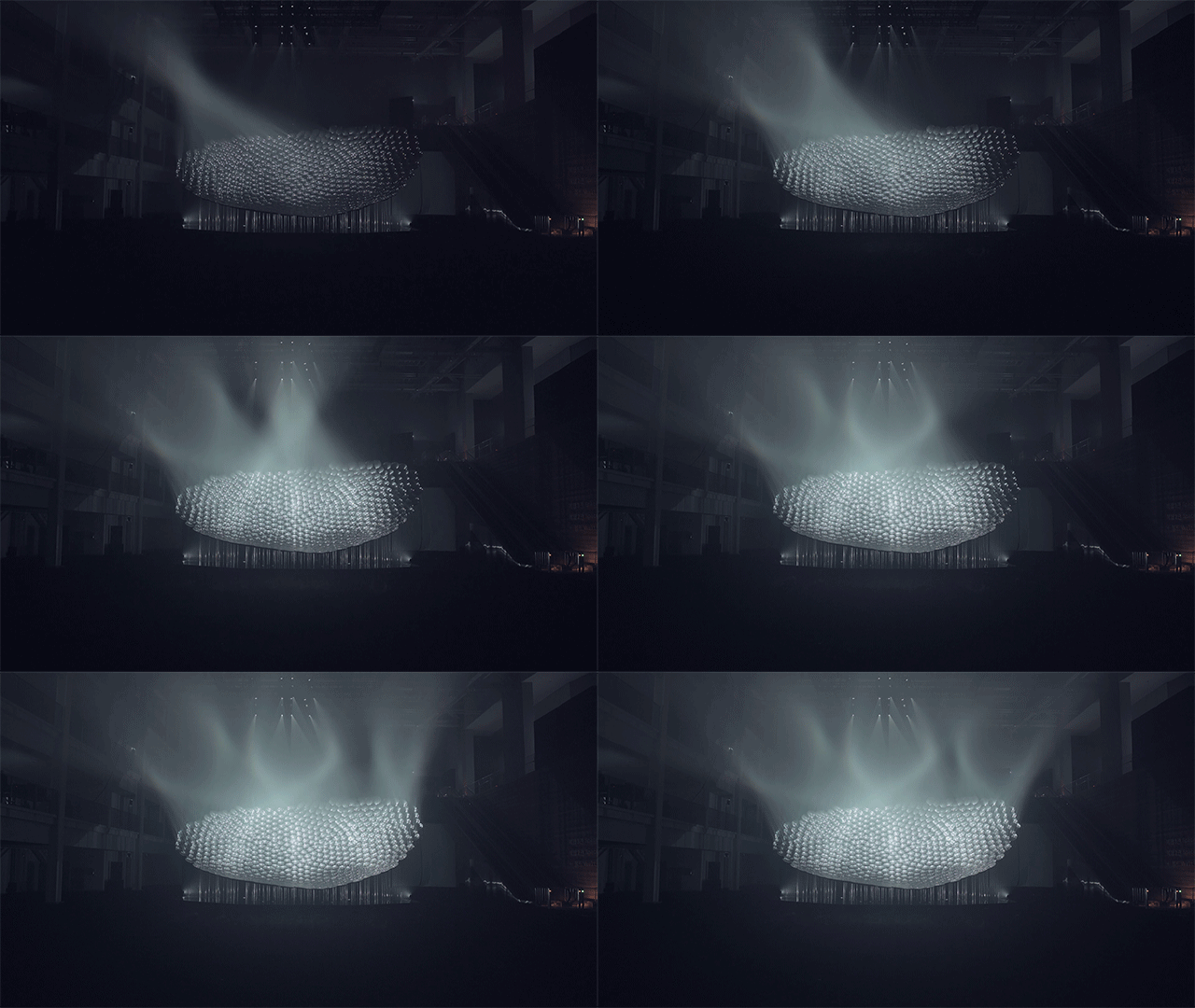
“Light Barrier Third Edition” is a multimedia light installation work from Kimchi and Chips, a studio based in Seoul founded by artists, Mimi Son (KR) and Elliot Woods (EN). This installation is an ongoing developmental series since 2014, the latest edition has been presented in Asian Cultural Centre, Gwangju, South Korea in 2016. 

The work consists of projection beams, concave mirrors, haze, and some scanning/interactive coding work to animate lights. This work requires precise calculation between the projection beams and the structure of concave mirrors to create a volumetric images or “light sculpture” through haze. They use materialized physical objects to create a non-materialistic object, light. It is interesting because we normally see and use light as a source of material to support our physical objects within space, however; Kimchi and Chips used it the other way around – having light as the object of imagery, shown as a geometric floating objects in this installation. 

Their art practices have been inspired by the values from the Impressionist movement in the 19th century and the first introduction to photography. Presenting their work as “viewerless images” as they focus on the visible brush strokes and emphasize on the depiction of light, rather than the contextual subjectivity of the work. I have been fascinated by their works and the use of their mediums, which consists of video projection, light, and coding in 3d softwares to create digital light installation art.

Light Barrier Third Edition [2016] (4K) from Mimi Son on Vimeo.