Raymond Pai-Looking Outwards-07

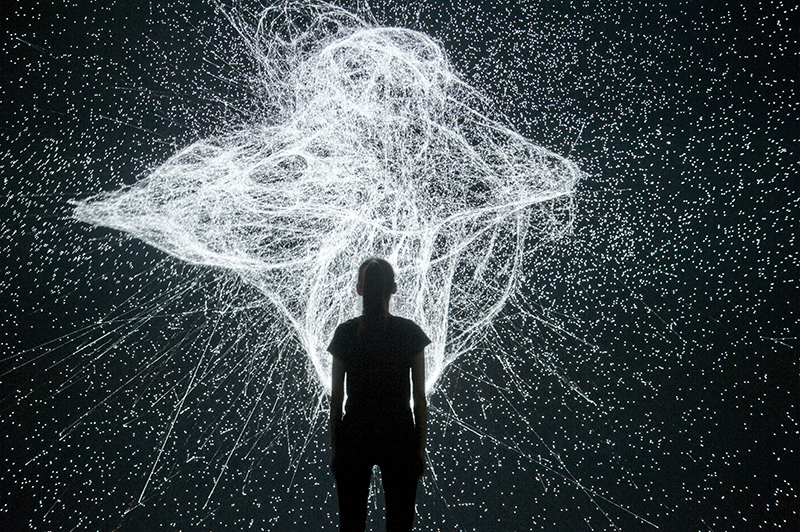
Artificial Arcadia is an installation by Swiss-based art collective Fragmentin. The installation visualizes the Swiss mountain range using moving poles and a white cloth. They appear as mountain peaks to visitors, who’s movement appears as a heat map on a screen behind the mountain range. This is an interesting use of live user data and data regarding how much human-made construction is impacting the environment of Sweden. As people move around the exhibit, they generate ‘heat’, which is visualized as a red cloud on the mostly blue screen. This, in turn, lowers the peaks of the ‘mountains’, which represents melting icecaps in the Swiss mountains.

There are many sensors and computers working to achieve this exhibit. There must be at least motion sensors, live data collection on construction sites, and perhaps even carbon footprints. This data is also computed as vertical heights of the poles that create the mountain peaks. I admire the simplicity and multilayered nature of this installation. Every part is a metaphor, and Fragementin‘s work all tend to have many layers of meanings.
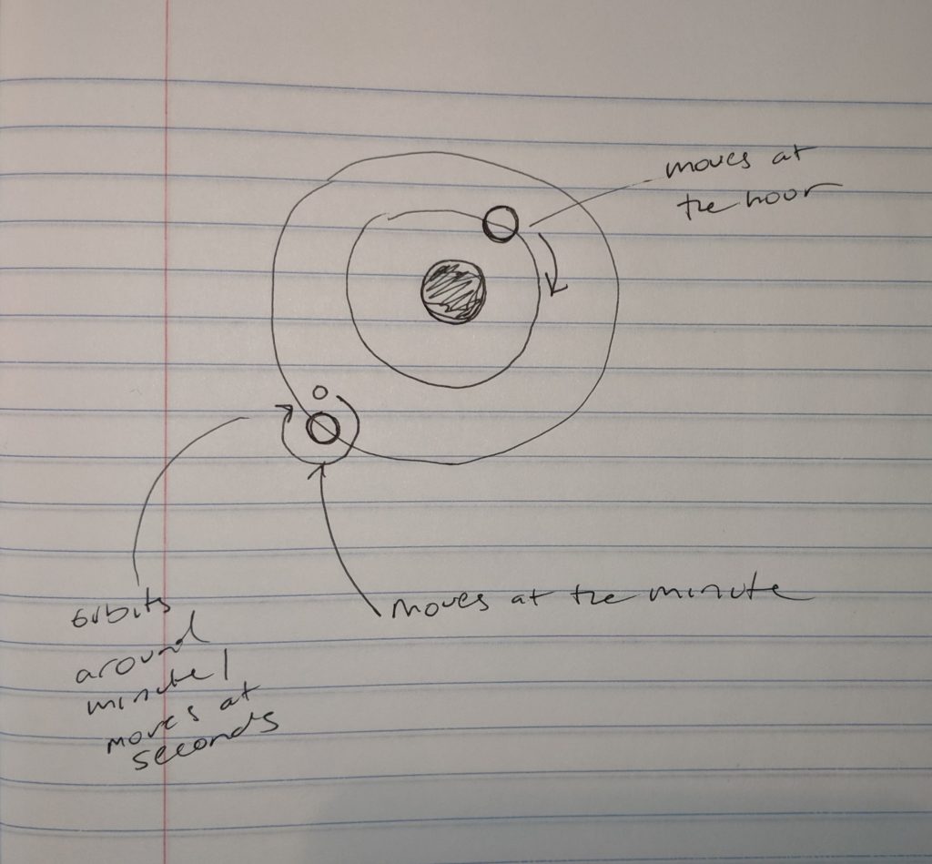
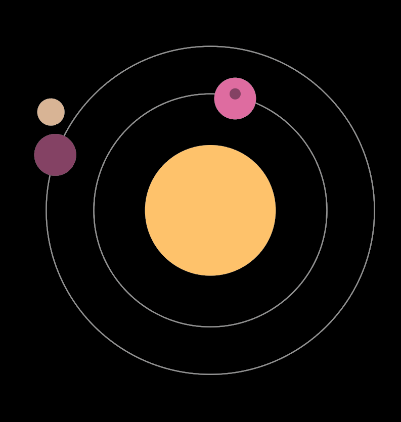
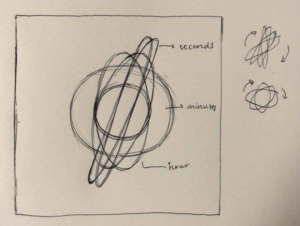
The piece:

Sarah Choi – Looking Outwards – 07

Flight Patterns from Aaron Koblin on Vimeo.


Aaron Koblin: artist, designer, programmer, and entrepreneur

For this week’s Looking Outwards, we are focusing on computational information visualization, which is why I decided to focus on Aaron Koblin. He is an artist, designer, programmer, and entrepreneur specializing in data and digital technologies. I decided to focus on his Flight Patterns project, documenting his own custom software with computational and interactive information visuals of the paths of air traffic over North American through color and form. This project intrigued me as a pretty heavy traveler and growing up in South East Asia, the art of having technical engineering skills to fly all over the world has been an important aspect.

The algorithms generating the work were parsed and plotted using a form of process programming. This project first started as a series of experiments for a project called “Celestial Mechanics” with his colleagues at UCLA. However, during the process, Koblin wanted to make a project of his own using his artistic skills. 

The project’s final form was manifested through his artistic ability to make interactive visualizations but also was made through technical computing skills that went along with flight patterns over the United States. 

Paths of air traffic over North America visualized in color and form.

Lanna Lang – Looking Outwards – 07

Aaron Koblin’s “Amsterdam SMS” // 2007

This project is a dynamic visualization of the mass volume of SMS messages that were transmitted on the night of New Year’s Eve across Amsterdam, revealing the city’s buildings and structures. This interactive tool was built with Processing and OpenGL. What inspires me about this project is that it usually isn’t the type of art I would normally gravitate towards, but it’s unique concept of taking the data of all the SMS messages from one of the busiest nights ever and forming a city’s cityscape with its volume is very intriguing and out-of-the-box.

I appreciate how Koblin includes a timelapse of how the SMS messages varied across the month of December, so that the drastic jump on January 1st  is exaggerated even further, displaying how many people were looking at their phone screens at the time of change of the new year. What Koblin got right was the message that this sends across by freezing the frame as soon as the date turned January 1st, and I would love to see this project redone now, and how modern technology has affected society even further than it did in 2007.

In general with Koblin and his use of data visualization art, Koblin was inspired by his interest in computer gaming and being exposed to the rich data of society that we live in, as well as learning from the two professors from UCLA who created Processing.

Aaron Koblin’s “Amsterdam SMS”

Ellan Suder Looking Outwards 07

Chris Harrison’s “Word Associations Visualizing Google’s Bi-Gram Data” displays information from a dataset in a really cool and artistic way. The project gathers information from the web to make the graphics.

Here is what Harrison said about how the project processes data: Each of [the rays] represent a different tendency of use (ranging from 0 to 100% in 4% intervals). Words are sorted by decreasing frequency within each ray. I render as many words as can fit onto the canvas. There is a nice visual analogy at play – the “lean” of each ray represents the strength of the tendency towards one of the two terms. As in the word spectrum visualization, font size is based on a inverse power function (uniquely set for each visualization, so you can’t compare across pieces).

One of the visualizations — this one shows the word associations for ‘cold’ and ‘hot’

Words closest to one side are used more for that term (so we can see from the graphic that ‘turkey’ is closely associated with cold, and the ‘water’ is used almost evenly for both cold and hot). I enjoy looking at the graphic and seeing what words usually ‘belong’ together — I imagine something like this is used for predictive text search.

I would also like to see something like this for a different dataset, where instead of gathering word frequencies from the web, you present the terms to many people and ask them to say the first word that comes to their mind.

This was a continuation from his previous Word Spectrum project, which looks more like a typical word cloud. They use the same dataset, but I prefer this one to ‘Spectrum’ since it looks more readable. He has more infographic projects on his site –– I also thought his Wikipedia Top 50 Visualization was interesting to look at.

Monica Chang – Looking Outwards – 07

LAUNCH IT by Shane Mielke

The beginning screen and visual options
Movement of the globe: Book locations

http://launchit.shanemielke.com/ (the website)

https://shop.shanemielke.com/ (the shop)

Shane Mielke is an award-winning creative director and designer who wrote this book called, LAUNCH IT- 300+ things I learned as a Designer, Developer and Creative Director. Along with publication, he created this website which illustrates all of the book locations that Mielke is aware of from sales data that was gathered from Amazon as well as his online shop(link provided above). Currently the website visualization shows book locations in 54 countries and 38 states in the USA.

Within this website, he provided different visual options for the viewers to interact with by incorporating different designs. For colors, he incorporated three different color options: base( dark blue and red), invert(red as the main color while a fluorescent blue indicates the location), and random(which utilizes different colors every time the user clicks the ‘random’ button). For visuals, he provided three options: bloom(constant lines), rocket(moving lines), and snake(moving lines with receding lines).

This website makes me feel like I traveled time into the future. There are very intricate details like the tiny, dust-like specs floating around the screen hidden within this beginning screen that just has me captivated with the whole concept although it is so simple: book locations. The idea could have easily ended up as a globe with marks on it, but Mielke was very clever with the idea of allowing the viewers to interact with the globe and even have a little fun with it by altering the visuals.

Jacky Tian Project 06

sketch

//Yinjie Tian
//Section D
//yinjiet@andrew.cmu.edu
//Assignment 06

var x = []; 
var y = [];
var dx = []; 
var dy = []; 
var color = []; 


function setup() { 
    createCanvas(480, 480);
    angleMode(DEGREES);
    for (i = 0; i < 100; i++) { 
        x[i] = random(width);
        y[i] = random(height);
        dx[i] = random(-5, 5);
        dy[i] = random(-5, 5);
        color[i] = color(random(255), random(255), random(255));
        
    }
    frameRate(5);
}


function draw() {
 
    background(0);
 
 //stars at the background   
    noStroke();
    for (i = 0; i < 100; i++) {  // for each stars at the back ...
        fill(color[i]);
        ellipse(x[i], y[i], 10, 10);
        x[i] += dx[i];
        y[i] += dy[i];
        
        if (x[i] > width) x[i] = 0;        //horizontally
        else if (x[i] < 0) x[i] = width;
        if (y[i] > height) y[i] = 0;       //vertically
        else if (y[i] < 0) y[i] = height;
    }

        var h = hour();
        var m = minute();
        var s = second(); 
        var ring = random(1, 50);

//planets (clock)
    push();
    noStroke();
    
    translate(width/2,height/2);
    rotate(s * (360/60));


    fill(0, 200, s * 5);
    ellipse(200, 0, 80+ring, 80+ring);
    fill(0);
    ellipse(200, 0, 80, 80);
    fill(200, 200, s * 5);
    ellipse(200, 0, 60, 60);
    
    line()

    pop();
    
    push();
    noStroke();
    fill(200, m * 5, 200);
    translate(width/2,height/2);
    rotate(m*(360/60));
    
    ellipse(60, 0, 40, 40);
    pop();
    
    push();
    noStroke();
    fill(h * 25, 200, 200);
    translate(width/2,height/2);
    rotate(h*(360/12));
    
    ellipse(100, 0, 20, 20);
    pop();

//center rotational axis
    strokeWeight(4);
    stroke(255)
    line(width / 2 - 25, height / 2, width / 2 + 25, height / 2);
    line(width / 2, height / 2 - 25, width / 2, height / 2 + 25);
    fill(255, 0, 0);
    ellipse(width/2, height/2, 10, 10); 

}

I was inspired by how the solar system operates like a clock that all the planets are rotating around the sun. For the clock I created, I drew three planets rotating around the center point where the nearest one represents hour, the medium one represents minute and the furtherest one tells the second.

CJ Walsh – Project 06 – Abstract Clock

sketch

// CJ Walsh 
// Section D
// cjwalsh@andrew.cmu.edu
// Project-06

var cx, cy;
var sunDim, hourDim, minDim, secDim;
var hx, hy;
var mx, my;
var sx, sy;
var tx = [];
var ty = [];
var starNum;
var colors = ['white', '#D8B495', '#DBD8A2'];

function setup() {
	createCanvas(480, 480);
	cx = width/2;
	cy = height/2;
	sunDim = 0.2*480; // establishing variables for the sun and orbit paths
	hourDim = 0.55*480;
	minDim = 0.85*480;
	secDim = 70;
	starNum = 150;
	
	// loop created for generation of stars
	for (i = 0; i < starNum; i++) {
		tx[i] = random(0, width);
		ty[i] = random(0, height);
	}
}

function draw() {
	background('black');

	// drawing background of stars
	for (i = 0; i < starNum; i++) {
		fill(colors[i%3]);
		ellipse(tx[i], ty[i], 5, 5);
	}

	var s = second(); // establishing variables for sec, min, hr
	var h = hour() % 12; // hours set to 12 hr day rather than 24hr
	var m = minute();

	var sAngle = s/60*2*PI - PI/2; // establishing variables for angle of hands 
	var mAngle = m/60*2*PI - PI/2 + s/60/60*2*PI;
	var hAngle = h/12*2*PI - PI/2 + m/60/12*2*PI;


	// drawing paths of orbit
	noFill();
	stroke('#919191');
	strokeWeight(2);
	ellipse(cx, cy, hourDim, hourDim);
	ellipse(cx, cy, minDim, minDim);

	// drawing sun and radiating lines
	noStroke();
	fill('#DB5858');
	ellipse(cx, cy, sunDim, sunDim);
	noFill();
	stroke('#FFC269');
	for (s = sunDim; s <= sunDim+4*12; s+=12) {
		ellipse(cx, cy, s, s);
	}

	// Hour Planet 
	hx = cx + hourDim/2*cos(hAngle);
	hy = cy + hourDim/2*sin(hAngle);
	drawHour();

	// Minute Planet 
	mx = cx + minDim/2*cos(mAngle);
	my = cy + minDim/2*sin(mAngle);
	drawMin();

	// Second Moon
	sx = mx + secDim/2*cos(sAngle);
	sy = my + secDim/2*sin(sAngle);
	drawSec();
	

}

function drawHour() {
	noStroke();
	fill('#DD6C9F');
	ellipse(hx, hy, 50, 50);
	fill('#844364');
	ellipse(hx+14, hy+3, 15, 15);
	ellipse(hx-6, hy-5, 5, 5);
	ellipse(hx-10, hy+10, 10, 10);

}

function drawMin() {
	noStroke();
	fill('#4A74A5');
	ellipse(mx, my, 35, 35);
	fill('#303C6D');
	ellipse(mx-3, my-6, 17, 13);
	ellipse(mx+4, my+6, 6, 6);
}

function drawSec() {
	noStroke();
	fill('#73B3FF');
	ellipse(sx, sy, 12, 12);
}


For this project I wanted to create a clock that looked like planets orbiting a sun. Although the design is still centered around circular themes, I think its still breaking outside the idea of a clock, and definitely couldnt be identified as a clock by first glance. My process began with sketching my ideas on paper, and then translating that into a drawing using Adobe Illustrator. After that I was able to translate my sketches into code, creating both fixed and animated objects on my canvas. I used the knowledge I gained from Assignment C to help me create my new clock. I added in the ability of the planets to move slightly in the transition from minute to minute or hour to hour. As a final touch, I drew some randomly generated stars to fill the background. This was definitely a fun project to make, though one that challenged my knowledge.

Lauren Park-Project-06-Abstract Clock

sketch

var sun = 220;
var moon = 235;
var cloud = 260;

function setup() {
    createCanvas(480, 480);
    frameRate(1);  
}

function draw() {
    background(0);
    noFill();
  
    if (second % 2 === 0) {
    if (hour >= 8 & hour < 13) {
      background(182, 224, 239);
      // base()
      // morning()
    } else if (hour >= 13 & hour < 17) {
      background(141, 194, 214);
      // base()
      // afternoon()
    } else if (hour >= 17 & hour < 22) {
      background(79, 130, 150);
      // base()
      // twilight()
    } else if (hour >= 22 & hour < 23.5) {
      background(34, 79, 96);
      // base()
      // night();
    }
    } else if (hour >= 0 & hour < 8) {
      base()
    }
  
    //minutes
    for (var j = 0; j < minute(); j ++){
      sun = map(j, 0, 70, 220, 255);
      moon = map(j, 0, 60, 125, 255);
      cloud = map(j, 0, 50, 280, 255);
      stroke(sun, moon, cloud);
      fill(37, 179, 255);
      ellipse(240, 240, 8*j, 8*j);
    } 
     push();
  
    //seconds
     noFill();
     translate(width/2, height/2);
    for (var i = 0; i < second(); i ++) {
      sun = map(i, 0, 70, 210, 71);
      moon = map(i, 0, 60, 345, 204);
      cloud = map(i, 0, 50, 0, 234);
      stroke(sun, moon, cloud);
      stroke(50, 75, 255);
      rotate(radians(3));
      ellipse(0, 0, 30, 450);
    } 
    
      pop();
  
      
    {
      
    } 
   
     strokeWeight(2);
     noFill();
     translate(width/2, height/2);
    //hours
    for (var k = 0; k < hour(); k ++){
      sun = map(k, 0, 70, 255, 255);
      moon = map(k, 0, 60, 255, 255);
      cloud = map(k, 0, 60, 102, 255);
      stroke(sun, moon, cloud, 190);
      rotate(radians(8));
      ellipse(0, 0, 150, 400);
      
        
    }		
    
}

For my abstract clock, I initially started with an idea revolving around an outer space theme. I wanted to use ellipses to form loophole-like forms and a harmonious shape overalls that move in rhythm to a ticking clock. It was really difficult figuring out how to implement time and speed with these shapes I wanted to incorporate. However, it was really enjoyable to experiment and finally create an artwork that changes depending on how much time has passed, and that the image will not stay the same.

Jacky Tian’s LookingOutwards 06

Generative randomness — CHARLES STREET CAR PARK

Seemingly random pattern can be generated by a comprehensive computational logarithms. This multi story public parking space in Sheffield city centre has natural anodized aluminum panels on its external envelope. Each of the aluminum panel is manufactured from a single sheet of folded aluminum hung in four different orientations with a seemingly random rhythm. The gaps between the panels in four direction provides natural ventilation and creates a sense of sculpture for a box.

Cathy Dong – Looking Outwards – 06

2015, NTT InterCommunication Center, Tokyo, Japan
The Irreversible, Dimensions Variable

Norimichi Hirakawa is a Japanese artist whose work centralizes in real-time digital audio-visual installations. The series of video, The Irreversible, is generated by a time-evolutionary algorithm. The process starts from randomizing the initial constants. As described by the artist, “everything within the video is just a result of meaningless calculation.” Math calculation is Hirakawa’s variables and parameters, and the final results are somehow confusing but appealing at the same time. The audience are astonished by the strong visual impact. The background sound fits into the visual rhyme well. Through two-dimensional media, such as lines and points, Hirakawa achieves a three-dimensional effect.