![[OLD FALL 2019] 15-104 • Introduction to Computing for Creative Practice](../../../../wp-content/uploads/2020/08/stop-banner.png)
///RAYMOND PAI
///SECTION D
///RPAI@ANDREW.CMU.EDU
///PROJECT 07

function setup(){
    createCanvas(480, 480);
}

function draw() {
    background(mouseX, mouseY, mouseX);
    //Draw Curves 1 and 2
    drawE1();
    drawE2();
    drawE3();
    drawE4();
}

function drawE1() {
    push();
    //Color
    fill(mouseX + 50, 50, mouseY + 50);
    //Center
    translate(width / 2, height / 2);
    var a = map(mouseX, 0, width, 0, 250);
    var b = map(mouseY, 0 , height, 0, 250);
    beginShape();
        for (var i = 0; i < 250; i++) {
            //Angle
            var t = map(i, 0, 250, 0, 2 * PI);
            //Epicycloid equations
            x = (a + b) * sin(t) - b * sin((a + b) * t / b);
            y = (a + b) * cos(t) - b * cos((a + b) * t / b);
            vertex(x, y);
        }
    endShape();
    pop();
}

function drawE2() {
    push();
    //Color
    fill(0, mouseX + 50, mouseY + 50);
    //Center
    translate(width / 2, height / 2);
    var a = map(height-mouseX, 0, width, 0, 250);
    var b = map(height-mouseY, 0 , height, 0, 250);
    beginShape();
        for (var i = 0; i < 250; i++) {
            //Angle
            var t = map(i, 0, 250, 0, 2 * PI);
            //Epicycloid equations
            x = (a + b) * sin(t) - b * sin((a + b) * t / b);
            y = (a + b) * cos(t) - b * cos((a + b) * t / b);
            vertex(x, y);
        }
    endShape();
    pop();
}

function drawE3() {
    push();
    //Color
    fill(200, mouseY + 50, mouseX + 50);
    //Center
    translate(width / 2, height / 2);
    var a = map(height/2-mouseX, 0, width, 0, 250);
    var b = map(height/2-mouseY, 0 , height, 0, 250);
    beginShape();
        for (var i = 0; i < 250; i++) {
            //Angle
            var t = map(i, 0, 250, 0, 2 * PI);
            //Epicycloid equations
            x = (a + b) * sin(t) - b * sin((a + b) * t / b);
            y = (a + b) * cos(t) - b * cos((a + b) * t / b);
            vertex(x, y);
        }
    endShape();
    pop();
}

function drawE4() {
    push();
    //Color
    fill(mouseX + 50, mouseX + 50, 200);
    //Center
    translate(width / 2, height / 2);
    var a = map(height/1.5-mouseX, 0, width, 0, 250);
    var b = map(height/1.5-mouseY, 0 , height, 0, 250);
    beginShape();
        for (var i = 0; i < 250; i++) {
            //Angle
            var t = map(i, 0, 250, 0, 2 * PI);
            //Epicycloid equations
            x = (a + b) * sin(t) - b * sin((a + b) * t / b);
            y = (a + b) * cos(t) - b * cos((a + b) * t / b);
            vertex(x, y);
        }
    endShape();
    pop();
}
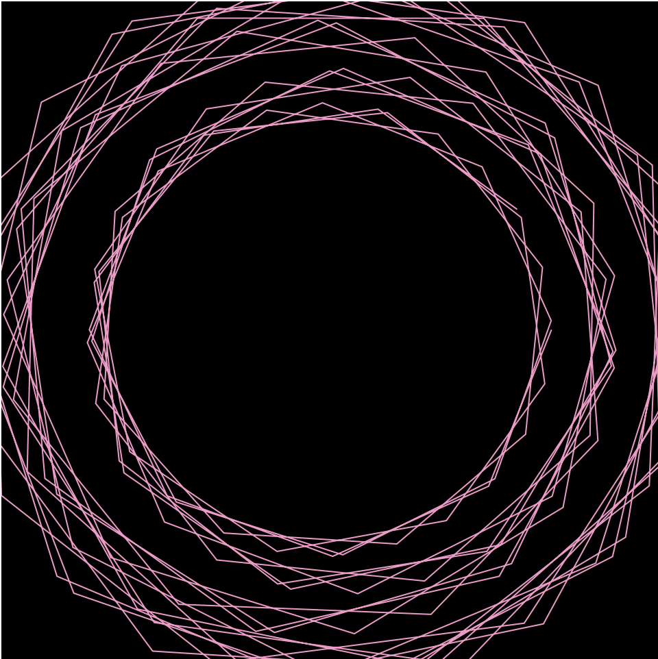
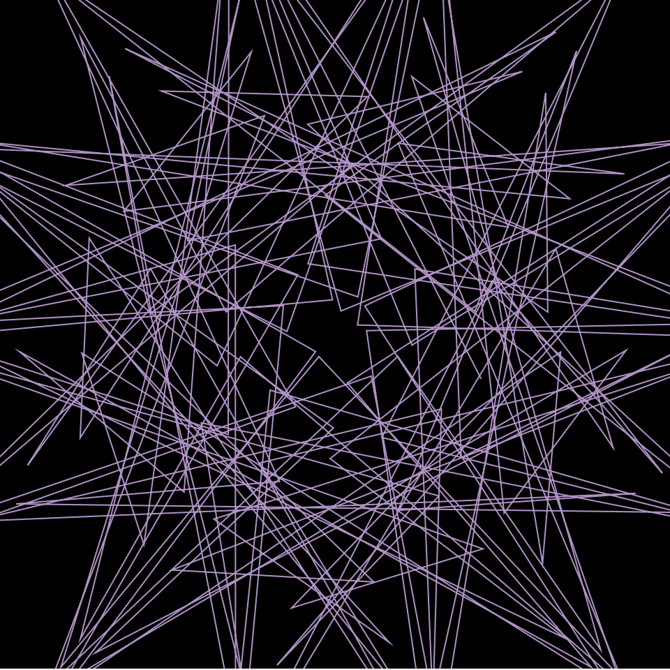
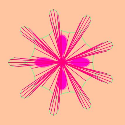
Flower Power!
The curve I used is the Epicycloid. I like how it creates petals that resemble flowers.
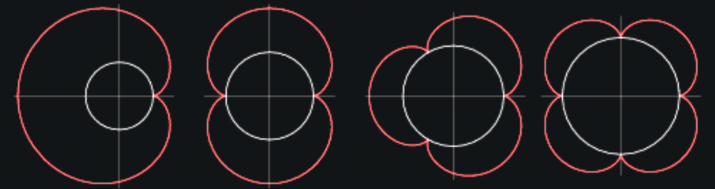
I used 4 Epicycloids of varying sizes to create the effect of flowers without making it obvious that they’re flowers. I decided to do this because the flowers looked pretty lonely.

The more curves I added the more interesting the floral patterns became.

The colors are based on the mouse position, but I limited them slightly to more pastel and ‘Spring’ colors, such as pink, green, yellow, etc.
The final product is an abstract and colorful depiction of flowers. Sometimes the flowers invert and create interesting sharp objects, like thorns of a rose. They also contribute to more detailed flowers, such as the process image above.