Mihika Bansal – Project 06 – Abstract Clock

sketch

//Mihika Bansal 
//mbansal@andrew.cmu.edu 
//Section E 
//Project 5


function setup() {
    createCanvas(500, 500);
}
   
  
function draw() {
    
    push(); 
    background(250, 141, 98); // making my background canvas
    translate(width / 2, height / 2); 
    pop(); 

    var s = second(); 
    var m = minute(); 
    var h = hour();

    let sAngle = map(s, 0, 60, 0, 360); 
    let mAngle = map(m, 0, 60, 0, 360);
    let hAngle = map(h, 0, 24, 0, 360); 

    translate(width / 2, height / 2); 
    
    //drawing the second hand circle 
    fill(255);
    noStroke(); 
    push(); 
    for (var i = 0; i < s; i ++){
        rotate(radians(sAngle)); //creates a pattern based on the second that it is currently 
        ellipse(0, -210, 10, 10); 
    }
    pop(); 

    //drawing the minute hand circle 
    push();
    fill(178, 219, 213);
    for (var j = 0; j < m; j ++){
        rotate(radians(mAngle)); // creates a pattern based on what minute it is 
        ellipse(0, -135, 18, 18); 
    }
    pop(); 

    //the hour hand 
    push();
    fill(43, 97, 109);
    for (var k = 0; k < h; k ++){ 
        rotate(radians(hAngle)); //creates a pattern based on what hour it currently is, displays that number
        ellipse(0, -50, 25, 25); 
    }
    pop();
     
}

This project was very fun to create. Playing with animations based on time was very interesting. The patterns that formed through the integration of for loops and based on the number for minutes and seconds was very pleasing.
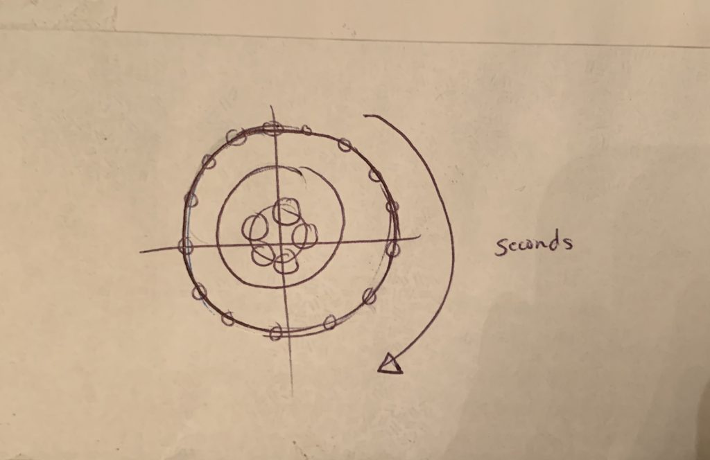
My sketch for the concept of the clock

Kimberlyn Cho – Looking Outwards 06

Arcs04-01 by Marius Watz

The “Random Number Multiple” series by Marius Watz and Jer Thorp attempt to encourage artists to use old school fine art strategies to hand print their computational (any computer or software-based) art. As part of the “Random Numbers” exhibit in NYC, the series takes part in a platform curated by Christina Vassallo for artists to experiment with new techniques or mediums.

Marius Watz’s “Arc” series uses a somewhat random composition of radial shapes that are distorted by a 3d surface to imitate a sense of movement while maintaining a focal point. Jer Thorp took a more systematic approach than Watz by using the newspaper as his reference. He tracked the frequency of specific words in the New York Times in a twenty-year time period, which he then graphed using a randomized group of colors based on the theme of the artwork.

Hope/Crisis by Jer Thorp

I found the combinative nature of the design process of these artworks to be most interesting. Most artists seem to go about one specific way of producing their art, whether it be by hand or with a certain software. I found it innovative how Watz and Thorp use a software to produce the computational image they want and then incorporate a factor of randomness with either the colors or array of the shapes to portray the work with traditional techniques. The timeless incorporation of a variety of strategies leaves room for results that might’ve not been expected or accidental new elements to the creation that creates work that the artist can then learn from.

Paul Greenway – 06 – Abstract Clock

pgreenwa_06

/*Paul Greenway
Section 1A
pgreenwa@andrew.cmu.edu
Project-06-Abstract Clock
*/


function setup() {
  createCanvas(480, 480);
}

function draw() {
  
  background(255,90,90);
  
  var S = second();
  var M = minute();
  var H = hour();
  var a = (0,0);
  var b = (480,480);
  
  var colorS = map(S,0,60,0,255);
  
  stroke(255);
  strokeWeight(0.3);
  line(0,0,480,480);
  strokeWeight(2);
  circle(234,234,10,10);
  circle(70,70,10,10);
  circle(480,480,10,10);
  
  stroke(255);
  strokeWeight(0.5);
  noFill();
   
  //hour rings
  for (i = 0; i < 25; i++) {
    
    circle(480, 480, i*24, i*24);
  }
  
  //minute rings
  for (i = 0; i < 13; i++) {
    
    circle(234, 234, i*24, i*24);
  }
      
  //second rings
  circle(70, 70, 200, 200);
  
  
  //fill circles color style
  noStroke();
  fill(0,colorS,90,90);
  
  //hour circle
  circle(480, 480, H*24, H*24);
  
  //second circle
  circle(70, 70, S*3.33, S*3.33);
  
  //minute circle
  circle(234, 234, M*4.8, M*4.8);
  
  
}

For this project, I wanted to create a clock that used various rings to indicate the time. As time passes, the inner circles begin to fill the 3 different sets of outer rings each representing a different measurement of time. I arranged the sets in a diagonal line so that the viewer is able to see each unit of contribute to the next.

Zee Salman Looking Outwards 05


https://www.artstation.com/artwork/k4BP6l

Hirokazu Yokohara

What I admire about this project is how hyperrealistic it looks. It also has this fantasy vibe that i get when I look at it, The skull is intruging and there are different parts of this project that makes it really intricate asw a whole. There are different vines crossing the screen and the rusty metal look is encorporated all over the skull and the body. I dont know the exact algorithms to create piece like this but it definetly tooks some for loops and some basic adrawings in the draw function of simple shapes that get more and more complicated. This piece was made by an artist named Yokohara in Tokyo, I would like to see more of his/ her pieces because they are pretty facinating and I could possibly draw inspiration

Zee Salman- Project- 05


sketch

//Zee Salman
//SECTION E

var red // horizantal
var blue  // vertical
var sz = 10;

function setup() {
    createCanvas(600, 400);
    noStroke();
}
 
function draw() {
    background(0);
    drawGrid();
     
}
function drawGrid() {
  for (var y = 5; y < height + 50; y += 100) {
  		var red = map(y,0,height,0,255);
        for (var x = 5; x < width + 50; x += 100) {
            //color gradient needs to be implemented
            var blue = map(x,0,width,0,255);
            noStroke();
            fill(red,0,blue);
            ellipse(x, y,20, 100);

            stroke("white");
            line(x /2, y /2, width / 2, height / 2);
            line(x *2, y *2, width / 2, height / 2);

            
        }
    }
}

I wanted to go for something a bit playful, I really enjoy gradients and I wanted to add them to this wallpaper along with lines that sprouted in different directions, I feel like it has a good contrast especially with the black background. I would like to further expand on this idea and see where I can rreally take the design, and even complicate the shapes a bit more in further explorations.

Shariq M. Shah – Looking Outwards – 05


Aldo Martinez Calzadilla is a 3D Computer Graphics Artist who works in highly detailed and lifelike three dimensional models. These computational techniques allow Martinez to explore other worldly ventures and develop methodologies that surpass what may be conceived as possible. Various modeling and processing techniques are used to produce highly articulated, vastly emotional, and intriguing images. Unlike many other artists, the mathematics and computation behind these processes produce a controlled and orchestrated image whereas some other computational artists take a generative approach to the design. In contrast, this process produces high resolution images that have an extreme level of planned detail. This work is highly resolved and its use of computational techniques is evident in its minute details.

Images by Aldo Martinez made from high resolution 3D Models

http://www.aldomartinezvfx.com/

Project 05 – Wallpaper


sketch

// Deklin Versace Section E
var patX = 120;
var patY = 120;

function setup() {
    createCanvas(900, 900);
    background(238, 195, 246);
    var xSpace = -30;
    var ySpace = 110;
    noStroke();

    for (var y = 0; y < 7; y++) {
      if (y % 2 === 0) {
        for (var x = 0; x < 12; x++) {
            var sety = ySpace + y * patY;
            var setx = xSpace + x * patX;
            drawHead1(setx, sety, random(1, 90));
        }
      } else {
          for (var x = 0; x < 11; x++) {
            var sety = ySpace + y * patY;
            var setx = xSpace + x * patX;
            drawHead1(setx + patX / 2, sety, random(1, 90));
          }
      }
    }
    noLoop();
}

function drawHead1(centerX, centerY, rotation) {
  fill(173, 60, 70);
  ellipseMode(CENTER);
  ellipse(centerX, centerY, patX, patY);
  ellipse(centerX, centerY - patY / 2, patX / 5, patY / 5);
  ellipse(centerX - patX / 7, centerY - patY / 2, patX / 6, patY / 6);
  ellipse(centerX + patX / 7, centerY - patY / 2, patX / 6, patY / 6);
  fill(89, 22, 22);
  triangle(centerX, centerY + patY / 3, centerX - patX / 4, centerY + patX / 6, centerX + patX / 4, centerY + patX / 6);
  fill(117, 40, 53);
  triangle(centerX, centerY - patY / 4, centerX - patX / 4, centerY + patX / 6, centerX + patX / 4, centerY + patX / 6);
  triangle(centerX, centerY + patY / 5, centerX - patX / 4, centerY + patX / 6, centerX + patX / 4, centerY + patX / 6);
  fill("white");
  ellipse(centerX - patX / 5, centerY - patY / 6, patX / 5, patY / 5);
  ellipse(centerX + patX / 5, centerY - patY / 6, patX / 5, patY / 5);
  fill("black");
  ellipse(centerX + patX / 5, centerY - patY / 6, patX / 8, patY / 8);
  ellipse(centerX - patX / 5, centerY - patY / 6, patX / 8, patY / 8);
}

Janet Peng-LookingOutwards-05

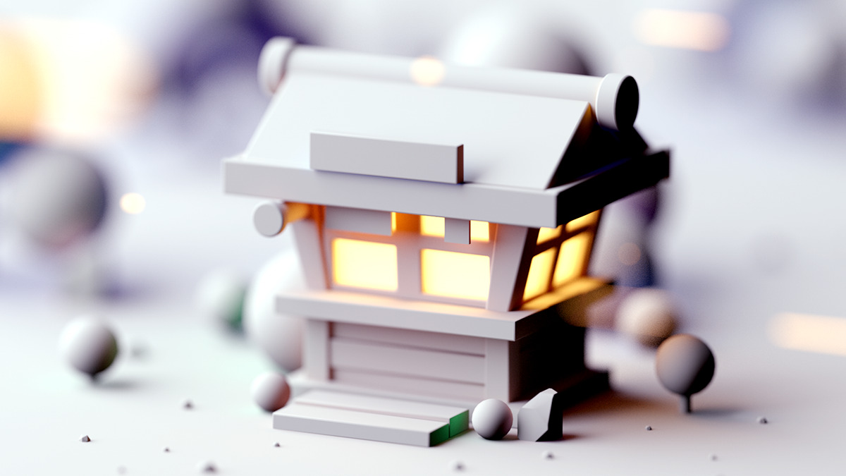
Miniature building stylized/inspired by games
Model/image before color is applied
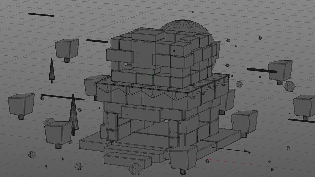
Outline/build of model before any lighting/shading, depth, and texture is applied

I really like the style of this project. Gustavo Henrique, a 3D Artist, motion designer, and art director, creates many different small 3D models that are usually buildings and often “toy-like”. The color and texture of the 3D models make the images more believable and they feel more like real toys or blocks. I believe that this work was probably created in some 3D computer modeling software such as Blender, Maya, or Autodesk Fusion. These programs allow you to make 3D objects on the computer and then render them with different textures, materials, lighting, and camera angles. I think the creator’s love for muted and soft colors as well as his love for miniature forms really show in these works. As well, his minimalist style really shows in these works.

Shariq M. Shah – Project 05 – Wallpaper

shariqs-05-project

// Shariq M. Shah
// Section C
// shariqs@andrew.cmu.edu
// Project - 05


function setup() {
    createCanvas(640, 400);
    background(200, 50, 0);
    noStroke();

    var w = 60;
    var h = 60;


    for (var y = 0; y < height; y ++) {

       // using modulus operator to determine even or odd row


       for (var x = 0; x < width; x ++) {

            // using spacing multipliers to get accurate spacing

            var py = y * h;
            var px = x * w;

            stroke(180, 200 - py * 0.5, 300 - py * 0.5);
            strokeWeight(2)
            noFill();
            rectMode(CENTER);


            rect(px, py, 50, 50);


            //coinciding geometries based on positions by changing rectMode to center
            //applying gradient to wallpaper

            stroke(180, 200 - py * 0.5, 300 - py * 0.5);
            rect(px, py, 35, 35);
            ellipse(px, py, 50, 50);
            stroke(200, 30, 50);
            ellipse(px, py, 60, 60);

      }

    }
    noLoop();
}

In this project, I explored using nested for loops to create a wallpaper from coinciding geometries, which created interesting overlapping shapes. By doing this and applying a color gradient, the different geometries created through the for loop develop into an interesting pattern design.

Carly Sacco – Project 05 – Wallpaper

sketch

//Carly Sacco
//Section C
//csacco@andrew.cmu.edu
//Project 5: Wallpaper

function setup() {
	createCanvas(400,500);
}

function draw() {

	background(145, 185, 217);
		
	fill(255); //white rectangles
	noStroke();
	for(var x = 0; x < 100; x = x + 1) {
		rect(x, 20, width, 25); //top two white lines
		rect(x, 100, width, 100);
		
		rect(x, 440, width, 25); //bottom two white lines
		rect(x, 300, width, 100);
}

	fill(178, 206, 219); //blue rectangles
	noStroke();
	for(var y = 0; y < 100; y = y + 1) {
		rect(x + 50, y, x, 25); //top set of three rectangles
		rect(x + 200, y + 50, x, 25);
		rect(x - 100, y + 50, x, 25);
		
		rect(x + 50, y + 205, x, 25); //middles set of rectangles
		rect(x + 200, y + 250, x, 25);
		rect(x - 100, y + 250, x, 25);
		
		rect(x + 50, y + 420, x, 25); //bottom set of rectangles
		rect(x + 200, y + 470, x, 25);
		rect(x - 100, y + 470, x, 25);
}

	stroke(186, 191, 194); //grey line set
	line(125, 0, 125, 500);
	line(275, 0, 275, 500);
	line(115, 0, 115, 500);
	line(135, 0, 135, 500);
	line(265, 0, 265, 500);
	line(285, 0, 285, 500);

	stroke(214, 120, 145); //pink
	line(0, 30, 500, 30); //top set of three pink lines
	line(0, 20, 500, 20);
	line(0, 45, 500, 45);
	
	line(0, 440, 500, 440); //bottom set of pink lines
	line(0, 450, 500, 450);
	line(0, 465, 500, 465);
}

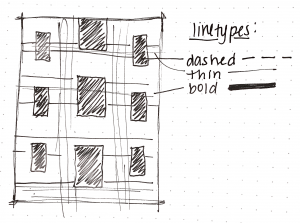
The inspiration for my wallpaper were different types of line types that were abstracted. Therefore, I used dotted lines, different line thicknesses, and different colored lines.