Project 7 Lydia Jin

sketch

//Lydia Jin
//Section B
// jialuj@andrew.cmu.edu
// Project 7
var nPoints = 100;
function setup() {
    createCanvas(600, 600);
}

function draw() {
	background('black');

	//print title
	fill('white');
	text("Astroid", 20, 20);

	//color changes over mouse interactions
	var r = map(mouseX, 0, 600, 0, 255);
	var rr = map(mouseY, 0, 600, 0, 255);

	push();
	stroke(r, rr, r);
	strokeWeight(4);
	translate(width/2, height/2);
	var x;
	var y;
	//get b from mouse X coodinate
	var b = map(mouseX, 0, width, 5, 35);
	var ph = mouseY/45;
	fill(rr, rr, r);
	beginShape();

	//draw the Astroid
	for (var i =0; i < nPoints; i++){
		var t = map(i, 0, nPoints, 0, TWO_PI);
		x = 3 * b * cos(t) + b * cos(3 * t);
		y = 3 * b * sin(t) - b * sin(ph + 3 * t);
		vertex(x, y);
	}
	endShape(CLOSE);

	pop();
}
capture1

capture2

capture3

astroid

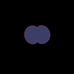
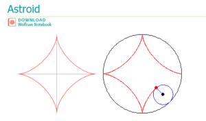
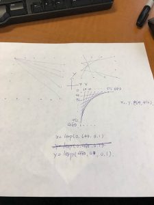
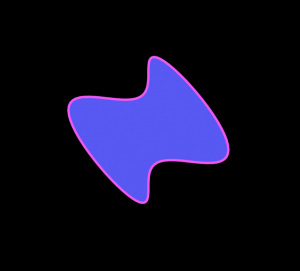
I came up with this idea by looking at the list of curves on the math website. I really like the looks of the astroid as it looks like a star. Then I did some changes to it so sometimes it looks round and other times pointy. I also wanted the colors to change and now the design sort of looks like changing microorganisms. The shapes are also enclosed by different colored strokes to make the images appear more visually appealing.The user can move the mouse to see the changing shapes.

Looking Outwards 7 Lydia Jin

selfiexploratory

Selfiecity analyzing selfies using different categories

Selfiecity is created by a group of 8 members starting in 2014 and this visualization technique investigates selfies using a mix of theoretic, artistic and quantitative methods. Rich media visualizations or image plots put together thousands of photos to reveal selfies’ patterns in 5 different demographic groups based on cities. The team then reports the patterns found in this experiment by writing essays relating to the history of selfies and how it is influencing social media. I find this idea particularly interesting because it uses creative methods to analyze a common phenomenon (taking selfies) and shows patterns of these phenomenon. The program uses an algorithm that identifies age, gender, position of face, position of eye, mood, and glasses. This project shows that the team are very innovative and are willing to investigate in depth of an activity that is commonly practiced in the modern world. Please click here for more information Selfiecity.


Project 6 Lydia Jin

sketch

//Lydia Jin
//Section B
//jialuj@andrew.cmu.edu
//Project 6
var h;
var m;
var s;
function setup() {
    createCanvas(800, 800);
    
}

function draw() {
	background('black');
	angleMode(DEGREES);
	h = hour();
	m = minute();
	s = second();

	//draw arcs
	fill(0,0,0,0);
	push();
	translate(width/2, height/2);
	stroke(181, 32, 104);
	strokeWeight(45);
	//draw hour arc
	arc(0, 0, 407, 407, 0, 30*h);
	stroke(32,181,161);
	//draw minute
	strokeWeight(45);
	arc(0, 0, 520, 520, 0, 6*m);
	stroke(48,124,244);
	//draw second
	strokeWeight(45);
	arc(0, 0, 633, 633, 0, 6*s);
	pop();

	
	push();
	translate(width/2, height/2);
	//text for displaying time
	var posS = (s%60)/60*360;
	textSize(17);
	fill('black');
	text(s, 317*cos(posS), 317*sin(posS));

	var posM = (m%60)/60*360;
	textSize(17);
	fill('white');
	text(m, 258*cos(posM), 258*sin(posM));

	var posH = (h%24)/12*360;
	textSize(17);
	fill('black');
	text(h, 200*cos(posH), 200*sin(posH));
	pop();

	
	push();
	//draw in moon and sun
	translate(width/2, height/2);
	noStroke();
	if (h>12 & h == 0){
		fill('yellow');
	}
	else {
		fill('grey');
	}
	
	ellipse(-55, 0, 80, 80);
	fill('black');
	ellipse(-35, -5, 80,80);

	if (h<=12 & h != 0){
		fill('orange');
	}
	else {
		fill('grey');
	}
	ellipse(50, 0, 70,70);

	pop();
// return to original state
}

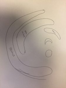
I have came up with this idea thinking about different yet simple ways to represent time. So I thought I can make the clock still look round but I replaced the hands by part of the circles to indicate time. I also wanted some differentiation between day and night so I drew in a moon and sun in the middle of the canvas and that they change colors accordingly to time. There is also text at each hand bar to indicate hour, minute and seconds. I previewed my post and apparently it’s not showing the entire canvas but my canvas size is below the 800 pixels limit. The part that didn’t show up is when the second hand reaches 60 then it resets and starts over again. Below is my rough sketch of the project:

801913011


Looking Outwards 6 Lydia Jin

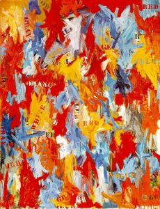
I chose Jasper Johns’ work False Start (created in 1959) for this week’s looking outwards. False Start at first seemed like a completely random painting as if the artist just smashed the colors onto the canvas. But then when I took a closer look there were actually words of colors on each patch of color even though the words did not identify the color it was written in nor did it identify the patch of color. I feel like this aspect of the artwork further randomizes it. I really like how randomization is expressed in every possible aspect of this piece. The artwork looks like an explosion of colors and produces an erratic theme. From this work of art, we can guess that Jasper was feeling inspirational by uncertainty and nervousness when he created this piece. The title of the piece False Start may also suggest something about the artist. I did some research on Jasper’s other artworks and they were usually organized at first but gradually became more random. This piece may symbolize a transition of Jasper’s artistic style to randomness.

false-start
False Start, 1959 by Jasper Johns

Link of artwork: False Start,Jasper Johns

Looking Outwards 05

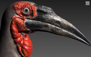
This 3D graphic named Southern Ground Hornbill depicts a southern ground hornbill bird’s head. It was crafted entirely in 3D by artist Leandre Hounnake. I really like how it looks like a photo as it is ultrarealistic. The author used a combination of Sculptris, 3ds Max, Mudbox, V-Ray, MultiScatter and Hair and Fur. These names listed above are 3D design software packages. The creator shows a love for details as the art is precise to a high level. The colors are also dim and simple. The entire design is dark with uniform colors. There is also strong contrast between the red and black colors. Which gives a highlight to the work.

sep30
Ground Hornbill by Leandre Hounnake

Link :http://www.creativebloq.com/3d/inspiring-examples-3d-art-12121523

Project-05-Lydia Jin

sketch

//Lydia Jin
//Section B
//jialuj@andrew.cmu.edu
// Project 5
var flag = false;
function setup() {
    createCanvas(600, 600); //setup canvas
    background('black');
}

function draw() {
    for (var y = 50; y<=550; y+=100){ 
    //iterate loop for rows until hits botton
        if (flag == false){ 
    //use a boolean to alternate between two sets of shape
            for (var x = 0; x<522; x+=30){ //iterate set A for columns
                if (x==0){ 
            //draw a PAC MAN at each beginning of the iteration
                    fill('yellow');
                    noStroke();
                    arc(50, y, 50, 50, QUARTER_PI*0.7, -QUARTER_PI*0.7);
                }
                noStroke();                
                fill(random(255), random(255),random(255)); //random color of the dots
                ellipse(x+80, y, 8); //draw the PAC-dots

            }
            flag = true; 
            //change the state of boolean
        }
        else{
            for (var x = 600; x>78; x-=30){ 
            //to iterate the another set of shape
                if (x==600){ 
                //draw a PAC MAN at each beginning of the iteration
                    fill('yellow');
                    noStroke();
                    arc(550, y, 50, 50, PI + QUARTER_PI*0.7, PI -QUARTER_PI*0.7);
                }
                noStroke();
                fill(random(255), random(255),random(255)); //random color of the dots
                ellipse(x-80, y, 8); //draw the PAC-dots
            }
            flag=false; 
            //change the state of boolean
        }
    }   
    noLoop();//Stop all loops, make static wallpaper

}

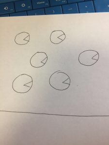
At first, I wanted random PAC MANs to appear in every row. But later on I decided to make it look more dynamic by putting in the beads along with the Pac Man to make the wallpaper more colorful. This would be a cool wall paper for a kid’s bedroom. 🙂
317037023

Project 4-Lydia Jin

sketch

//Lydia Jin
//Section B
//jialuj@andrew.cmu.edu
//Project-04
//first quadrant intial values
var x1 = 0;
var y1 = 0;
var x2 = 0;
var y2 = 600;

//third quadrant intial values
var x11 = 0;
var y11 = 640;
var x22 = 0;
var y22 = 0;

//second quadrant intial values
var x111 = 0;
var y111 = 0;
var x222 = 480;
var y222 = 0;

//fourth quadrant intial values
var x1111 = 0;
var y1111 = 640;
var x2222 = 480;
var y2222 = 640;

//step sizes
var deltaX = 24;
var deltaY = 30;

//set initial value for i for if statement
i=0;

function setup() {
    createCanvas(480, 640);
    background('pink');

}

function draw() {
	//20 steps
	if (i < 20){
		//first quadrant
		x1 += deltaX;
		y2 -= deltaY;
		stroke(0);
   		line(x1,y1,x2,y2);
   		//third quadrant
		x11 += deltaX;
		y22 += deltaY;   		
   		line(x11,y11,x22,y22);
   		//second quadrant
		x111 += deltaX;
		y222 += deltaY;   		
   		line(x111,y111,x222,y222);
   		//fourth quadrant
		x1111 += deltaX;
		y2222 -= deltaY;   		
   		line(x1111,y1111,x2222,y2222);   
   		//repeat until i reaches 19
   		i++;

	}
	
}


1938792002

Looking Outward 4 -Lydia Jin

This piece -Dazzled Project by David Dalmmazzo combines different types of sounds and symphonized them together. I really admire the combination of the visual component of this piece with the sound background. At first, the sound was quite disturbing, but then a really high toned string-like sound came out and changed the feel. I like the transition a lot. Also, the visual looks like a galaxy which is cool. The algorithm is not explained. But I suppose that the movement of the lines create sounds to make them sync. The creator’s art work shows that he likes changing elements and progressive themed art. The strings slowly accumulate in the center and created a rotating sphere.

Citation: https://vimeo.com/19440023

Looking Outwards 3 – Lydia Jin

24665717146_a4b22340b2_b

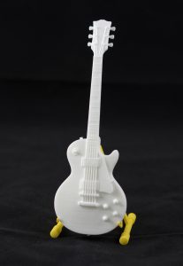
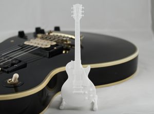
The project is a mini guitar printed out by a 3D printer. I really like how guitar looks delicate and actually shows a lot of details in its design. The tiny guitar sculpture serves as a guitar stand making it both artistic and practical. The material is plastic with a white matte finish. The guitar can also stand by itself. I am not very sure about the algorithm behind its design. There is limited description on the making of the product. The guitar is for sale of 20 dollars each. It shows that the artist Georg Kreuter is really into details and his products look very exquisite. In the ads on his website, the artist put the white guitar next to a regular sized black guitar. This shows that he likes contrasts. The creation was printed in 2016 and the name is Gibson Les Paul.
24665717086_1fb616395d_h

http://www.shapeways.com/product/P6LSXDESU/gibson-les-paul-scale-1-6?optionId=58806394

Dynamic Drawing-Lydia Jin

sketch

var offset=50;
var barX=offset
var barY;
var barW;
var barH=30;
var sliderX = offset
var sliderY;
var sliderW=50;
var sliderH=30;
var modify=50;
var colorR=133;
var colorG=209;
var colorB=228;

function setup() {
    createCanvas(640, 480);
    
}

function draw() {
	background(colorR,colorG,colorB);
	fill(255);
	barY=height-50;
	barW=width-2*offset;
	rect(barX,barY,barW,barH);
	//draw slider box
	fill(247,176,193);
	sliderY=barY
	rect(sliderX,sliderY,sliderW,sliderH);
	//draw slider
	fill(144,217,148);
	ellipse(modify,modify,modify/2);
	//draw circle in the top left corner
	fill(116,100,185);
	ellipse(640-modify,480-modify,modify/2);
	//draw circle in the bottom right corner
	fill(255,204,222);
	ellipse(640-modify,modify,modify/2);
	//draw circle in bottom left corner
	fill(255,107,29);
	ellipse(modify,480-modify,modify/2);
	//draw circle in top right corner
	push();
	translate(width/2,height/2);
	rotate(millis()/sliderX);
	fill(62+sliderX/5,116,44);
	rotate(radians(0));
	ellipse(50,50,50,100);
	rotate(radians(50));
	ellipse(100,100,50,100);
	rotate(radians(100));
	ellipse(150,150,50,100);
	rotate(radians(150));
	ellipse(200,200,50,100);
	pop();
	//draw leaves falling down, leaves rotate in different speeds. 
	//Leaves turn from green to brown as slider moves.
}

function mouseMoved(){
	var sliderMax=width-offset-sliderW;
	if (mouseY>=barY & mouseY<=barY+barH){
        sliderX=max(min(mouseX,sliderMax),barX);
	    modify=sliderX/0.8+50;
	// if statement restrains that mouse can only be moved within the slider bar. The modify changes shapes of the circles. 
	}


}

The drawing I am presenting is named falling leaves. The user can put their mouse on the slider and move the mouse within the slider bar to see changes of how the tornado turned leaves from green to brown. The leaves spin really fast in the beginning and slows down once the slider is at the right end. The 4 circles represent people as they come and go and disappear. It should leave a sad feeling in the end as the leaves slowly whirls.