Michal Luria – Looking Outwards – 12

This week I will present two different projects that present famous media (movies and books) in an unexpected way that reveals new and fascinating aspects of the well know work.

TextArc / Bradford Paley

The project of TextArc takes famous books and analyzes their text and content, presenting them a new and interactive way:

TextArc, presenting a whole book in a visual, interactive way. Source.

All the sentences in the book are presented clockwise, and in the middle the words most frequently used are presented. Furthermore, each word is located in the area it is mentioned the most, for example “Queen is near the end of the book”. When the user hovers a specific word, they can see in what parts of the book this word is used:

TextArc: view in what parts of the book a word is used. In this example – “Alice”. Source.

Photographs of Films / Jason Shulman

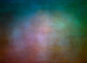
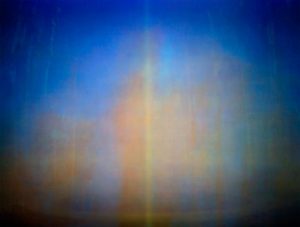
In this project, the artist condensed whole well known classic films into a single frame. Shulman used an algorithm to create the mood and style of the film in a single frame:
fantasia
Fantasia in “Photographs of Films”, presenting the whole movie in a single frame. Source
the-wizard-of-oz
The Wizard of Oz in “Photographs of Films”, presenting the whole movie in a single frame. Source

In both projects, famous media are taken and presented in a new way that shows aspects that were hidden before, allowing others to look at a piece from a different point of view.

The projects differ in the medium they use – TextArc uses text, as opposed to visual compositions in the films project. Furthermore, TextArc is an interactive program that encourages the user to look into the text, explore, look what words are used and where, etc. The second project, although not interactive, has an advantage of creating a mood that represents a full length movie just by looking at a still image. This resembles more of a work of art, rather than interactive text presentation.

As my final project suggestion is looking at plays from different eras in a new way by visualizing structure aspects, I think both of these projects can inspire my work. I can look at what aspects of the work are presented and what are some ways in which they can be computed and visualized.

Looking Outwards 12: Project Priors and Precursors

There are two inspirations for my project. The first is one of my favorite game apps from 2010, Tilt to Live, and the second is a visualization of immigration lobbies.

code-red
Tilt to Live

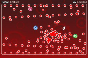
The game app Tilt to Live, developed by One Man Left Studios, is a survival game in which the user tilts their phone to move a cursor around the screen. The objective is to avoid the continual appearance of red particles that are attracted to the cursor and will end the game if the two make contact. To slow the steady barrage of red particles, the cursor can pick up various power-ups that destroy particles. I am considering a recreation of a similar type of game. I am considering adding more physical and mutual interactions to the particles. I might use a similar concept to drive an interactive mouse display instead as a game might be difficult, but the idea could use some exploration.


978_big01
Untangling the webs

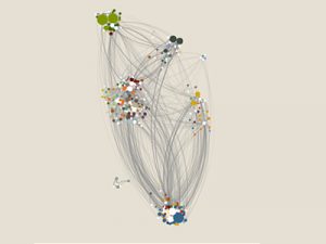
This visual is Untangling the Webs of Immigration Lobbies with an unknown creator. I think that this type of grouping and relating might be a good approach to redesign the game. I like how there are distinct differences and a strong set of rules governing the relationship of the particles. I want to keep this kind of idea in mind when I create my particle game/interaction. While I design my game, I want to keep in mind what the particles represent. As in the case with this project, there is a meaning behind every particle. Perhaps I can do something similar in my project.

Isabella Hong – Looking Outwards – 12

For my last Looking Outwards post, I will be comparing and discussing the works of interaction designers, Daito Manabe and Caitlin Morris.

Daito Manabe is an artist, programmer, and DJ based in Tokyo, Japan. As a designer, he focuses on the relationship between the body and programming, opting to represent the connections in simple, clean works. He enjoys finding the balance between simple and intricate in his productions and this shows in his work, “Arigato Skating”, a motion graphic made for the opening of the NHK Trophy (a stop on the figure skating grand prix circuit). By using projectors and cameras, Manabe created the illusion that the junior skaters were creating lines of light and flowers with their blades. The full production is beautiful.

http://www.daito.ws/en/work/2012-nhk-trophy-arigato-skating.html

Caitlin Morris is an artist and technologist that explores various representations of physical space often through sound and perception. She is constantly crossing the line between digital and physical space, testing where the limit is on both. In November of 2010, Morris did a sound installation on the Brooklyn Bridge that demonstrated this flirtation with digital and physical interaction. She installed contact microphones across the railings of the Brooklyn Bridge. When pedestrians plugged their headphones into the little boxes, they could hear the vibrations of the bridge, indirectly interacting with the bridge’s interaction with water, wind and travelers. It was very cool.

Contact Microphone
A pedestrian listens to the Brooklyn Bridge

Although both Manabe and Morris are interaction designers, their works delve and trigger reactions from different senses. Manabe focuses on the visual and tactile interaction between his art and his audience. Meanwhile, Morris focuses on how her audience can interact with sound. Overall, both artist provoke reaction through their productions, something that I think is crucial when presenting personal work.

AndrewWang-LookingOutwards-12

Traces

– 2008

Barrel Distortion – Philip Rideout – 2011

Screenshot


Chris O Shea’s work emphasizes visualizing fluid motion. Although in this project he primarily focused on car paths, this technique could be applied to many different patterns as well. I really like time lapse as a form of visualization, and I believe that it can provide key insight and allow patterns to form from data that previously might look disoriented. On the flip side, Philip Rideout’s project focused more on the nature of one object. In this case he distorts barrels using vertex based techniques. By applying these techniques he is able to view the barrels under a comprehensive list of conditions and gain more insight into the object’s structure this way.

Although their work appears different, I believe they are actually quite similar in that they both try to explore and gain insight into objects and scenarios. Philip’s work does this with objects while Chris’ work applies to scenarios and larger scale activities. These two stood out to me as I feel that a missed opportunity could be a combination of both cases. I think it would be very interesting to see a project that combines the two aspects and observes an object in certain scenarios and evaluates its form and condition.