Grace Cha-Looking Outwards-12

For my Final Project, I want to create a generative landscape that loops in a entertaining and delightful way perhaps some interactive features with the mouse.

Two projects that I got inspiration from is from Leander and Holger’s projects.

Leander ‘s project Basecamp (2014)

screen-shot-2016-11-18-at-9-19-06-pm

Leander’s Basecamp project is an ongoing loop of pyramids that show stripes of colors as the background changes.  I really like the very predictable nature of the colors and changes. I wish there was an element of people walking around to indicate that it was a Basecamp, but I do enjoy the simplicity of the program.


Holger Lippmann’s Project NoiseScape 4 (2016)
screen-shot-2016-11-18-at-9-17-14-pm

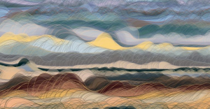
Holger’s NoiseScape is a rework of an ongoing script.  It morphs slowly into a kind of “romantic” landscape painting.  The technical basics are still very simple; rows of ellipses with some 2d noise and different color arrays.  I admire the simplicity and spontaneity of different random lines as the more structure loop of Leander’s Basecamp.


I hope to incorporate simple colors such at Leander’s Basecamp, while adding an element of spontaneity.

Diana Connolly – Looking Outwards 12

For my project, I take inspiration from Flappy Bird and Super Mario (Underwater). Flappy Bird is a game in which the user controls a bird as it’s flying to the right, and moves it up or down to avoid hitting obstacles. The underwater Super Mario game has you control Mario’s location as he’s going right or left in the underwater landscape, and you have to make sure to not hit any of the monsters in your way or else you’ll die. Please see some gameplay of each game below:

Both games are “side-scroller” games in that the storyline of the game progresses as you move horizontally across a landscape. Both games have the player move up or down to avoid hitting things that could kill them. This is similar to my project, because I want to make a game in which a player plays as a scuba diver underwater, and the landscape is moving past them horizontally. The player has to manipulate only the vertical position of the scuba diver in order to explore the side-scroller world and avoid hitting the rock cliffs that exist above and below the scuba diver character.

Looking Outwards 12- Sofia Syjuco

In this last Looking Outwards, I looked through projects in the infinite-runner and side-scrolling genres of games. These would be especially interesting and relevant to my final project, because I intend to create a kind of infinite-runner/side-scroller game.

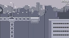
http://www.canabalt.com/

The first project that I was inspired by was the game Canabalt by Adam Saltzman for the Experimental Game Project. I thought this game was very interesting because, while thematically it’s a pretty simple game, its aesthetics and strict color scheme make it a very visually appealing game, and add a sense of drama. I really admire the way that art can not only just make a game look ‘good’, but it can actually play such a deciding role in whether the game’s experience itself is good. The graphics don’t have to be hyper-realistic, it’s all in the artistic sensibilities of the artist. The only thing I think that was overlooked was adding more appeal and interest to the game itself – jumping over buildings as a suit-clad office worker looks alright, but quickly loses luster.

http://www.swordandsworcery.com/

The second project I looked to for inspiration was Sword and Sworcery, by Superbrothers. It’s not an infinite runner, but it is a very beautifully created side-scroller. I really admire the art of it, how nostalgic it is even when it isn’t exactly what retro games used to look like – it still retains some feeling of the past. I want to use Sword and Sworcery as an art inspiration for my project, and study it for how I can incorporate visuals into my side-scrolling game. As my project will be a game that many will remember from childhood, I want its art to suggest something nostalgic and fond memories.

Both of these projects are very different in terms of what kind of games they are, and what the user experience is, but I think that I can learn a lot from the both of them in order to create the kind of game that I’m imagining.

sihand – LookingOutwards 12 – Prior Art

Shadow Art

Rubber duck turned into burglar

The first piece of art that inspired my to-be final project is illustrations by artist Vincent Bal. Bal, a Belgium filmmaker and illustrator, finds sparks in everyday objects. By clever use of lighting, angle, and a tad of imagination, he creates playful doodles of the shadows. His drawings particularly interested me because of how well he manipulates angles and produces interesting results based on them.

Tinted glass turned into the sea and the sky

Another piece of shadow art that inspired me was Shadow Monsters by Philip Worthington. Shadow Monsters was Worthington’s project at the Royal College of Art. His project adds a whimsical twist to the usual shadow puppet fun. As told by Worthington himself, the installation consists of a light box that produces the perfect silhouette, which is fed into a real-time program. The algorithm utilized “blob detection” that isolates, analyzes, and assumes features of the curvature of the shadows. In such, an arm movement can be captured and interpreted into a fire-breathing mouth.

It’s a technological magic trick.   -Philip Worthington

Doodles by Vincent Bal from thisiscolossal

Another video on Shadow Monsters


Looking Outwards 12

The two people I’ve chosen for this week are Angela Washko and Porpentine. Their projects are both interactive video games, The Game: The Game (Angele Washko) and Witch Egg (Porpentine). I’m a fan of interactive games like these, which is why I wanted to make my final project a sort of interactive game/program as well.

The first game, “The Game: The Game” is an interactive dating sim (or dating simulation) where you are given a list of choices for each event, that I assume furthers the date you are on with the character you’ve picked.

Here are some still images from the game.

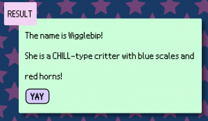
The second game, Witch Egg, is also an interactive game where events happen based on the choices you make. This game is focused more on raising an egg, so for the sake of this post I tried playing the game.

This is the description of my egg at the start of the game:

screen-shot-2016-11-18-at-5-58-41-pm

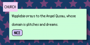
I tried picking some of the options to advance my egg’s level:

screen-shot-2016-11-18-at-5-59-49-pm   screen-shot-2016-11-18-at-5-59-42-pm

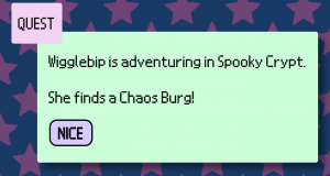
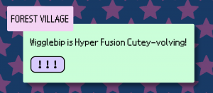
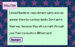
After doing some more quests I managed to evolve my egg and got this:

screen-shot-2016-11-18-at-6-00-50-pm

screen-shot-2016-11-18-at-6-00-57-pm

I have no clue what any of this means.

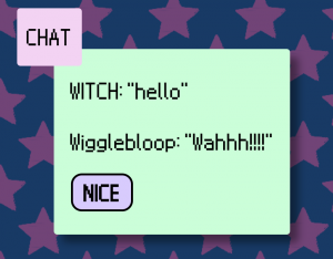
HOWEVER, both of these games are relevant to what I want to do for my final project. Both have a lot to do with user-program interaction, and choices you make affect what happens in the game. My project is more close related to the Witch Egg game, especially since the game gives you the option of talking to your egg, which I did (I’m the Witch):

screen-shot-2016-11-18-at-6-05-55-pm

Since my project is to have an interactive character you can “talk” to, I found this project to be relevant to my final project.

Liu Xiangqi-Looking Outwards 12

The first project I found interesting is “On Broadway” by Lev Manovich. In this project, he trying to analyze and present a city by collecting data from new media Instagram, Foursquare, Twitter, and from traditional indicators taxi and income. What interests me most is how he compressed a 3-D city into one single string(a street, Broadway), and by analyzing those aggregation of data, he found a clear division between city upper 110th street and below. This is a video.

The second project I admire is Phototrail by Nadav Hochman, Lev Manovich and Jay Chow. In this project, they collect data directly from photos uploaded to Instagram by people in different cities. Multiple grams are used to correlate the attributes of photos and other factors. For example, they used radicals to organize the images by their visual attribute (hue, brightness, texture, etc.) and by when and where they were taken. One parameter decides the angle; another parameter controls the radius (how far a photo is from the center).

Looking Outwards 12: Sound Calligraphy/Lyrical Wrap

For the final Looking Outwards post, I decided to compare the projects of artists Ulla Rauter‘s “Sound Calligraphy” and Ronald Pellegrino‘s “Lyrical Wrap.”

Ulla Rauter is a artist and musician whose works focus on the intersection of fine art and sound. Rauter’s “Sound Calligraphy” explores the relationship between script and sound. In a live performance, Rauter draws calligraphic forms, which is then translated into sound through a scanner that employs camera and computer technology; in other words, she is essentially exploring how to draw/write sound. It appears that she attempts to draw certain words (i.e. “somebody”) as shown by the words on the upper right-hand corner, but I am unsure how they correlate to the line marks she makes in her calligraphy. Before watching the performance video, I expected her to write words on the scanner and have them translate into sound.

Sound Calligraphy from Ulla Rauter on Vimeo.

Ronald Pellegrino is an artist that has been involved in intersecting sound and light through electronic art since its inception. His work “Lyrical Wrap” combines five decades of his work in electronic arts into a piece that pairs sound with abstract grids, lines, and various shapes that constantly change. I kind of like how the piece gives off a mysterious air, mostly due to the eerie sounds and accompanying holographic visuals. It makes the viewer feel like they are in some kind of weird dream. Pellegrino has a variety of similar videos, which can all be accessed through his Vimeo channel.

Lyrical Wrap from Ronald Pellegrino on Vimeo.

Looking Outwards-12

This week I looked at Glenn Marshall’s work called Statue, which displays a dramatic look at the Statue of Liberty being crucified. I also looked at the Hyphae Zoetrope on Nervous System, which is an animation of a plant-like figure growing.

I find these both interesting because they each have a component of the animation that I aim to make. I admire the growing branch-like look to the hyphae zoetrope, and I admire the design and camera work of the Statue project. They are different in their content, but share the 3D aspect to their projects.The meaning behind the works also appear to differ as Statue appeared largely political, while the Hyphae Zoetrope was more intricate and appeared to be designed for aesthetic purposes.

Statue was created on November 9, 2016, while the Hyphae Zoetrope was created in 2014.

A link can be found here for the statue project, while a link can be found here for the Hyphae Zoetrope. The video of the Statue project can also be found below.


Looking Outwards 12 – Simin Li

I chose two projects as reference for my final project.

Extinct by Joe Cutting

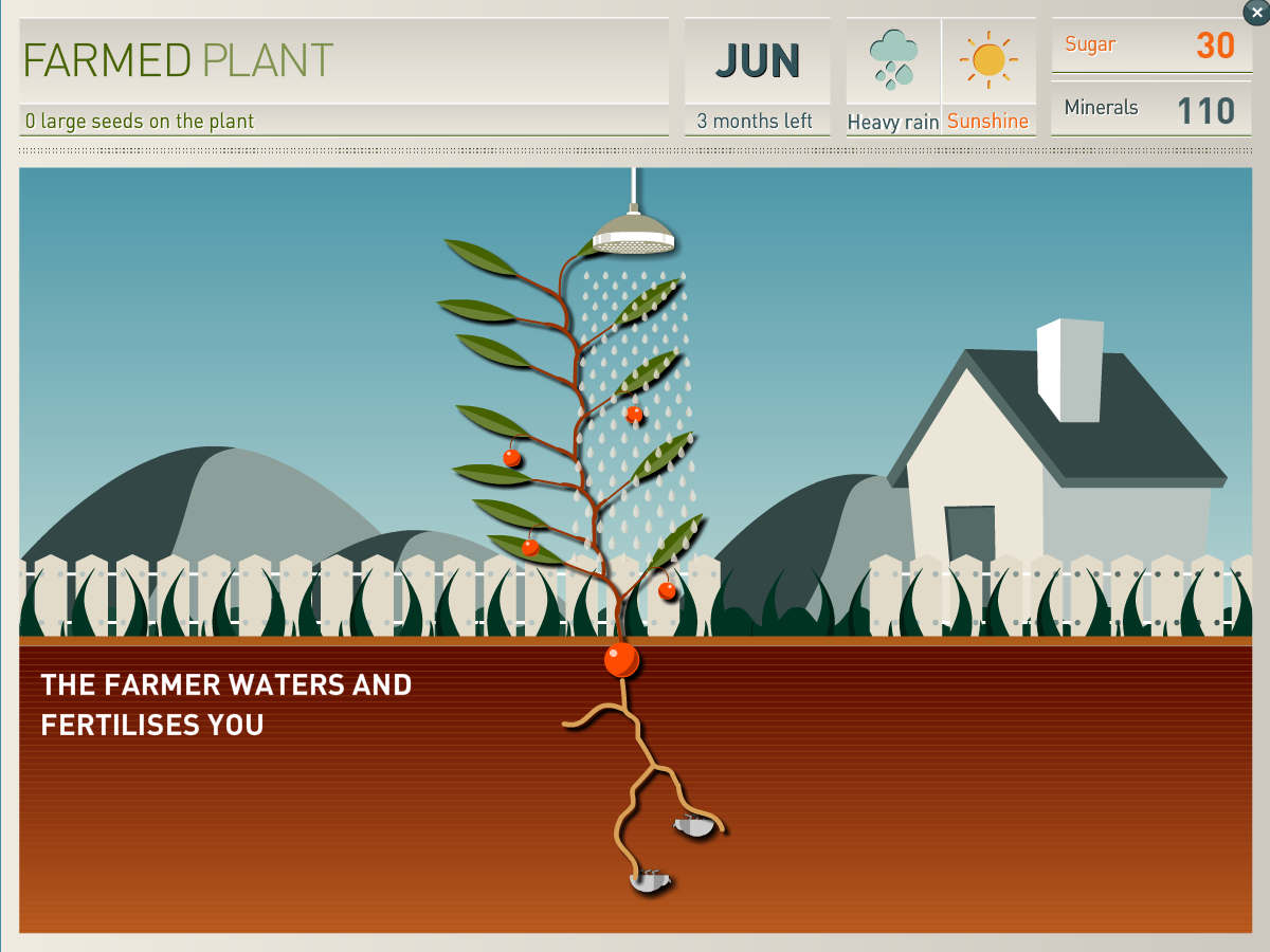
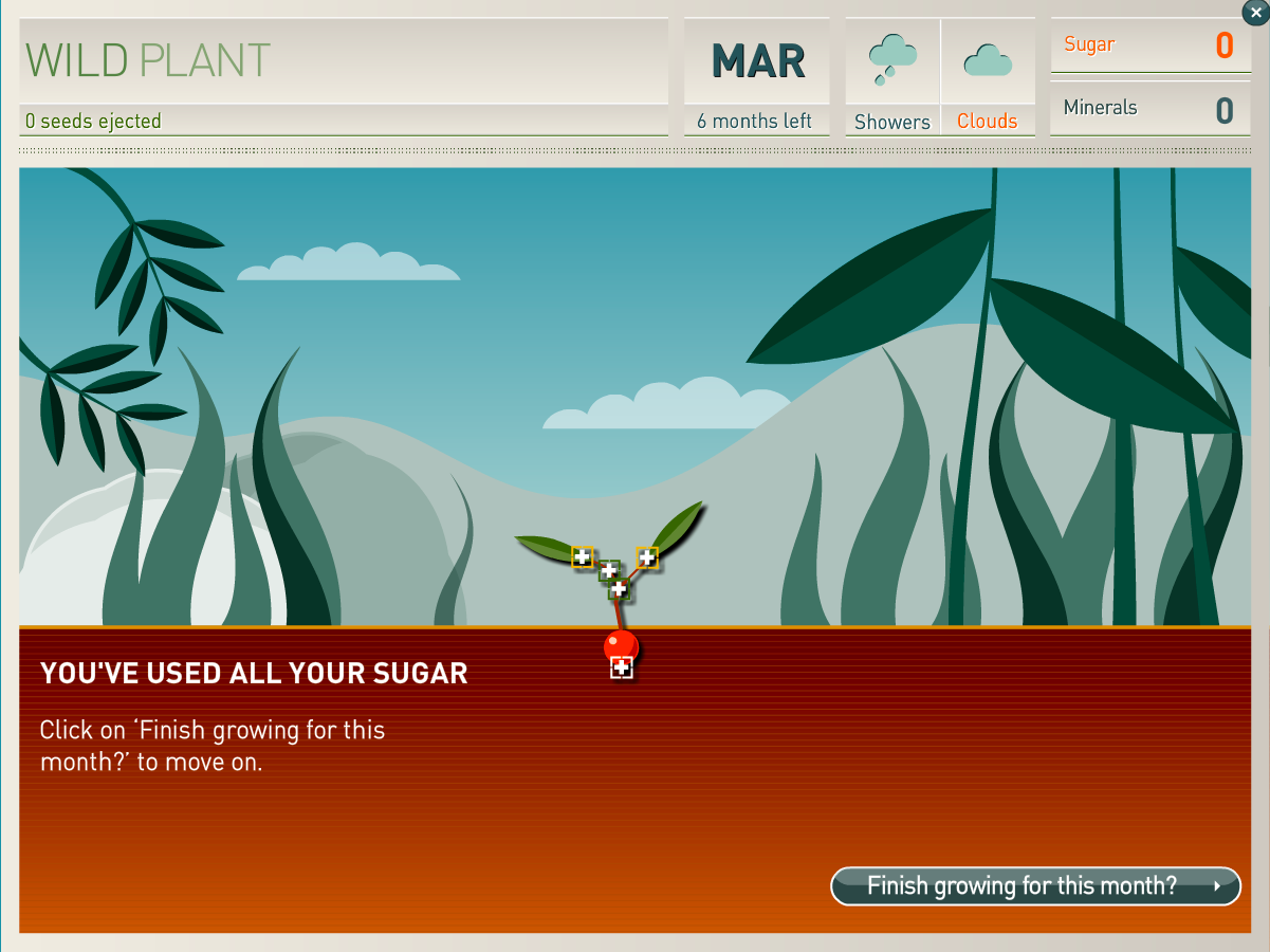
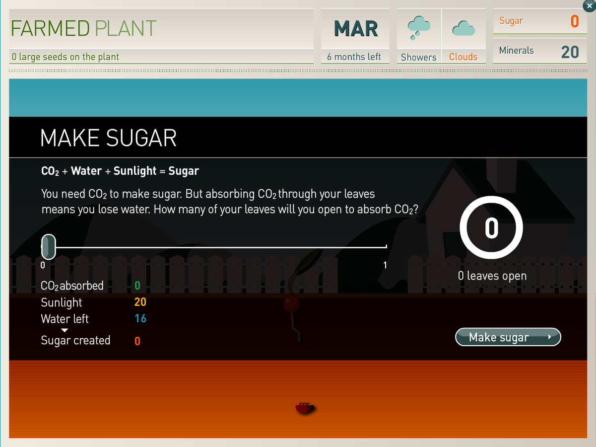
Extinct is an educational game that allows players to plant either a wild plant or a farm crop by Joe Cutting. The goal of the game is to grow as many seeds as possible through deciding how much water, minerals and sunlight to distribute to growing different parts of the plant. The more seeds you get, the higher your survival rate. The game is interesting in that you have control over your plant and it makes use of scientific knowledge that gives the player something more to take away from the game. Something I wish Cutting did better is that the window is too small for the plant. When the plant gets really tall it goes out of view. The slider bars are also a bit too long.

fake flower by W:Mute
121 Fake Flowers by W:Mute

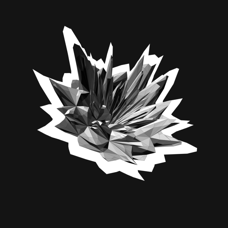
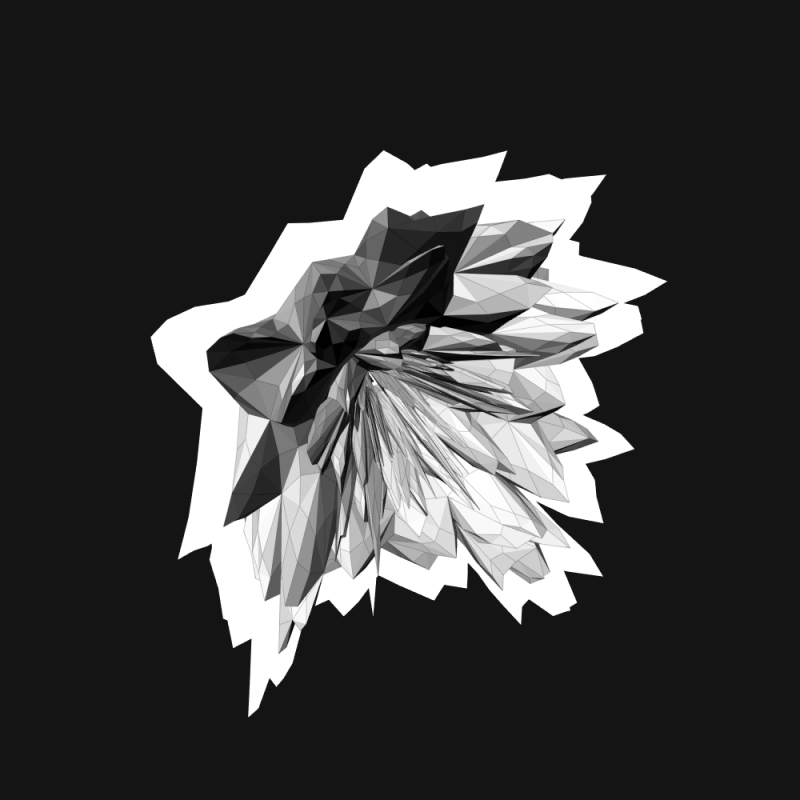
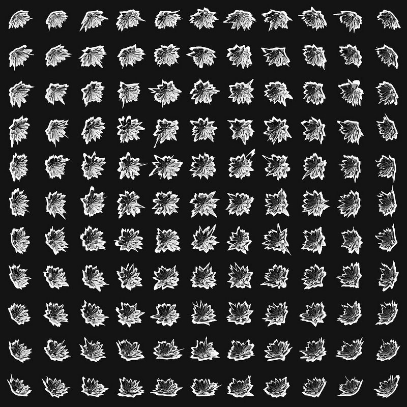
121 Fake Flowers by W:Mute is a series of 121 computer generated flowers. The artist uses processing to make the flowers and they are all in black and white. What is interesting about the project is that all the flowers have a crystal like structure. Unlike the first project, this is only a simulator of flowers. I thought this project was worth investigating because it could help me generate the leaves and fruit in my game. Is seems that this project has differentiated the petals and the pistils. When I generate my plant I should generate stems and leaves individually. If this project could include more variability, it would be even more interesting.

Links:

About

Joe Cutting

Play Extinct

James Katungyi – Looking outwards 12

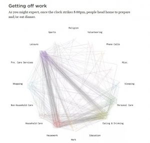
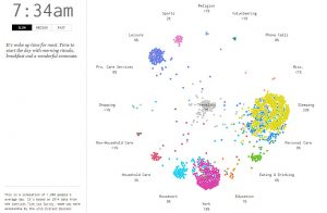
I chose two projects that make data accessible to the non-technical minded. One, the most interesting, is Nathan Yau’s ‘A day in the life of Americans‘. In it, he uses dots to simulate how each of 1000 Americans occupy themselves within a 24 hour period. The source data is based on 2014 American Time Use Survey, made accessible by ATUS Extract Builder. The project represents each person as a dot whose color is determined by the activity of the moment. Dots of the same color congregate to the same spot on a circular clock-like canvas with activities located around it. Each activity records the percentage of dots at the location. The dots are in constant motion; they become frantic in rush hour then settle into work or sleep depending on the time of day.

nathanyausketch

nathanyaufinal

The second one is Ekene Ijeoma’s ‘The Refuge Project‘. It is an animated world map that shows the country of origin of refuges for each year from 1975 – 2015.  At the earliest, the project was done in 2015. The circular illustrations are scaled to represent the number of refugees. At a glance, one is able to tell where the largest number of refugees came from for a given year. When the mouse is positioned at the circle of origin, the destinations of the refugees are shown by arrows and numbers. A side screen narrates key events contributing to the largest refugee numbers for each year.

ijeomamapinteractivity

ijeoma2015

I admire the two projects because they turn numbers into intriguing representations that are easily apprehended. One of the challenges of our times is how to make meaningful use of the enormous quantities of data that is available. Making the data easily apprehended is an important step in analyzing and using the data.

As to the algorithms, Nathan’s work suggests that each circle is an object that stores properties and functions which change its color and drive its movement across the screen. Even though Ekene’s work is static for each year, it also probably relies on an array of objects with properties and functions. The map at the back is also interactive because it is linked to the circles.

For my project, I wish to make a platform that graphically presents a location’s climate data – one unlike the common weather apps. The two projects inspired this idea which I also hope to use in later work.