Flight Patterns

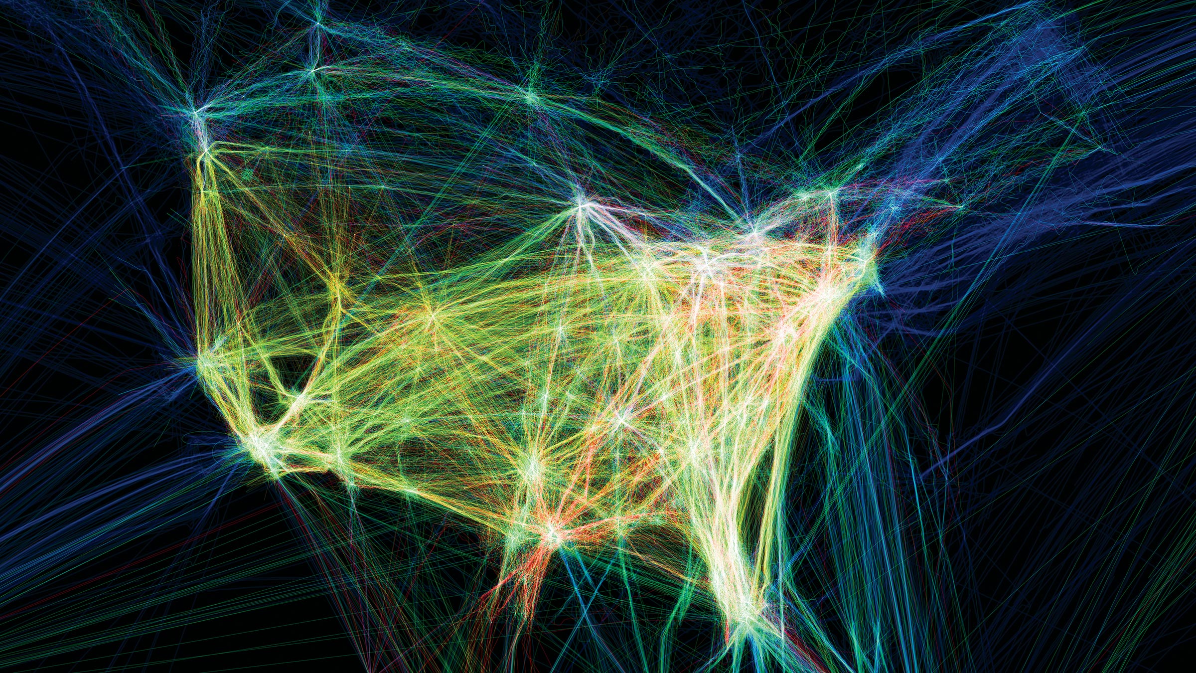
Aaron Koblin 2009

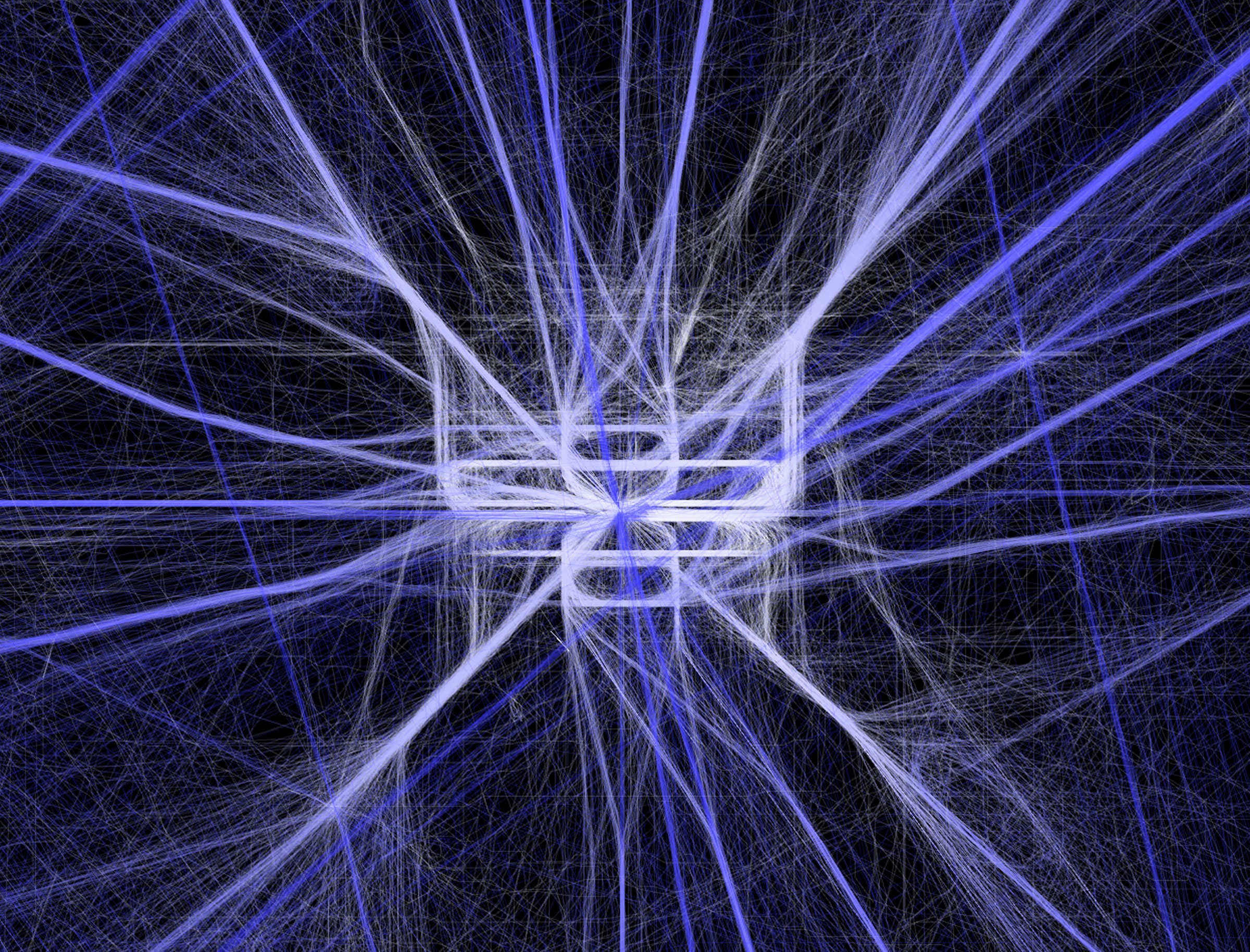
Aaron Koblin 2009
While browsing his website, I found Aaron Koblin’s visualization of flight patterns very interesting. Aaron is a great designer who has co-founded a virtual reality company called “Within” and had led the Google Data Arts team from 2008 to 2015. In his project “Flight Patterns”, he used data from FAA(Federal Aviation Administration) and mapped them onto the north American landscape. To do that, he parsed the data information and plotted them using the “Processing” programming environment. His data visualizes both in color and form. It is also extremely detailed even when zooming in closely. The flight routes naturally form clusters at where the airports are, making it visually compelling. In the animations, he presented a time lapse of the flight patterns, which lead the viewer to further visualize the information in a larger scale and in a new dimension(time).
Skip to content
[OLD – FALL 2016] 15-104 • COMPUTING for CREATIVE PRACTICE
Professor Roger B. Dannenberg • Fall 2016 • Introduction to Computing for Creative Practice
![[OLD – FALL 2016] 15-104 • COMPUTING for CREATIVE PRACTICE](wp-content/uploads/2020/08/stop-banner.png)