LookingOutward-01

SixthSense site

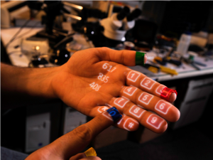
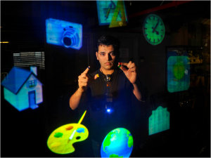
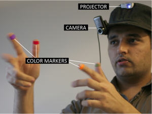
     One interactive project that really stuck to me is the SixthSense project. I first came across this project in a TEDx video. SixthSense is a prototype consisting of a projector, mirror and camera. It allows the user to have an interactive projection/screen on various surfaces in everyday life, using simple hand gestures to control it.

I find this project very inspiring because of its ease. The prototype relies on simple hand gestures and various physical surfaces that can be found anywhere. Its brings high-tech concepts and software into the every day lives of people. The website itself even has instructions to creating your own prototype device.

It is also very interesting seeing the potential of the prototype and trying to envision where this technology will end up. Although a lot of software and tech has been developed for this prototype, it is still a long way from becoming a refined product.

sntong-Project 01 – Face

sketch

//Scarlet Tong 
//
function setup() {
    createCanvas(600, 600);
    background(254);

}

function draw() {
    //hair
    var c = color(0,0,0);
    fill (c);
    noStroke();
    rect (105,184,382,350);
    ellipse(296,195,382,282);

    //clothes
    var c = color (171,229,255);
    fill (c);
    noStroke();
    rect(140,483,319,170,25,25,0,0);//tee


    //face and neck
    var c = color (255,204,188);
    fill(c);
    rect(170,193,255,260,0,0,140,140);//face
    noStroke();
    rect (267,420,63,80);//neck
    rect (238,483,120,49,0,0,20,20);//collar

    var b = color(0,0,0);//eyes, noses, lips
    fill(b);
    ellipse(245,275,13,23);
    ellipse(354,275,13,23);
    noFill();
    stroke(0);
    strokeWeight(5);
    line(294,316,294,335);
    line(294,335,305,340);
    strokeCap(SQUARE);
    arc(300,400,30,25,0,PI);

    stroke (255,96,97);//glasses 
    strokeWeight(10);
    strokeCap(ROUND);
    line(204,246,280,246);
    line(280,246,280,300);
    line(204,300,280,300);
    line(204,246,204,300);
    line(320,246,396,246);
    line(396,246,396,300);
    line(320,300,396,300);
    line(320,246,320,300);
    line(170,270,204,270);
    line(280,270,320,270);
    line(396,270,425,270);


}

This is my first coding assignment and working with Java Script. I believe the Mondrian assignment was a nice jump start for me to get used to the coding language and the formatting. I relied on the online reference to help me on the assignment.


akluk – project 01 – face

sketch
It was a good and fun exercise to simply use basic shapes to build an interpretation of myself

function setup() {
    createCanvas(600,600);
    var backgrd = color(153,25,120)
    background(backgrd);
}

function draw() {
	var x_mid = 200;
	var y_mid = 200;
	var skin_c = color(255,201,167);
	var white = color(255,255,255);
	var black = color(0,0,0);
	var gold = color(212,175,55);
	var pink = color(242,120,130);
	var red = color(248,23,17);
	var maroon = color(181,3,0);
	stroke(0);
	strokeWeight(0);
	fill(black);
	rect(140,80,320,120,0,30,0,0);
	rect(140,30,120,50,50,0,0,0);
	triangle(260,30,260,90,455,90);
	strokeWeight(8);
	fill(red);
	rect(110,450,380,300,50,50,0,0);
	noStroke();
	fill(maroon);
	rect(300,453,187,300,0,50,0,0);
	stroke(0);
	//arc(300,235, 350,350, PI, 0, OPEN);
	fill(skin_c);
	ellipse(300,300,370,400);
	noFill();
	fill(white);
	ellipse(230,250,80,40);
	ellipse(370,250,80,40);
	noFill();
	ellipse(230,250,100,100);
	ellipse(370,250,100,100);
	fill(black);
	ellipse(210,255,10,10);
	ellipse(345,256,10,10);
	rect(280,250,40,3);
	noFill();
	arc(300,320, 40, 40, 0, PI+QUARTER_PI, OPEN);
	fill(pink);
	rect(230,370,140,90,0,0,40,80);
	fill(black);
	quad(180, 210, 185, 190, 250, 160, 258, 180);
	quad(350, 180, 358, 160, 420, 190, 425, 210);
	noStroke();
	triangle(250,100,350,100,300,140);
	rect(300,100,120,40);
	noFill();
	/*strokeWeight(12);
	rect(160,200,130,100, 0, 0, 18,18);
	rect(310,200,130,100, 0, 0, 18,18);
	stroke(gold);
	strokeWeight(10);
	arc(300,220,25,25,-2.4,-0.8);*/

}

akluk_LookingOutwards01

https://experiments.withgoogle.com/ai/quick-draw

Quick, draw! is a very simple game where the user simply draws or doodles on an empty canvas and the artificial intelligence/computer will attempt to guess and determine what the drawing is of, as the user doodles more the artificial intelligence gets better and more accurate with the guesses.

This application was developed by Jonas Jongejan, Henry Rowley, Takashi Kawashima, Jongmin Kim, Nick Fox-Gieg, and the a few other individuals in Google Creative Lab. The creators were first inspired during a hackathon where they wanted to a create a pictionary-esque game with artificial intelligence. It utilized technologies and algorithm that was developed by the Handwriting recognition engine developed for Google Translate (which also most likely what inspired it) as well as other machine learning concepts. The model was trained to become better and better at identifying doodles as more people provided more data and samples for it to analyze. It could be further developed into a picture keyboard.

I wish to do something with computer vision in the future so this is similar to what I strive to learn and understand in the future. It is also a very creative and fun way to apply machine learning and AI.

abradbur-Project-01: Self Portrait

selfportrait

function setup() {
    createCanvas(600,600);
    background(122,231,199);
}

function draw() {
    fill(207,152,147);//hair
    noStroke();
    ellipse(300,160,100);
    ellipse(300,290,250,250);
    fill(248,229,238);//face + neck
    noStroke();
    rect(275,435,50,60);
    ellipse(300, 300,240,250);
    fill(255,107,107);//glasses
    rect(330,270,60,50,10,10,10,10);
    rect(220,270,60,50,10,10,10,10);
    rect(170,290,260,10); 
    fill(248,229,238);
    rect(334,274,52,42,10,10,10,10);
    rect(224,274,52,42,10,10,10,10);
    fill(39,45,51);//eyeballs
    ellipse(360,300,25);
    ellipse(250,300,25);
    rect(270,370,60,5);//mouth
    fill(255,107,107);//tongue
    rect(290,375,20,30);
    ellipse(300,402,20);
    fill(39,45,51);
    rect(298,375,5,22);
    fill(78,205,196);//nose
    triangle(300,340,305,300,310,340);
    fill(207,152,147);//eyebrows
    rect(328,250,60,10);
    rect(218,250,60,10);
    fill(254,254,254);//glasses shine
    triangle(375,270,380,255,385,270);
    triangle(375,270,380,285,385,270);
    fill(58,190,255);//shirt
    noStroke();
    rect(245,505,110,10);
    rect(235,520,130,10);
    rect(225,535,150,10);
    rect(215,550,170,10);
    rect(205,565,190,10);
    rect(195,580,210,10);
    rect(185,595,230,10);
}

This project ended up taking a lot longer than I thought it would, primarily because I had to think in coordinates and simple shapes, rather than just drawing like I’m used to. I enjoyed it though, and I’m pretty pleased with the product. It forced me to draw in a simple, yet crisp, style that I’d never bothered to try. I might use this piece as an icon in the future.

afukuda_LookingOutwards01

Over the summer I visited the ArtScience Museum in Singapore, where they were holding the FUTURE WORLD exhibition. The exhibition consisted of teamLab’s Sketch Town project, designed to engage children to inspire one another to meet the challenges of the urban setting as a shared space. Usually I feel that learning through technology has its negative consequences, however, teamLab’s project showed the capabilities of technology to foster and children’s imagination, creativity and growth, which was an inspirational experience. The biggest factor of this project is the PFU ScanSnap, a scanner which converts 2D drawings to 3D on a virtual screen, allowing a platform in which children could visualize how their drawings can be applied in a global urban system.

Link to work: https://www.teamlab.art/w/sketchtown (Author: teamLab Title: Sketch Town)


mecha-lookingoutwards-01

Daily Tous Les Jours

Every year, Quartier des spectacles in Montréal is decorated with installation art meant to bring together the community around the area. In 2011, the Canadian design firm Daily Tous Les Jours led a team consisting of over forty individuals including specialists in design, technical direction, music, animal/human behavior, and technical direction in order to create the urban instrument, 21 Balançoires.

Each swing represents a specific instrument (piano, guitar, harp, or vibraphone) that plays a note based on how high a user swings. Depending on how users interact with the swings and with each other, the instrument has the ability to play scales and melodies.In order to play the corresponding note to the height of the swing, the installation relies on sensors hidden in the swings that communicate its location to a central computer.

What inspired me the most about this project was the ability of the design firm to bring life to an area that was originally closed off and essentially abandoned. 21 Swings became so popular that the installation became scheduled to reappear every spring since. Through its playful nature, the piece was able to attract people of all different ages and demographics.

BrandonHyun-LookingOutwards-01


Videos: Motion Phone at Ars Electronica, 1996; Motion Phone at SIGGRAPH 1995; Motion Sketch at Brown University, 1989-1994

Scott Snibbe is a pioneer in augmented reality, gesture-based interfaces, digital video, and interactive art. He started this project called the Motion Phone in 1995 and evolved out from an exploration of how to make cinema out of one’s body.

Motion phone was created by Scott Snibbe himself. He explains that this program, Motion Phone, is a “networked version” of Motion Sketch. Rather than multiple humans controlling the program, several different computers are connected to run this program.

Scott Snibbe did use “Motion sketch” which he created himself, which attaches the movements of one’s hand to the movements of abstract forms.

Scott Snibbe had been inspired by two experimental animation pioneers. The first, Oskar Fischinger, pioneered a cinema of pure abstraction. His earliest films are simple black and white forms, drawn frame-by-frame in charcoal. Yet the resulting movements, such as in Study Number 7 (1931), have incredible emotional power. The second pioneer, Len Lye, pioneered “direct cinema,” created by marking directly on the film surface with pens, inks, or by scratching emulsion off of black leader.

This project is especially interesting because this is an earlier form of how humans can interact with computers. Since we are familiar with augmented reality today, it seems to be interesting how Scott was able to pioneer in that area.

For reference

https://www.snibbe.com/


rgroves – Looking Outwards 01


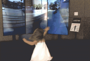
The Light Clock is a project that has been on display at the Carnegie Museum of Art by new media collective the Innovation Studio. Outside the museum, there is a clock with a hand that makes a rotation every 5 minutes, and when it reaches the top it takes a 360 degree photograph of its surroundings. In the lobby of the museum, the photographs are used in an interactive display that allows viewers to spin their bodies to left to change the point-of-view and to the right to change the time. The project required both new software as well as new hardware as nothing similar had been done before. They don’t elaborate on this in the blost post I found, but apparently the sensor that detected when and what direction a viewer was spinning was particularly challenging. The artists where all particularly inspired by a quote from critical theorist Roland Barthes – “…cameras, in short, were clocks for seeing…” The project is as much about the clock as much as it’s about the camera. It is meant to explore how we perceive space and time to be deeply, intrinsically related when in many ways they are not. Seeing them so blatantly ripped apart is jarring to the viewer. The display is curved around you, increasing the sense that you’ve been transported to a universe where you cannot navigate space and time simultaneously.

On their blog, the artists describe this project as the ultimate new media project. They claim that the success of this artwork as forced the museum to “consider where art objects can come from” and ponder whether perhaps the Light Clock isn’t art but something else entirely. I’m not sure whether it’s quite as groundbreaking as they say it is, but in the context of the Richard Serra and Henry Moore sculptures that neighbor it, it is certainly a unique project.

https://studio.carnegiemuseums.org/clock-9aa6da28a4e5

serinal — self portrait (project 1)

sketch

//Serina Liu
//Section C
//serinal@andrew.cmu.edu
//Project-01
function setup() {
    createCanvas(600, 700);
    background(165, 203, 250);
    }

function draw() {

    strokeWeight(0)
    fill(107, 156, 185)
    rect (0, 605, 600, 80);

    strokeWeight(0)
    fill(107, 156, 185)
    rect (0, 500, 600, 80);

    strokeWeight(0)
    fill(107, 156, 185)
    rect (0, 390, 600, 80);

    strokeWeight(0)
    fill(107, 156, 185)
    rect (0, 280, 600, 80);
   
    strokeWeight (0) //hair upper
    fill (0 , 0 , 0)
    ellipse (300, 300, 420, 420);

    strokeWeight (0) //hair lower
    fill (0, 0, 0)
    rect (91, 300, 419, 290);

    strokeWeight (0) //head
    fill (255, 195, 170)
    ellipse (300, 300, 360, 360);

    strokeWeight (0) //nose
    fill (197, 151, 131)
    rect (290, 270, 10, 85);

    strokeWeight (0) //eye1
    fill (0, 0, 0)
    ellipse (220, 300, 30, 30);

    strokeWeight (0) //eye2
    fill (0, 0, 0)
    ellipse (370, 300, 30, 30);

    strokeWeight (0) //smile
    fill (256, 256, 256)
    arc (297, 389 , 80, 80, 0, PI, CHORD);

    strokeWeight (0) //smile interior mouth
    fill (0, 0, 0)
    arc (297, 395 , 80, 70, 0, PI, CHORD);

    strokeWeight (4) //glasses1
    fill (256, 256, 0, 20)
    ellipse (370, 300, 100, 100);

    strokeWeight (4) //glasses2
    fill (256, 256, 0, 20)
    ellipse (220, 300, 100, 100);

    strokeWeight (0)
    fill (0, 0, 0)
    rect (420, 300, 90, 10);

    strokeWeight (0)
    fill (0, 0, 0)
    rect (110, 300, 60, 10);

    strokeWeight (0)
    fill (0, 0, 0)
    rect (269, 300, 50, 10);

    strokeWeight (0)
    fill (255, 195, 170)
    rect (260, 470, 80, 60);

    strokeWeight (0)
    fill (255, 195, 170)
    ellipse (300, 670, 300, 300);

    strokeWeight (0)
    fill (153, 16, 21)
    ellipse (300, 690, 350, 350);

    strokeWeight (0)
    fill (255, 195, 170)
    arc (300, 514, 80, 80, 0, PI, CHORD);

    strokeWeight (0)
    fill (256, 256, 256)
    ellipse (375, 300, 20, 20);

    strokeWeight (0)
    fill (256, 256, 256)
    ellipse (225, 300, 20, 20);

    strokeWeight (5)
    noFill();
    arc(220, 315, 60, 60, HALF_PI+HALF_PI, PI);

    strokeWeight (5)
    noFill();
    arc(370, 315, 60, 60, HALF_PI+HALF_PI, PI);

    strokeWeight (0)
    fill (0, 0, 0)
    rect (187, 314, 65, 5);

    strokeWeight (0)
    fill (0, 0, 0)
    rect (338, 314, 65, 5);

    strokeWeight (0)
    fill (197, 151, 131) 
    triangle(276, 360, 295, 310, 313, 360);

    stroke(0,0,0)
    strokeWeight(3);
    fill(0);
    arc(220, 246, 60, 15, PI, TWO_PI);

    stroke(0,0,0)
    strokeWeight(3);
    fill(0);
    arc(372, 246, 60, 15, PI, TWO_PI);
    }

I have never coded before this class, so it took my some getting use to. The practice with the Mondrian definitely helped and made me a lot more comfortable with working with rectangular shapes. The arcs and the triangles took me a little time to figure out, but after Wednesday’s class, there was a nice guideline on the p5js site that ended up proving to be really really helpful. I think it turned out pretty well for a first attempt and I am looking forward to learning more ways to manipulate it/make it more detailed.