![[OLD FALL 2017] 15-104 • Introduction to Computing for Creative Practice](../../../../wp-content/uploads/2020/08/stop-banner.png)
Peer: Supawat Vitoorapakorn
Peer Post: https://courses.ideate.cmu.edu/15-104/f2017/2017/10/13/svitoora-07-font-map/
Creator: IDEO
Title of Work: IDEO Font Map
Year of Creation: 2016
Link to Project Work: http://fontmap.ideo.com/
Link to Artist Bio: https://www.ideo.com/about
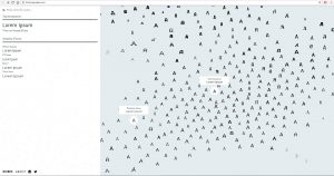
The IDEO Font Map Supawat discussed in his Looking Outwards 07 interested me for reasons similar as Supawat’s — collectively, typeface can be considered a massive arsenal of bullets used for different purposes. For exploration purposes, the IDEO Map gives users the ability to visualize a type and its similarities to others — by grouping type based on shared elements and the intensity of those shared elements, it becomes easier to encourage the utility of less-used typeface (rather than use established, sometimes over-used typeface).
As an actual selection tool(i.e. in opposition to dropdown style menu) however, the Font Map can be somewhat confusing — the quantity of sampled “A”s on a frame is overwhelming, and the individual aspects of the typeface, although highly contrasted, get lost in a sea of letters. The user does not have the ability to increase the proximities of the letters further away from each other, nor do they have the ability to swap the A for a different letter.