Yoo Jin Shin-Project-05-Wallpaper

Project-05

// Yoo Jin Shin
// Section D
// yoojins@andrew.cmu.edu
// Project-05-Wallpaper

var ellipseSize = 8;
var rectSize = 8;
var R = 120;
var G = 50;

function setup() {
    createCanvas(392, 500);
    noLoop();
}

function draw() {
	background(191, 166, 149);
	for (var y = height / 2.4; y < height; y+=35) {
		for (var x = 20; x < width; x += 50) {

			// rectangles
			fill (R, G, 50);
			noStroke();
			rectMode(CENTER);
			rect(x, y, rectSize, rectSize);

			// circles
			fill(230, 212, 200);
			stroke(R, 52, 52);
			strokeWeight(2);
			ellipse(x, y, ellipseSize, ellipseSize);

			// lines
			stroke(255);
			strokeWeight(0.5);
			line(x, 0, x, height);

			stroke(255);
			strokeWeight(0.5);
			line(x - 3, 0, x - 3, height);

			stroke(255);
			strokeWeight(0.5);
			line(x + 3, 0, x + 3, height);

			ellipseSize += 0.15;
			rectSize += 0.3;
			R -= 0.7;
			G += 0.8;
		}
	}
}

I was looking at the plain, default curtains in my dorm room and was inspired to create this design. I used the original taupe color as the base and tried to make it more interesting by adding geometric shapes (circles and squares) with gradient color changes. I tried to prevent making the design seem too congested so I started the shapes from around mid-height. I stuck with a more, toned down, deep color palette to match with the upcoming fall season. Throughout this process, I thought it was really difficult to create a design that I would actually purchase. Even though my intention was to amp up my plain curtains, I’m unsure whether I would choose this over the original. Perhaps this will be more suitable for another purpose, not curtains.

Joanne Lee – Looking Outward 05

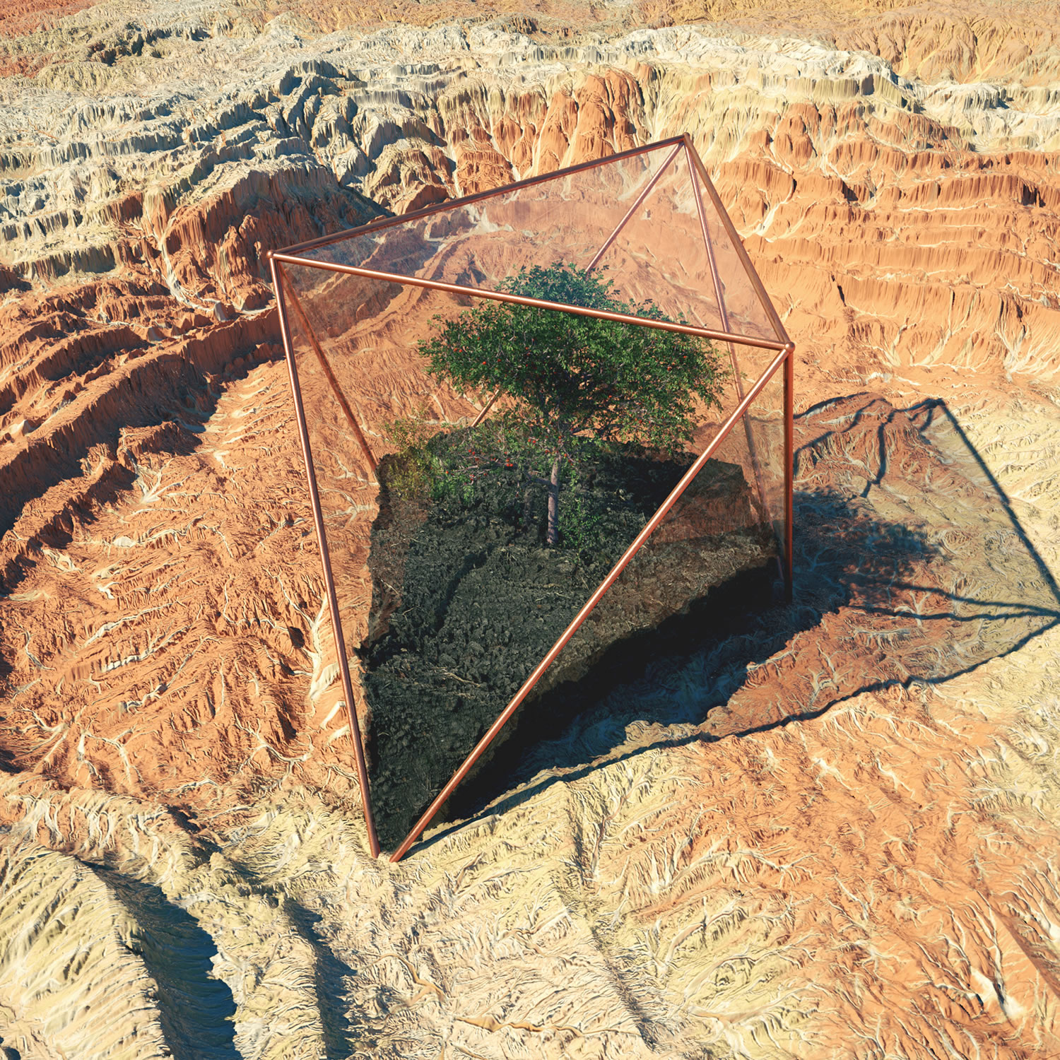
Inner Growth” created using Cinema 4D, Photoshop and Octane Render (2016).

Andrew Williams, better known as Gohmn, creates surreal and detailed 3D worlds by using Cinema4D, Octane Render, and Photoshop. He gets his inspiration from daily art makers that he follows on platforms like Instagram, Tumblr, and Ello. His real life inspiration is the southwestern area of the US, particularly Arizona. The above photo is called “Inner Growth” and although it is a quite literal interpretation of it, I’m very intrigued by how realistic the image looks. There’s something very peaceful about the realistic greenery in the photo and the way he portrays inner growth. The photo below also caught my intention in his portfolio. You can see that it is clearly inspired by the southwestern states in the US with an isolated compartment with dirt and trees growing in the middle of the dry, rocky terrain. There is something futuristic about his works and seems like a world very similar to ours yet different — which is personally the most intriguing part to me. Gohmn has been recognized for his works and gone on to create live visuals and stage renders for many big name artists such as Katy Perry, San Holo, and G-Eazy. He has a Vimeo where he uploads “making” videos of some of his most popular art pieces.

Arium” created using Photoshop and Cinema 4D.

Hannah Cai—Looking Outwards—05

This music video for Damon Albarn’s (you might know him from the Gorillaz) song “Everyday Robots” is actually a sculpture video. I don’t know the actual software being used for it, but I really love the way the music and the video go together, even through some unexpected moments. Focusing on the 3D graphics portion of this prompt though, it’s really amazing how detailed the skull is, as well as how realistic you can get with the final sculpture, including lighting effects. In theory, it makes sense for 3D graphics to be easy to compute—instead of just having x and y, there’s just another axis added on. But I never understood textures, lighting, and basically everything else that make 3D graphics look realistic. If I had to guess how those things were programmed, I’d guess that textures might be able to be implemented with for loops and randomization, and lighting could be some kind of vector with a gradient, but I really don’t know. I know there are lighting and texture functions in p5 as well; now that my curiosity has been piqued, I might do some research into how and why those functions work.

Yiran Xuan – Project 05 – Wallpaper


To generate the wallpaper, I first drew a pattern on graph paper, labelling the number of points and the connections that would need to be made between them. Then I realized that I would need 3 nested loops to draw this pattern with the most efficiently; outermost loop to iterate through the rows, next loop to iterate through each butterfly, and innermost loop to iterate through each line. I used arrays to store the coordinates of the points. I also wanted butterflies to alternate orientation with their horizontal and vertical neighbors, necessitating two variables to keep track of orientation.

sketch

function setup() {
    createCanvas(400, 600);
    background('grey');
    
    var xdist = 32; //horizontal distance between iteration
    var ydist = 24; //vertical distnace between iteration

    var xcoord = [16, 16, 8, 0, 4, 8, 8]; //x coordinates for butterfly
    var ycoord = [12, 4, -4, 0, -12, -8, -4]; //y coordinates for butterfly

    
    var firstdir = 1; //orientation of the pattern at the beginning of the row
	var dir = -1; //determines orientation of butterfly

	//strokeWeight(4);
	

	//line(32 + xcoord[1], 24 + dir*ycoord[1], 32 + xcoord[1+1], 24 + dir*ycoord[1+1]);

	
    for(var i = 12; i <= height; i += ydist ){ //one iteration is one row
    	dir = firstdir;	//sets first orientation

    	for(var j = 16; j <= width; j+= xdist){ //one iteration is one pattern
    		stroke(127 + dir*127);

    		for (var k = 0; k < xcoord.length; k++){ //one iteration is two lines, mirrored
    			line(j + xcoord[k], i + dir*ycoord[k], j + xcoord[k+1], i + dir*ycoord[k+1]);
    			line(j - xcoord[k], i + dir*ycoord[k], j - xcoord[k+1], i + dir*ycoord[k+1]);
    			}
    			//line(j + xcoord[3], i + dir*ycoord[3], j + xcoord[6], i + dir*ycoord[6]); //missing lines whoops
    			//line(j - xcoord[3], i + dir*ycoord[3], j - xcoord[6], i + dir*ycoord[6]); //missing lines whoops
    			line(j + xcoord[0], i + dir*ycoord[0], j + xcoord[3], i + dir*ycoord[3]); //missing lines whoops
    			line(j - xcoord[0], i + dir*ycoord[0], j - xcoord[3], i + dir*ycoord[3]); //missing lines whoops

    		dir = -dir; //flips direction so pattern alternates
    	}

    	firstdir = -firstdir; //flips first orientation so next row alternates
    }
    
    noLoop();

    
}

function draw() {
}

Robert Oh Project-05-Wallpaper

version2

//Robert Oh
//Section C
//rhoh@andrew.cmu.edu
//Project-05-Wallpaper

//assigning variables
var x = 0;
var y = 0;

function tile(x, y) {
    //creating the top border of each tile
    strokeWeight(5);
    stroke(6, 54, 132);
    fill(0);
    rect(x*250, y*100 + 2, 250, 10);

    stroke(0);
    //this x + y % 2 alternates every tile 
    if ((x + y) % 2 == 0){
        //creates gap
        rect(x*250, y*100, 70, 20);
        
        //making pacman
        fill(235, 255, 58);
        arc(x*250 + 45, y*100 + 53, 50, 50, PI/4, -(PI/4));

        //making the smaller dots
        fill(255);
        ellipse(x*250 + 85, y*100 + 53, 12, 12);
        ellipse(x*250 + 125, y*100 + 53, 12, 12);
        ellipse(x*250 + 165, y*100 + 53, 12, 12);

        //making the larger "power-up" dot
        ellipse(x*250 + 205, y*100 + 53, 20, 20);
    }
    else {
        //creating the gap
        rect(x*250 + 175, y*100, 70, 20);

        //pacman
        fill(235, 255, 58);
        arc(x*250 + 205, y*100 + 53, 50, 50, PI+PI/4, PI-(PI/4));

        //creating the smaller dots
        fill(255);
        ellipse(x*250 + 85, y*100 + 53, 12, 12);
        ellipse(x*250 + 125, y*100 + 53, 12, 12);
        ellipse(x*250 + 165, y*100 + 53, 12, 12);

        //creating the power-up dot
        ellipse(x*250 + 45, y*100 + 53, 20, 20);
    }
}

function setup() {
    createCanvas(500, 500);
    background(0);
    //nested for loop to fill up my wallpaper with my pacman tiles
    for (y = 0; y < 5; y ++){
        for (x = 0; x < 2; x++){
            tile(x, y);
        }
    }

    //creating borders and middle line
    fill(0);
    strokeWeight(5);
    stroke(6, 54, 132);
    rect(245, 0, 10, 500);
    rect(0, 487, 500, 10);
    rect(0, 0, 10, 500);
    rect(488, 0, 10, 500);

    //creating a gap on the bottom
    stroke(0);
    rect(245, 417, 20, 65);

    noLoop();
}

function draw() {
    //nothing here because noLoop is called
}

When I started this project, I was brainstorming for ideas to create my tiles with. I am a huge video gamer, and so I thought a cute little Pacman “maze” would be cute to code. I designed the background and details to match those of the actual original game (with the blue walls, black background, white pellets and bigger “power-up pellets”. All in all, I love how it ended up looking!

Austin Treu – Looking Outwards 05

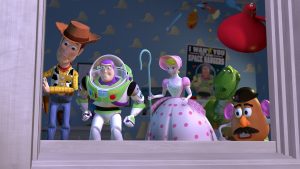
In this post, I would like to highlight 3D graphics in general, referencing a few projects throughout. If you were to graph the speed of technological progress in the last century, I’m sure it would look like some sort of exponential function. Disney Pixar’s Toy Story was the world’s first animated movie featuring 3D graphics.  While it was technologically impressive for its time, the animation from that movie looks incredibly primitive today to anyone’s eyes. Compare that to something like Avengers: Infinity War. While it uses human actors with motion capture, nearly everything in that movie is animated using computer-generated graphics. The resolution, textures and shading are so good that they can make these extraordinary scenes and events seem as real as the movie’s actors. And this is just in a period of 23 years! I cannot imagine how far we’ll go in the next 23! Currently we can animate things to look real enough to trick our eyes into thinking something presented to us in a VR headset is real, but this is just the advent of VR. Progressing with these sorts of graphics capabilities presents a fascinating picture for the future. We could have movies that take place around us that are so realistic that it’s impossible to tell them from reality. Maybe they could even be able to generate graphics around the viewers and involve them in the action. Whatever happens, the result of the future of 3D graphics will be fascinating.

Jisoo Geum – Looking Outwards 05 – 3D Computer Graphics

INTANGIBLE MATTER 2016

By Lucy Hardcastle

work: https://lucyhardcastle-thefifthsense.i-d.co/en_gb/

Intangible Matter is a browser-based interactive motion graphic created by Lucy Hardcastle, which recreates a visceral experience of the Chanel perfume No.5 L’Eau.

For this particular project, Hardcastle collaborated with web/content developers, sound artists, and animators who work with software such as Javascript, Maya, Adobe programs, and etc. What I admire the most about this project is its full utilization of every possible artistic element in the creation of the final browser. The web form allows people to interact with the content physically, while visually engaging them with grandeur motion graphics. In addition, the sound embedded in every theme brings the audience even further to the experience. While Hardcastle’s artistic sensibilities are best represented in the visual rendering of texture and intangible experiences, I believe that the interactive feature of the final art form – how users have to click and complete every task to move further – works as a powerful element that makes this project unique.

YingyingYan – LookingOutwards-05

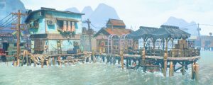
Closer view of the 3D world Tomer created

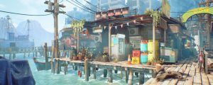
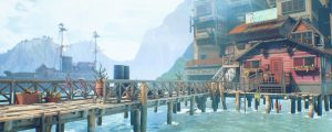
Somerset Isle is a 3D rendering project done by an environment artist from Vancouver, Tomer Meltser. He got his inspiration from the world heritage site Chew Jetty in Malaysia. The project includes a walkthrough video and a series of images from the rendering. Most of the items he used in the render can be found in the ArtStation website.

The faded background creates an interesting atmosphere.

I was looking at a list of 3D renderings drawings, the spatial atmosphere in Tomer’s image totally caught my attention. The environment he created is very dreamy, has a sense of unrealistic yet realistic at the same time. It is conflicting, but that’s the feeling I got from looking at this project. I know 3D artists use Rhino, Vray, AutoCAD, Photoshop and other software that I am using in the studio right now. But Tomer totally made a new world with all the software! Those tools are so much more powerful than I thought. Maybe he’s 3D graphic did not involve any algorithm, and does not fit the Looking Outward requirement this week. Yet, I think the drawings he made are super cool, so I feel the need to share this.

A larger scale view of the project.

Somerset Isle | Environment Reel 2018 from Tom Meltser on Vimeo.

Lan Wei-LookingOutwards-05

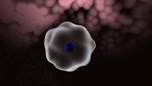
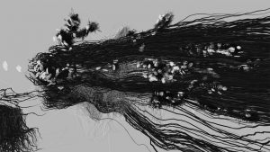
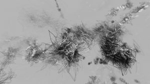
The project is called When Leaving Becomes Arriving and the video is an excerpt of it. It was done by Rebecca Ruige Xu (Director/ Computer Graphics),  Sean Hongsheng Zhai (Computer Graphics) and Nicolas Scherzinger (Music) in 2015. The softwares used are Processing and Max/MSP.

What fascinates me of the project is that the graphic style is like a pencil painting on paper but the effect is with depth in it. Maybe because of my architecture background, the spatial effects in computer graphics always interest me a lot. The dynamic effect is also very successful with the patterns popping up and fainting away. The graphic has some relationships with the music but I feel like it also has its own logic. So I guess the graphic has some parameters controled by the music and at the same time has randomness.

Screenshot of the project

Project-05-Wallpaper-Veronica

sketch

/*
Veronica Wang
Section B
yiruiw@andrew.cmu.edu
Project-05
*/

function setup() {
    createCanvas(600, 780);
    background('pink');   

    var tw = 50; // x spacing
    var th = 50; // y spacing
    var newTh = th * sqrt(3) / 2; // new y spacing

    var ang = radians(60); //radians to degrees
    var offset = tw / 2; // new x shift

    
    var ox = 0; // ellipse center y
    var oy = 0; // ellipse center x
    var num = 10; //elements per row

    for (var y = 0; y < 80; y++) {
        
        //if its an even number row, have one less element
        if (y % 2 == 1){
            var z = offset;
            num = 20;
        }
        //if its an odd number row draw all elements
        else{
            var z = 0;
            num = 20;
        }

        //draw circle grid
        for (var x = 0; x < num; x++) {

            var py = oy + y * newTh;
            var px = ox + x * tw + z;
    
            noFill();
            stroke('white');
            ellipse(px - 50, py, 100, 100);
            fill('white');
            ellipse(px - 50, py, 10, 10);
            stroke(5);
            strokeWeight(2.5);
         
        }


    }
    noLoop();
}


function draw() {
    // draw is not called due to noLoop() in setup()
}

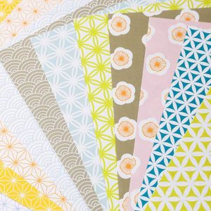
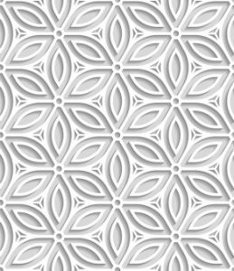
In this assignment I was inspired by Japanese origami paper patterns and decided to play with repeated patterns of simple geometry.

I altered the hex grid code so that the circles start overlapping and then I added nodes to the connection points. I am happy with the result and wouldn’t mind using this as a wallpaper in my room.