For this Looking Outwards, I looked to Eunice Choe’s week 6 post on Matt Deslauriers‘s randomly generated line work called Color Wander (2016). This artwork generates a new composition of lines randomly with every click, expressing unique patterns and color palettes.
I agree with Eunice that this work is very pleasing since the growing abstractions are not overwhelming or large to the point of them being uncomfortable. However, I would add that he way he used Simplex noise to make the objects move is arguably the most pleasing part of this work. There is something so wonderful about the way that you never know what line or color will appear next, what direction or form it will take, or at what speed it complete those two actions at. It is as if someone is painting on your computer screen and it is simply mesmerizing to watch.
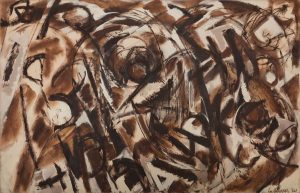
For this week’s assignment, I have decided to look at Xindi Lyu’s Week 7 Looking Outwards Project and Lee Krasner’s painting. I decided to review this entry because I really enjoyed that week’s promo of randomness as well as the way that Xindi interpreted this assignment. For me, I still chose to continue with something relating to technology and did not consider stepping out of that field into fine arts. I enjoyed how she describes the simplest elements of strokes and slashes to create something random and yet still beautiful. In addition, the story behind the painting attracted me to reinterpret the visual language of the strokes and look at the painting differently than how it looks upon first glance. (I’m also a huge Jackson Pollock fan). As a whole, I appreciated the choice to step out of conventional choices for projects and this post inspired me to branch out with future subject matters for Looking Outwards.
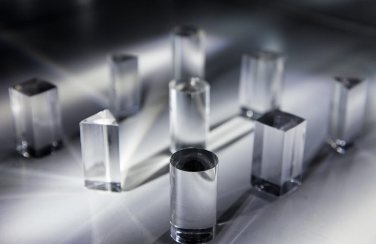
I loved the piece that Anthony posted; Hush‘s interactive sound-art installation invites onlookers to rotate prism pieces of a board that refracts and changes color— and therefore sound.
My favorite statement from Anthony’s post is that the project ” allows for a calm duality in light projection and soundscape.” The elegance for this duality is exactly what makes the project so astoundingly sublime— and generates such a calm, multi-sensorial experience.
close up of board pieces
The pieces are elementary, and simple in a way that makes the piece inviting to touch and understand. What generates as a result, is something that feels seemingly complex, but aesthetically correct (and therefore simple). This duality is something that speaks to me as well, as someone who aims to create experiences that draw from inherently complex processes, this immediate and simple harmony is something I hope to achieve in my work in the future.
//Jenny Hu
//Section E
//jjh1@andrew.cmu.edu
//Project 09

var underlyingImage;
var coffeeImage;

function preload() {
    var myImageURL = "https://i.imgur.com/raTslIA.jpg";
    var myCoffeeURL = "https://i.imgur.com/6kkGXgx.png";
    coffeeImage = loadImage(myCoffeeURL);
    underlyingImage = loadImage(myImageURL);
}

function setup() {
    createCanvas(400, 600);
    background(255);
    underlyingImage.loadPixels();
    frameRate(10);
}

function draw() {
    //variables needed for drawing the pixels over and over again
    var xa = random(width);
    var ya = random(height);
    var xb = random(width);
    var yb = random(height);
    var xc = random(width);
    var yc = random(height);

    var ixa = constrain(floor(xa), 0, width-1);
    var iya = constrain(floor(ya), 0, height-1);
    var ixb = constrain(floor(xb), 0, width-1);
    var iyb = constrain(floor(yb), 0, height-1);
    var ixc = constrain(floor(xc), 0, width-1);
    var iyc = constrain(floor(yc), 0, height-1);

    var theColorAtLocationXaYa = underlyingImage.get(ixa, iya);
    var theColorAtLocationXbYb = underlyingImage.get(ixb, iyb);
    var theColorAtLocationXcYc = underlyingImage.get(ixc, iyc);

    //open ellipses
    noFill();
    stroke(theColorAtLocationXaYa);
    strokeWeight(1);
    ellipse(xa, ya, 15, 15);

    //big rectangle
    fill (theColorAtLocationXbYb);
    noStroke();
    rect(xb, yb, 10, 10);

    //small rectangle
    fill (theColorAtLocationXcYc);
    noStroke();
    rect(xc, yc, 5, 5);

}

//call the coffee image when you click
function mousePressed() {
  image(coffeeImage, mouseX-75, mouseY-75, 150, 150);
}
I loved the textural quality individual shapes gave to this project— like in the brief, it was nice to see this transforming effect happen as I generated the pixels across the canvas.
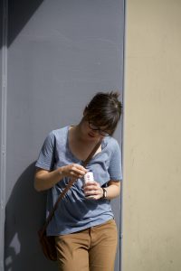
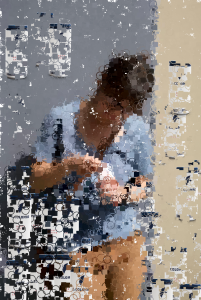
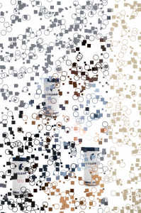
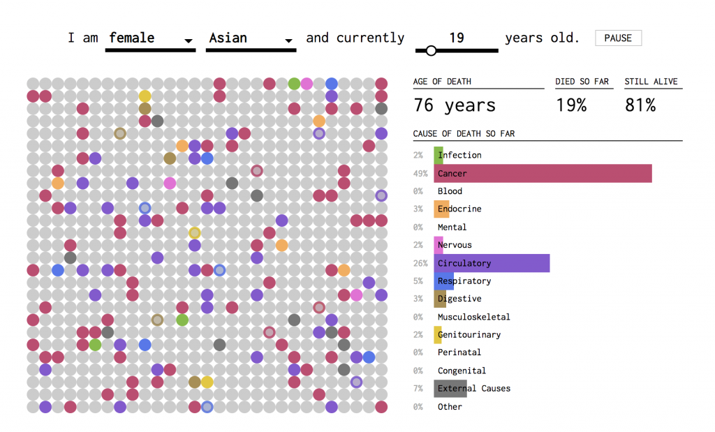
My image is of my friend, Adella, who is pictured here opening a bottle of La Colombe. Rightfully so, I thought it would be interesting and fun to add a La Colombe image as the user clicks around. Doing so, makes the image feel even more artificial/generated, and even ad-like. In some ways, it contextualizes the image.
adella in the original photoresulting image screenshotbeginning screenshot, with a few mouse presses
For this week I looked at Alex Kaplan’s looking outwards post about Neil Mendoza. Neil Mendoza is an artist who has an MA in math and computer science from Oxford University and MFA in design media art from UCLA. One of his projects that particularly stood out is “Hamster Powered Hamster Drawing Machine”, where he built a contraption that, when a hamster runs on its wheel, draws a picture of a running hamster. I really resonated with Alex’s comment about how Mendoza opened her mind to the different possibilities of programming and code outside of the digital world. So far, I’ve been looking at and thinking about code in a very digital sense. Even when it is interactive, I think about it as the user vs. digital interactions, whereas Mendoza’s work integrates code to create physical and analog pieces. This opens a ton of new possibilities, especially for artists, to create unique and meaningful work.
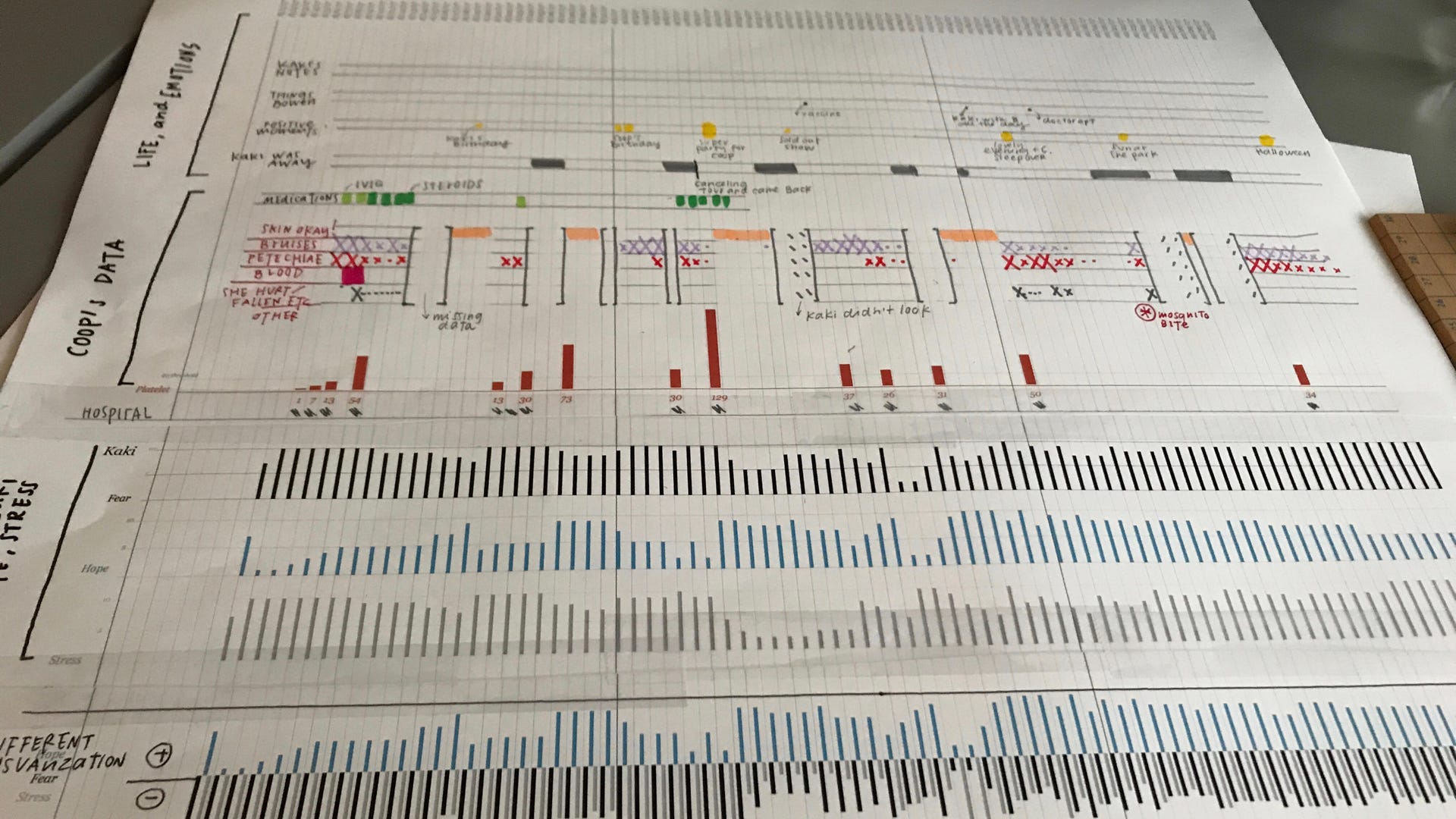
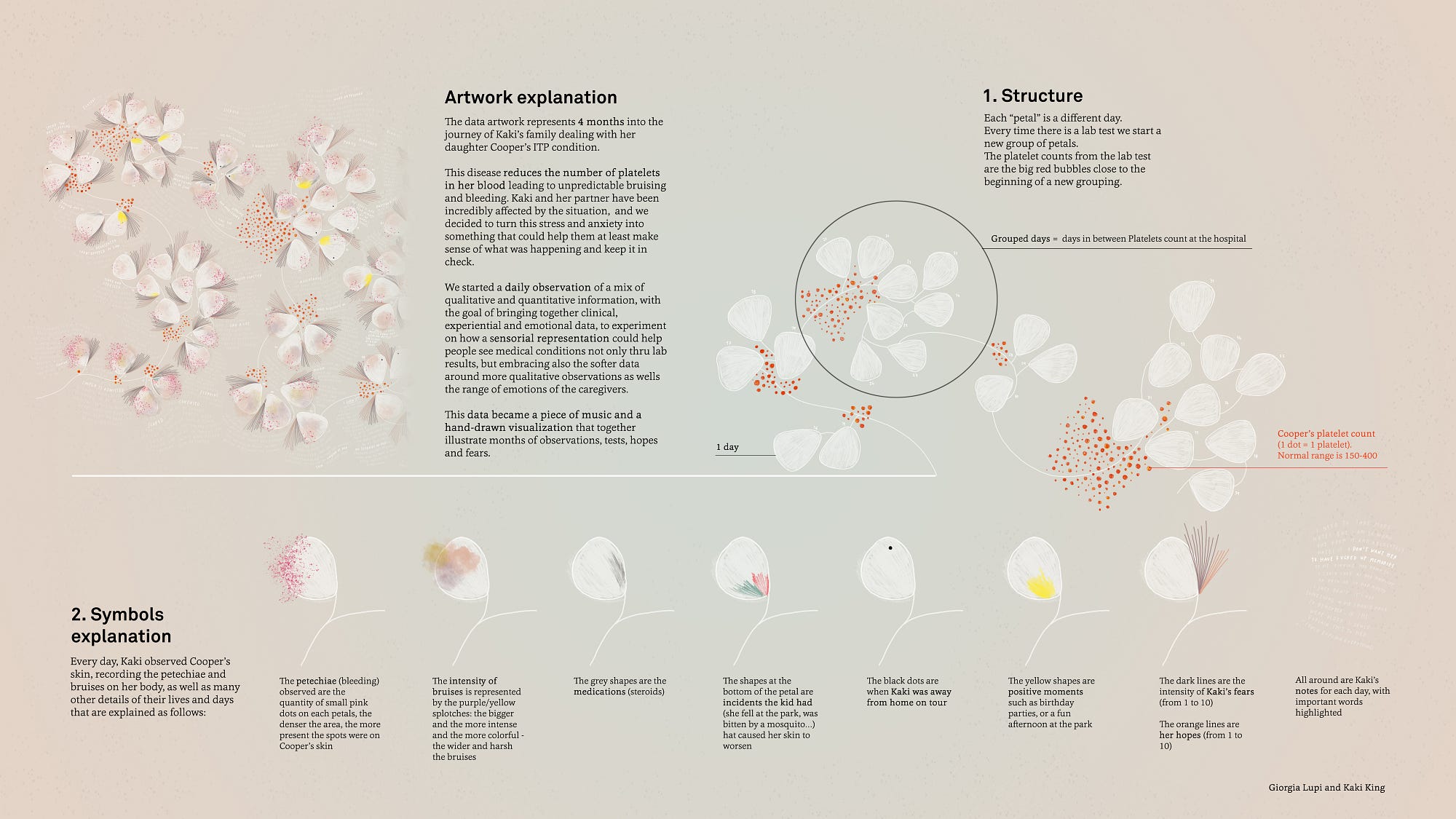
This week, I have decided to review Jenny Hu’s Week 7 Looking Outwards on Giorgia Lupi and Kaki King’s project titled ‘Bruises: The Data We Don’t See‘ (2017). I decided to review project because last week, I reviewed a few projects by Lupi and really enjoyed how she is able to humanise data and convey it in a visceral way. I really enjoyed Jenny’s note about how the creators of this project tied in the sensorial and emotional experience of documenting Kaki’s child’s journey with the ITP condition, as it makes the user feel a lot more connected and be able to empathise with the patient. Further, something I admired about this project was how Lupi and King began the project by hand documenting symptoms and moods by hand via charts and interviews, but were able to piece the information together in a fluid timeline that was sensitive to the context at hand via digital animation. Something else that I found especially visceral about this project was the motif chosen– the white flowers and hand written annotations created a delicate quality, that allowed for the symbols exploration to supplement with a truthful transcription of the pockets of pain and pleasures of the journey. Finally, I love how the animation of the piece (how the petals, text and symbol embellishments fade onto the screen) fills in a ghostly shell, and helps viewers to understand that the child’s journey is every changing and not static, filled with both highs and lows, thus conveying an important piece of the emotional journey while also allowing for artistic direction to occur.
Initial data visualisation work that was translated digitallyKey of symbols used throughout the video
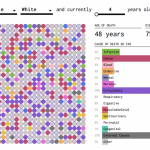
I was looking through Looking Outwards and Jason’s Looking Outwards 07 caught my eye because of the simple little grid. The grid that caught my eyeScreenshot of possible simulations of my life
This project by Nathan Yau simulates causes of death and related mortality rates. I agree with the assessment that the simplicity of conveying complex data is very successful in this project, and that interaction is balanced nicely with customization or individualization. It’s a little strange to think about though, because it compares the individualization to a general population of other simulated individualizations. My first reaction to seeing this chart was how low the mortality rate is for majority of a person’s lifespan, compared to what I assumed it would be; at 70 years old, the Asian female population has only a 9% mortality rate, which is shocking considering all of the negative stats and information that we retain from media. Similarly, Nathan Yau’s othervisualizations on life and death are equally as intriguing, although I think this project is the easiest to understand.
/*
Jamie Dorst
jdorst@andrew.cmu.edu
Project 09
Section A
*/

var underlyingImage;

function preload() {
    var myImageURL = "https://i.imgur.com/Dd4CnQI.jpg";
    underlyingImage = loadImage(myImageURL);
}

function setup() {
    createCanvas(360, 480);
    background(0);
    underlyingImage.loadPixels();
    frameRate(30);
}

function draw() {
    // variables
    // first line coordinates
    var x1 = random(width);
    var y1 = random(height);
    // make line stroke bigger further from the face (slightly above center)
    var distBtwn = dist(width / 2, (height / 2) - 100, x1, y1);
    var sw = map(distBtwn, 0, 350, 2, 10);
    // picture colors
    var ix = constrain(floor(x1), 0, width-1);
    var iy = constrain(floor(y1), 0, height-1);
    var theColorAtLocationXY = underlyingImage.get(ix, iy);
    // second line coordinates
    // make lines shorter closer to the center
    var xy = map(distBtwn, 0, 350, 5, 30);
    var x2 = x1 + xy * random(-2, 2);
    var y2 = y1 + xy * random(-2, 2);
    // randomize stroke caps
    var num = random(2);
    var sCap;

    // assign stroke values
    if (floor(num) === 0) {
        sCap = SQUARE;
    } else if (floor(num) === 1) {
        sCap = ROUND;
    }
    strokeCap(sCap);
    strokeWeight(sw);
    stroke(theColorAtLocationXY);
    // draw lines
    line(x1, y1, x2, y2);
}
For this project, I was inspired by the idea of a painting. I decided to make it draw using lines, and I had it randomly select a stroke cap to emulate even more a random brush stroke. I also made it so that closer to the face, the strokes are shorter and thinner, so that more detail can be achieved. Toward the outside of the canvas, the strokes get longer and thicker. Overall I thought this project was pretty fun to do and try out with different photographs.
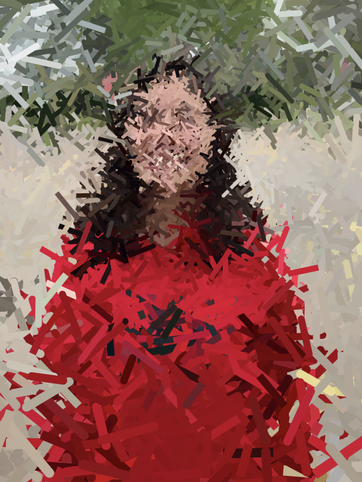
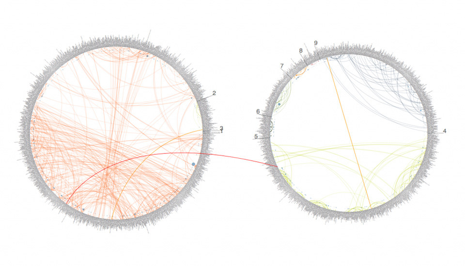
As I was browsing past Looking Outward posts, this one by Liz Maday about the 9/11 memorial caught my eye. I had no idea that the names on the memorial were organized in such a thoughtful and calculated way. The project was done by Jer Thorp, and he created an algorithm that would cluster names based on adjacency and relationships.
The 9/11 MemorialA visualization of the clustering algorithm
Liz mentioned that she thought “this is an amazing example of how a program is able to reflect very human emotions and intentions while also utilizing a precision and complexity that is above human ability,” and I completely agree. I think it’s amazing that we are able to use technology to determine such personal connections, and create something so meaningful. Before seeing this project, I never imagined that something like this was possible–I never thought relationships between humans could be computed in any way.
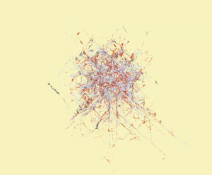
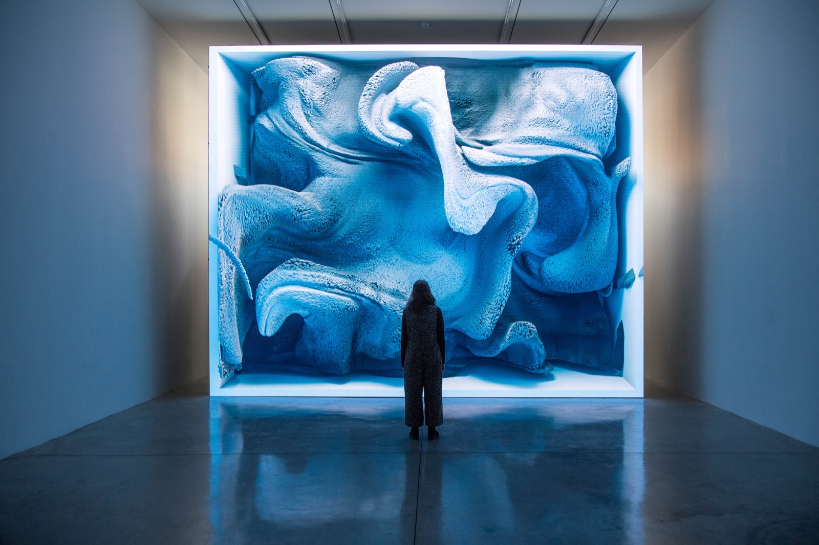
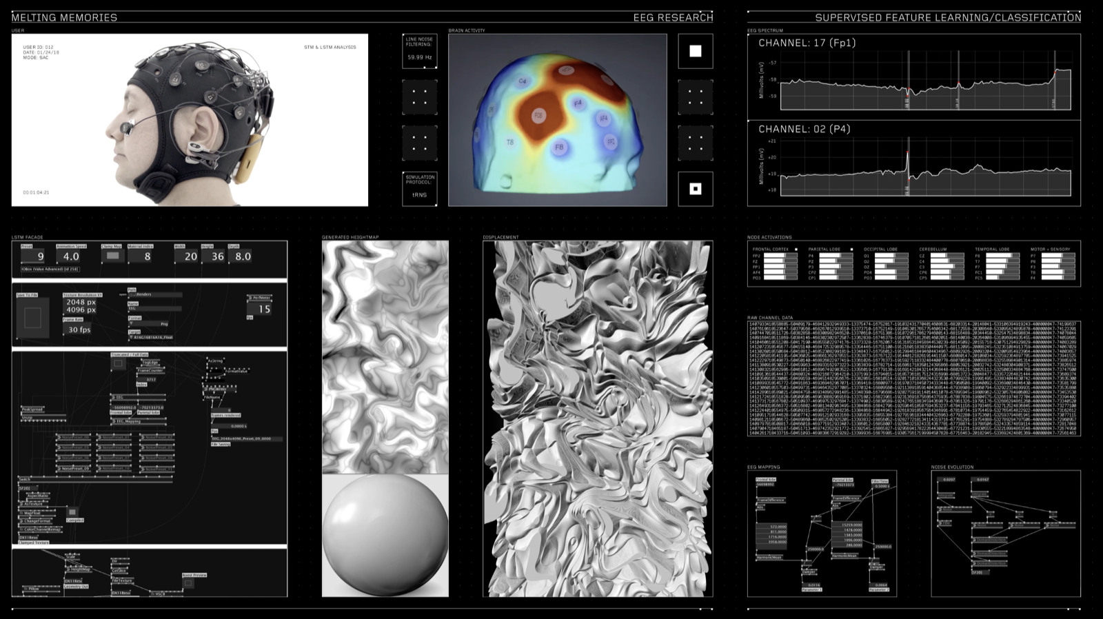
For this week’s Looking Outwards, I found an interesting art piece founded by Shirley Chen. Created by Refik Anadol Studio, the project is called “Melted Memories”.
The main concept of the art piece was to use cognitive controls to create an artwork from our memories. By collecting brain waves and extracting the data, abstract and organic pieces of art are created. This method allows people to have a physical representation of something that is intangible. The memory used to create the art piece was to be a piece of memory from childhood. This would allow different users to have a specific piece of art that is distinct.
Depiction of One Memory From an Individual
I agree with Shirley that this art piece is an amazing piece to help illustrate something that is non-tangible. By doing so, the usage of different computational methods can help enhance this field of art expression.
![[OLD FALL 2018] 15-104 • Introduction to Computing for Creative Practice](../../../../wp-content/uploads/2020/08/stop-banner.png)