For my final project I’d like to do something that would be personally intimate to me and that I can add onto throughout time and go back to and reminisce on.
That’s why for my final project I would like to design an interactive personalized map of the places I’ve been!
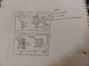
In my room I have a map with little pins sticking out in different colors– yellow for my “home bases” (Pittsburgh and Rochester), blue for the countries I’ve been, purple for places where I have friends, green for weird places my plane has made emergency stops haha, and red for the destination I will go to next.
I want to create something colored in a similar but simplifies way, where when the mouse clicks on a certain region it will pop up with a picture from when I was there and a description of when I went/the place/etc. // a picture and description written by a friend from that place.
My map proposal — the first picture is the map with different shadings, the second is what it would look like upon clicking a certain country, for example
I think this would be a cool way to share with people where I’ve been, as well as serve as a small ribbon connecting the people all over the world who I’ve met.
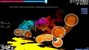
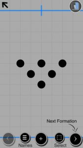
The two projects that are relevant to my project are Osu by Dean Herbert, and Playbook.dance by Greg Lee. Osu is a rhythm game, where players press on the keyboard or click the mouse to the song they are listening to in the game. I admire the game because it has grown to be one of the biggest of its genre, and it has never lost any player engagement; the idea of interacting with music is interesting. Playbook.dance is an application for the iPhone, that allows choreographers to arrange dancers, represented by circles, to create concepts for staging and formations. I like this application because it is easy to use, and pretty flexible. The only negative side of it is that it is becoming outdated, because the author does not update it anymore.
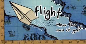
Title screen for “Flight”How the data is collected and visualized (A Dialogue between Four Hands, 2017)
Flight is a paper airplane simulator made by Armor Games, in which you can upgrade your airplane to go higher, faster, and farther. It really only the up and down arrow keys. This project is really interesting (in fact, I played a lot of it as a kid because it’s a fun flash game), but they missed on the opportunity to add difficulty via levels.
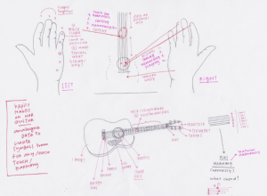
Another project is Giorgia Lupi’s 2017 “A dialogue between four hands.” She finds ways to collect data from a guitarist/drummer, and makes the data look interesting. It’s a great testament to our ability to eke out data from everyday life, not just from things with computers.
These two projects don’t seem to be very connected. However, Flight offers a great opportunity for data collection (simple key presses). The way that Lupi acquires data, on a very individual-level, could be enlightening for how good players of Flight are successful, and how bad players are…not so good.
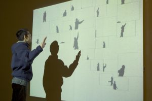
Cause and Effect by Scott Snibbe
After looking extensively through the list of generative artists I found two projects that i was the most interested in. Surprisingly, the projects seemed to be very similar to each other. I decided to look at Design I/O’s Mimic as well as Scott Snibbe’s Cause and Effect. I admire how both of the projects require the user/viewer to move and through this movement, the project will begin to interact. For the Cause and Effect, because it was done in the early 2000’s i believe that the technology from that time could not have lended itself well to visual interest. I think that in both projects the artist could have focused on the visual form more as opposed to the interaction.
I hope that in my final project I will be able to create a visual that reflects the user’s actions in an engaging visual manner.
https://www.snibbe.com/digital-art#/projects/interactive/causeandeffect/
http://design-io.com/projects/Mimic/
In this Looking Outward post I investigated some interactive maps that exist.
Nancy Milholland’s San Francisco Public Art Map
Something I’ve recently spent some time learning and thinking about is that geography and cartography are not static things — they are fluid and can be utilized to show more than just topography and physical location, but culture and thoughts.
Milholland uses a combination of official sources, such as the municipal planning department and arts commission, the SF Mural Arts program, and unofficial sources like Flickr, Instagram and YouTube. This allows her to document not only art officially recognized by the government, that was perhaps governmentally or privately funded, but also art erected more casually and personally.
Screenshot of an artwork’s description
I think what makes this project so powerful is the community-aspect of it. People within the community can contribute to finding and updating where there is art in the city, creating a richer knowledge-base than a more formal assessment that would exclude many less officially created art pieces. In this way, the map can grow and develop and reflect the people who live within its geographic area.
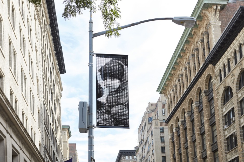
Ai Wei Wei’s Good Fences Make Good Neighbors interactive map
This map allows viewers to explore Ai’s New York City-wide exhibition online by clicking around to the different art pieces he has set up around the city. After selecting one, you can read more about where the inspiration for the piece is from (each piece represents a portrait of an immigrant or refugee who came to America at different points in history and from different places). The map also links to directions so you can physically go and see the piece in person.
Portrait from Good Fences Make Good Neighbors
This map is very personal also, because the pieces reflect the stories and experiences of individuals. Each place is not just a physical location, but a story.
I like the idea of personalizing a map, and having it reflect something about yourself, your community, etc., and I hope to use this inspiration for my final project.
As a kid I always loved maze puzzles; there was even a point in early middle school where I would spend hours not paying attention to school and create my own mazes on graph paper and come back a week or two later to try to solve them. Because I was creating them I had some underlying logic that I was unconsciously implanting, so I solved them pretty quick.
For my final project, I want to create a program that randomly generates a maze that users can solve. I think this would be done with turtle graphics or some sort of recursion algorithm. If time permits, I would like to add animation to the users’ progress in completing the maze and possibly sound.
The project ‘Rotary tumble’ was created by Muharrem Yildirim and David Tinapple in 2012. The amazing part of the project is that both human action and physical principles are integrated into it. The blurring boundary of the physical world and the virtual world is also one idea that I want to achieve in my final project. In addition, the use of sound in the project also strengthens the visual effect. Thinking about how to improve the project, I feel it’s even better to make the screen touchable, meaning that people can move the shapes with their hands, and more sound effects can be added.
The second project is Dream Catcher created by Oggy (full name and date unknown). The amazing beauty of processing can be fully seen in this project. The common feature of this project with the first one and also what interests me the most is that they both imitate natural principles, which in this one is the flow of wind. What I feel missing in the project is sound. Compared to the first one, this one can be seen both as an interactive project and merely a visual project. But both of the projects are very inspiring to my final project.
For my final project, I will be creating an interactive computer keyboard instrument, similar to the example project, “Patatap”. “Patatap” seems like it uses a lot of mellow sounds, creating a very chill atmosphere, when one creates music with the keyboard. However, for my project, I want the sounds to be more EDM (Electronic Dance Music) focused, by having drum beats and boom effects. Originally, since I love makeup and beauty blogging, I wanted to do an interactive makeup game, where a user would give a character a makeover. However, I also love EDM and I thought “Patatap” was pretty cool (I couldn’t stop playing around with it). For some sound ideas, I would extract the sound from some of my favorite EDM like Whiplash by R3HAB, You & Me Remix by Flume, Thief by Ookay, Ghost by Jauz, and the list goes on. I would use Audacity to extract sound for each key, so I would have to extract about 26 different sounds, which would be played with a certain animation.
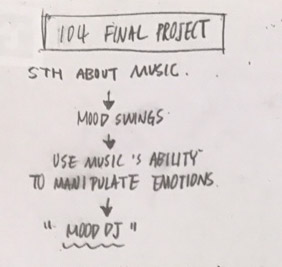
For my final project, I want to incorporate music’s ability to manipulate emotions and create a program that directs users to the music of their ‘current mood’. Although there are many apps that have similar features, I wanted to make my own version that increases the interaction between music, color, and emotions. Also, I will be adding animations in my program.
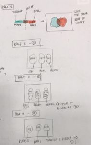
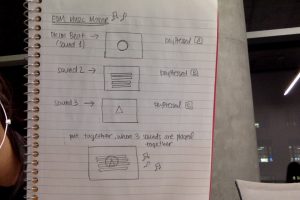
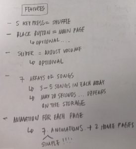
*The structure may change depending on how much storage the program can take*
The program will have 7 different directory pages, each containing up to 5 (or more if the program can take more) songs. To minimize the storage size, I will be cutting the length of each song.
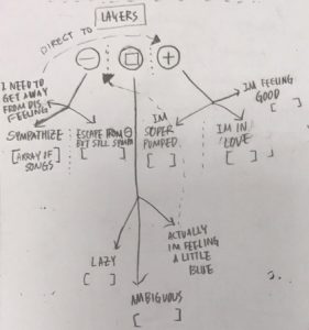
The main page will contain two semi-transparent blobs intersecting with each other. Clicking the blue blob (sadness) will direct the user to a new page with three other blob buttons. Each blob buttons are assorted with a different purpose. For example, one of the blobs is a button that directs the user to the final page that plays music with a simple animation that sympathizes with his/her sadness. Pressing the S button will shuffle the music in the array of songs.
Clicking the other blobs on the main page will also do similar things.
*Since the blobs are very specific to certain feelings and lack at the variety, I will try to map the intensity of emotions in gradient colors. However, this is only workable if I can link the songs to Spotify.*
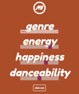
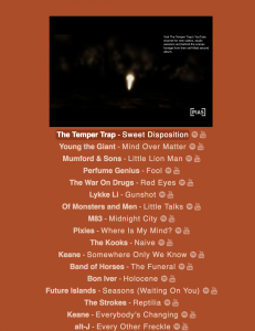
Moodfuse.com is a website that allows the user to discover music based on his/her current mood. In order to load the music, the user needs to choose a genre and adjust the slide bars according to his/her mood. The website is linked to both Youtube and Spotify so it is able to display music videos as well as the information about each song. I was first very impressed by the Moodfuse because of its simple and effective visualization that allows the user to choose the range of emotion.
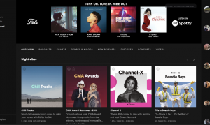
Spotify (pretty self-explanatory) is an app that allows people to stream a wide variety of music. I wanted to mention this app mainly because of its browsing feature. Every time the user opens the app, the algorithm in Spotify selects songs and playlists that are most relevant to the user’s listening history. The selection process is a bit different from Moodfuse since the algorithm ‘guesses’ the user’s taste instead of letting the user describe his/her preference. Thus, Moodfuse is more personalized and relevant to one’s temporary emotion.
![[OLD FALL 2018] 15-104 • Introduction to Computing for Creative Practice](../../../../wp-content/uploads/2020/08/stop-banner.png)


 For my final project, I want to incorporate music’s ability to manipulate emotions and create a program that directs users to the music of their ‘current mood’. Although there are many apps that have similar features, I wanted to make my own version that increases the interaction between music, color, and emotions. Also, I will be adding animations in my program.