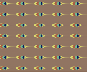
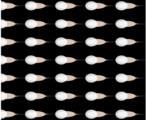
/* Jaclyn Saik
Section E
jsaik@andrew.cmu.edu
Project-05-Wallpaper
Eyeballs
*/

function setup() {
    createCanvas(600, 600);
    background("CadetBlue");
    var xs = 70; //x spacing
    var ys = 50 //y spacing
    var yo = 30; //y offset
    var xo = 30; //x offset


    for (var y = 0; y < 20; y++) {
        for (var x = 0; x < 20; x++)  {
            if (x % 2 > 0) { //odd-numbered rows are offset by 1.5 times the y position
                yo = 30 * 1.5;
                //sleepy eye
                strokeWeight(4);
                stroke("DarkSlateGray");
                line(px-3, py-3, px-20, py-15);
                line(px-4, py-3, px-25, py-10);
                line(px-5, py, px-28, py-3);
                strokeWeight(2);
                line(px+20, py+2, px+10, py+10);
                fill("Burlywood");
                arc(px, py, 40, 40, PI, 0);
                fill("PeachPuff");
                arc(px, py, 40, 20, PI, 0);
                arc(px, py, 40, 12, 0, PI);
                fill("DarkSlateGray");
                ellipse(px, py-5, 10, 10);

                //accent dots, which are connected to the odd-numbered rows, so sleepy eyeball
                strokeWeight(0);
                fill("Yellow");
                ellipse(px-35, py-35, 2, 4);
                fill("gold");
                ellipse(px-12, py-30, 3, 3);
                fill("Orange");
                ellipse(px+45, py-15, 4, 3);
                fill("Khaki");
                ellipse(px+30, py-20, 3, 3);

            } else if (x % 2 == 0) { //even numbered rows stick to original variable values
                yo = 30;
                //wide awake eye
                strokeWeight(2);
                line(px-4, py-3, px-28, py-7);
                line(px-5, py, px-35, py-3);
                fill("PeachPuff");
                arc(px, py, 40, 40, PI, 0);
                fill("AliceBlue");
                arc(px, py, 40, 30, PI, 0);
                arc(px, py, 40, 20, 0, PI);
                fill("Sienna");
                ellipse(px, py-3, 17, 17)
                fill("DarkSlateGray");
                ellipse(px, py-3, 7, 7);

                //some fun text!
                textSize(7);
                strokeWeight(1);
                text("z z . . ", px+12, py-27);

            }
            var py = yo + y * ys; //position y is y offset plus y multplied by spacing
            var px = xo + x * xs; //position x is x offset plus x multplied by spacing


        }

    }
    noLoop(); //so that it is static
}
This project was really fun to do, probably because it’s exciting to see what a design looks like when the visual elements repeatedly interact with themselves across a page. I was inspired by wallpapers that were loud and intrusive, since I felt like the broke the classic look of something appealing and ornamental, and would be something I would be more likely to put in my own home. I found an image online from an artist who creates odd, curious designs.
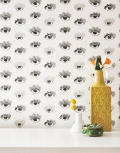
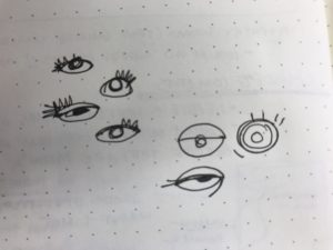
I wanted to see if I could create something on the same subject matter, but with a different, more computed aesthetic. I played a lot with stoke weights and colors to achieve the final look that I wanted, and got to experiment using text as an ornamental feature. I had to be careful with the text and make sure it didn’t say anything that would be irritating if repeated often. I used what I learned Assignment 05-B about offsetting grids in order to alternate the spacing between rows, which I think makes the wallpaper flow better when looking at it from far away. Here are some of my initial sketches for decided what type of eyes to include.
![[OLD FALL 2018] 15-104 • Introduction to Computing for Creative Practice](../../../../wp-content/uploads/2020/08/stop-banner.png)
