Looking Outwards-09 on Looking Outwards-Veronica

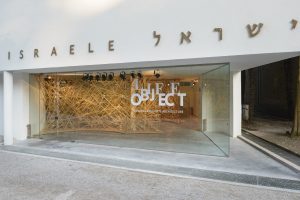
The exterior of the Israel Pavilion showcasing LifeObject

This week I went through my friend Judy’s posts and was inspired by one of the projects she has shared, LifeObject. The project is a biologically inspired interior installation mimicking the behavior of bird’s nests and was designed through 3D scanning and modeling.

Judy wrote in her blog:

There is a system of hierarchy reflected through the process, from design to fabrication to assembly. The entire form is made by the use of gravity and that is where randomness comes into the design.  With the analysis of the bird’s nest, twig-like structures were produced and arranged/bent randomly with a preset value, which means that the form of LifeObject is adaptable. The core is simple, the inner array is varied slightly, and the edges are diverse in static movement.

The introduction and practice of new materials blurred the line between digital fabrication processes and design. And this sort of architectural exploration – properties of materials and modes of transformation – came from the architect’s palette of expression.

I find the project’s narrative of exploring the relationship between human and nature beyond the binary distinction of nature and culture inspiring. I think the project is successful in conveying and contradicting ideas of ecosystems, eco-literacy and system resiliency. The designers described the project as “an assembly of weak and light found materials with no additional joints or glue, out of which emerges a free-form complex structure that is extremely light, robust and highly resilient”. I think the strength in solidarity and cultural resiliency and tolerance contributes to the conversation of globalization and ongoing cultural issues, and LifeObject presents a stance in the Israeli geopolitical context and responds to the crisis with resiliency.

Project-09-Portrait-Veronica

sketch

//Veronica Wang
//Section B
//yiruiw@andrew.cmu.edu
//Project-09

var underlyingImage;

function preload() {
    //loading image from URL
    var myImageURL = "https://i.imgur.com/25qNlPj.jpg";
    underlyingImage = loadImage(myImageURL);
}

function setup() {
    createCanvas(480, 480);
    background(0);
    //loading pixels from image
    underlyingImage.loadPixels();
    //drawing speed
    frameRate(220);
}

function draw() {
    //random pixel from image
    var px = random(width);
    var py = random(height);
    //constraining pixel to canvas
    var ix = constrain(floor(px), 0, width-1);
    var iy = constrain(floor(py), 0, height-1);
    var theColorAtLocationXY = underlyingImage.get(ix, iy);

    noStroke();
    fill(theColorAtLocationXY);
    push();
    //rotate pixel
    translate(px, py);
    rotate(random(0, PI));
    //scale pixel
    scale(random(0.5, 3));
    //draw pixel as rectangles
    rect(0, 0, 10, 6);
    pop();
}

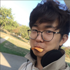
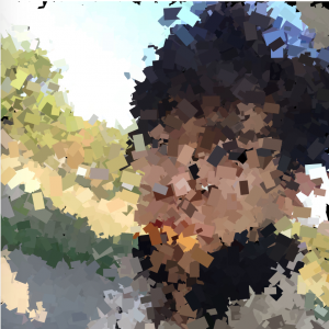
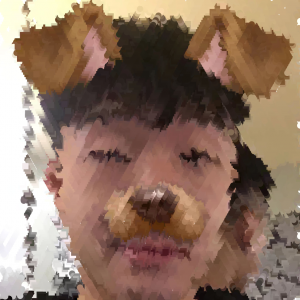
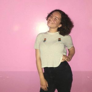
This is an abstract portrait of my friend Yang. I decided to use randomly sized and rotated rectangles to represent the pixels to create a confetti looking effect. The result ended up looking quite abstract.

Original image
Digital Portrait

Sarah Yae – Project 9 – Section B

sketch

//Sarah Yae
//smyae@andrew.cmu.edu
//Section B
//Project 9

var basepic;
var sqsize = 5;
var click = 0; 

//Load Image
function preload() {
    var myportrait = "https://i.imgur.com/ZUZbO4M.png";
    basepic = loadImage(myportrait);
}

//Translates original image 
function setup() {

    createCanvas(275, 300);
    background(0);
    basepic.loadPixels();

//Makes certain pixels into rectangles after retrieving that pixel's color 
    for (var x = 2; x < width; x += (sqsize + 2)) {
        for (var y = 2; y < height; y += (sqsize + 2)) {
            var color = basepic.get(x,y);
            fill(color);
            noStroke();
            rect (x, y, sqsize, sqsize);
        }
    }

}

//Turns image into black and white once mouse pressed 
function mousePressed() {

    createCanvas(275, 300);
    background(0);
    basepic.loadPixels();

    for (var x = 2; x < width; x += (sqsize + 2)) {
        for (var y = 2; y < height; y += (sqsize + 2)) {
            var r = basepic.get(x,y)[1]; //Retrieves a pixel's 1st value in its array 
            fill(r, r, r);
            noStroke();
            rect (x, y, sqsize, sqsize);
        }
    }

}

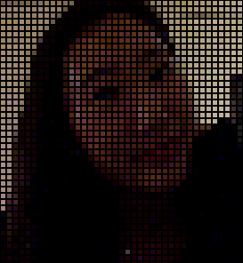
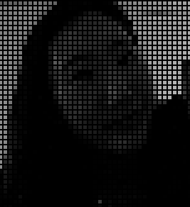
Once you click on the image, the translated image turns black and white. I had a hard time figuring out how  to change the image black and white, but I used pixel array to make it work.

Translated Image with Color
Translated Image into Black and White

Philip Gates – Project 09 – Computational Portrait

sketch

var img;
var x = 0;
var y = 0;
var circle = 20;
var dirX = 1;
var dirY = 1;

function preload() {
    img = loadImage("https://i.imgur.com/YA5ZxuZ.jpg");
}

function setup() {
  createCanvas(391, 480);
  imageMode(CENTER);
  noStroke();
  background(255);
  img.loadPixels();
}

function draw() {

  var pix = img.get(x, y); //gets color of pixel at location x,y
  fill(pix);    //fills circle with that color
  ellipse(x, y, circle, circle); //draws circle

  x+=random(10) * dirX; //sets horizontal wobbly direction for traveling "snake"
  y+=random(10) * dirY; //sets vertical wobbly direction for traveling "snake"

  //code below: if snake goes out of bounds in canvas
  //then restart in a random location
  //with new snake size and reversed direction

  if (x > width || x < 0) {
    x=floor(random(width));
    circle=random(10,25);
    dirX = -dirX;
  }

  if (y > height || y < 0) {
    y=floor(random(height));
    circle=random(10,25);
    dirY = -dirY;
  }

}

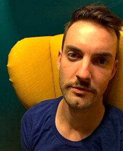
I enjoyed this project quite a bit. I chose to go the narcissistic route and make a self-portrait, mostly because I recently painted my apartment and took this selfie against the new wall, and I really like the color palette of this photo.

I started with the pointillism example for reference, but I knew I wanted to make a portrait that gradually filled in with moving lines, rather than random dots/points. What ended up emerging was this kind of “snake” made up of circles moving across the canvas.

Here’s the original photo:

Alessandra Fleck-Looking Outwards-09

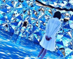
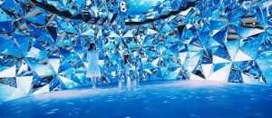
For this looking outwards, I wanted to look at Yingyang Zhou’s Looking Outwards 08 entry on media artist Chris Cheung. According to Yingyang, Cheung’s work is inspired by the intersection of light rays though a Brilliant cut grade diamond. Yingyang describes the phenomenon of Cheung’s work as “…splendors of our mother nature, ranging from the galaxy and distant stars, rare gemstones, glistens of flowing water, and refracted light beams.” Looking at Cheung’s work I agree that perhaps a key foundation to his work stems from a subtle, yet elegant event of light refraction that brings life to varying elements of mother nature. The fact that the theme of the project carries such a universal language, I think is very interesting. Additionally to Yingyang’s analysis on Cheung’s work I also think that as seen in his installation, Prismverse, the illuminated interior that as Yinyang notes is a metaphor for “the instant tone-up effect of Dr.Jart + V7 Toning Light” also acts as moment of extraction. What Cheung’s work seems to do is take a rudimentary event that occurs in nature and blows it up into a perspective that we can walk into. Typically the type of light refraction Cheung illustrates does not occur at such a large scale. Pulling the scale up and displaying the work at such a large level highlights the subtle beauty that is otherwise overlooked.

The images below shows the glowing effect of the Prismverse installation.

Link to the original looking outwards post by Yingyang Zhou: https://courses.ideate.cmu.edu/15-104/f2018/category/looking-outwards-08/

Link to bio of Chris Cheung: http://eyeofestival.com/speaker/chris-cheung/


Shirley Chen – Project 09 – Portrait

sketch

// Shirley Chen
// Section B
// junfanc@andrew.cmu.edu
// Project 09

var myPic; 
var x;
var y;
var dx;
var dy;
var colAtPoint;
var count = 0;

function preload() {
    var myPiclink = "https://i.imgur.com/uktbZVu.jpg";
    myPic = loadImage(myPiclink);
}


function setup() {
    createCanvas(480, 480);
    background(255);
    myPic.loadPixels();
    x = random(width);
    y = random(height);
    dx = random(-1,1);
    dy = random(-1,1);
    frameRate(20);
}


function draw() {   
    
// get the pixel color for the geometry
    var ix = constrain(floor(x), 0, width-1);
    var iy = constrain(floor(y), 0, height-1);
    colAtPoint = myPic.get(ix, iy); 
    noStroke();
    fill(colAtPoint);
//If the number of pressing the mouse is even, then draw ellipse
    if (count % 2 == 0){
        ellipse(x, y, 10);
    }
//If the number of pressing the mouse is odd, then draw sqaure
    else{
        rect(x,y,10,10);
    }

//Update the coordinates of the geometry
    x += dx * 5 ;
    y += dy * 10  ;

//Make the geometry bounces back when it hits the boundry
    if (x > width || x < 0) {
        dx = -dx
    }  
    if (y > height || y < 0) {
        dy = -dy        
    } 

    
}

//When the mouse clicked there is a new serie of geometry being drawn with oppsite direction
function mousePressed() {
    count += 1;
    x = mouseX;
    y = mouseY;
    dx = -dx;
    dy = -dy;

}

For this project I used one of my best friends photo. I used two different geometries – square and circle to gradually reveal the photo by displaying pixels of the photo. The displaying geometry will change between these two by the user clicking the mouse. The square and circle would bounce back when they hit the boundary of the canvas. Therefore, the image will gradually show up at the paths that are drawn by these geometries.


Twenty Second Later

Two Minutes Later

Final

Meejin Koon // Howeler + Yoon Architecture

For this week’s blog post, I am taking a deeper dive into the Howeler + Yoon Architecture firm from Min Lee’s Week 8 Looking Outwards on Meejin Yoon.

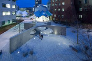
I actually had the pleasure of seeing 2 of their projects on a studio trip to Boston last summer. One project I really want to highlight from this firm is the Collier Memorial on MIT’s campus.

Sean Collier Memorial, MIT, Boston, Howeler + Yoon

This project is a memorial to an officer, Sean Collier, that was shot and killed in 2013. As most memorials result in statues, plaques, benches, etc. I remember being completely inspired by this project’s ambition, structure, and integration into the public landscape.

Now looking further into this project, and learning more about the firm from Meejin Yoon, I have learned that the entire design and structural analysis utilizes computational design. I believe the project mainly utilizes Rhino 3D Modeling Software and Grasshopper, a Rhino plug-in for computational and parametric design.

Computational model of Memorial

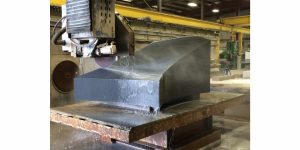
The structure being constructed of 32 granite blocks presents new challenges that are wouldn’t be the same for something like poured in place concrete. So for this project, not only was the design computational, but the actual fabrication of these pieces used a combination of manual labor and robotic sawing.

Fabrication of memorial at Quarra Stone Co., in Madison, Wis.

What I really appreciated in Min Lee’s piece is the emphasis on the idea of public/private space. With the Collier memorial, the project has transformed a public area to create new spaces for the public to interact with, rather than look at or observe. This firm is really combining their design goals with the right tools and software to make them happen.

Tanvi Harkare – Looking Outwards 09

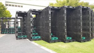
For this looking outwards, I liked the project that Romi Jin covered in her looking outwards 3 about computational fabrication. As an architecture major, computational design is one of the many ways we can design buildings for the future. The specific computational project was HG’s opening chronometry. I agree with the fact that using a tool called Grasshopper to create parametric designs are a very easy way to create iterations in your design process, versus trying to record all those things by hand. My favorite project by this group is their Hide-and-Seek project, which is an art museum and cultural space. They used computational design to create a labyrinth of corridors that visitors can use to go through series of small spaces. Users are to “hide and discover each other” through different material transparencies and stairs. The main building material is recycled plastic pallets & LED lights for lighting, which is an unusual combination of materials I haven’t seen before.

Click here for a link to the original looking outwards post, and click here for the link to the project!

The Hide & Seek pavilion

Min Jun Kim- Looking Outwards 9


Multiverse by fuse*

This week I’ve decided to do a peer review of a Han Yu’s looking outward’s post. I found a post that is very interesting and it contains a project that immediately drew my attention. It is a art installation that has heavy usage of both visuals and sounds by a company called fuse*. The project is representative of the vastness of the multiverse that is infinite and always going through the cycle of life- that is, the birthing and the dying of the universe. Personally, I thought that the project was very engaging as an artform that encourages the audience to fall into deep thought. It really showed the immenseness of the universe with huge displays with patterns that never repeats itself. I thought that the experience of the project could have been improved had the screen been wider horizontally (like a room) and had different noises that blend with the visual display- or had other features such as user interation. Otherwise the I would have to agree with the poster about the influence that it has on the viewer- it really does give a sense of the infinite possibility of life. Overall, it was a super unique project with very good execution.

Link to Original Work: https://courses.ideate.cmu.edu/15-104/f2018/2018/09/18/han-yu-looking-outwards-04/
Creator’s name: fuse*
Created in 2018 in Italy

cmhoward-project-08

click me!

cmhoward-09

var img;

//decalre initial gridsize
var gridSize = 50

function preload() {
    var myImageURL = "https://i.imgur.com/h0fNs2y.jpg";
    img = loadImage(myImageURL);
}

function setup() {
    createCanvas(600, 600);
    background(0);
    img.loadPixels();
    frameRate(500);
}

function draw() {
    for (var x = 0; x < width; x += gridSize) {
        for (var y = 0; y < height; y += gridSize) {
            //rectangle color
            var theColorAtLocationXY = img.get(x, y);
            fill(theColorAtLocationXY);
            noStroke();
            //array squares in grid
            rect(x, y, gridSize, gridSize);
        }
    }
}

function mouseClicked() {
    //make grid size smaller when user clicks
    gridSize -= 1
    //reset gridSize
    if (gridSize < 5) {
        gridSize = 50;
    }
}

For this project, I wanted to create a pixel grid that becomes smaller and thus, clearer as the user clicks!

The  beginning image:

The final rendering:

I wanted the image to stop at a certain resolution so it maintains the pixelation effect, so it resets after a certain amount of clicks.