Xiaoying Meng- Looking Outwards 05

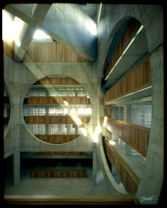
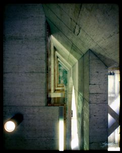
(Phillips Exeter Academy Library by Alex Roman)

These are two photo-realistic architecture renders made by Alex Roman. Other examples can be found here. The quality of light and texture make the renders look like photos. I admire 3D computer renders such as this one because they make the viewers feel like they are in the space, looking at the building. They emphasize the details of the building, qualities that people might miss. I think the algorithms that rendered the works might be linking color and light intensity together, using different colors to describe the quality of light. The algorithms might also be using the size of pixels to describe the smooth/roughness of materials. The artist can choose to express a specific quality of the building or the vibe he/she wants the viewer to experience.


yinjiet-LookingOutwards-05

3D Computer Graphics — Transformers

CGI & VFX Showreels: ILM “Transformers 3” by Brad Kinley

Talking about three dimensional computer graphics art, Transformers series must be one of the masterpieces.  The 165-minute movies are mostly about intricate giant robot actions. It is extremely data-heavy behind the scene. The artwork starts with a lot of design and photoshop in 2D. Then they producers turn the 2D artworks into a 3D characters and built all its little pieces little by little. For example, Optimus has over 10000 pieces in him and every single piece in him has to modeled correctly. For me, the whole movie is like a collection and every single robot is like a piece of 3D computational artwork. With all the structures, colors, animations and etc come together, the robots become realistic on the screen.

source link: https://www.creativebloq.com/making-transformers-3123105


Sean Meng – Looking Outwards 5

The Avatar

The left image shows the blue cat-like alien Neyitiri shouting. The right image shows the actress who portrays her, Zoe Saldana, with motion-capture dots across her face and a small camera in front of her eyes.

The computational-capture graphics technique

Speaking of computational 3D artwork, the first project that comes to  my mind is definitely the 2009 sci-fic movie Avatar by James Cameron. I still remember when I first saw the movie, I was totally shocked by the breathtakingly beautiful scene: the Avatars, the enormous valley, the dragons etc. I was even more surprised when I knew those graphics were computer generated. The director planned to make use of photorealistic computer-generated characters, created using new motion capture animation technologies he had been developing in the 14 months leading up to December 2006. Innovations include a new system for lighting massive areas like Pandora’s jungle, a motion-capture stage or “volume” six times larger than any previously used, and an improved method of capturing facial expressions, enabling full performance capture. To achieve the face capturing, actors wore individually made skull caps fitted with a tiny camera positioned in front of the actors’ faces; the information collected about their facial expressions and eyes is then transmitted to computers.

Reference:

http://www.avatarmovie.com/

Austin Treu – Looking Outwards 05

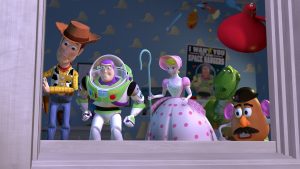
In this post, I would like to highlight 3D graphics in general, referencing a few projects throughout. If you were to graph the speed of technological progress in the last century, I’m sure it would look like some sort of exponential function. Disney Pixar’s Toy Story was the world’s first animated movie featuring 3D graphics.  While it was technologically impressive for its time, the animation from that movie looks incredibly primitive today to anyone’s eyes. Compare that to something like Avengers: Infinity War. While it uses human actors with motion capture, nearly everything in that movie is animated using computer-generated graphics. The resolution, textures and shading are so good that they can make these extraordinary scenes and events seem as real as the movie’s actors. And this is just in a period of 23 years! I cannot imagine how far we’ll go in the next 23! Currently we can animate things to look real enough to trick our eyes into thinking something presented to us in a VR headset is real, but this is just the advent of VR. Progressing with these sorts of graphics capabilities presents a fascinating picture for the future. We could have movies that take place around us that are so realistic that it’s impossible to tell them from reality. Maybe they could even be able to generate graphics around the viewers and involve them in the action. Whatever happens, the result of the future of 3D graphics will be fascinating.

Jisoo Geum – Looking Outwards 05 – 3D Computer Graphics

INTANGIBLE MATTER 2016

By Lucy Hardcastle

work: https://lucyhardcastle-thefifthsense.i-d.co/en_gb/

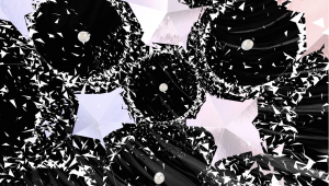
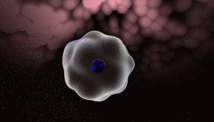
Intangible Matter is a browser-based interactive motion graphic created by Lucy Hardcastle, which recreates a visceral experience of the Chanel perfume No.5 L’Eau.

For this particular project, Hardcastle collaborated with web/content developers, sound artists, and animators who work with software such as Javascript, Maya, Adobe programs, and etc. What I admire the most about this project is its full utilization of every possible artistic element in the creation of the final browser. The web form allows people to interact with the content physically, while visually engaging them with grandeur motion graphics. In addition, the sound embedded in every theme brings the audience even further to the experience. While Hardcastle’s artistic sensibilities are best represented in the visual rendering of texture and intangible experiences, I believe that the interactive feature of the final art form – how users have to click and complete every task to move further – works as a powerful element that makes this project unique.

Project-05-Wallpaper-Veronica

sketch

/*
Veronica Wang
Section B
yiruiw@andrew.cmu.edu
Project-05
*/

function setup() {
    createCanvas(600, 780);
    background('pink');   

    var tw = 50; // x spacing
    var th = 50; // y spacing
    var newTh = th * sqrt(3) / 2; // new y spacing

    var ang = radians(60); //radians to degrees
    var offset = tw / 2; // new x shift

    
    var ox = 0; // ellipse center y
    var oy = 0; // ellipse center x
    var num = 10; //elements per row

    for (var y = 0; y < 80; y++) {
        
        //if its an even number row, have one less element
        if (y % 2 == 1){
            var z = offset;
            num = 20;
        }
        //if its an odd number row draw all elements
        else{
            var z = 0;
            num = 20;
        }

        //draw circle grid
        for (var x = 0; x < num; x++) {

            var py = oy + y * newTh;
            var px = ox + x * tw + z;
    
            noFill();
            stroke('white');
            ellipse(px - 50, py, 100, 100);
            fill('white');
            ellipse(px - 50, py, 10, 10);
            stroke(5);
            strokeWeight(2.5);
         
        }


    }
    noLoop();
}


function draw() {
    // draw is not called due to noLoop() in setup()
}

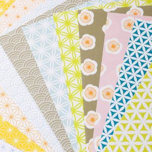
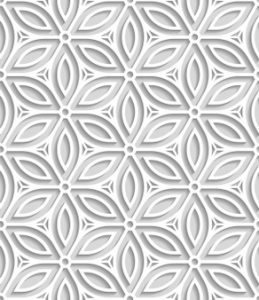
In this assignment I was inspired by Japanese origami paper patterns and decided to play with repeated patterns of simple geometry.

I altered the hex grid code so that the circles start overlapping and then I added nodes to the connection points. I am happy with the result and wouldn’t mind using this as a wallpaper in my room.

Looking Outwards-05 3D Computer Graphics-Veronica Wang

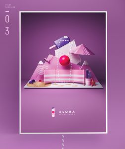
ALOHA Illustration
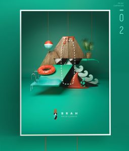
BRAH Illustration


This is a project by Saatchi & Saatchi IS in Poland. It’s a series of advertising/branding illustrations for Nobile Sports in Poland, and the dotted line in each image represents the pattern on their surfboards. I think it’s a clever idea and the graphics of the miniature scenes were very nice.

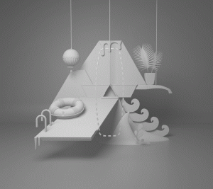
Clay Render

The illustrations were done using Cinema4D, and they modeled each element in the software for rendering and color is added later on.

Marketing Image

https://www.behance.net/gallery/51225177/Nobile

Jisoo Geum – Project 05 – Wallpaper

sketch

// Jisoo Geum
// Section B
// jgeum@andrew.cmu.edu 
// Project-05
var rect1y = 50;
var rect1x = 10;
var rect2xy = 25; 
var rect3y = 81;
var rect3x = 0;
var rect4y = 0;
var rect4x = 50;

function setup (){
	createCanvas(600,600);
	background(1,59,255);  
}

function draw(){
    // red lines 
    for (var redvertX =5; redvertX<width; redvertX+=10){
            stroke(252,59,69);
            line( redvertX, 0, redvertX, height ); 
    }
    // yellow lines 
    for (var yellowY = 40; yellowY < height; yellowY +=100){
        stroke(255,190,8);
        line(0,yellowY, width, yellowY);
    }
    //first rect layer (3rd one from the right top)
    for (var numbY= 0; numbY < 6; numbY++){ // the y number of squares increase till 6 
        for (var numbX = 0; numbX < 6; numbX++){ // the x number of squares also increase till 6
            var r1y= rect1y +numbY * 100; // position of y increases by each tile
            var r1x = rect1x +numbX * 100; // position of x also increses
        fill(1,59,255);
        stroke(255);
        rect(r1x,r1y,40,40);
    // 2nd rect layer (2nd one from the right top)
            var r2y= rect2xy +numbY * 100;
            var r2x = rect2xy +numbX * 100;
        fill(1,59,255);
        stroke(255);
        rect(r2x,r2y,50,50);
    // 3rd rect layer (bottom left corner)
            var r3y= rect3y +numbY * 100;
            var r3x = rect3x +numbX * 100;
        noFill();
        stroke(255);
        rect(r3x,r3y,19,19);
    // 4th rect layer (top right)
            var r4y= rect4y +numbY * 100;
            var r4x = rect4x +numbX * 100;
        noFill();
        stroke(255);
        rect(r4x,r4y,50,50);
     }
    }
}

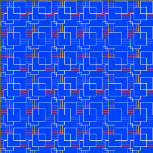
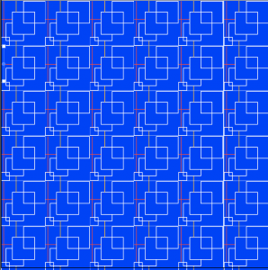
I decided to create a geometric pattern that looks interconnected.

The final pattern turned out to be more simple than my initial design because I could not create a big gap between every 10 or 3 lines as shown above.

I tried to reduce the number of lines like the picture above, but I ended up creating dense lines using the for-loop.

Daniel Teague – Looking Outwards 05 – 3D Computer Graphics

Title: Guilty Gear

Creator: Daisuke Ishiwatari

Latest releases: 2016 and 2017

While I am aware the prompt asked us to refrain from using video games for this post, I chose this video game title for two reasons: I was actually introduced to this title by my younger brother, and the interesting interaction of 2D and 3D models and styles within the latest versions of the franchise.

As previously stated, I was introduced to this title by my younger brother. Both he and I are big video game fans, but we tend to stick to our respective genres: FPS and strategy games for me, and RPGs and fighting games for him. Guilty Gear falls into the latter category, and so naturally gained the attention of my brother. Normally this would mean I would have little interest in the title, but watching him play it, I was intrigued by something. As one can see from the top picture, the game typically appears in what looks like a 2D format. Most fighting games nowadays, like most video games, use a 3D format. When I noted this, my brother corrected me, saying that, in actuality, the game was 100% 3D. As I was confused by this, he proceeded to show me how the seemingly 2D character models were in fact complete 3D models, a fact which became immediately apparent when certain moves were made or events were triggered.

This setup of 3D models in a semi-2D style absolutely fascinated me and my brother, especially in relation to anime, another media form we’re both fans of and which has often used 2D formats but recently begun using 3D as well. Many have disliked some of the 3D adaptations or additions to classic anime shows, and my brother and I agreed that the use of styles such as the type found in the latest Guilty Gear games would allow for flexibility in areas like anime that wish to both retain the “traditional” 2D format while taking advantage of the possibilities 3D offers.

This graphic style apparently involves special modeling and artistic rendering, as it takes special effort to make the 3D models look 2D from certain angles only. This likely means that special algorithms are used which keep the “camera” or viewpoint fixed in certain positions until any one of various events are triggered, or special care is required to change how the models look from different perspectives. Considering the game seems to be partially developed in Japan, where anime traditionally comes from, it seems likely that many of the artists involved in the games creation had some experience in both 2D and 3D rendering.
Hunky-Dunky Creative Studio

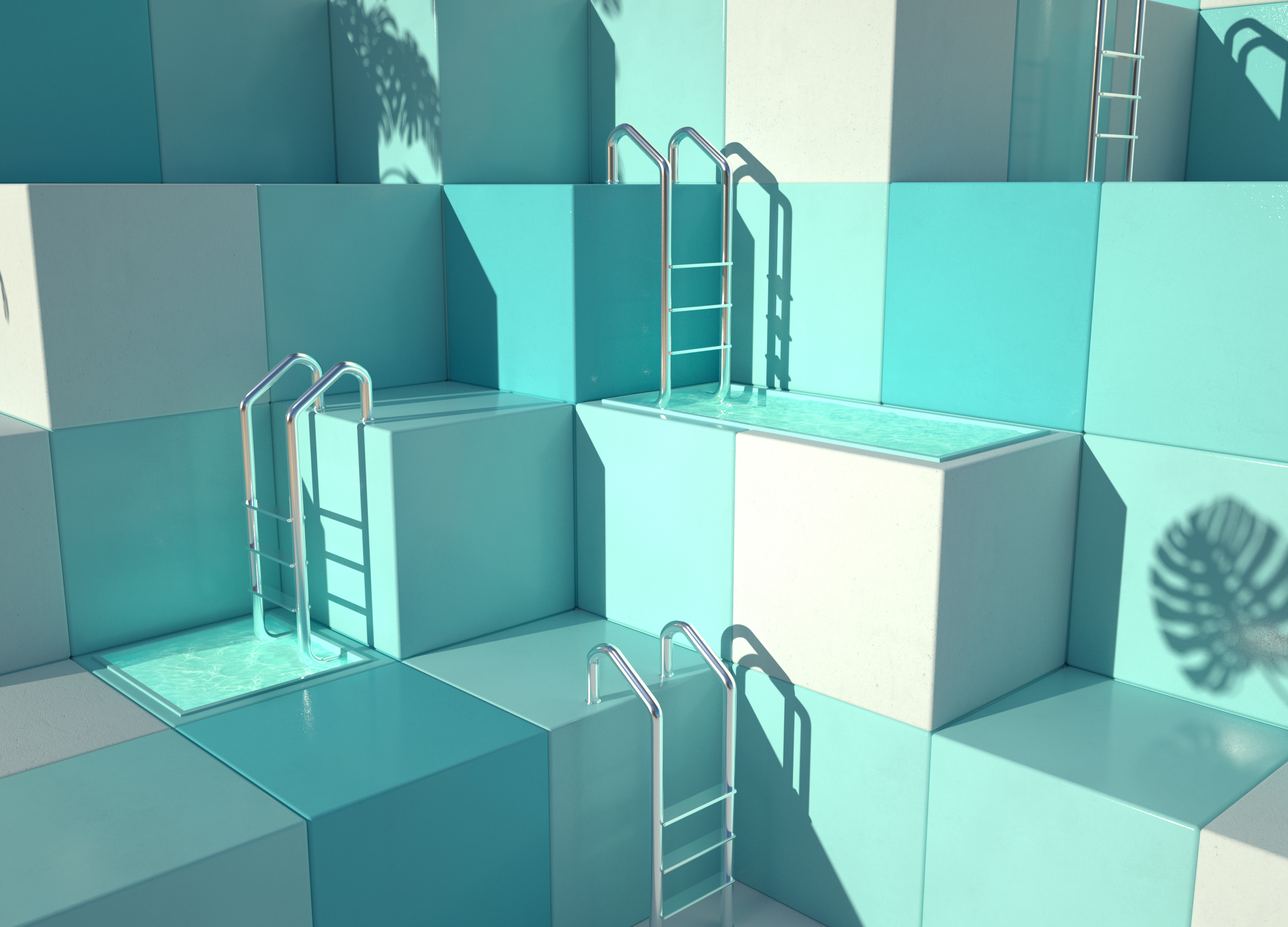
Hunky Dunky is a creative design studio based in Spain, that specializes in 3D art and animation.

Animation from Summer Diary collection

I am completely mesmerized by this studio’s animation and design style. This design studio uses a combination of rendering and illustration techniques. Rendering is the process of adding shading, texture, and color to a drawing that creates a realistic form. Using rendering software, which is a hardware based process, 2D images become 3D.

Rendering from Summer Diary Collection

The artists, 3D Artist Yonito Tanu and Art Director Jessica Chapiness, refer to their medium as CGI. CGI is computer generated imagery which refers to a non-static image, such as the dynamic animation we see in CGI rendered movies. This dynamic form of CGI relies on algorithms that triangulate surfaces, often based on fractal algorithms that recursively zoom in further to smaller triangles.

In in interview with ballpitmag, the artists stated that they intend on “creating surreal worlds we wish to live in.” With their use of color, form, and hyper-realism- the artists have definitely drawn viewers into their surreal world.

See more of their work here: http://www.hunky-dunky.com/