Hannah Cai—Looking Outwards—09


link to the article

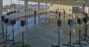
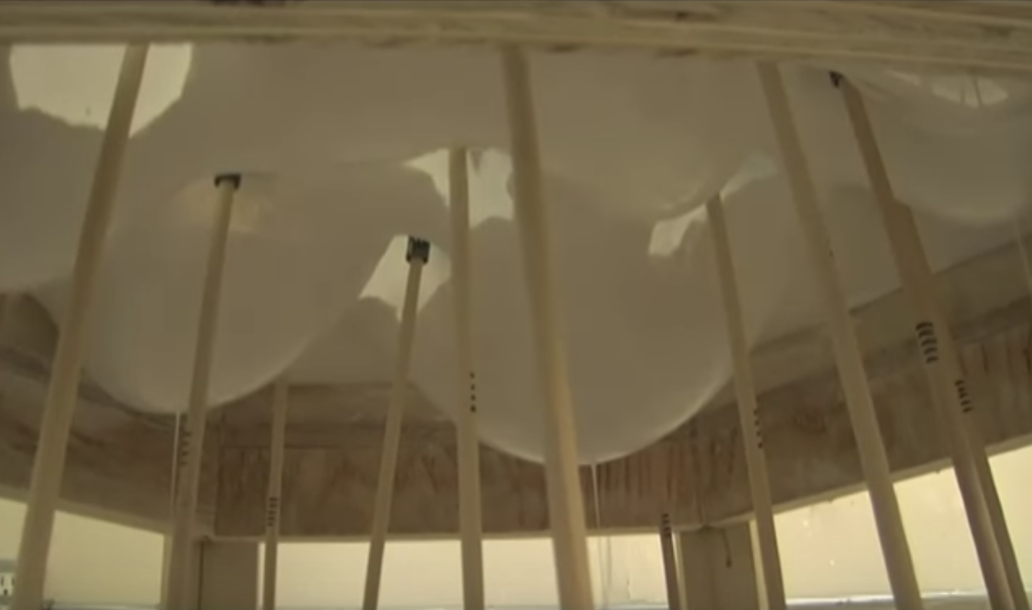
This post is a response to rjpark’s Looking Outwards 04 on the Artist Andrius Šarapovas’ room-sized interactive musical sculpture. The installation uses an algorithm to take 4G data and convert it into sound, consisting of 16 notes: C, D, F and G, spread across four octaves.

rjpark commented mostly on the inherent simplicity yet external complexity of the project—how the 77 individual units combined and placed throughout the room created such a complex soundscape. While I agree on the impressiveness of the generated soundscape, I think the installation is actually inherently pretty complex, due to all the filters and “instruments” those 16 notes are being played from (a metal bar, sound activator, sound damper, resonator, and mechatronics). I’m actually really curious how the network data was converted into sounds, and what choices were made in the formulation of the algorithm. Do the four notes mean anything in correlation to the data, or were the just chosen to create an appealing chord? What do the different textures of sound stand for? Overall, I like the end product a lot, but like many other projects which map data to a different output (sculpture, sound, visuals, etc), I wish there was more correlation between the input and output; otherwise the end products feel beautiful, but arbitrary.

Hannah Cai—Project 09—Portrait

(move mouse around to paint, click and drag to erase.)

/* Hannah Cai
Section C
hycai@andrew.cmu.edu
Project-09-Portrait
*/

var img;

//brush start position is top left corner of the canvas
var x = 0;
var y = 0;

//load image
function preload() {
    img = loadImage("https://scontent.fagc2-1.fna.fbcdn.net/v/t1.0-9/44824245_1935019013257397_3442166024294629376_n.jpg?_nc_cat=106&_nc_ht=scontent.fagc2-1.fna&oh=20689f4ef54a6fc95922b240a2579026&oe=5C552C4F");
    
    //sorry for long link, it's from facebook,
    //I tried url shorteners but they messed up the program
}

function setup() {
    createCanvas(480, 480);
    background("RosyBrown");

    //load pixels from image
    img.loadPixels();
}

function draw() {
    
    //get the color of the image at the current position (x, y)
    var col = img.get(x, y);

    //click and drag to erase
    if (mouseIsPressed) {
        noStroke();
        fill("RosyBrown");
        ellipse(mouseX, mouseY, random(5, 20));

    } else { //if mouse isn't pressed,

        //draw an ellipse with random size at (x, y) with the color from col
        noStroke();
        fill(col);
        ellipse(x, y, random(5, 20));

        //ellipse follows mouse around; move mouse around to paint
        var dirX = mouseX - x;
        var dirY = mouseY - y;
        x += dirX / 5;
        y += dirY / 5; 
    }
}


I tried a lot of different variations for this project. The one I settled on is pretty simple in terms of the code, but I liked its aesthetic the most. This program invites the user to “paint” the portrait themself (including the option to erase content by clicking and dragging) adding an element of interactive discovery and intimacy.

Here’s what a “painting” could look like:

And here are some of the variations I did before choosing the final one:


Alexandra Kaplan – Project 09

sketch

/*
Alexandra Kaplan
aekaplan@andrew.cmu.edu
Section C
Project - 09
*/

var img; //image
var w; //width of balloons

function preload () {
    img = loadImage("https://i.imgur.com/0F4euVwm.jpg?2") //loads image
}

function setup() {
    createCanvas(320, 315);
    background(0);
    noStroke();
    img.loadPixels(); // loads pixels
    frameRate(200); // fast
}

function draw() {

    var x = floor(randomGaussian(width / 2, 75)); // draws balloons concentrated in the center
    var y = floor(randomGaussian(height / 2, 75)); // draws balloons concentrated in the center
    var col = color(img.get(x, y)); 
    var d = dist(x, y , width / 2, height / 2);
    w = map(d, 0, width, 1, 10); // balloons in center are smaller than edge
    fill(col); // fill is color of image at x and y
    stroke(col); // stroke color is color of image at x and y
    balloon(x, y, w, w); // draws balloon
}

function balloon(x, y, w){
	strokeWeight(0.5);
	line(x - (w / 12), y, x - (w / 12), y + (w * 2)); // draws balloon string
	strokeWeight(0);
	ellipse(x, y, w, w); // draws filled up balloon 
	triangle(x - (w / 4), y + (w / 1.5), x + (w / 4), y + (w / 1.5), x, y); // draws balloon nubbin
}

I had a lot of fun finding a picture for this project, and I ended up going with a photo I took of my housemate at the end of last year when we filled up another housemate’s room with balloons. For the computational image, I decided that it should be made up of balloon shaped pixels. The pixels are bigger and more concentrated in the center (and therefore a higher resolution) and bigger and less concentrated on the outskirts.

Beginning of image
Closer to end of image
Original Image

Christine Seo – Looking Outwards 09

Ariel view of Janet Cardiff’s The Forty Part Motet, 2001 at At the Fort Mason Center for Arts + Culture, Gallery 308

This installation was by Janie Cardiff, which displayed forty separately recorded voices are played back through forty speakers strategically placed throughout the space. It was exhibited in a lot of different locations and was recorded by the congregational choir of the Gothic Salisbury Cathedral. This project was mentioned by Joanne Lee, in her Looking Outwards 04; she is in my Section C recitation. She pointed out that “There is something unique about the way all of the voices travel to the audience and mesh together to hit you at once, and that can only be experienced live. This installation seems to emulate that experience despite using speakers by giving each voice a different speaker channel.” I agree with what she said because the installation has 40 speakers playing a track in the recording, where each singer has their own individual mic attached to them.

Additionally, I am very intrigued by the experience the audience can interconnect with the installation. I think it is interesting to be able to place yourself into this installation. The interaction that happens where you, as the audience, can control (by where you are standing in the room) is a different level of technology and experience that people can have with sound. I actually was able to experience this installation myself at the Nelson Atkins Museum of Art, so I know how intricate each voice and connectivity is.

Caption: experiential video representation of The Forty Part Motet at The Art Gallery of Ontario

https://www.cardiffmiller.com/artworks/inst/motet.html

Alexandra Kaplan – Looking Outwards – 09


I chose to look at Sophie Chen’s Looking Outwards Week 5, a 3D animation for TEDx Sydney 2018 created by Rich Nosworthy and directed by Scott Geerson. When I read Sophie’s comments about how unbelievable it is how the project is all computer generated, I knew I had to take a look. I completely agree with Sophie, I can’t believe the amount of work and detail that went into this animation. If I didn’t know beforehand it was all made on the computer I probably would not have realized that fact most of the video. I thought that the project itself was very impactful. The visuals and audio paired well together to create a surprisingly powerful and emotional piece about humankind.

Sophia Kim – Project 09 – Sec C

sketch

// Sophia S Kim
// Section C 1:30
// sophiaki@andrew.cmu.edu 
// Project-09-Portrait

var friendImage;

//function that loads the image
function preload() {
  var myImageUrl = "https://i.imgur.com/kEQsen9.jpg"; 
  friendImage = loadImage(myImageUrl); 
}

function setup() {
  createCanvas(310, 480); 
  background(0); 
  imageMode(CENTER);
  friendImage.loadPixels(); 
  //loads the image using pixels 
  frameRate(5000); 
}

function draw() {
  var positionX = random(width); 
  var positionY = random(height); 
  //positions the pixels randomly (x & y values random)
  var constrainX = constrain(floor(positionX), 0, width); 
  var constrainY = constrain(floor(positionY), 0, height);
  //constrains the randomly assigned positions within the canvas
  var colorGet = friendImage.get(constrainX, constrainY); 
  //retrieves color from image pixels to a random position

  noStroke();
  fill(colorGet); 
  ellipse(positionX - 5, positionY, 2, 2); 
  //left eye for smiley face
  ellipse(positionX + 5, positionY, 2, 2);
  //right eye for smiley face
  noFill();
  stroke(colorGet); 
  strokeWeight(2); 
  arc(positionX, positionY + 5, 7.5, 3, 0, radians(180));
  //the smile part (arc) of the smiley face
}

function mousePressed() {
  textSize(18); 
  fill(168, 217, 255);
  textStyle(BOLD);
  noStroke();
  text("get me water!", mouseX, mouseY);
}

I chose to do a portrait of Jaclyn that I took last semester at the tennis courts. I knew that I didn’t want to just use simple shapes for the pixels. Instead, I chose to use smiley faces, because Jaclyn is really funny, goofy, and happy. I am really glad I have a friend like her 🙂

Because her tongue is sticked out in the photo, I immediately thought of dehydration and water.

beginning of the portrait with some clicks (“get me water!”)
finished portrait without clicks


Connor McGaffin – Looking Outwards – 09

This post is in response to Mimi Jiao’s looking outwards post from week three, which can be found here.

Andrew Kudless is an architect and professor who leads Matsys, a studio based in Oakland, California which does work at the intersection of form, growth, and material systems. Material systems, the central motif of the studio, refers to the interactions of a material’s biologic, geologic, and synthetic qualities.

P_Wall (2013)                                                                                                                                                              FRAC Centre, Orleans, France                                                                                                                           concrete cast into preformed panels secured on steel frame

I was drawn to the piece “P_Wall” in for the same reasons Mimi was. I feel a personal connection to the piece and a desire to interact with it through touch.

Mimi proposed the idea of an extension of this piece through the installation of a more interactive iteration. I am interested in this idea because of the indirect dialogue the piece would conduct amongst those who have engaged with the form.

After further research into the fabrication process for “P_Wall” I have found that although Matsys renders a the panel forms digitally, they also embrace the inaccuracies in how the concrete slurry settles into approximate equilibrium.

view of concrete settling into the fabric stretched over a wooden frame, manipulated by wooden dowels, to create a panel of P_Wall (source)

Mimi touched upon the connotations in the final organic form resembling that of a tree. I agree that the wall feels very natural, although I initially felt that the wall looked like a collection of torsos smoothly cropped out of context. The folds resemble that of a sitting or turning person.

This impression is in sharp contrast to the inflation test Matsys used in modeling a sister piece to P_Wall, titled Sevenstar (2011). The initial form of this piece reminds me of a tessellation of lounge cushions, inviting me to sit. As the render progresses, it comes to live and begins to warp in a breathing motion. The rendering process is mesmerizingly beautiful, placing me as a spectator to an abstract materialization of life.

source

Sophia Kim – Looking Outwards 09 – Sec C

Different examples of what the MIT media lab produced using their voxel-based 3D printing. (Created in June of 2018)

Looking at Julie Choi’s Looking Outwards-03, I was instantly drawn to the vibrant, accent colors within the clear, gel-like material. I like to study  projects that fuse science with art/design, because with visual representations, the common person is able to appreciate something that is very complex like the human brain. I really appreciate how these pieces were visualized not on a sheet of paper, but rather printed in layers to create 3D forms. I especially like the 3D printed brain, because using various colors, it represents the different elements of the brain like neurons. Also, I believe it addresses the interaction between the right side of the brain, creativity, and the left side of the brain, logic/thought.

https://www.fastcompany.com/90174994/the-gorgeous-future-of-3d-printing 


Rjpark – Looking Outwards 08

I’m using one of my late days.

Representation of Differential Growth for FloraForm

Jesse Louis Rosenberg is an artist and programmer who uses a combination of technology, art, and science when creating his nature inspired, computer simulation designs. He studied mathematics at MIT and has previously worked as a consultant for Gehry Technologies. He is now working in his own design studio called Nervous System in Somerville, Massachusetts, which he co-founded with Jessica Rosenkrantz back in 2007. His work consists of understanding scientific knowledge of nature and applying that to design that’s interactive and open. One of his works is the FloraForm, which is the latest generative design that is inspired by biomechanics of growing leaves and flowers. I admire the work because of its beauty and intricacy but I admire his thinking and designing process even more because he studies the science behind his inspiration. He focuses on the growing process of flowers and how that affects the shape and form. He also compares his findings (shapes and forms) to that of other things like jellyfish and sea slugs. He tries to fully understand every possible shape and form that can arise from flowers so that he can create a design that’s not only beautiful but also representative of its inspiration. In the video, you can see how Jesse and Jessica explain their work more in depth. They both explain their work using pictures and sketches which takes the audience through every step of their process. Every step also has an important purpose. In other words, they might’ve sketched or studied something to understand the shape/form or science or intricacy/beauty behind their inspiration and understanding each of these are important for the overall design of their final work. This has taught me that it’s important to have physical evidence or visuals throughout your thinking process. Not only does it help the audience understand your work in the end, but it also helps you analyze everything that you need to thoroughly, without missing any key information.

Video

Nervous System

About Nervous System

FloraForm

Hannah Cai—Looking Outwards—08

I was drawn to Brian House’s work while viewing his website, which is filled with unconventional projects such as Tanglr, a chrome extension that links your own web browsing with that of a random stranger, and Conversnitch, a small “lightbulb” that discretely records conversation and posts bits of them to Twitter. Compared to my assigned projects in design, the unexpectedness and unconventionality of Brian’s work is really refreshing. I’d like to try doing exploratory work like that.

Brian has a background in computer science and sound, which results in a lot of experiments that generate sound from data. He describes himself as “an artist who investigates more-than-human temporalities.” Listening to his presentation, it was more dry than I thought it would be based on his eclectic projects, and a bit meandering. He didn’t really describe his work in an exciting or passionate way, and it was pretty objective — which I would expect more from projects that were assigned by others, and not self-driven. The content is interesting, it’s just formatted more like a essay than sharing your own art/work. I would present my own work differently.

Some of my favorite projects of Brian House are Fight Logic, Conversnitch, Animas, and Everything that happens will happen today.