Kevin Thies – Looking Outwards 08


Minimaforms is an experimental architectural design practice founded in 2002, the vision of two brothers, Theodore and Stephen Spyropoulos. Theodore is an architect, and Stephen is an artist and interactive designer. Their work is synergistic, and look at possible futures and designing projects that act as prototypes. They’re interested in looking at communication and the way information is deconstructed and connected.

Their work is quite refined. The more pure architecture projects not display parametricism, but specifically resemble communicating nodes, or as they say, an agent based system with an emphasis on how they communicate over time. One of their projects that I particularly admire is titled Archigram on their website, and is an evolution on a 1966 Archigram project “Living Pod“, which is a proposal for a trailer home-like dwelling that can move and connect to other units to create larger structures. I think the project is impressive both on the conceptual level, but especially that they brought it all into a large physical model. Additionally, they took the idea of the pod and literrally evolved it, developing spines and tails to connect, which does fit with the idea of a time-based development.

“Archigram” by Minimaforms

Their presentation strategy felt “standard architectural”. They ran through their work, showing images and videos, going through the goals and results of the projects. By looking at the results of the projects, you can frame what it is an individual or group aims to change or improve.

Christine Seo – Looking Outwards 08

Caption: Artist talk on Instint from Eyeo Festival

Kate Hollenbach is an artist, programmer, and educator from Los Angeles, California. She develops and examines interactive systems and new technologies relating body, gesture, and physical space. She designs and builds interactive experiences for collaborative spaces and acts as the Director of Design & Computation at Oblong Industries. Kate has a MFA from UCLA and a Bachelor of Science from MIT, as she studied Design Media Arts and Computer Science and Engineering.

In this project, Instint, she designed a platform that lives in the real environment around us and displays people’s interaction with each other and the space. The installation uses interfaces animate to illustrate activity, connection through spacial and gestural interactions in the product to build a software that makes interactions in a higher scale. She is able to effectively describe her work by communicating to the audience her intentions and going step by step to explain the process.She also shows various perspectives of the work, where the functions are revealed as she goes through the talk. Most importantly, she is very engaged in her work, which can be shown in her speech. I can learn from this that being engaged and having passion for what I make can make a difference to the audience when it comes to presenting works of my own.

I thought that this project was very interesting how she was able to create something that can relate to the nature around us. I think it is fascinating to see something that is a digital media, to come out of the screen and actually communicate in the world around humans. At first, it reminded me of having different monitor screens on the computer and being able to drag windows into different screens. However, this project is something that speaks more than having connected screens interact. It makes the digital world seem more accessible in our time and space.

http://www.katehollenbach.com/

https://vimeo.com/channels/instint2014

Catherine Coyle – Looking Outwards 8

Jane Friedoff’s full EYEO Presentation

This week I decided to write about Jane Friedhoff’s talk at the EYEO festival as I thought the summary of her work was interesting and I think game design is a really cool intersection of art and computing!

Jane Friedhoff studied sustainable development at Columbia University and later design and technology at The New School in New York. She seems still very young but has a lot of impressive experience with Google, the New York Times, and also founding the Code Liberation Foundation.

In her presentation, she talks about her ‘Riot Grrrl’ approach to making games. She describes these games as ‘power fantasies’ but not the usual ones found in games. Instead they revolve around making chaos and just running wild. Instead of making punk music, Friedhoff likes to make unpolished punk games. Some of the games she creates deal with tougher issues, but instead of being meant to educate the other side on why she is feeling this way, they are meant more for ‘catharsis’ and just expressing her feelings. For example in ‘Lost Wage Rampage’ two girls who find out that they’ve been paid significantly less than their male co-workers steal a car and rampage through a mall, taking back the money that they lost.

I think this is a perfect example of art in games as more than anything else, it is an effort to make you feel a certain way. Many games are more story based (which is still fun), but creating games based entirely around chaos and feelings is something new that I can admire.

As for her presentation style, she works with a standard PowerPoint presentation. However, she is great at using her voice to keep your attention and uses interesting visuals to help us follow along.

Altogether, I really admired learning about her and her work! You can read about her on her website here.

Justin Yook – Looking Outwards 08

Chris Sugrue is a digital artist who is known to create interactive displays, audiovisual performances, and algorithmic animations. She has a Masters of Fine Arts in Design and Technology from Parsons School of Design, and now is based in Paris, France; she currently is a teacher at Parsons Paris.  Sugrue’s work mostly involves experimenting with technology by coming up with fascinating ways to explore artificial life, optical illusions, and eye-tracking. I admire her art because each piece she made has a different story within it. Story is important in any art piece because it gives the art a new level of depth and interpretation. My favorite project is Delicate Boundaries, an interactive simulation where cell-like creatures on a screen can crawl onto the person touching the screen; the small creatures move around a person’s body to another in interesting ways. The visual for this project is very simple, so that it is relaxing to the eyes. However, the project’s message and interactivity makes all the difference because it is a way for something so simple looking to have so much complexity. I learned from this that what is more important than visuals is the message that is conveyed, and that my projects should try to incorporate more interactivity.

Source: http://csugrue.com/delicateboundaries/

Sharon Yang Looking Outwards 08

Eyeo 2014 – Mouna Andraos and Melissa Mongiat from Eyeo Festival on Vimeo.

The artists that I have been inspired by are Mouna Andraos and Melissa Mongiat. They are  both from Montreal but they work all over the US and in Canada. Mouna studied New York University’s Interactive Telecommunications Program and Melissa holds Creative Practice for Narrative Environments from Central Saint Martins College of Art and Design, London, UK. They are the founders of Daily Tous Les Jours. Daily Tous Les Jours is a design studio that uses technology and storytelling to explore collaboration of different individuals to induce change. It is known for its work in public spaces; their projects involve inviting passing crowds to play important roles in changing their environment. Their work utilizes tools such as  digital arts, performance, and contemporary devices such as sensors, phones and real-time data, to musical instruments, dance choreographies, food and meditation. Out of their many outstanding projects, the one that attracted my attention was Choreographie pour humans et les etoiles (Choreography for humans and stars). The goal of the project was to get passing crowds to dance in public as if they were celestial bodies, which many would not do in fear of others’ judgments.  During the project, the crowd were instructed to hold hands and lean back while spinning as fast as they could. Their celestial motions were captured by a camera and were processed into a graphic of universe on the screen. I found it highly interesting to see how the crowds, though some at first were reluctant to do it, but became increasingly comfortable with doing it especially as other people joined them to do it. I found the project highly inspiring and powerful as it delivers a message of how you should not be afraid of others’ judgements and be willing to act differently from the norm sometimes.

As for their presentation, I believe it was done quite effectively. It was not one of those highly engaging with funny jokes or heartfelt and powerful presentations, but was calmly done and the content was delivered clearly. As an audience I felt comfortable watching their presentation. Also, as they are co-founders of an organization and have been working with each other for a while, them presenting together also worked very well. I learned that presentations can be calm and still be able to communicate effectively.

Mouna and Melissa’s websites: http://www.dailytouslesjours.com/about/

http://inst-int.com/speaker/mouna-andraos/

http://inst-int.com/speaker/melissa-mongiat/

Kevin Riordan Looking Outwards-08

INST-INT 2013 – Jared Ficklin from Eyeo Festival on Vimeo.

I chose to do this week’s Looking Outwards on Jared Ficklin. He is based in Austin, Texas, and he is currently a partner and Lead Creative Technologist at ArgoDesign. In his past, he worked at frog, becoming one of four frog fellows for his work. He is most interested in the interactions between user-experience and touch and multi-touch, and using physics to enhance the user’s experience. I admire the way he approaches his work, and his motto which is “Think by making, Deliver by demo”. He believes that the best way to integrate cutting edge technology is by using user experience simulation as early in the process as possible, which is something I admire.

In his presentation at INST-INT 2013, he talked about organizing frog party, which is the unofficial name for the opening to the SXSW interactive. I enjoyed his presentation style of making little jokes throughout to keep the audience engaged, while still making sure the important information was included. His slide design was also very nice, which is something I will be incorporating into my own presentations. He focused on the user experience entirely, not getting into the technical stuff at all, which was interesting to me.

His bio can be found at http://www.argodesign.com/jared-ficklin-bio.html

Sophia Kim Looking Outwards – 08 – Sec C

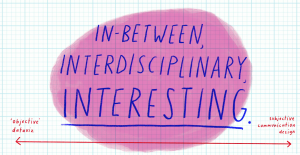
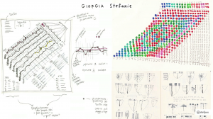
Stefanie Posavec is a communications designer who moved from Denver, Colorado to London, UK in 2004. Posavec’s works focus on non-traditional representations of data. Posavec received her bachelors degree in graphic design at Colorado State University and master degree in communications design at Central Saint Martins (CSM) College of Art and Design in London. Breaking the strict barriers of data and design, Posavec describes her work to fuse and fall in between the lines of “dataviz” and communications design.

Posavec does not actually code her work,  but does prefer to work with data in a hand-crafted way. I admire how she loves to work with data and personalizes the information by visualizing it. I appreciate how she fuses her skills in communications design and her passion for data to create tactical information and interactive design. As a communications designer, I see her style and goals to communicate social/word issues well to the common people. During her EyeO talk in 2018, I liked how she made her presentation flow well, mainly because of the visuals she used to assist her talk. Also, the way she talks during the presentation flowed very well, and I admire how used no filler words.


Among all her works, I really liked the “Air Transformed: Better with Data Society Commission” project, because she was able to communicate the issues of air pollution in London using data, design, and 3D printing. Also, I really like how she was able to approach this issue, which people do not take more seriously, by making her products wearable.

AirTransformed7.jpg

AirTransformed10.jpg

Robert Oh-Looking Outwards 07

Word Associations Visualization by Chris Harrison

For this Looking Outwards, I chose to study the word association art of Chris Harrison. I really admire this kind of art because I’ve taken multiple classes that show the importance of words and their similarities. This project shows which words are used more frequently with the two base words, “hot” and “cold”.  I really admire how simple and clear it is to look at this graph. You can see clearly which words are more frequently used with either of the base words.

In other to make this graph, Harrison went through many different processes. Words were bucketed into one of 25 different rays. Each of these represented a different tendency of use (ranging from 0 to 100% in 4% intervals). Words were sorted by decreasing frequency within each ray. Finally they rendered as many words as could fit onto the canvas.

You can see how methodological and clear the artist is through this piece. This art is really all about data and applying that data, and so I would claim that you can see Harrison’s logical artistic style in this art.


http://www.chrisharrison.net/index.php/Visualizations/WordAssociations

Robert Oh- Project 07 – Curves

curves

//Robert Oh
//Section C
//rhoh@andrew.cmu.edu
//Project-07-Curves

//assigning variables
var nPoints = 100;
var angle1 = 0;
var adj1 = 10;
var angle2 = 0;
var adj2 = 0;
var angle3 = 0;
var adj3 = 0;

function setup() {
    createCanvas(400, 400);
    frameRate(60);
}

function draw() {
    background(0);
    
    //drawing the white circle
    ellipse(mouseX, mouseY, 170, 170);

    //drawing the red Quadrifolium 
    push();
    fill(255, 0, 0);
    translate(mouseX, mouseY + 45);
    rotate(radians(angle1));
    drawQuadrifolium();
    angle1 = (angle1 + adj1) % 360;
    pop();

    //drawing the green Quadrifolium
    push();
    fill(0, 255, 0);
    translate(mouseX + 39, mouseY - 20);
    rotate(radians(angle2));
    drawQuadrifolium();
    angle2 = (angle2 + adj2) % 360;
    pop();

    //drawing the blue Quadrifolium
    push();
    fill(0, 0, 255);
    translate(mouseX - 39, mouseY - 20);
    rotate(radians(angle3));
    drawQuadrifolium();
    angle3 = (angle3 + adj3) % 360;
    pop();

    //adjusting speed of rotation for only blue and green Quadrifoliums
    adj2 = (15 * (mouseX / width)) + (15 * (mouseY / height));
    adj3 = (15 * (width - mouseX) / width) + (15 * (width - mouseY) / height);
}

//formula taken from: http://mathworld.wolfram.com/Quadrifolium.html
function drawQuadrifolium() {
    var a = 40;
    
    beginShape();
    for (var i = 0; i < nPoints; i++) {
        var t = map(i, 0, nPoints, 0, TWO_PI);
        r = a * sin(2 * t);
        x = r * cos(t);
        y = r * sin(t);
        vertex(x, y);
    }
    endShape(CLOSE);
    
}

When I first started this assignment, I was looking around for inspiration. One morning, when I started shaving with my electric razor, I realized that my blades were in the shape similar to that of a quadrifolium. Thus, I created the three quadrifoliums in the same shape as my razor. I adjusted the speed of the top two “razors” to speed up/slow down if they are near the edges of the canvas.

my attempt to make a quadrifolium

Hannah Cai—Looking Outwards—07

https://www.creativeapplications.net/vvvv/melting-memories-drawing-neural-mechanisms-of-cognitive-control/

This project by Refik Anadol Studio caught my eye because it’s so beautiful and haunting—it really looks like something from a sci-fi movie. In reality, it’s a visualization of brain wave activity of participants who were asked to recall specific childhood memories. These memories weren’t mentioned; I’m really curious what they were. Even without that information though, the project still gives off a really nostalgic feeling.

I didn’t really understand the technical details behind the visualization, but the designer(s) seemed to have taken EEG data and input it into algorithms for 3d structures. While the concept behind that is really neat, I feel like the actual structures created would be very subjective based on the algorithm used, and I wish there was more context about the how one was translated into the other. I feel like this type of visualization has a lot of potential in research and education; I’d love to see a more concrete approach used to describe brain activity—for example, what different emotions look like, brain activity mapped to height of data points, etc. However, I do still think the end result of this project is really beautiful and innovative on its own.