![[OLD FALL 2018] 15-104 • Introduction to Computing for Creative Practice](../../../../wp-content/uploads/2020/08/stop-banner.png)
var x;
var y;
function setup() {
createCanvas(480, 480);
frameRate(25);
}
function draw() {
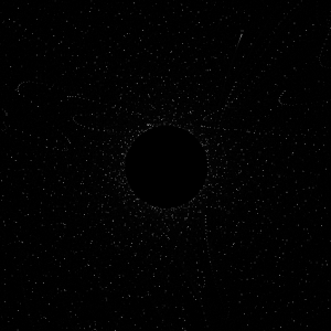
background(0, 0, 0, 57);
noFill();
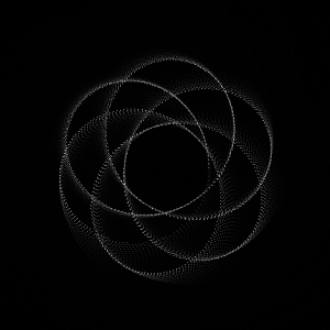
drawDeltoid();
drawDeltoid2();
drawDeltoid3();
}
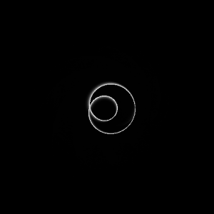
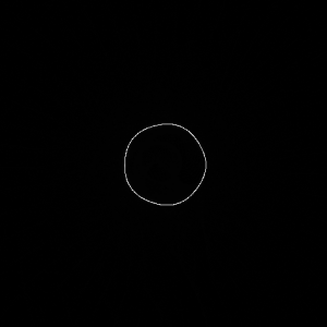
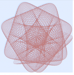
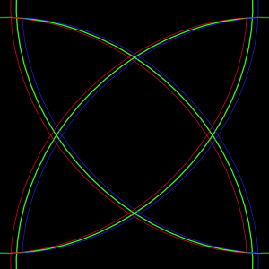
// Outermost circle
function drawDeltoid(){
var nPoints = 50;
var radius = 50;
var separation = 60;
strokeWeight(1);
stroke(150, 205, 255);
push();
translate(4 * separation, height / 2);
beginShape();
for (var i = 0; i < nPoints; i++) {
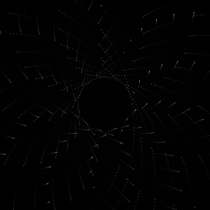
var range = map(mouseX, 0, width, 0, 200)
var px = range * cos(i) + cos(2 * i);
var py = range * sin(i) - sin(2 * i);
vertex(px + random(-mouseX / 30, mouseX / 80), py + random(-mouseX / 30, mouseX / 80));
}
endShape(CLOSE);
pop();
}
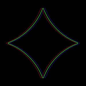
// Middle circle
function drawDeltoid2(){
var nPoints = 50;
var radius = 50;
var separation = 60;
push();
translate(4 * separation, height / 2);
beginShape();
for (var i = 0; i < nPoints; i++) {
var px = mouseX / 4 * cos(i + mouseY / 50) + cos(2 * i);
var py = mouseX / 4 * sin(i) - sin(2 * i);
vertex(px + random(-5, 5), py + random(-5, 5));
}
endShape(CLOSE);
pop();
}
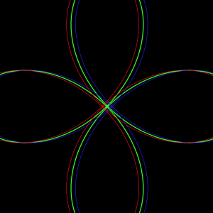
// Inner circle
function drawDeltoid3(){
var nPoints = 50;
var radius = 50;
var separation = 60;
push();
translate(4 * separation, height / 2);
beginShape();
for (var i = 0; i < nPoints; i++) {
var px = mouseX / 4 * cos(i + mouseY / 50) + cos(2 * i);
var py = mouseX / 4 * cos(i) - sin(2 * i);
vertex(py + random(-5, 5), px + random(-5, 5));
}
endShape(CLOSE);
pop();
}At first I was a bit overwhelmed by all the mathematical equations for different curves, but once I settled on one and started playing around with it everything made a lot more sense. I really enjoyed the process of this project and changing every value in the equations to see and understand what they did.