Min Ji Kim Kim- Looking Outwards – 05

Peter Nowacki’s “The Race Day”

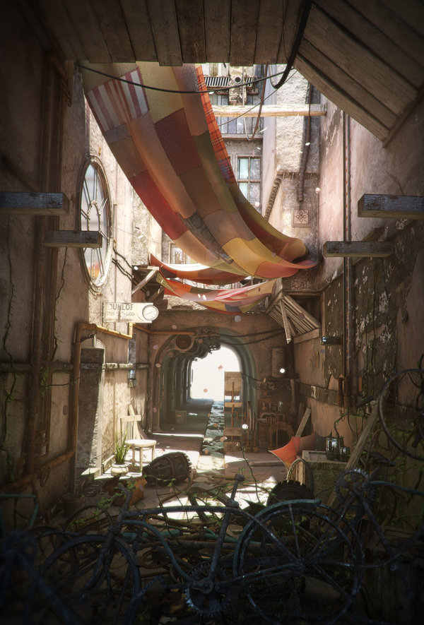
The Race Day is a 3D environment created by Peter Nowacki. Inspired by concept artist Gary Tonge’s Old Backstreet, Nowacki sought to recreate the environment with a more “steampunk” vibe. Utilizing tools like 3ds Max and Vray, Nowacki clay sculpted the basic components of the environment first and then spent a lot of time creating UV maps, which is essentially projecting a 2D image onto a 3D surface, to add texture and make the environment more realistic. 

Clay model of “The Race Day”

He then proceeded to create the gears, bicycles and dust details for the steampunk effect using Zbrush and Mudbox and added finishing touches on AfterEffects. 

Before and after adding the steampunk details.

Overall, I was in awe of Nowacki’s portfolio, but I was particularly attracted to this piece because it showed me the power of 3D rendering. I admire how Nowacki was able to recreate the 2D graphic design and bring it to another dimension, creating an even fuller and more complete environment by adding details and depth that can’t be captured in 2D. I think Nowacki’s twist of adding the steampunk vibe was a very good artistic choice. 

You can read more about Nowacki’s process here, and see his portfolio here.

Joanne Chui – Looking Outwards- 05

Andy Lomas “Growth by Aggregation”

Andy Lomas is a mathematician and a computational artist. He creates computer generated 3D sculptures that explore and simulate different processes of growth. Growth by Aggregation is a study of how natural forms can produce such complex intricate aggregations just by adhering to simple mathematical laws. This is based on simulating disposition and flow and how these natural processes can create structures similar to coral. The artist’s creative sensibilities manifest in this computer graphic in how a lot of Lomas’s graphics visualize the process of expanding and contracting, dividing and multiplying, etc. What I find interesting about not only this computer graphic but also his other ones are the constraints that he uses in order to restrict the form that is produced, rather than creating a general massed aggregation.

Kimberlyn Cho- Looking Outwards 05

rendering of the beach by Koola

Koola, a computer graphics artist, uses a video game development tool called Unreal Engine 4 to create incredibly realistic scenery renderings. The youtuber is known for his/her attention to environmental details and the effects on the 3D attributes of the landscapes. Koola doesnt limit him/herself to any specific season or environment. From underwater structures to science fiction depictions, the renderings all depict a high level of reality.

I was initially intrigued by the shocking resemblance to reality. As the article is literally titled “This Isn’t Real Beach”, I clicked on it to see just how realistic the beach looked. Renderings are an important tool for artists to depict the physical realities of their design. Architects for example, use rendering tools to portray how their design would look in reality in context to the site and human interaction when proposing an idea. I appreciate the attention to detail as well as both the realistic and creative aspects of Koola’s renderings.

This Isnt a Real Beach

Xu Xu – Looking Outwards – 05

Alexey Kashpersky is a 3D digital artist who has experience in creating CG artworks, large amounts of 3D models for televisions, and 3D printing studios. His series of Virus artworks are intended to raise awareness, such as this Hepatitis C artwork. While visually pleasing to the eye, the video was intended to capture attention, imply the hidden dangers of an undiagnosed HCV infection, and generate awareness of this bloodborne pathogen. Through thoughtful abstractions, the morphological form of the Virus is created in order to express the hidden dangers of this virus, yet still portraying a certain amount of realism. VR was utilized to create a sense of realism in this piece of work. I admire the attention to detail and the cleanness of his 3D artworks, which I can only imagine he used certain 3D modeling softwares to create these artworks. It is apparent that the virus is deadly, despite its beautiful form and colour.

Outside of the digital world, Alexey is a strong believer in living a healthy lifestyle – one which would allow him to live life to its fullest. He says, “…perhaps one day, I will decide to go diving along the coral reefs or explore thousand year-old caves at the ends of the Earth.” But for now, he’s happy to show the world where his imagination takes him through his art.  (Autodesk)

Ammar Hassonjee – Looking Outwards – 05

“Dear Fabricio” Computer Art

Image of the 3D generated graphic image “Dear Fabricio”

The graphic image above is a rendered image of a toddler and toy in an artificial landscape developed by CG and 3D artist Pedro Conti. The artist was inspired to make this image for his wife after she announced that she was pregnant, and its inspired by forms of the ultrasound of their child as well as a toy that they bought for their newborn child. The artist used software such as 3D Max, ZBrush, Maya, and Cinema3D in order to physically sculpt the figures from existing images.

I admire this works intricate level of detail and rendering that make it look both realistic and yet cartoon-like at the same time. I also love the sentimental intent behind this image. I think that the artist’s original artistic intent was manifested in this piece as he produced a realistic image that worked well with the message he wanted to convey to his audience.

Taisei Manheim – Looking Outward – 05

The project I chose was the Nike Strike Series FA16 by onformative, a studio for digital art and design.  Growing up, I was a huge soccer fan and I have always loved the Nike soccer advertisements so I was curious about how they were made.  For this project, onformative created still images and films for the fall 2016 launch of the Strike Series apparel collection. In order to do this, they took full body scans of several famous soccer players which were made into specialized 3D models that served as the base for the visuals.  Motion capture data from training drills were used to create the dynamic imagery that fit the campaign’s slogan, “Play fast. Train faster.” The data of each player like speed and power helped to define and stylize the figures. In order to create dramatic effect, rim and back lighting highlights the players on darkened backgrounds. The collection is very prominent on each athlete, which results in captivating images and films.


Promotional video made as part of the series using 3D body scanning  technology.

Siwei Xie – Looking Outwards – 06

Gerhard Richter’s 4900 Colours: Version II at Serpentine Galleries, 2008

Gerhard Richter is the German visual artist who created “4900 Colours: Version II” in 2008. The 196 square panels of 25 colored squares was conceived to be configured in a number of variations, from one large-scale piece to multiple, smaller paintings.The development of 4900 Colors was influenced by Richter’s grid paintings in 1966.

I admire how rigorous the process of generating randomness is. A computer program assigned a color to each square drawn at random from a palette of 25 colors. The 196 panels can be put together to form one huge display, or in the Serpentine exhibition were arranged at random in sets of four to form 49 10x 10 displays.

Creator’s artistic sensibility manifests by how “non-random” the panels look, with some dominated by particular colors which are often placed next to each other. But the whole point of “pure” randomness is that apparent patterns are expected to occur.

Original source here.

Joseph Zhang – Looking Outwards – 05

https://maikool.com/transit/

This week, I looked at 3D graphic artist Michael Kim and his project “Transit.” At first glance, the image looks like an ordinary photo, until you realize the rendering and texturing process that went behind building up this reality. Kim began the process by collecting references from his rides in NYC subway trains. From there, he began clay modeling the interior structure of the subway train, in Autodesk Fusion and Cinema 4D. After contacting him, he said the modeling process took 5 days, 4 hours a day.

From there he hand drew all the graphics he wanted on paper and used them as a graphite textures on the surfaces.

Much of his process was dedicated to UV mapping, which is projecting 2D visuals onto a 3d surface. If you look closely at the details, Kim created every individual surface imperfection, which includes, fingerprints, smudges, dust particles, and wear on curvatures.

Besides Cinema 4D and Autodesk Fusion, Kim also used programs such as Substance Painter, Marvelous Painter, and Adobe Photoshop.

I think what really compelled me to this piece was the process and procedure that Michael underwent. From a surface level glance, the final product is incredible but, ultimately it was talking to him and understanding the process he went through that really attracted me to “Transit”. His artistic sensitivity is very evidently seen in his attention to detail, and the subtle references, such as the “Mailkook Express”, his logo, and just all the texturing.

Lanna Lang – Project 05 – Wallpaper

sketch

//Lanna Lang
//Section D
//lannal@andrew.cmu.edu
//Project 05-Wallpaper

function setup() {
  createCanvas(590, 480);
  //navy blue for right quad
  //that peeks out
  background('#25363e'); 
}

function draw() {
  
//left triangle
  //repeat every 100 pixels down the canvas
  for (var y = 0; y < height; y += 100) { 
    //repeat every 60 pixels across the canvas 
    for (var x = 0; x < width; x += 60) {
      //fill with lighter brown
      fill('#af9477'); 
      triangle(x, y, x + 30, y + 20, x, y + 40);
    }
  }

//right triangle
  //repeat every 100 pixels down the canvas
  //
  for (var y = 0; y < height; y += 100) {
    //repeat every 60 pixels across the canvas
    //with additional 50 pixels off screen
    for (var x = 60; x < width + 50; x += 60) {
      //fill with darker brown
      fill('#7e5535');
      triangle(x, y, x - 30, y + 20, x, y + 40);
    }
  }
  
//center quad
  //repeat every 100 pixels down the canvas
  for (var y = 20; y < height; y += 100) {
    //repeat every 60 pixels across the canvas
    for (var x = 30; x < width; x += 60) {
      //fill with cream color
      fill('#fbe8bd');
      quad(x, y, x + 30, y + 20, x, y + 40, x - 30, y + 20);
    }
  }
  
//lower left quad
  //repeat every 100 pixels down the canvas
  for (var y = -60; y < height; y += 100) {
    //repeat every 60 pixels across the canvas
    for (var x =0; x < width; x += 60) {
      //fill with ochre color
      fill('#dcae56');
      quad(x, y, x + 30, y + 20, x + 30, y + 80, x, y + 60);
    }
  }
noLoop();
}

I wanted my wallpaper to be more geometric and include a bold, aesthetic color palette, but I didn’t want it to be a simple geometric design. I came up with this design that combined triangles and quadrilaterals, and that combination of shapes was the repeated image. I love the combination of ochre and blue, so I decided to revolve my palette around those two. This code relies solely on math and how the coordinates of each shape correlate with one another.

My sketch of what the repeated image would be and a sample of how it would look.

Sewon Park – LO – 5

Image result for typography portrait christopher haines
-A less typical Typography Portrait by Cristopher Haines used as cover of Computer Arts Magazine #111

One project produced through the use of computer graphics are the series of typography produced by Cristopher Haines. Although there are some significantly less complicated versions of such work, Haines utilizes his background in photography and digital art to create a more advanced form of portraits drawn through words. Through this work, Haines demonstrates mastery over Master Adobe Illustrator and a unique sense of style.

Typography portraits are interesting in that it can utilize words to deliver meaning. As such they are sometimes used in political campaigns. However, Haines attempts to show the convoluted nature of a human mind with a disorganized array of letters that combine together to create a disturbing face that eerily represents a woman’s. Such style puts his project at a completely new dimension from the simple works of typography portrait into a new realm of art.