Sydney Salamy: Looking Outwards-09

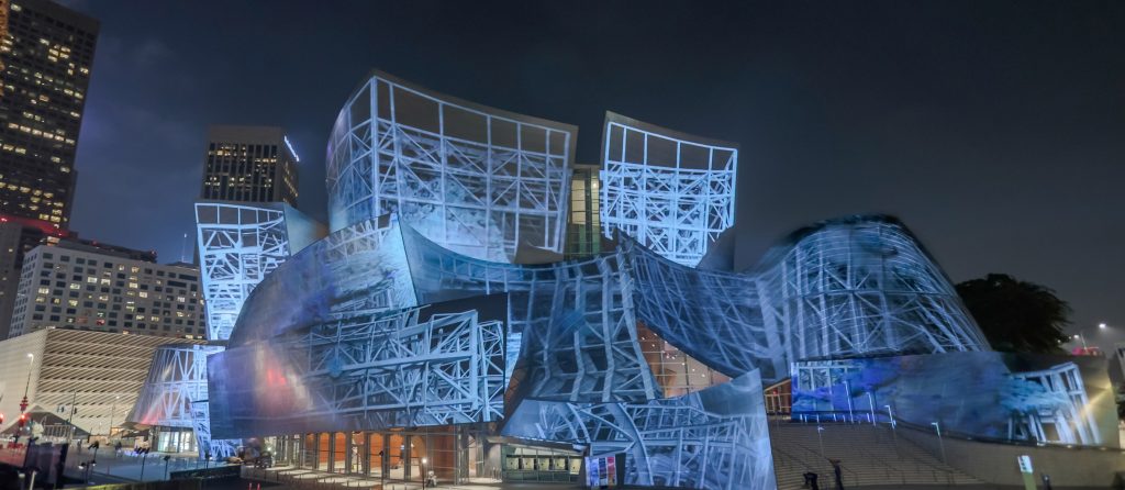
I chose to do my blog on the 6th Looking Outwards post of Jenny Lee. The project she did was an installation called “eCloud” built by Aaron Koblin, Nik Hafermaas, and Dan Goods in 2010.

On first glance of the image on Jenny’s post of the installation from below, I decided I already liked it. The way the squares were placed were already pretty on their own. The technological aspect only made it better. I like the concept of incorporating live changes into an art piece. Having these changes be changes in weather, and having the sculpture look like a cloud were really cool ideas. One of my LO posts had a similar idea of incorporating live weather changes, but with music, so I was already inclined towards liking the piece. The squares turning opaque was visually interesting as well. I’m used to seeing stuff change color, but changing clarity was different and I’m very curious to know how it works.

There isn’t much to really disagree with within her post. Most of the things she states are just factual information. The one thing I would critique is the explanation about what the pattern is displaying. She states the piece “transforms the patterns of the tiles to create the “cloud” in the accurate shape of one in particular time zone.” However, what I got from the video was that the patterns weren’t changing so much to emulate the shape but more the weather. So if it was raining hard, the tiles changed in a way that made the piece look like rain, like little squares falling to the ground. It seemed like the speed of the “falling” would also change speed based on how hard it was storming.

Maybe a way to improve the report would be to mention specifically how the piece changes in response to the different types of weather. In the picture I posted, it seemed like the cloud also changed color as well, since some parts are blue, which isn’t shown in the video. She might want to dive into how things like temperature, wind speeds, precipitation, snow, rain, etc… affect opaqueness, what squares are being changed, what speed they’re being changed at, what color the squares are, what areas of the piece is colored or not, etc…

Video Demonstrating eCloud by Dan Goods
Image of eCloud

Fanjie Jin-Looking Outward-09

WDCH Dreams, Refik Anadol

A Looking Outwards assignment that I found interesting was my classmate Taisei Manheim’s week 8 LookingOutwards post. I think this project, WDCH Dreams, that Tai has chosen is really interesting in that the data visualization was projected onto the facades of the Walt Disney Concert Hall. The displayed dataset was the 45 terabytes of data from the LA Phil data archives and through artificial intelligence algorithm, Refik Anadol utilized a computational ‘mind’ to mimic how humans dream – by processing memories to form a new combination of images and ideas. 

Agreeing with Tai, this project truly shows really high levels of rigorous and endeavors as every detail of the Disney Concert Hall from old Catia models has been remodeled so that all the projection and data visualization will be smoothly and coherently mapped on the very irregular surfaces. As an architecture student, this project is really exciting to me in that it is fascinating to see a new layer of meaning and information on top of the original complex geometry. Through the use of light as an architectural median showing the memories that are associated with this concert hall, Refik Anadol has established a new sense of visual performance that has a hybrid relationship between architecture and media arts with machine intelligence. 

Caroline Song-Looking Outwards-09

For this Looking Outwards post, I decided to look at Monica Chang’s Looking Outwards 03. In this Looking Outwards, she studies programmable bio-composites called Aguahoja, created by Neri Oxman and MIT. Using the most available materials that can be found on Earth currently, they create organic art that moves away from using plastic and other materials that are toxic to the environment.

Aguahoja I Pavilion, standing at 5 meters tall

I agree with her statement on why it is intriguing, the fact that this art is being sustainable in its resources shows the possibility in duality between conserving the resources we currently have in the ecosystem, while not halting our movement towards further modernizing the world.

Furthermore, I also think the statement that they are making in redefining art is strong. When thinking of art, what comes to mind is a lot of traditional materials, such as paint, clay, wire, etc. All of these materials (especially thinking of different types of paint) are also toxic to the Earth. However, using materials that are organic and that the environment has plenty of, traditional art is being challenged and being evolved as Earth does as well.

Chelsea Fan-Looking Outward-09

I looked at Claire Lee’s Looking Outward 07. It covers Stamen Design’s Cell Phone Coverage in the bay area. I agree with Claire in a lot of aspects of the work. The design is extremely interesting to look at and agree that the piece takes a mundane idea and turns it into something unique and artistic. I do wish that there was more explanation on how the piece is interactive. The post discusses that the piece covers 4 major cellular networks in the bay area, but it doesn’t mention which 4. I think this would also be good information to know. In addition, I wish there was some way to see what sections of the design correspond to which cellular network and maybe an image of all the carriers together on one map.

Although the original work is not linked, here is the link to Claire’s Looking Outward 07 Post: https://courses.ideate.cmu.edu/15-104/f2019/author/seoyounlandrew-cmu-edu/

Image from Claire Lee’s Looking Outward 07 of Cell Phone Coverage in San Francsico, Carrier 1 (n.d.)

Jamie Park – LO – 09

I was inspired by my friend Charmaine’s Looking Outwards post 05. This post is about a CG company in Tokyo that creates 3D models and develops character concept design. Among many other things created by company ModelingCafe, Charmaine focused her research on Imma, a computer generated fashion model. This computer generated model has a twitter and instagram account, where someone weekly posts an image of her.

The gap between the computer generated model, Imma, and real-life person is almost non existent that it is a little creepy. If one did not know who Imma is, one would have easily thought that she is another human being posting pictures on Instagram. Although it is really cool to see the impact of technology on media, I am concerned with the unintended consequences of this type of digital technology. I hope people do not misuse or abuse the ability to render and create identical copies of humans.

Katrina Hu – Looking Outwards – 09

Claire Lee’s Post: Prelude in ACGT

Pierry Jacquillard’s Prelude in ACGT

I chose to review Claire Lee’s Looking Outwards 04 Post. Her post looks at Pierry Jacquillard’s Prélude in ACGT. This piece takes the A-C-G-T (adenine, cytosine, guanine, thymine) order of Jacquillard’s own DNA and turns it into a musical composition. He uses a Javascript-based program to do this, creating a piece that is correlated to the order of his own DNA. The project uses a midi library that generates signals to be converted into electronic sounds.

I also think the cited project is really interesting, as it combines the topics of art, technology, and biology. I agree with Claire’s assessment that this work is very simple, but that the concept in itself is very creative. It is also fascinating how the entire project’s sheet music is an entire book long, yet only contains 0.2% of Jacquillard’s entire DNA. I think the idea itself is very different from other works, as it combines many fields of study.

Charmaine Qiu – Looking Outwards – 09

In Jamie Park’s Looking Outwards 05, she introduced me to a 3d artist from creative cloud named Roger Kilimanjaro. He is a 3d artist from Paris, France, and he uses Maxon Cinema 4d to render his projects. He mainly creates animated videos of motions that loops over and over in a satisfying manner. On his social media pages, you can find endless short videos and images of realistic and yet unusual 3d renderings that come to life. The videos are very pleasing to look at with the attentive incorporation of popping colors and logical audios as support. At the same time, Roger utilizes his skills to create advertisements for food companies such as Krispy Kream. I agree with Jamie that it is fascinating to see how software like Maxon Cinema 4d allows a vast range of potentials for designers around the world, and it must be life changing for its developers to realize what they contributed to elevate the designers’ experience of their project making process.

3D doughnuts for Krispy Kreme

Min Ji Kim Kim – Looking Outwards – 09

Creative miniworld by Jan Reeh

For this week’s Looking Outward post, I chose to review Claire Yoon’s Looking Outwards 05. The 3D computer graphic piece that she reviewed was CG/FX artist Jan Reeh’s Creative miniworld created in 2012 through 3Ds Max and rendered in Vray. Similarly to Claire, I was drawn to this piece because of how the word “creative” is expressed very literally and how the artist weaves a story into this 3D piece.

Closeup of the letter C in Creative miniworld

The other part that really caught my eye was the level of extreme detail and texture Reeh created, such as the grass or the bricks on the letter A. Furthermore, the effective use of sound, such as the explosion and the car engine, combined with the use of color and texture create a synergy that really breathes life into this piece. Claire also mentioned how the canvas fills left to right mimicking how we read words left to right which I thought was spot on analysis on her part and ingenious of Reeh to do.

You can see Jan Reeh’s portfolio here.

Sammie Kim – Looking Outwards 09

Looking into the Looking Outwards 8 report by CJ Walsh, I was intrigued by Meow Wolf, which an artist collective. Consisting of more than 400 employees with various artistic and digital backgrounds, Meow Wolf is known for creating interactive installation projects. The project that was analyzed is called the “House of Eternal Return,” which is a large immersive space (20,000 square foot art exhibit) in Santa Fe. Once a visitor enters the space that resembles the lawn of a Victorian House, he or she is then able to explore and discover portals into other worlds. Likewise, this space contains dozens of rooms, secret passages, and even musical objects that the visitors can interact with to unfold the mystery of the Selig family, who mysteriously disappeared after conducting a forbidden experiment. This maximalist art showcase engages guests of all ages, letting them walk, climb, and crawl through fantastic and unexpected environments within a particular narrative. 

Personally, I agreed with most of my peer’s assessment, as I appreciated not only the resultative project, but also the strenuous process that was involved. In the lecture video, the way the group presented a lot of visuals like progress videos really showed how they were able to overcome challenges, particularly in establishing themselves as a productive artist group. Moreover, I wanted to add to how Meow Wolf really strives to challenge social norms and radical inclusions through community based art projects.

Image of the House of Eternal Return (Eye catching visuals that engage with the narrative)
Interactive objects that visitors can play around with

Link to Meow Wolf website: https://meowwolf.com

Looking Outwards about Meow Wolf

Kimberlyn Cho- Looking Outwards 09

A post I found most interesting while looking through my peers’ looking outwards is Lee Chu’s post for week 04. He focused on Porter Robinson and his visuals for live performances. I found the attached video of Porter’s visuals at one of his live performances to be really exceptional and breath-taking, which is why I chose to look into the process of the animations for my looking outwards. As Lee describes, Porter is a well known EDM artist who is noted for his amazing animations that are coherent to his music. I agree with Lee in that Porter’s musical style and artistic inspiration are well translated into his visuals that are portrayed in beautiful pastel, futuristic landscapes. As I looked into the process behind the animations, it was most interesting to learn that Porter receives a lot of inspiration from anime- especially the exploration of love and adventure in alternative realities by the characters. Hence, the artists behind his animations take Porter’s foundation into heavy consideration in all design choices, and actually personally involve Porter in most of the process. One of the challenges is said to have been trying not to be overwhelmed while creating a coherent piece of art. I found it amusing to hear that they actually struggled with this because it seems like they did an exceptional job at undergoing such a difficult development process.