Human and Computer Science interations have been upgraded onto a higher level. Among the projects in eyeofestival 2013, the mosting fascinating one to me is Zach Lieberman’s Eyewriter Project.
Always pursuing to surprise people, Zach aims to design projects that integrates different human sensual experiences through coding to realize and strengthen such relationships. Standing as one of the co-founders openFrameworks, the artist takes advantage of C++ library to create this Eyewriter project and it is held worldwide and recognized one of the 50 best inventions in 2010. By studying the human eyeball movements and how sensors can detect the pupil deflections, the artist created the program to fulfill the dream of letting our eyes to compose artworks.
From my perspective, such low-budget has a wide range of social-influences. Obviously it has shaped a new way of transmitting information through an effortlessway. Moreover, patients who cannot move or speak easily may be able to take advantage of this tool to communicate with their doctors. Artists are able to connect such tool for real-time modeling with robotic arms rather than manually make a model in 3D softwares.
Ultimately, the project influences me on how to present the project more effectively by allowing for more “in-touch” experiences on the program and people. By showing a low-budget program and benign outcomes, the audiences would be more attracted to it.
edit (forgot to put this earlier) – I am using 1 of my grace days for this late submission.
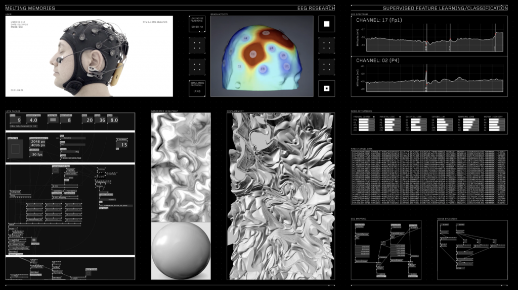
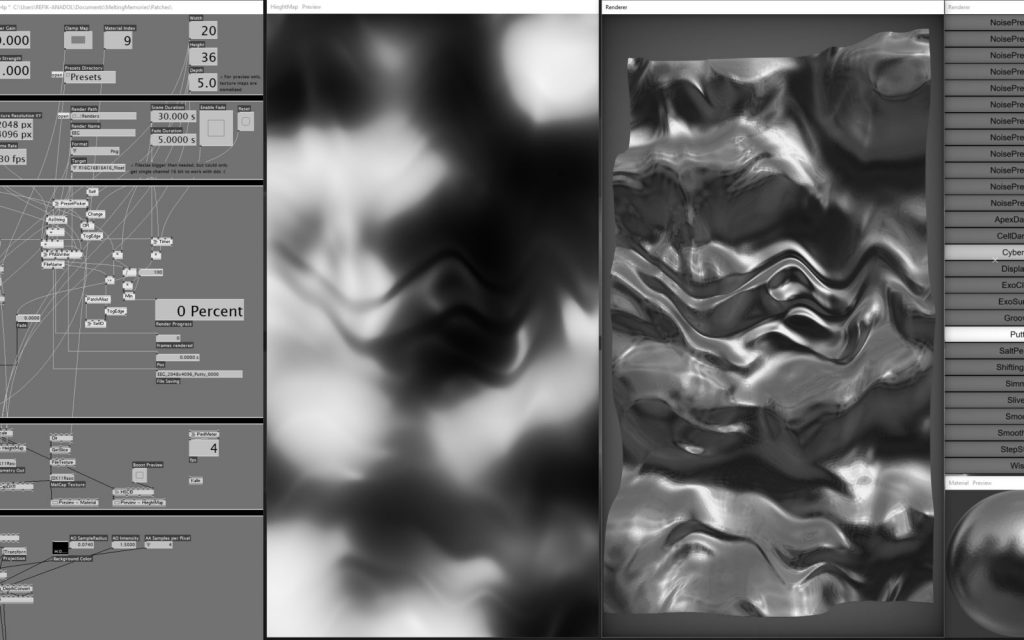
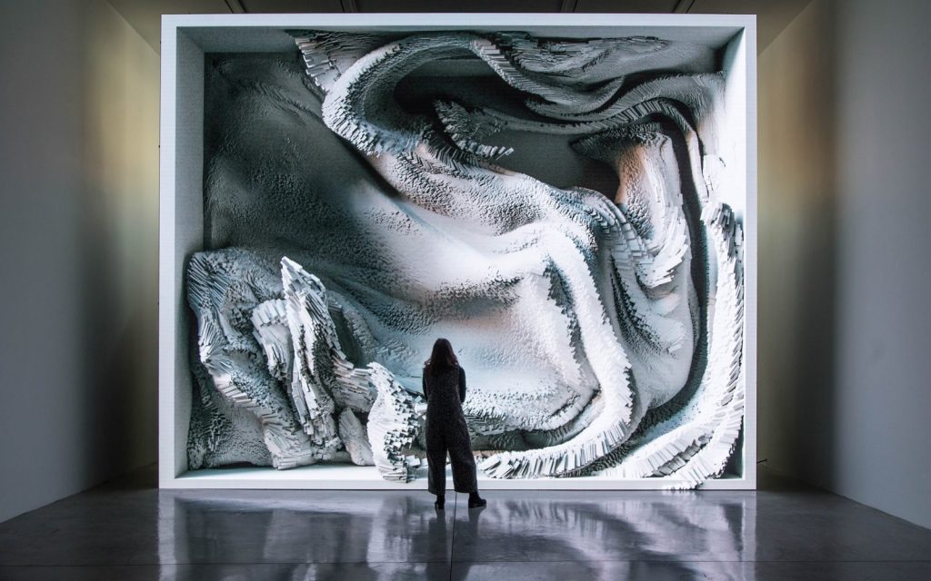
The project “Melting Memories” by Refik Anadol Studio created in 2017 is a beautiful series of artworks created from visualizing different EEG data collected. By representing the EEG data gives it a tactility that emphasizes the materiality of memory. The EEG data collected was based off of the prompt to focus on recalling specific moments of childhood.
I think it is beautiful and admirable that the project has this large scale, and this sense of having an organic life of itself. It is interesting to me how the data was able to have such a sculptural form. This sculptural form makes me think about how all EEG data is collected from the flesh of our being, and that the integration of data into this piece allows one to understand this generated sculpture as part of one’s own personal world.
I suppose the algorithms that generated this work broke down the EEG data into several characteristics like the amplitude of the wave, the duration of the spikes, and used these broken down variables in order to also cue the drawing for the moving image.
The artist’s sensibilities for simplicity and emotional impact are clear through the clean documentation for this piece in the photographs and the video of this work.
Capturing EEG data, process image data visualization process image of person standing in front of EEG data map
The Architecture Radio shows the user a visualization of the network traffics of cell phone towers, wifi routers, navigation and observation satellites, and their signals. We currently live in a world where our visual experience is generated through invisible transfers that takes place without us understanding them.
I have no idea how it sees different networks and visualizes them. The only way that I can imagine is having a predetermined location and data about different sources of network signals and just showing them on the display. I wonder if this visualization process happens realtime or not.
This application is available on App Store for iPads and can be downloaded easily and brings to the user’s fingertips an entrance to a world unseen.
I tried using Vivani spacial curve for this project. I was curious how a 3D function would appear on a 2D surface. It was definitely an interesting exploration, but was also difficult to play with. I wanted to make the visualization look as if the circles are constantly being absorbed into the void, but couldn’t make it happen. Below are some screenshots.
//Danny Cho
//changjuc@andrew.cmu.edu
//Section A
//Composition with Curves


var a = 0;

function setup() {
  createCanvas(480, 480);
  frameRate(10);
}

function draw() {
    background(0)
    translate(width / 2, height / 2)
    fill(255);
    a = mouseX;
    vivani();
    vivani();
    vivani();
    vivani();
}

function vivani() {
    var x = 0;
    var y = 0;
    var move = 1;
    strokeWeight(0);
    rotate(PI / 2);
    for (var i = 0; i < mouseY * 3; i++) {
        x = a * (1 + cos(i * 10));
        y = a * sin(i * 10);
        circle(x, y, i / 500)
        a += 0.1;
    }
}
// Ilona Altman
// Section A
// iea@andrew.cmu.edu
// Project-07

function setup() {
    createCanvas(400, 400);
    frameRate(10);
    noStroke();
}

function draw() {
//pink background
background(121,20,20);

// variables d/n = petal variations
var d = map(mouseX, 0, width, 0, 8);
var n = map(mouseY, 0, height, 0, 8);

// translating the matrix so circle is in the center
push();
translate(width/2, height/2);

//changing the colors
var colorR = map(mouseX, 0, width, 200,255);
var colorG = map(mouseY, 0, width, 50,245);
var colorB = map(mouseX, 0, width, 50,200);

// the loop generating the points along the rose equation
for (var i = 0; i < TWO_PI *3*d; i += 0.01) {
    var r = 150* cos(n * i);
    var x = r * cos(i);
    var y = r * sin(i);

    //making the circles more dynamic, and wobbly
    fill(colorR,colorG,colorB);
    circle(x +random(-1, 1), y + random(-1, 1), 1, 1);
    }

pop();
}
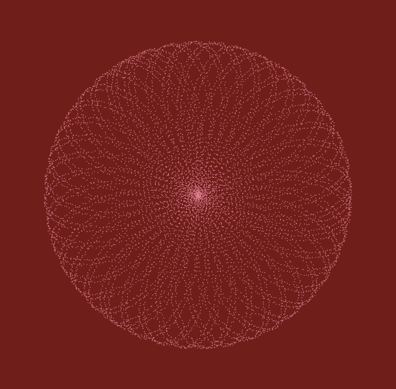
With this project, I was thinking a lot about auras, and energy, and how to make something digital that feels organic. I wanted to experiment with a flickery effect, achieved by alternating the size of the circles which compose this curve. I like the idea of these patterns looking like they are created from vibrations. I have been thinking about sacred geometry a lot, and about the patterns made in water when sound reverberates through it.
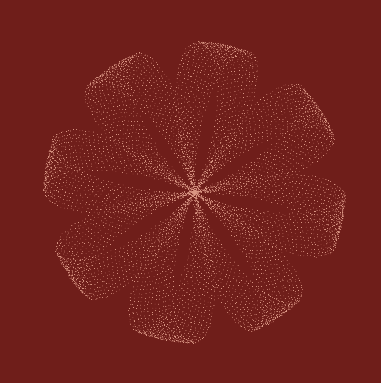
I think this was the hardest project to do so far. I didn’t really understand the assignment so I just started by looking at the curves on MathWorld and I was really interested in the Hypotrochoid and the Hypocycloid Pedal Curves. I decided to use those for this project and layer them to create a flower like effect. I think the hardest part of this project was trying to figure out the formulas and how to manipulate the variables but once I got it, it was fun to play around with the shapes and colors. I used mouseX and mouseY to manipulate the variables and the colors to create pretty flowers.
top left
bottom right
top right
/*
Min Ji Kim Kim
Section A
mkimkim@andrew.cmu.edu
Project-07
*/

function setup() {
    createCanvas(480, 480);
}

function draw () {
    background(0);
    drawHypotrochoid(); //draw the Hypotrochoid
    drawHypocycloidPC(); //draw the Hypocycloid Pedal Curve
}

function drawHypotrochoid() { //http://mathworld.wolfram.com/Hypotrochoid.html
    var a = int(map(mouseX, 0, width, 100, 200)); //radius of Hypotrochoid
    var b = int(map(mouseY, 0, height, 50, 80)); //radius of circle b
    var h = int(map(mouseX, 0, width, 40, 50)); //distance between center and point P of circle with radius b
    //draw Hypotrochoid
    push();
    translate(width / 2, height / 2); //move center to middle of canvas
    fill(150, mouseX, mouseY); //color changes depending on mouseX and mouseY
    beginShape();
    for(var i = 0; i < 100; i++) {
        var tH = map(i, 0, 100, 0, TWO_PI); //map theta angle
        var x = (a - b) * cos(tH) + h * cos((a - b) * tH); //parametric equations
        var y = (a - b) * sin(tH) - h * sin((a - b) * tH);
        vertex(x, y);
    }
    endShape();
    pop();
}

function drawHypocycloidPC() { // http://mathworld.wolfram.com/HypocycloidPedalCurve.html
    var a = int(map(mouseY, 0, height, 30, 80)); //map the radius with mouseX movement
    var n = int(map(mouseX, 0, width, 5, 20)); //map the number of cusps with mouseX movement
    //draw Hypocycloid Pedal Curve
    push();
    translate(width / 2, height / 2); //move center to middle of canvas
    fill(mouseY, 100 , 120); //color changes depending on mouseY
    beginShape();
    for(var i = 0; i < 500; i++) {
        var t = map(i, 0, 500, 0, TWO_PI); //map theta angle
        var x = a * ((n - 1) * cos(t) + cos((n - 1) * t)) / n; //pedal curve equations
        var y = a * ((n - 1) * sin(t) + sin((n - 1) * t)) / n;
        vertex(x, y);
    }
    endShape();
    pop();
}
/*
Hyejo Seo
Section A
hyejos@andrew.cmu.edu
Project 7 - Curves
*/
var nPoints = 200;
var angle = 0;

function setup() {
    createCanvas(480,480);
    frameRate(20);
}

function draw() {
    background(56, 63, 81);
// placing Hypocycloid to be centered in the cavas
    push();
    translate(width/2, height/2);
    drawHypocycloid();
    pop();
// Making two ranunculoids rotate depending on mouseX position
    push();
    translate(width/2, height/2);
    rotate(radians(angle));
    angle += mouseX;
    drawRanunculoid();
    drawRanunculoid2();
    pop();
}

function drawHypocycloid(){
    var xh;
    var yh;
    var ah = map(mouseY, 0, 480, 150, 200);
    var bh = 15;
    var hh = mouseX / 25;

    stroke(255, 200, 200);
    strokeWeight(5);
    noFill();
    beginShape();
// drawing hypocycloid
    for (var i = 0; i < nPoints; i++) {
        var tH = map(i, 0, nPoints, 0, TWO_PI);
        xh = (ah - bh) * cos(tH) + hh * cos((ah - bh) / bh * tH);
        yh = (ah - bh) * sin (tH) - hh * sin((ah - bh) / bh * tH);
        vertex(xh, yh);
    }
    endShape(CLOSE);
}

function drawRanunculoid(){
    var ar = 20;
    stroke(255, 159, 28);
    strokeWeight(5);
    noFill();
    beginShape();
// drawing ranunculoid, for this one, I didn't need small increments with mapping
    for (var i = 0; i < nPoints; i += 0.3){
      var xr = ar * (8 * cos (i) - cos (8 * i));
      var yr = ar * (8 * sin (i) - sin (8 * i));
      vertex(xr, yr);
}
endShape();
}

function drawRanunculoid2(){
    var ar2 = 15;

    fill(215, 252, 212);
    noStroke();
    beginShape();
// drawing second ranunculoid
    for (var i = 0; i < nPoints; i += 0.3){
      var xr2 = ar2 * (6 * cos (i) - cos (6 * i));
      var yr2 = ar2 * (6 * sin (i) - sin (6 * i));
      vertex(xr2, yr2);
}
endShape();
}
I spent fair amount of time browsing the Mathworld Curves website. How I approached this project was, instead of trying to plan the big picture (unlike the other projects), I chose one curve shape I liked and started there. Then, I slowly added other shapes. Unintentionally, my final work looks like a flower, which I am happy with. As the rotation gets faster and the hypercycloid expands, it almost looks like a blooming flower. Overall, it was interesting to play around with different math equations.
When mouseX is on the left edge of the canvas. Rotation is the slowest, and hypocycloid forms a circle.When mouseX is on the far right of the canvas. Rotation is at its fastest and the hypocycloid forms curls.
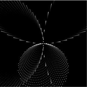
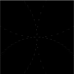
It is interesting to visualize a world from radiowaves. Through collecting WIFI signals, GPS information, and the radio-active data created by the built environment, the Dutch designer Richard Vijgen successfully constructs an “infosphere” in which people are able to see how the radio waves and dots are bounced back and forth under different network condition. What attracts me about this project is that under this digital tool, people are able to visualize how the radio signals are transmitted not only from a plan view but also from a person’s standing position. Moreover, such a way of navigation in any built environment has implied different network construction and social infrastructural conditions such as the satellite services and cell tower managements.
Meanwhile, the program allows diverse datasets to show on the screen, which creates the opportunities for different visual information to join and compose a dynamic drawing for artists to experience and observe the information-industrial world. What’s more, the real-time info software also provides the chance for people to see which area of the information traffic is busy or not to help guide people to explore into different worlds and places.
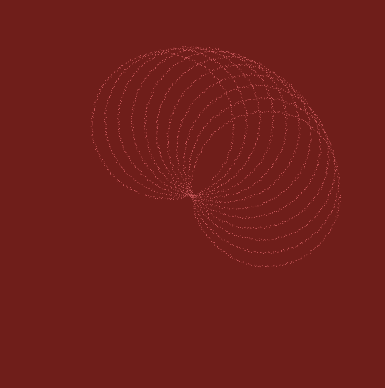
For this project, I was fascinated with the curves generated by those functions to breakdown the x and y coordinates. Then I started to play it around with mouse positions to create a growing, blooming effect. Generally, I used 2 types of curves — hypocycloid and hypotrocloid — to construct the imaginary veins and flowers. The central “mark-pen” drawing of the hypotrocloid was discovered accidentally when I tried to add varying thickness to the lines and now it gave a more realistic and 3D effect when combined with the light green lines. The blooming process integrates a series of overlappings among different elements. The white, cyan, and grey lines are related to give an impression of how the flowers can “squeeze” and “expand” during the process. The outer red,orange, and yellow lines give the basic pedestals for the drawing.
State0, blooming begin
state1, blooming
original sketch of using curves to generate a spatial drawing
//Steven Fei
//Section A
//zfei@andrew.cmu.edu
//Project-07
var nPoints = 100;

function setup() {
    createCanvas(480, 480);

}


function draw() {
    background("pink");
    push();
    translate(width/2, height/2);

    hypocycloidInvolute();
    hypotrochoid();

    pop();

}
function hypotrochoid(){
    //http://mathworld.wolfram.com/Hypotrochoid.html
    var x;
    var y;
    var x2;
    var y2;
    var a = constrain(mouseX,60, 180) ;//variable for hypotrochoid with 1/6radius
    var b = a/6; //variable for hypotrochoid with 1/6 radius
    var h = constrain(mouseY/8, 0, 2*b); // control the size of the radius
    var ph = mouseX/20; // control the starting angle of the radius
    var a2 = map(mouseY,0,480,30,80); // variable for hypotrochoid with 1/2 radius
    var b2 = a/2; // variable for hypotrochoid with 1/2 radius
    var a3 = a-20;//variable for the grey hypotrochoid
    var b3 = a3/4;//variable for the grey hypotrochoid
    var h3 = constrain(mouseY/8,0,2.5*b3);//variable for the grey hypotrochoid
    var lineV1x = []; // arrays to collect the hypotroid coordinates with 1/2 radius
    var lineV1y = []; // arrays to collect the hypotroid coordinates with 1/2 radius
    var lv2x = [];//arrays to collect the white hypotrochoid coordinates
    var lv2y = [];//array to collect the white hypotrochoid coordinates
    var lv3x = [];//arrays to collect the grey hypotrochoid coordinates
    var lv3y = [];//arrays to collect the grey hypotrochoid
    noFill();
    //draw the grey hypochocoid with 1/4 radius
    beginShape();
    stroke("grey");
    strokeWeight(1);
    for (var z = 0; z<nPoints; z++){
        var tz = map(z, 0, nPoints, 0, TWO_PI);
        x2 = (a3-b3) * cos(tz) - h3*cos(ph + tz*(a3+b3)/b3);
        y2 = (a3-b3) * sin(tz) - h3*sin(ph + tz*(a3+b3)/b3);
        vertex(x2,y2);
        lv3x.push(x2);
        lv3y.push(y2);
    }
    endShape(CLOSE);

    //begin drawing the hypotrochoid with 1/6 radius
    beginShape();
    stroke("white");
    strokeWeight(2);
    for (var i = 0; i<nPoints; i++){
        var t = map(i, 0, nPoints, 0, TWO_PI);
        x = (a-b) * cos(t) - h*cos(ph + t*(a+b)/b);
        y = (a-b) * sin(t) - h*sin(ph + t*(a+b)/b);
        vertex(x,y);
        lv2x.push(x);
        lv2y.push(y);
    }
    endShape(CLOSE);
    //draw the blue vains
    for (var d = 0; d<lv2x.length; d++){
        stroke("cyan");
        strokeWeight(1);
        line(lv2x[d],lv2y[d],lv3x[d],lv3y[d]);
    }

    //begin drawing the hypotrochoid with 1/2 radius
    beginShape();
    stroke(0);
    strokeWeight(1);
    for (var j = 0; j<nPoints; j++){
        var t2 = map(j, 0, nPoints, 0, TWO_PI);
        x = (a2-b2) * cos(t2) - h*cos(ph + t2*(a2+b2)/b2);
        y = (a2+b2) * sin(t2) - h*sin(ph + t2*(a2+b2)/b2);
        vertex(x,y);
        lineV1x.push(x);
        lineV1y.push(y);
    }
    endShape(CLOSE);
    // creating the mark pen effect by adding lines with 4 spacings of the inddex
    for (var j2 = 0; j2 < lineV1x.length-1; j2++){
        strokeWeight(1);
        stroke(0);
        line(lineV1x[j2], lineV1y[j2],lineV1x[j2+4],lineV1y[j2+4]);
        stroke("lightgreen");
        line(0,0,lineV1x[j2],lineV1y[j2]);//drawing the green veins
    }
}
function hypocycloidInvolute(){
    //http://mathworld.wolfram.com/HypocycloidInvolute.html
    var x1;//vertex for the red hypocycloid
    var y1;//vertex for the red hypocycloid
    var x2;//vertex for the orange hypocycloid
    var y2;//vertex for the orange hypocycloid
    var lx1 = [];//array for collecting the coordinates of the red hypocycloid
    var lx2 = [];//array for collecting the coordinates of the red hypocycloid
    var ly1 = [];//array for collecting the coordinates of the orange hypocycloid
    var ly2 = [];//array for collecting the coordinates of the orange hypocycloid
    var a = map(mouseY,0,480,90,180);//size of the red hypocycloid
    var b = a/7; //sides for the red hyposycloid
    var h = b; //determine the sharp corners
    var ph = mouseX/20;
    noFill();
    // red hypocycloid
    beginShape();
    stroke("red");
    strokeWeight(4);
    for (var i = 0; i<nPoints; i++){
        var t = map(i, 0, nPoints, 0, TWO_PI);
        x1 = a/(a-2*b) * ( (a-b)*cos(t) - h*cos( ph + (a-b)/b*t) );
        y1 = a/(a-2*b) * ( (a-b)*sin(t) + h*sin( ph + (a-b)/b*t) );
        vertex(x1,y1);
        lx1.push(x1);
        ly1.push(y1);
    }
    endShape(CLOSE);
    // begin drawing orange involute of the hypocycloid
    beginShape();
    stroke("orange");
    strokeWeight(3);
    for (var j = 0; j<nPoints; j++){
        var th = map(j, 0, nPoints, 0, TWO_PI);
        x2 = 1.5*((a-2*b)/a * ( (a-b)*cos(th) + h*cos( ph + (a-b)/b*th) ));
        y2 = 1.5*((a-2*b)/a * ( (a-b)*sin(th) - h*sin( ph + (a-b)/b*th) ));
        vertex(x2,y2);
        lx2.push(x2);
        ly2.push(y2);
    }
    endShape(CLOSE);
    // drawing the connection of the two hypocycloids
    for (var k = 0; k < lx1.length; k++){
        stroke("yellow");
        strokeWeight(1);
        line(lx1[k],ly1[k],lx2[k],ly2[k]);
    }

}
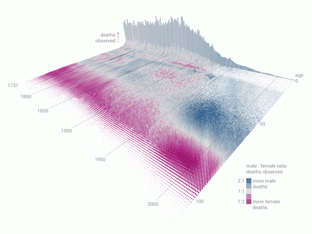
Data Visualization of Mortality Rates in Sweden across 264 years.
A data explorer, Wesley Bernegger, created the above data visualization for the Swedish Human Mortality Database. First, he had to decode the database that consisted of 264 years worth of data. He focused on basic trends in mortality such as deaths increasing with older age, highest observed mortality during war times. Then, slowly, he moved onto more specific patterns such as infant mortality spikes, higher mortality events, and he studied more of the Swedish history in order to get a better understanding of these trends. Finally, he included additional variables: male to female mortality ratio by age across all years and cumulative deaths observed during a year for each age group.
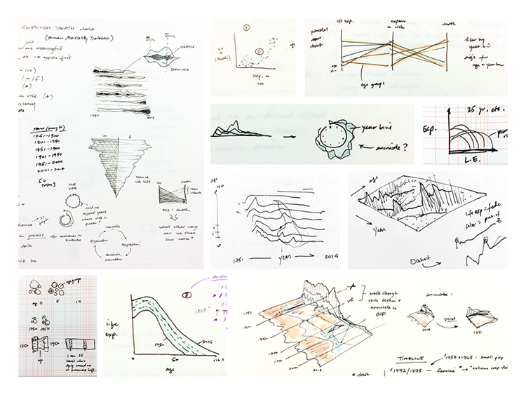
First sketch, exploring different types of data visualization such as tornado charts, parallel diagrams, and etc.
Then, further in the process of data visualization, he included the z axis, making the graph more 3D, in the hopes of better understanding the plots within the context of total mortality. Finally, they added gradient of colors to distinguish mortality rate of female and male.
This particular project was interesting to me because I have never seen one like it. It is very interesting because each data point might seem obscure, but it is effective in giving the big picture of mortality rates in Sweden across the years with additional variables such as gender, different historical events and age groups.
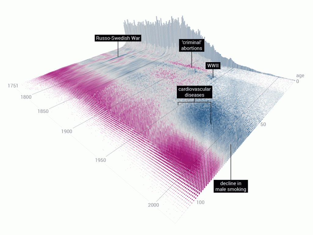
The same data visualization, but with different causes showing
![[OLD FALL 2019] 15-104 • Introduction to Computing for Creative Practice](../../../../wp-content/uploads/2020/08/stop-banner.png)