Looking Outwards 07

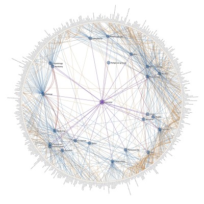
he project I will be discussing for this looking outwards is The Ross Spiral Curriculum from 2015. It was created by Santiago Ortiz and it is an interactive display of a K-12 curriculum. At the center of the spiral is cultural history, and different subjects expand outwards in complexity from that center point. I admire this project because it was created to serve teachers and administrators, so its design is easily readable. It also outlines the material by grade and by time, which allows for digesting the information in whichever manner is most useful. Because you can zoom in and out to view the design as a whole or individual parts and you can click on parts of the design to reach new pieces of information, I know that there is some interactive code involved. The curve of the spiral also makes me think that there is code similar to the code we used for our project this week involved.

Here is a link to the project:

https://spiral.ross.org/spiral/#/

https://spiral.ross.org/spiral/#/

LO 07 – Data Visualization and WikiRacing

Data Visualization

According to Wikipedia, “Wikiracing is a game using the online encyclopedia Wikipedia which focuses on traversing links from one page to another”. I used to play Wikiracing in high school due to school-provided computer restrictions which severely limited entertainment websites, (3-Clicks-To-Jesus was a popular variation of this game requiring the player to start at a random word and try to reach ‘Jesus’ in – you guessed it – three clicks). When I saw Chris Harrison’s Wikipedia data visualization project, ‘Cluster Ball’, I was immediately reminded of Wikiracing and the intricately woven nature of the Wiki universe. This graphic elegantly depicts the interrelations of wikipedia articles that have a common denominator. As stated in the project description, links between category pages are illustrated by edges, which are color coded to represent their depth from the parent node. Not only would this graphic serve as a handy aid in an intense round of WIkiracing, but it uses simple means to demonstrate how humans communicate and organize language. I admire this work because I think it is surprisingly moving to see how organically the structures of interrelation seem to develop and how every word contributes to and depends upon a greater system of words. The, overwhelming, intricate, and organic architecture and relationships of a single word to a system of words reminds me of ants working together in clearly systematic ways that I don’t quite understand, but can’t help but appreciate the intricacy of.

https://www.chrisharrison.net/index.php/Visualizations/ClusterBall

Looking Outwards 07 : Computational Information Visualization

Rachel Binx is an American designer, data visualizer, and developer. She graduated from Santa Clara University and is currently the co-founder of Meshu and Gifpop. Meshu and Gifpop are companies that focus on creating visualizations from social data. One of her projects includes Healthy Los Angeles. This project’s purpose was to provide the residents of Los Angeles with a more interesting way to view information about neighborhoods. Combining creativity/art with data/numbers is a great way to grab the attention of the audience. It can also have the possibility of making information much easier to read and understand. The website itself is able to collect 100 health indicators while featuring two different views: a city-level view and a neighborhood view.

Looking Outwards 07: Information Visualization

A visualization of human development levels in 2013.

For this week’s Looking Outwards, I was drawn to Dutch creative developer Jurjen Verhagen’s online data visualization Human Development Tree, an interactive platform that lets users visualize a level of human development based on set conditions of life expectancy, expected years of education, mean years of education, a country’s GDP, the country’s ideals on gender equality, and a color of your choice. Based on your input, the platform will reveal
your “ideal tree” with leaves. Leaves that fall off the tree represent current countries that don’t meet your conditions in 1985. More leaves grow back on tree as the data visualization progresses to the year 2013.

You can change the color of the tree’s leaves.

I thought this project was a super fascinating way to combine data and gamification in a fun but educational way. This visualization taught me a lot about human development and how much the world has changed since 1985, as well as leave me curious on how the tree’s leaves would have changed since 2013. I’m really curious on what kinds of algorithms Verhagen combined with
his beautiful 3D models, and if he ever plans on updating this project to reflect data from 2020.

Interact with the data visualization here.

LO 07: Data Visualization

For this week’s LO, I researched the 24 hour movement of air traffic over Europe, called Europe 24, found on Visual Complexity. It is a beautiful array of data, set over a geographically accurate representation of Earth to better reflect where each plane is going. Europe 24 was made by NATS, the leading organization in air traffic control in the UK, which oversees all airports in the country, especially the busiest airport in Europe, in Heathrow. The visualization is particularly important for a company such as NATS as it provides a representation of how flights move over the space they work to keep safe and allows them to identify areas of high traffic which could prove to be dangerous. It is also artistically pleasing, with soft blues and a beautiful almost-photorealistic graphic of the globe below each line. The entirety of the animation is very clean and professional, as befitting such an important organization, and the overall cleanliness of the work makes it more accessible to the public so they might understand the work of NATS in the UK. Individual planes are show as points of light to enhance clarity as they move, and so they are not lost in the blue trails others leave behind, and cities are highlighted so they stand out as well.

The video of Europe 24 running, tracking flights over the continent for a day.

LO_07_Data Visualization

For this week’s topic, I looked at a chart relating to money- Trillions.

The author is David Macandless, and the source are from New York Times, Bloomberg, UNESCO,WorldBank,Forbes,World Health Organisation, Stanford Uni, Credit Suisse, etc.

Money is a very interesting topic but when the number gets huge, it is very hard to get a real feeling of the amount.

https://informationisbeautiful.net/visualizations/trillions-what-is-a-trillion-dollars/

In this chart, the author raised some very interesting(or not that interesting) topics about what money can do.

By comparing the size of different squares, it is easier to get the idea of how large a concept means or how much money to get one thing to be done.

Among all the topics and comparisons the author can make, those topics shown on the chart silently describe the author’s opinions about some social topics.Also the author secretly implies his/her opinion by gradually changing colors.

I think by visualizing data and deliberately representing data in a certain way, people are easier to get influenced because they tend to think data is object numbers.

Looking Outwards 07: Information Visualization

A work of computational information visualization that I find intriguing is Stamen Design’s “Metagenomics with the Banfield Lab.” This project came about when the Banfield Lab asked Stamen Design to visualize their data about gene sequences in an ecosystem. I admire the clarity of the visual result because it takes what would normally be considered complex data and arranges it in a way that is easy to access and read. I suppose that the artwork was generated by sorting the data into a matrix and visualizing the data as squares. Stamen Design’s artistic sensibilities are manifested in the final form because they created a clear and readable visualization of data while being visually interesting.

Gif of Stamen Design’s “Metagenomics with the Banfield Lab”

LO 7

COVID-19 cases across the 50 states over the course of the pandemic

I found Pitch Interactive Inc.’s Ebb and Flow: COVID-19 Daily Cases Across the US a very effective data visualization tool, not to mention very relevant during the pandemic. The tool plots the daily cases and fatalities of each state in the U.S. in relation to each other over the course of the entire pandemic. I think the use of color and the visual nature of the graph effectively instills alertness and demonstrates the severity of the pandemic. As we enter the 7th month of dealing with this public health crisis, the inclusion of all states on the map is essential for the public to access to inspire better community action. People living in states that are doing worse in the current moment will feel a greater sense of responsibility to do better, as they can see their state “called out,” their performance directly plotted against “better” states, and how it affects the holistic curve of the United States. With our country becoming increasingly divided, a tool like this is not only scientifically representative, but has the potential to inspire social and political unity. I find it more effective than the largely achromatic COVID-19 graph provided by Google that forces users to choose their state from a drop-down menu.

Magnifying function displays state’s curve in comparison to the national curve when the user mouses over the state’s curve on the main map

I believe the algorithm is largely determined by some of the functions that made the “stock market tracker” from the last lab, like arrays and array methods like push. Instead of using the noise function to generate the data values, real COVID data from The New York Times would determine the “marketvalue” array. A loop will also hold the array so that it updates daily without manual input. I wouldn’t consider this project to have a lot of artistic considerations, but I do believe the color and other visual decision made make this a good form of communication design made functional with code.

Deaths in America due to COVID-19

LO-07 (information visualization)

For this LO, I looked at Chris Harrisons data visulazation on amazon books. In the project he let his computer run an automated algorithm based on title, topic, and relevance to each other. This allows for similar books to “cluster” and create a more solid color. What I thought was interesting is how he mentions through each iteration, the books that are more and more similar will then begin to attract to one another, thus the more time provided equals a more coherent data graph. But due to the sheer sample size of the project, 700,000 books, Chris stated that it would have taken too much memory for the computer to run. Thus emphasizing the sheer physical space it takes to process data with a large sample group. What I thought was the most intriguing aspect of the project is the resulting color field as it creates such a unique gradient that almost seems like some form of abstract pixel art.

LO 7

I particularly enjoyed the recommended Chris Harrison‘s ColorFlower project, where he ran 16,276 data points of known and named colors and organized them by their hue to create rainbow visualizations. Harrison had to play a hand in helping the algorithm determine the difference between brown and red, etc. He also used an aspect of randomization to make the visualizations seem more organic and textural.

Harrison’s ColorFlower render.