LO – 07

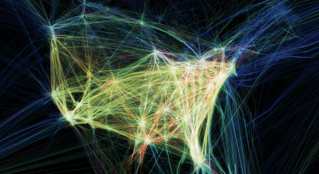
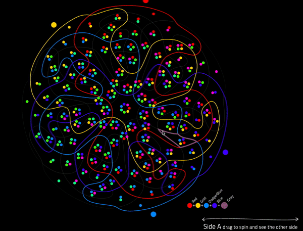
“Flight Patterns” by Aaron Koblin explores the cultural trends and relationships between humans and technology with the use of U.S. flight data. He used data from the U.S. Federal Aviation Administration which resulted in an animation that shows the frequent routes in popular western cities and traffic over certain geographical areas. I was initially drawn to this piece because I had initially thought it was randomly generated from its close up shots, but it was when the image zoomed out, did I see it in its entirety. This phantom like quality mixed with various colors and patterns illustrates a wide range of aircraft events and results in a mesmerizing depiction of our country. I enjoyed this time-lapse animation of the American air-traffic patterns because it parallels with our idea of what a recorded time lapse footage of these flight patterns may look like in real life.

Paths of air traffic over North America visualized in color and form.

LO – Info Visualization

Iris Yip
15-104 Section D
Looking-Outwards
Information Visualization

For this week I looked at nand.io and the way they synthesis information through custom data software. I took a look specifically at their project ‘Peak Spotting‘, which was a tool designed to visually manage Germany’s complex railroad network and its daily passengers.

Based on machine learning algorithms, it uses load and capacity prediction data heavily to allow traffic managers to look at data up to 100 days in advance so they can optimally calculate ticket prices and supply and service.

I was personally drawn to this project because of its amazing applications. Being able to predict data points up to 100 days in advance while being able to automatically generate concise and readable visual depictions of the data is a huge step in the automation of data visualization.

I also really enjoy the aesthetics of nand.io’s projects from a visual design perspective. The colors used are distinctive and readable yet aesthetically pleasing, making it functional and optimal for data visualization.

LO 07

Title: Herald/Harbinger
Artists: Jer Thorpe & Ben Rubin

In the heart of Calgary, Alberta, an installation piece titled “Herald/Harbinger” brings to life the motion of Bow Glacier, demonstrating the connection between human activity and that of the melting glacier. A series of LED arrays installed at the entrance of a building use colored light to indicate real-time movements in the glacier; meanwhile, several speakers project the glacier’s subtle noises into the traffic-filled area. The lights and speakers are connected to the glacier via a seismic observatory and relayed via satellite, then put through an algorithm to visualize the data collected for display. Thousands of passersby feel the glacier’s presence every day, a reflection of how the glacier is an integral part of the city’s water source and history. However, the installation has a shelf life; it is a reminder that this glacier is melting, and there will be one day where the city sounds no longer duet those of Bow Glacier.

A video of the installation in action

Looking Outwards 7

For this looking outwards assignment, I decided to look at this chart that helped visualize food additives and where they are most commonly found. The reason why I chose this graph is because I’ve always been very health conscious and aware of what goes into my foods. Although I’ve always on and on about how unhealthy snacks can be.

Something that I really like about this work is asides from it’s informational purposes is how it is able to turn data that would normally be a bar chart into something easier to read that can communicate data on quantity on bar thickness like a pie chart but demonstrate the dramatic disproportionate distribution like a pie chart.

I think that they used algorithms that determined thickness as a proportion of the quantity and then just connected the points to the corresponding category.

Looking Outwards 07 – Notabilia

This week I’m discussing Moritz Stefaner’s “Notabilia”, a visual exploration of the most controversial corners of wikipedia. The diagram takes data from Wikipedia’s longest “deletion discussions”: arguments over whether to delete a page or not. Ranging from the absurd – “Object validity of Astrology” – to the hilarious – “List of similarities between Canada and New Zealand”.

Categorized into ‘the deleted’ and ‘the kept’, for whether the article in question was deleted or not, these threads visually show the rough, warped, messy work of distinguishing knowledge from misinformation. The artist managed to represent this highly abstract data in a comprehensible tangle, an impressive management of contradiction that makes it particularly interesting.

-Robert

LO- 07

The work I chose is “Facebook: Mapping the World’s Friendships” by Stamen Designs published in June of 2020.
This project is incredibly interesting as it takes data on the interconnectedness of Facebook’s users and turns the data into clean cut visuals on a map to illustrate the world’s friendships.
The countries are sorted by a combination of how many facebook friendships there are between countries as will as the total number of facebook friendships within one county.
The data isn’t only intriguing, it is also informative. Surprisingly, you can see a lot of history within the data, such as where countries have been. If one country has occupied another you can see the connectedness through peoples friends on facebook which is extremely interesting.
I really admire this work as it condenses large quanities of data into an easily undersood visual that can tell you more than you would ever expect.

LO: Information Visualization

Apricot Graph: Analysis of Apricot Trends from 2004 – 2016 (Rhythm of Food)

While I was looking through the list of recommended works, this one project by Moritz Stefaner stood out. Stefaner is an independent designer that specializes in data visualization. The project that stood out to me was “The Rhythm of Food,” which analyzes food seasonality. Using data from Google News Lab, they developed a new type of radial “year clock” graph that shows the seasonal trends of food. With the months spread evenly around the “clock”, viewers can easily distinguish when certain food items are popular in certain times of the year. We are able to see the general trend of any sort of food item and can search specifically for that item or browse food items based on seasonal popularity. The website “Rhythm of Food” showcase the findings and allow visitors to explore the data themselves. Personally, it was very fun and indulging to look through the numerous graphs. The project takes on food, an item very prominent in our lives and visualizes the data in a very appealing way.

Moritz Stefaner (Truth & Beauty): http://truth-and-beauty.net/projects/the-rhythm-of-food

Looking Outwards 07: Information Visualization

Looking Outwards 07: Information Visualization

Santiago Ortiz’s Lostalgic was interesting to me. He visualized all the scripts of ABC’s LOST TV show. It is interesting to see how a lot of text is organized and visualized in an interesting format. I like how the text data is translated into interactive visual experience. It is interesting to see heavy data at a glance, and also be able to look closely into the details. I am not sure of what kind of algorithms that generated the work, but I suppose he used some kind of conditionals and loops to organize the data into different episodes and scenes. This work is an interesting experience in which I can read the series in a different, interactive way.

http://intuitionanalytics.com/other/lostalgic/

Looking Outwards 7

For this week, I chose to focus on Stamen’s project called “Getty Institute: Ed Ruscha’s Photo Archive”, a computational organization and documentation of Ed Ruscha’s photo archives of Los Angeles. These photographs were taken from a car-mounted camera, which when driven, would document the buildings and street views of Los Angeles’ Sunset Strip. This documentation continued every few years, creating a dynamic record of the changing views of the street. 

The photos, however, were never digitized, which made it hard to visualize the change in the strip over time: hence the implication of the dynamic interface created. With the use of “AI-generated tags”, Stamen was able to sort through the photos and create an interface that allows the user to virtually “drive” through the street and visualize the change over time. The interface simultaneously shows multiple years of change stacked on top of each other as the user “drives” through the map that is sandwiched in the middle. One is also able to zoom or sort through specific photos with keywords. This project is therefore a combination of both the algorithms created that easily sorts and orders photos, and the ‘creative’ part of the interface that allows the user to drive the car.

Capture of the Interface itself

Looking Outwards-07

http://intuitionanalytics.com/other/knowledgeDatabase/

http://moebio.com/research/sevensets/

This project titled “Personal Knowledge Database” was created by Santiago Ortiz. In this computational project, Santiago catalogues his internet references collected over more than 10 years. These references include projects, wikipedia articles, images, videos, texts, and many others. All of these references are organized into an isomorphic 7 set Venn diagram that tries balance each section. The 7 categories in this Venn diagram are humanism, technology, language, science, interface, art, and networks. He has also included 19 filters based on the source of the reference (ie. Image, post, blog, book, etc.).

What I absolutely love about this project is the self-reflection of his own digital searches and references. I think looking at 10 years of this data can teach you a lot about yourself, and I’ve always admired large scale self-reflection. What is also amazing about this project, is that all of these references are embedded into the interface, so with one click you can access any of the information. This project shows a lot about this artist’s sensibilities, and I admire them very much. I would be curious to know how Santiago feels after cataloguing this much personal data and finding patterns.

One other comment I have about this work is that I find it a bit hard to keep track of the category overlaps with the main Venn diagram. With the colored archetype, you are given a list of which colors are overlapping with each section you hover over. I wonder if this would be a helpful section to be utilized in the main project.