LO7

Link of the project:https://benfry.com/genomevalence/

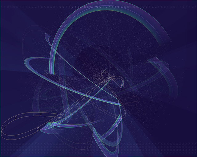
This project is called genome valence by Ben Fry, which is a visual representation of the algorithm most commonly used for genome searches.
The genome of an organism is made up of thousands of genes (34,000 for the human, 20,000 for the mouse, and 14,000 for the fruitfly). A gene is made up of a sequence of As, Cs, Gs, Ts that averages 1000 to 2000 letters apiece. To handle this amount of information, the BLAST algorithm breaks each sequence of letters into 9 letter parts. Every unique nine-letter set is represented as a point on the screen. I’m very surprised by the complexity of the project. The creator’s artistic sensibilities are manifest through the integration of biology, computer science, and art.
Looking Outwards 07: Computational Data Visualization

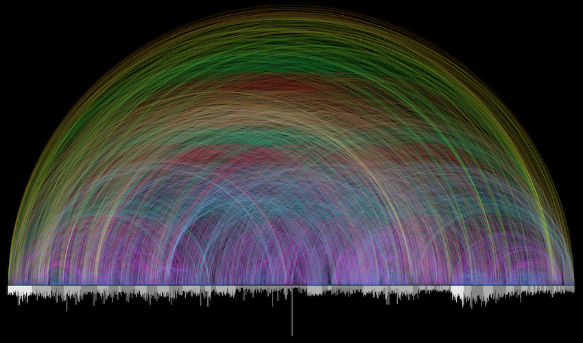
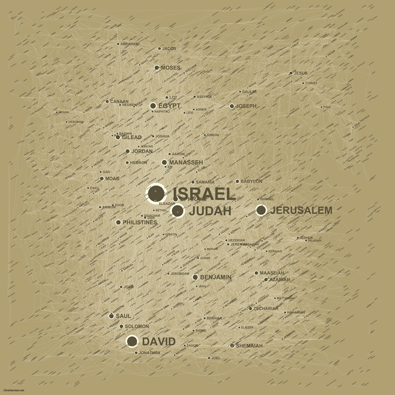
This week I took a look at some artists who specialize in computational data visualization. In particular, I took a look at Chris Harrison’s piece, Visualizing the Bible. This piece drew me in particular because the bible has always been something I have been so fascinated with. The combination of technology and a piece of world history felt refreshing and innovative. Harrison was able to visualize 63,000 cross-references within the bible to create a stunning piece that “honored and revealed the complexity of the data at every level”. A couple of other pieces were also made following the conclusion of the bible arc piece. Harrison wanted to capture the story of the bible and more specifically the people and the places within the bible. He used a spatial clustering algorithm to show the different connections between the 2619 biblical names. These pieces create new and refreshing ways to view classic pieces of human history. They give us a different perspective on how things can be interpreted.

Chris Harrison’s Bible Visualization

Looking Outwards 07

A particular work that I find very interesting is ‘FORMS – String Quartet’ by Playmodes. It is a “live multimedia performance for a string quartet, electronic music and panoramic visuals, in the field of visual sonification”(Visnjic 2021). They are able to create performances that are visually appealing that are controlled by the sound they were creating. In a sense, it was such a great experience watching them because it was so cool how the lights and images were adding to the meaning of the song. It is done by a generative system that creates endless, unrepeatable graphic scores that are immediately transformed into sound. The software that’s used is “coded in processing where the image sonification was done in Max/MSP. Hardware in this performance is comprised of a 3840*1080 pixels LED screen, aMacbook Pro with RME Fireface UCX soundcard, stereo sound system + subwoofers, a series of DPA 4099 microphones and two violins, one viola and a cello”(Visnjic 2021).Overall, I really enjoyed their performances.

Website: https://www.creativeapplications.net/maxmsp/forms-string-quartet/

Looking Outwards 07: Information Visualization

“Melting Memories” by Refik Anadol is one of my favorite digital works as a designer. The website itself which presents the work is immersive and dynamic which is so fitting to the work. Anadol is a pioneer in the aesthetics of machine intelligence and researches practice centered around the discovery and development of data narratives. His work addresses the challenges of computing which imposed on humanity and what it means to be an individual in the age of AI. The perception and experience of time and space he creates work around is enriched in environments which are so immersive and create a multi-dimension perception of space. His specific piece “Melting Memories” is a reference to Anadol’s unexpected interconnections between philosophical works and academic inquires which take memory as it’s principal theme. The work is a digital “video” format which is 2-dimensional but appears as if it is 3-dimensional, reaching out to the viewer. The work is a slow burn which mimics liquified colors to represent time and perception of humans.

Information Visualization

Bible-Cross Reference Visualization

https://www.chrisharrison.net/index.php/Visualizations/BibleViz

As someone who is not particularly interested in reading the Bible I was surprised to find Chris Harrison’s work on Bible Cross-References to be both beautiful and thought provoking. I can imagine this work being done on other novels and creating an equally beautiful result. Harrison and Pastor Christoph Romhild worked together to render the data of over 63,000 cross references in the Bible. The cross-references used in the visualization is from bottom page references, concepts, and locations and people found throughout the text. I found the tracking of people throughout the text to be particularly interesting.

Harrison also created a Social network of the people and places mentioned by using a spatial clustering algorithm. I think it is interesting to have a visualization of where people were spending time and how often they are mentioned.

Looking Outwards 7: Information Visualization

“The Rhythm of Food” showing the seasonality of Apricot

The project that I find incredibly intriguing is “The Rhythm of Food” created by teams at the Good News Lab and Truth & Beauty. The goal of the project is to investigate the seasonal patterns in food searches. Using data from 12 years of weekly Google Trends, the creators developed a radial “year clock” chart with various segments indicating the search interests of hundred of dishes and ingredients. The results are featured on a website that highlights the ongoing trends in the current month. The website also allows people to dig into the data themselves and explore the seasonality of various food. The project was built using ES2015, webpack, react, Material UI, and d3 v4. I really enjoy this project because it uses something that we need every day, food, to reveal all sorts of cultural and social phenomena. For instance, the clock shows that searches for “gefilte fish” peak around mid-March because it’s a traditional appetizer for Passover. It’s even more interesting because it explores how the seasonality of food varies across the world. Another aspect that I admire about “The Rhythm of Food” is the visual design. Moritz Stefaner mentioned that he wanted to find “unique, intriguing, expressive and elegant visual devices to bring out the most interesting aspects of the data.” This was accomplished very successfully through the intricate designs of the clock and the cohesive color scheme.

Animation showing how the clock works

Looking Outwards: Information Visualization

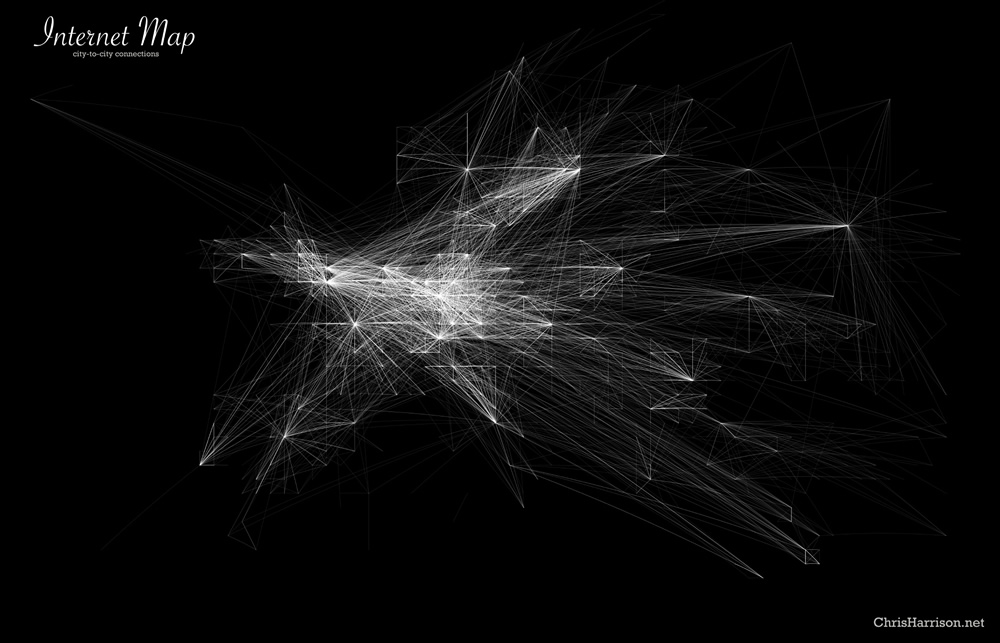
World City-to-City connections

Creator: Chris Harrison

Link: https://www.chrisharrison.net/index.php/Visualizations/InternetMap

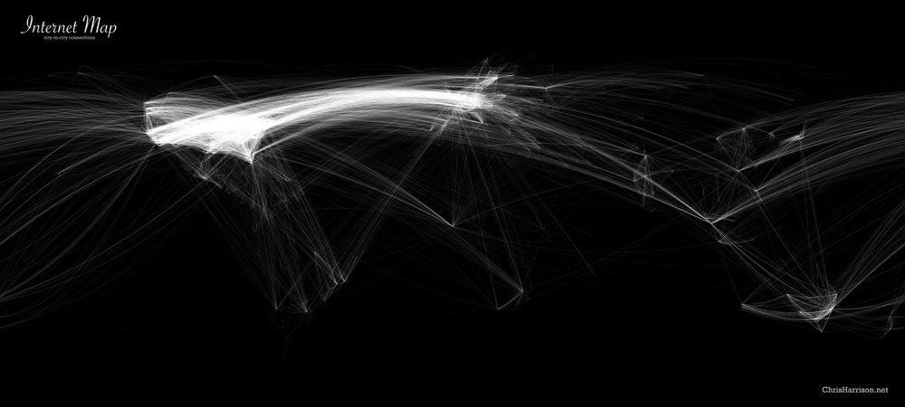
This map visualizes the city-to-city Internet connections, which play a huge role in our lives nowadays. For those of us in the US, it seems like we would no longer be able to survive without the Internet. Yet looking at this map helped me realize how millions of people have little to no access to the Internet. Being connected online feels like a guarantee for many of us, and at least for me, this map made me realize that I’ve been taking granted how easy it is to access the Internet, when in reality, access to the Internet would be a life changing resource for the millions of people without access. 

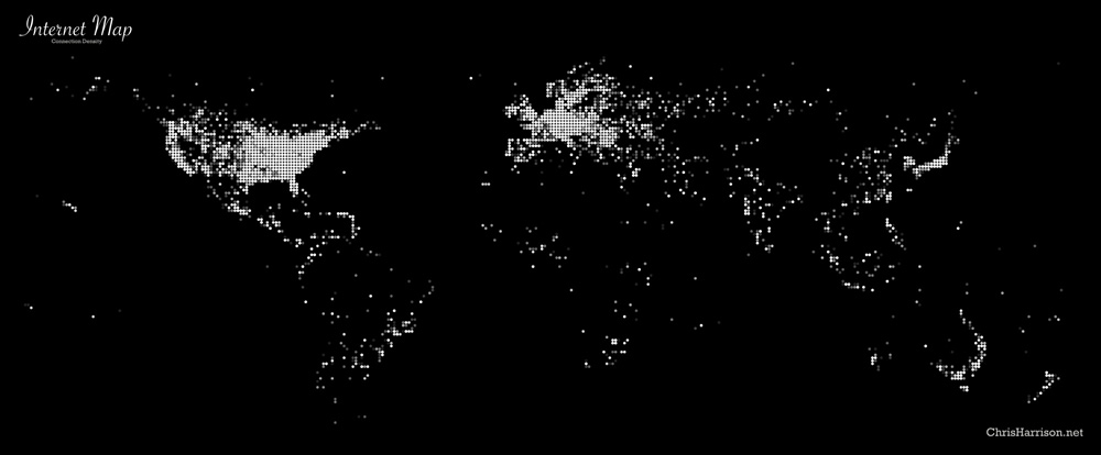
World Connection Density

This project also made me wonder about the quantity of communication between high internet usage countries and low internet usage countries. Due to globalization, the choices that more powerful countries make can drastically affect every single other country in the world. It seems to me that as a resource, the Internet has become so fundamental for so many things that lack of Internet access and infrastructure is a huge disadvantage for many countries and people. 

The map was created with data from the DIIMES Project. It displays a total of 89,344 connections.

European City-to-City Connections