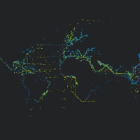
Platts is a data visualization project created by U.K. designer Brendan Dawes in 2017 which visualizes “the journey of over 3000 ships created from five months of historical shipping data.”It was created for the Igloo 360 degree wrap-around projection system. The map of the world in this piece is created with little dots that grow over the course of the video. I find it fascinating to see how connected the world is in terms of the way we exchange products and exports, but also realize how disconnected I feel I am to that same world.

This project reminds me a lot of the travel and migration patterns of animals. I love this visualization of ship routes because it reduces human life to a simpler, objective level. The ship moves from Country A to Country B while experiencing some weather difficulties along the way. No opinion is needed with simple facts like these. And so I find it comforting to see the life in this way because it shows how insignificant and small humans are, even if we sometimes act like we’re the universe’s royalty.
![[OLD FALL 2017] 15-104 • Introduction to Computing for Creative Practice](wp-content/uploads/2020/08/stop-banner.png)