Kyle Leve-LO-Week 05-Section A

One of the first projects that made me notice graphics was the movie Avatar. Created by James Cameron, after years of waiting for technology to advance enough to capture the movie, the movie finally debuted in 2009. I remember watching the movie and being amazed at the depth the movie had. I felt as though I was on Pandora experiencing all the lights and sounds around me. Weta Digital was the leading visual effects company throughout the project, and they used about 4,000 Hewlett-Packard servers and 35,000 processor cores to create and store all the visual elements of the movie. Even though there were real human characters in the movie, most of the characters and the entire setting had to be computer generated. What made this project so special however, was the amount of detail put into every aspect of the setting. The setting was captured in a way that had never been done before. Even though it was computer-generated, it looked so real and even now looking back at the movie, I still get the same feelings as I did nine years ago.

For more info: https://en.wikipedia.org/wiki/Avatar_(2009_film)#Visual_effects

Erin Fuller – Wallpaper

//Erin Fuller
//SectionA
//efuller@andrew.cmu.edu
//Project 05 - WallPaper


function setup() {
    createCanvas(600, 400);
    noLoop();
}

function draw() {
    background(255, 206, 233);
    for (var i = -1; i < 6; i++) { //for loop to make grid of "tiles"
        for (var j = -1; j < 4; j++) { 
        rX = i * 100; // tile spacing
        rY = j * 100;// tile spacing
        tile(); //runs "tile" function where all my actual components are
        }
    }
}

function tile() {
    squiggle(); //runs two arc functions to make "squiggle"
    triangles(); //draws 2 triangles offset
    circles(); //draws 2 circles offset
}

function squiggle() {
    strokeWeight(6);
    stroke(0);
    noFill();
    arc(rX + 30, rY, 30, 30, PI, 3 * HALF_PI); // upper curve
    arc(rX + 30, rY + 70, -30, 30, 0, 3 * HALF_PI); // lower curve
}

function triangles() {
    noStroke();
    fill(0); // background triangle always black
    triangle(rX + 80, rY + 5, rX + 35, rY + 55, rX + 80, rY + 55);

    fill(random(255), random(255), random(255)); // makes front triangle fun colors!
    triangle(rX + 85, rY + 10, rX + 40, rY + 60, rX + 85, rY + 60);
}

function circles() {
    noStroke();
    fill(0); //background circle always black
    ellipse(rX + 30, rY + 25, 15, 15);

    fill(random(255), random(255), random(255)); //makes front circle fun colors!
    ellipse(rX + 25, rY + 20, 15, 15);
}


My inspiration was that I wanted my wallpaper to look like a fun 90s pattern. I made the objects in separate functions and tiled them using a for-loop. A neat thing is the triangle and circles are random fills so everytime you refresh it is a color!

Jamie Dorst Project 05 Wallpaper

sketch

/*
Jamie Dorst
jdorst@andrew.cmu.edu
Section A
Project-05
*/

var xPosition = -25;
var yPosition = -10;
var r = 133;
var g = 198;
var b = 199;

function setup() {
    createCanvas(600, 400);
    background(255);
}

function concentricCircle() {
    // draw concentric circles with diameter 50
    var diam = 50;
    // draw circles inside the previous circle until 0
    for(var i = 50; i > 0; i -= 10) {
        fill(r, g, b);
        ellipseMode(CENTER);
        ellipse(xPosition, yPosition, diam, diam);
        diam -= 10;
    }
}

function draw() {
    // make an offset grid of concentric circles
    for(var j = 0; j < 625; j += 50) {
        xPosition += 25;
        r += 5;
        g -= 2;
        for(var k = 0; k < 825; k += 50){
            concentricCircle()
            yPosition += 25;
            b -= 1;
        }
        yPosition = -10;
    }
}

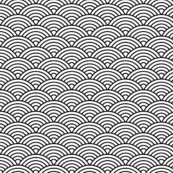
This project was pretty cool once I started going. I drew inspiration from this picture, and the scale-like texture it has.

I had trouble figuring out how to get the for loops to work at first, but once I figured that out it went pretty smoothly. I took the concept from the lab this week of making a color gradient, and then also tried defining my own variable to actually make the concentric circles. Overall I’m happy with how it turned out, and I think I learned from this.

Jamie Dorst Looking Outward 05

For this looking outward, I chose this project titled Back to School, drawn by Vivien Bertin and modeled by Patrick Evrard in 2015. I chose this project because I have a good amount of experience with 3D modeling using Autodesk Maya, and I know how hard it can be. I was really impressed with the lighting and the detail achieved in this model, including how dynamic the hair is, how there are even little drops of saliva coming out of her mouth, and the texture of the sweater. I thought it was really great how they managed to bring her to life even though she is a static image–she has a lot of personality. I would’ve loved to see a wireframe of this model to see how it was made. I also would’ve loved to know what software they used to make this, and see more pictures of the process itself.

Jonathan Liang – Looking Outwards – 05

The Incredibles soar back on screen with the help of a new ally, RenderMan

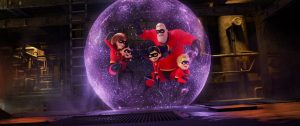
The Incredibles returned on screen over the summer, but not everything from the original movie returned for the sequel. The new film utilized Pixar’s newest rendering technology RenderMan. RenderMan enabled animators to better render textures onto environments,  clothing, skin, and hair (the hair in the movie now moves like real hair instead of moving like a blob!) and forcefields! RenderMan is not a technology that is exclusively used in Pixar films, but is now a popular rendering technology used in many Hollywood films. One example of this is their success with the photorealistic rendering of Rachael in Blade Runner 2049. Animators were able to photorealistically render Rachael’s face from the original film onto an actress that looked nothing like Sean Young, the original actress. RenderMan is an effective rendering tool like can render photorealistically but can also create an animated feeling. It is no surprise that Pixar’s RenderMan is now the predominant rendering technology in the film industry today.

https://renderman.pixar.com/product

Judy Li-Project-05-Wallpaper

judyli: Wallpaper Project 05

/*
Judy Li
Section A
judyli@andrew.cmu.edu
Project-05
*/

function setup() {
    createCanvas(480, 480);
    background("pink");
    noStroke();
}

function draw() {
    var tw = 60;
    var th = 60;
    var oy = 60;
    var ox = 60;
    for (var i = 0; i < width; i = i + 5) {
		stroke(255);
		line(i, 0, i, height);
    }
    for (var y = 0; y < 8; y++) {
    	noStroke();
        for (var x = 0; x < 7; x++) {
            var py = oy + y * (sqrt(3) * (th / 2));
            var px = ox + x * tw;
            for (var x = 0; x < 6; x++) {
                var py = oy + y * (sqrt(3) * (th / 2));
                var px = ox + x * tw;
                if (y % 2 != 0) {
                    py = oy + y * (sqrt(3) * (th / 2));
                    px = ox + x * tw;
                    fill(128, 206, 214);
                    arc(px + (tw / 2), py, 50, 50, PI - QUARTER_PI, TWO_PI - QUARTER_PI);
                    fill(213, 244, 230);
                    arc(px + (tw / 2), py, 50, 50, TWO_PI - QUARTER_PI, PI - QUARTER_PI);
                }
                else {
                	fill (97, 134, 133);
	                arc(px, py, 50, 50, QUARTER_PI, PI + QUARTER_PI);
	                fill (254, 251, 216);
	                arc(px, py, 50, 50, PI + QUARTER_PI, QUARTER_PI);
	            }
            }
            if (y % 2 == 0) {
            	fill(97, 134, 133);
                arc(px + tw, py, 50, 50, QUARTER_PI, PI + QUARTER_PI);
                fill (254, 251, 216);
	            arc(px + tw, py, 50, 50, PI + QUARTER_PI, QUARTER_PI);
            }
        }
    }
    noLoop();
}

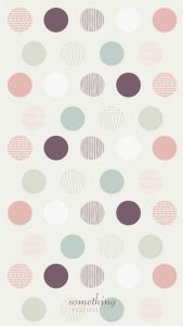
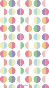
I found two wallpapers from Pinterest that I really liked. But, the goals of this project was to create one static wallpaper. So, I wanted to combine the two I found to create my own wallpaper. I think that the base of my project can serve to be useful for adding more details to the wallpaper such as making the arcs divide into different rings so that it’s more intricate. I also referred to the code from the assignment to help me with this project. I attached the two inspirations I got from Pinterest below.

Photo Inspiration 1
Photo Inspiration 2

Looking Outwards – 05

Article

Designer: Alexey Zakharov

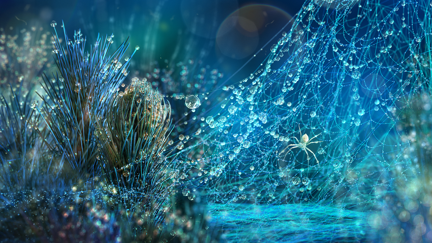
This is a project designed by Alexey Zakharov. This project showcases a macro vision world full of spiders, caterpillars, dragonflies, and ladybugs surrounded by dew drops that are lively, but animated for that effervescent effect. In my opinion, what makes this project so successful is the way that Zakharov plays with light and how he makes it reflects off of the water droplets and onto the plants and insects/bugs. His attention to that detail is exquisite and thus, makes the scene vibrant and real. For the algorithm that he used, I believed that each droplet is made from a surface subdivided into smaller surfaces. And that allows him to make them so detailed. He also uses a lot of repetition in quantity to make the object/thing more full/rich to look at.

Water Drops: Animation of the project.

Illustrations: Other pictures of the project.

Process: Some behind the scene works leading to the finale.


Erin Fuller-Looking Outwards-05

Scale of ANIMAS

The Berlin-based studio Onformative created an interactive art installation called “ANIMAS” (2015). Physically the installation is a giant glowing sphere measuring two meters in diameter, on the interior is a powerful wide-angle projector and fisheye lens, producing images in a full 360-degree directional beam onto the sphere.

The orb, which can be seen from all angles, is constantly moving, producing a dynamic “texture” that is computer generated. Modulating frequencies audible in the installation respond to those in the installation space as sound is picked up and resonated back. While the project is not necessary “groundbreaking” in technologies, it was certainly executed well and a beautiful art piece.

Video of Animas in Action


Audrey Zheng-Looking Outwards-04

Apparatum
Apparatum – Inspired by the Polish Radio Experimental Studio

I am using 1 of my grace days for this late submission.

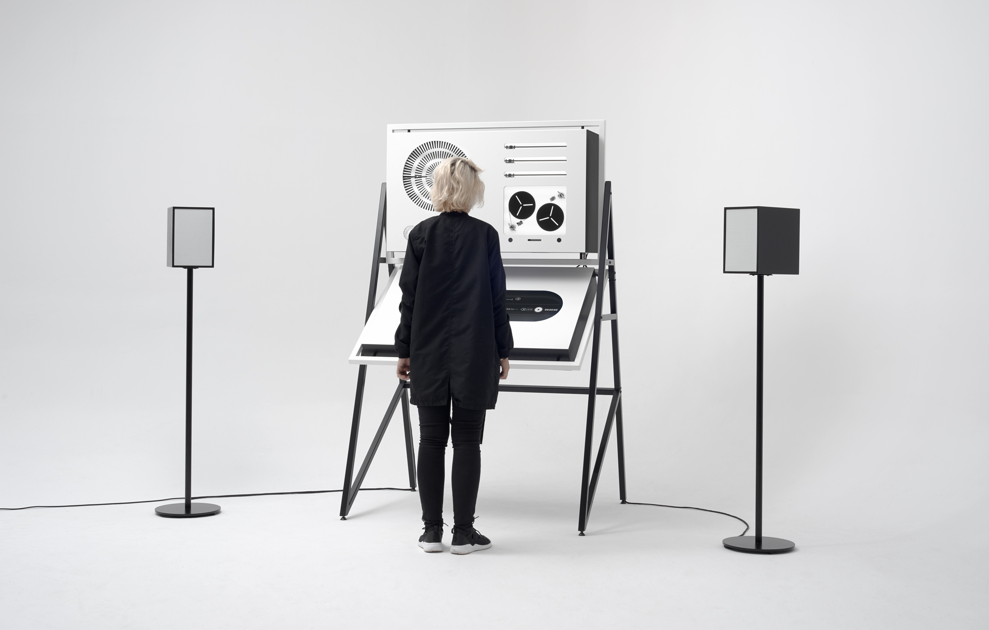
For this week’s Looking Outward, I chose to read up on the Apparatum, created by panGenerator. In a nutshell, the apparatum is a custom made apparatus with digital interface that emits purely analogue sound.

It’s a tribute to the Polish Radio Experimental studio. This studio recorded electronic and utility pieces. The studio was established in 1957 and operated until 2004; it was one of the first studios in the world producing electroacoustic music.

I think it’s cool how multifunctional this installation is. Apparatum is equipped with optical analog sound generators and tape samplers. It has seamless UI design and a touch screen to allow users to compose their own music.Then it print’s the user’s score and uploads the audio file.

I also admire the black and white minimalist aesthetic of the physical design. The physical form of the apparatus is inspired by the general aesthetics of the Studio’s famous “Black Room” designed by Oskar Hansen. I think it suits the tempo and range of electronic sounds the apparatum produces.

I enjoy the mixture of old technology and new technology. The new tech: Software used to create the interface/GUI is electron (node.js) and microcontroller elements are c running on teensy 3.2. The older tech:  the panGenerator team decided to use two types of “tape samplers” – two 2-track loops and three one-shot linear tape samplers. To obtain noise and basic tones they are utilising purely analog optical generators based on spinning discs with graphical patterns.

See more here.

Katherine Hua – Project 04 – String Art

sketch

function setup() {
    createCanvas(400, 300);

}

function draw() {
	background(0);

	//creating variables for starting point of lines (indicated by 1) and the ending points of the line (indicated by 2)
    var x1;
    var y1;
    var x2;
    var y2;

    //creating the two circles in the center
    noStroke();
    fill(232, 140, 114);
    ellipse(175, 125, 90, 90) //orange circle

	//creating the black lines going through the orange circle
	x1 = 70 
	y1 = 85;
	x2 = 200;
	y2 = 85

	strokeWeight(6);
	stroke(0);
	for (i = 1; i < 10; i++) {
		line(x1, y1, x2, y2);
		y1 += 10 //the height of starting point is moving down
		y2 += 10 //height of the ending point is moving down as well
		x2 -= 10 // line is getting shorter with each iteration
	}

	noStroke(); 
	fill(200, 42, 35);
	ellipse(200, 150, 75, 75); // red circle

	// creating the white lines crossing through the center
	strokeWeight(1);
    stroke(255, 255, 255);
    x1 = 0;
    y1 = 0;
    x2 = 400;
    y2 = 300;
    for (i = 0; i < 41; i ++) {
		line(x1, y1, x2, y2);
		x1 += 10;
		x2 -= 10;
	}

	//pink
    stroke(246, 159, 255);
    x1 = 400
	y1 = 0
	x2 = 0
	y2 = 0
	for (i = 0; i < 81; i ++) {
		line(x1, y1, x2, y2);
		x1 -= 5;
		y2 += 5;
	}
	//green
	stroke(27,178, 141);
	x1 = 400;
	y1 = 0;
	x2 = 400;
	y2 = 300;
	for (i = 0; i < 81; i ++) {
		line(x1, y1, x2, y2);
		y1 += 5;
		x2 -= 5;
	}
	//yellow
	stroke(232, 214, 114);
	x1 = 0;
	y1 = 0;
	x2 = 0;
	y2 = 300;
	for (i = 0; i < 81; i ++) {
		line(x1, y1, x2, y2);
		y1 += 5;
		x2 += 5;
	}
	//blue
	stroke(150, 173, 255);
	x1 = 400
	y1 = 300
	x2 = 400
	y2 = 0
	for (i = 0; i < 81; i ++) {
		line(x1, y1, x2, y2);
		y1 -= 5;
		x2 -= 5;
	}


}

I wanted to create an abstract version of the sunsets I often see back home in LA. Because of the pollution that surrounds the city, the sunsets that overlooks the city is very colorful.