Curran Zhang – Project 12- Proposal

As an architecture student, I wanted to do something that involves architecture information. As an architecture student, we usually try to find precedent studies based off of a certain idea. With a collection of different ideas of architecture like green features, atrium, cubic forms, and landscape design, students can click to see further information. With each collection, I plan to have an animation that can draw out an iconic building that represents that idea. this would require an archive that has different design ideas and show some sort of information that can help architecture students like myself. The picture below shows diagrammatic representations of buildings drawn by Fedrico Babina. Each drawing is a different representation of works done by other artist like Andy Warhol and Mark Rothko. I want to do something similar but combining iconic building, animation, and information together.
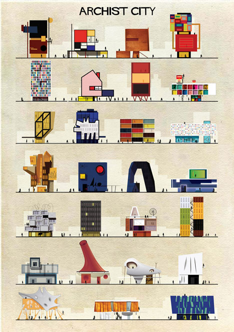
Art meets architecture in Federico Babinas Archist Series
Work by Fedrico Babina

Curran Zhang – Looking Outwards -12

For this looking outwards, I was more interested in interactive art works that uses the human and computational design to create something new. Projects that I was interested in was the Digital Type Wall by SEA Design (2012) and Vanishing Points by Rafael Lozano- Hemmer(2018). Digital Type is an animation sequence that changes the array of letters into different font types. Out of 6000 possible combinations, one is chosen at random. This allows visitors to observe the changes and various types of “language” created by the same letters. Vanishing Points is an interactive art piece that changes the vanishing point of the drawing based on the location of the closest viewer. These projects gear me towards something that is more of an artistic game or interactive program that allows the user to create amazing drawings.


http://www.lozano-hemmer.com/vanishing_points.php

http://marcinignac.com/projects/digital-type-wall/

Looking Outwards Week 12 – Sara Frankel

Looking through my peers’ posts, I found that Jenna Kim’s Week 10 and Sean Meng’s Week 4 Looking Outwards are quite similar to my project. I hope to capture the shape and colors of music. Jenna wrote about Christopher Yamane’s “wassiliscope”. This project uses a telescope to translate light frequencies to audible frequencies. In other words, this artist brings forth the sound and correlation of the color portrayed.

Sean talks about pop artist Ed Sheeran’s visualization of his song “Shape of You”. Ed Sheeran uses colors and geometric shapes to fill his backdrop of his music video allowing the viewer to follow along and experience the mood of the music visually.

Ed Sheeran’s creative process explained with music visualization

This is relevant to my project as I hope to incorporate visuals connected to music to help enhance the users experience in understanding the music, which both projects do. I admire these projects as, a music major, I experience more of the entire musical experience. I would love to be able to share this with other people in terms of how I feel and see the music.

Week 12 – Project Proposal Sara Frankel

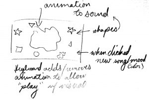
For my project, I would like to incorporate a game with music. I have always loved projects that interact with music. I would be lying if I said I know exactly how my project will look as of right now, but I am thinking of using some sort of animation that is coordinated with a soundtrack. For instance, color tones match the “mood” of the piece and the shape represent the different musical aspects of it. On the other hand, I want to take advantage of the user’s keyboard so that they can play a part of the visual experience of sound. I attached an image of my sketch that I am envisioning. As you can see below, my plan is to have this abstract image most correlated with the piece in both color and shape, this shape will change in shape according to the frequencies emitting from the song. Scattered around this main shape will be simpler shapes that “pulse” and rotate according to different aspects of the piece. The user will be able to play around with all of these shapes and change the song and aspects of it on the color chosen by the user. This project connects color, sound, and shapes to display music.

Looking Outwards – 12

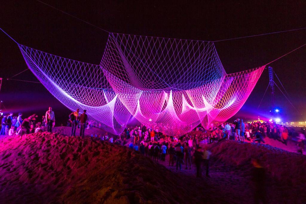
The Space Between Us, Santa Monica, CA. 2013
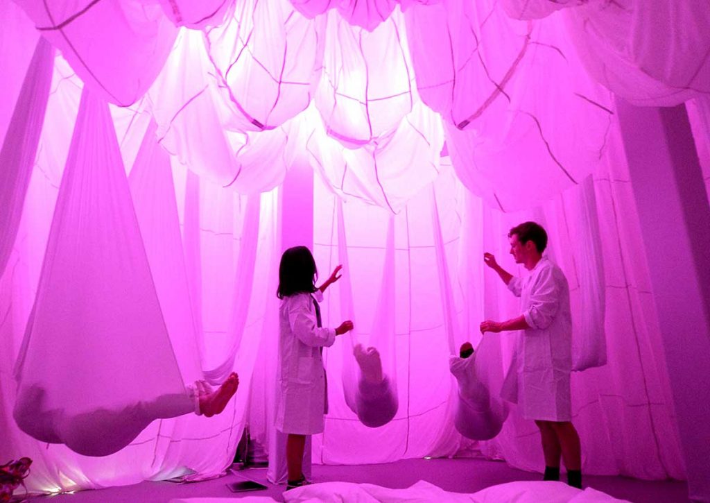
The Chronarium Sleep Lab, The Cathay, Singapore. 2015

The project The Space Between Us, is by Janet Echelman and the project The Chronarium, is by Rachel Wingfield. Both of these projects are similar in the way that they are both human centered and designed for interaction and to create an experience throughout. I found these projects interesting because the approaches to similar concepts are different. Echelman’s project is situated in an open environment, while Wingfield’s project is a part of an enclosed space. While both are different in the physical aspect, both project incorporates lighting and sound to create an immersive audiovisual experience for their audience. Both project also include some sort of physical change to the environment by the audience. In the Space Between Us, the audience had to carve or make indentations through the sand so that they could sit comfortably to look up at the aerial sculpture. In the Chronarium, the audience would lie inside a textile canopy, which would change the shape and form of the envelope as they moved/turned to find the most comfortable position to rest/sleep.

Jamie Dorst Looking Outward 12

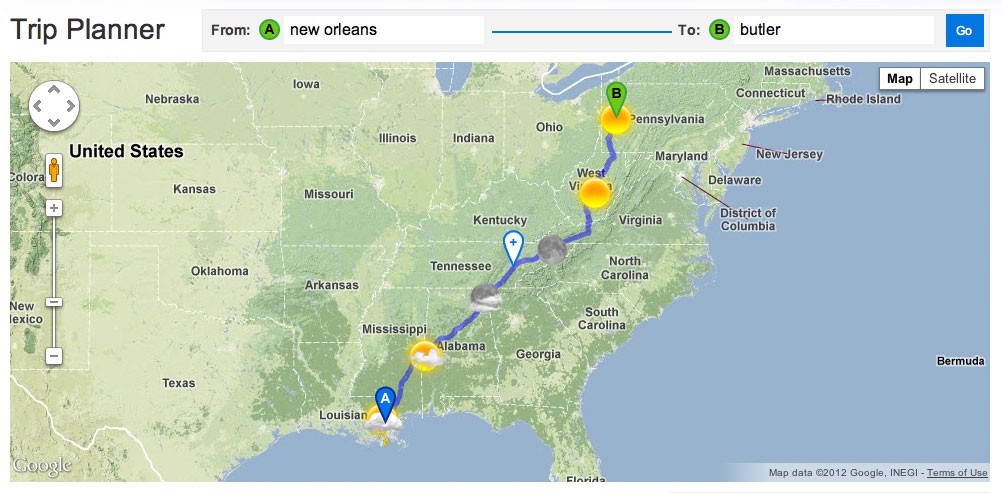
For this week’s looking outward post, I found two different projects that have inspired my final project. The first one is a travel planner by Stamen Design that helps you plan a road trip, but also tells you what the weather is like along the way so you can plan better. After making your plan, you can drag around the stops on your trip and see how the weather changes if you take a different route. I think this is a good way to interact with weather and make the basic numbers more understandable and approachable.

An image of the trip showing the weather along the way
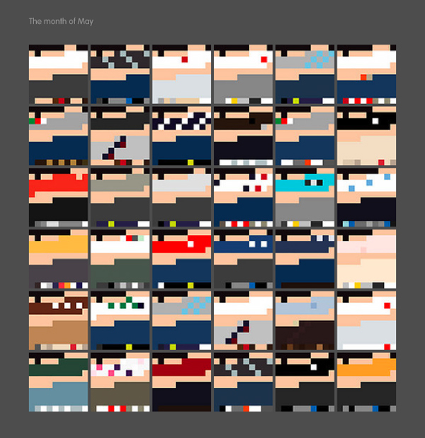
The other project I found was My Daily Color Palette by Jacobo Zanella. He made an image every day for the entirety of 2010 showing the color palette of his clothes and how much skin was showing. I thought this was a really cool project that would let you see patterns in what you wear, and see as the year goes by how that changes.
These are all of his color palettes for the month of May in 2010

Jamie Dorst Project Proposal

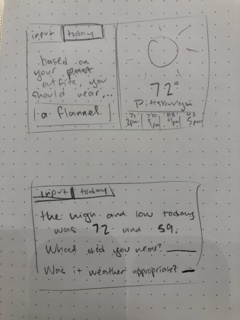
For this project, I had the idea to create some sort of weather app, but in addition to telling the forecast, it will suggest what to wear based on inputs you’ve given in the past. I’m not totally sure if this project will work, because it seems pretty complicated, involving some sort of basic machine learning and a weather API, but I’m interested to see if I could get it working on some basic level. I know this is something I’d love to have, and even though my final product may not be perfect, I think it’ll teach me a lot. The basic things I’ll need are a way for the user to input data, including what they wore and if it was good, a way to store, retrieve, and display that data later, and a forecast display.

A simple image of what I imagine my project looking like.

Final Proposal, Erin Fuller

As a kid I always loved maze puzzles; there was even a point in early middle school where I would spend hours not paying attention to school and create my own mazes on graph paper and come back a week or two later to try to solve them. Because I was creating them I had some underlying logic that I was unconsciously implanting, so I solved them pretty quick.

For my final project, I want to create a program that randomly generates a maze that users can solve. I think this would be done with turtle graphics or some sort of recursion algorithm. If time permits, I would like to add animation to the users’ progress in completing the maze and possibly sound.

Image result for simple maze
Simple Maze Graphic

Jonathan Liang – Looking Outwards – 12

Two projects that I have been inspired by for my final project are Shanshui DaDA and the IOS game Battle Cats by PONOS. Many of my projects thus far this semester have involved drawing stuff onto the canvas, and Shanshui DaDA is taking that concept and putting in on steroids. This AI program allows any ordinary civilian (no matter how talented they are at drawing) to draw lines on an iPad and then it transforms their creation into a beautiful Chinese landscape painting.

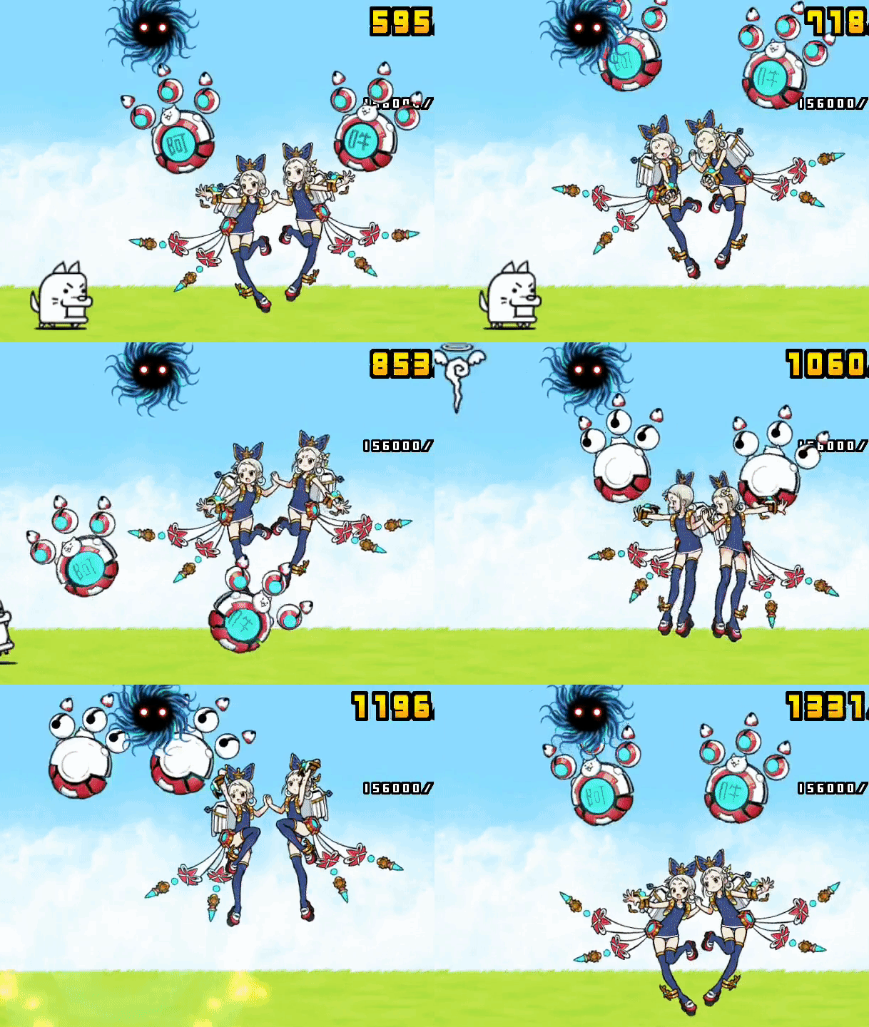
Battle cats inspires me because I always wanted to try making an animated game of some sorts. After project 10 and the walking man assignment, I’ve really been interested in trying to animate some characters I created into p5js.

http://battle-cats.wikia.com/wiki/Main_Page

https://www.creativeapplications.net/member-submissions/shanshui-dada-ai-assists-human-creator-in-drawing-chinese-ink-wash-landscape-painting/


Yiran Xuan – Looking Outwards – 11

I am a fan of a wide variety of music, including American folk music and Chinese folk music. In the middle of switching between Sanxian (Chinese traditional 3-string banjo) playlists to bluegrass playlists, I suddenly noticed that there was a great many similarities between the two genres. Both featured fast, colorful strings that operated in the major scales, often pentatonic scales, giving them energetic but grounded feelings. The topic of the songs are also similar, describing longings of home, the beauty of rural environments, and amusing interpersonal relationships. What this meant to me was despite the genres being folk, there was room for new growth and cross-cultural synthesis, and that the two cultures I have grown up were strangely bridged.

I searched for any realized union of the two genres, and I was happily surprised to find Redgrass:
The Chinese musical group featured frequently experiments with combining traditional Chinese instrumentation with the music from other cultures, including American jazz, Malaysian percussion, and experimental electronic music.

Website

(Completed with 2-day extension)