Jisoo Geum – Project 07 – Curves

sketch

// Jisoo Geum
// Section B
// jgeum@andrew.cmu.edu 
// Project-07
var x;
var y; 
var bR; // big radius outside 
var r; // smaller radius inside 
var d; // distance from the center of the interior circle 
var mx; // mouseX
var my; // mouseY 

function setup() {
    createCanvas(480, 480);
}

function draw() {
    background(255,0,0);
    translate(width/2, height/2);
    noFill();
    mx = constrain(mouseX,0, width);
// draw a Hypotrochoid with ellipses 
        strokeWeight(1);
        stroke(255);
        for (var a = 0; a < 2*TWO_PI; a ++){ // a is angle 
            bR = 50; // big radius 
            r = map( mx, 0, width, 10, 65 ); // small radius
            d = map( mx, 0, width, 10, 100 ); // distance 
            x = (bR-r)*cos(a) + d*cos( ((bR-r)/r)*a ) ;
            y = (bR-r)*sin(a) - d*sin( ((bR-r)/r)*a ) ;
        ellipse(0,0,x*5,y*7);
        }

// draw Nephroid
            strokeWeight(0.25);
            stroke(255);
            for (var a = 0; a < 10*TWO_PI; a ++){ // a is angle 
                bR = map( mx, 0, width, 0, 130 ); // big radius  
                x = bR*((3*cos(a)) -  (cos(3*a))) ;
                y = bR*((3*sin(a)) -  (sin(3*a))) ;
            ellipse(0,0,x*30,y*15);
            }

// draw Hypotrochoid 
    beginShape();
        strokeWeight(.75);
        stroke(255);
        for (var a = 0; a < 25*TWO_PI; a ++){ // a is angle 
            bR = 200;   // big radius 
            r = map( mx, 0, width, 10, 130 ); // small radius
            d = map( mx, 0, width, 10, 300 ); // distance 
            x = (bR-r)*cos(a) + d*cos( ((bR-r)/r)*a ) ;
            y = (bR-r)*sin(a) - d*sin( ((bR-r)/r)*a ) ;
        vertex(x,y);
        }
    endShape();

}


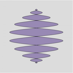
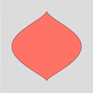
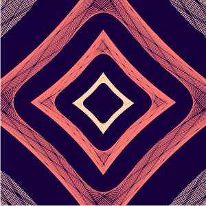
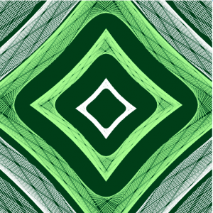
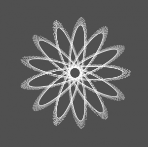
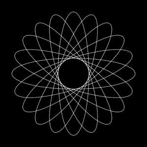
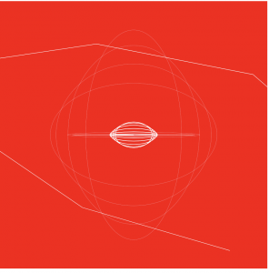
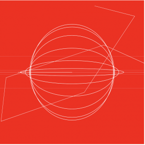
I first went to WolframMathworld website too look for shapes that I found interesting. I eventually decided to use the equations for hypotrochoid and nephroid since I thought the combination of roulette and plane curves would make a good contrast.  Although the curves in the final iteration didn’t turn out as I thought, I thought that the shapes were still interesting.

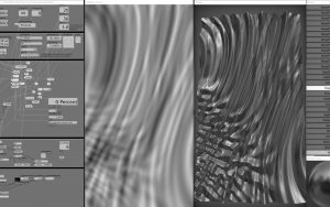
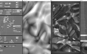
These are the process images before I adjusted the limits in the for loops and the parameters of vertex & shapes. If I could change anything from the final design, I would adjust the map()  more so that the movement would look more organized.

Lingfan Jiang – Looking Outwards 07

This week, I am particularly interested in this project called “skies painted with unnumbered sparks”. It was done by an interactive artist, Aaron Koblin collaborated with Janet Echelman in 2014. Made entirely of soft fibers, the sculpture can attach directly into existing city architecture.

Being an architecture student myself, I really like how the artist started to think about the space between the buildings and how art could be involved in it. I really like the contrast between the hard concrete buildings and the smooth, light installation. Most importantly, with computational information visualization and great lighting effects, it really became something its audiences are willing to interact with. It is also amazing how people could just use their phones to draw lines and that would project directly onto the installation.

I think the final form of this art piece is very successful. As I mentioned earlier, this project is done by an interactive artist,  Aaron Koblin and another artist, Janet Echelman, who mainly does amazing huge scale installation art. Therefore, I think the combination of the two artists really created something fascinating.  As for the algorithm behind it, I would assume that the installation becomes a bigger monitor of people’s phones. Whatever is drawn on the phones would project directly on to the installation.

Furthermore, I think this kind of techniques could really make some science fiction movie scenes come true where a lot of projecting figures are floating in the air in the future.

Victoria Reiter – Looking Outwards – 07

Computational interaction between humans and plants

Disney Research Pittsburgh has developed a project which uses a touch sensor to create an electromagnetic field around plants. The sensor detects minute disturbances in the field, and responds by creating a shapes and colors around the plant, in a type of aura, reacting to different forms of touch, movement, and proximity to the plant.

Orchid emitting an “aura” from the electromagnetic field

The video below demonstrates some interactions with the plants.

Video of interactions with plants

I think that this project is beautiful. It combines nature with technology, and although nature is already alive, it manages to animate it even further, giving these plants personalities, and making the interaction seem almost mutual rather than simply one-dimensional.

Furthermore, I thought it was fascinating that this project pertains to Pittsburgh, and in particular Disney Research Pittsburgh. Not sure how much the facts connect but shout-out to Randy Pausch just in case they do:) Just like how Randy Pausch combined technology and the arts, two “unlike forces,” so does this project combine technology and nature, another “unlikely” pair.

Full details on the project can be found here.

Sarah Yae Looking Outwards 7 Section B

“How Different Groups Spend Their Day” by Amanda Cox displays how different types of people (unemployed, employed, etc) spend their time during the day. I was intrigued by this visual because it was amazing how one could use computation to display such practical data. One could also easily pick out the type of data they wish to extract. For example, we can see that the unemployed sleep an hour more than the employed; the unemployed also spend an extra hour for house chores. It is amazing how Amanda Cox was able to get such data and display it in a visually appealing way, using computation. This type of display was not only highly informative, but also very visually pleasing.

To see more of her artwork, please follow the link: http://amandacox.tumblr.com/post/2709495753/a-peek-into-netflix-queues 

How Different Groups Spend Their Day

Xiaoying Meng -Looking Outwards 07

(Visualization for Amersterdam SMS messages on New Year’s Eve)

This is a visualization for Amersterdam SMS messages data on New Year’s Eve created by Aaron Koblin. The data is visualized by representing each message with a colored dot vertically on a map. The dataset creates city-like animations.  Interestingly, the vertical tubes go up and down together almost like music beats. The colored dots are denser at certain areas and closer at others, like population. And at 00:00 on New Year’s Eve, the number of data reaches ultimate high. The artist used P5js and OpenGL for the visualization. I appreciate this visualization because it makes the data a lot easier to understand for the viewers.  I guess the artist could be using algorithms such as using one colored dot to represent one message sent, locating them geographically on a map.


Sarah Yae Project 7 Section B

sketch
//Sarah Yae
//smyae@andrew.cmu.edu
//Section B
//Project 7

var nPoints = 500; 
var sizeHeart = 150; 

function setup() {
    createCanvas(400, 400);
}

function draw() {
      background(220);
      drawHeartCurve();
}

function drawHeartCurve() {
    var t; //Theta 
    var x; 
    var y;

// Conditional to determine color of curve 
    if (mouseX > width / 2) {
        fill ('Salmon');
    }
    else {
        fill (148,141,179);
    }

// Draw the curve 
// Heart formula used: 
// x = 16 * sin^3(t)
// y = 13 * cos(t) - 5 * cos(2 * t) - 2 * cos(3 * t) - cos(4 * t)

    beginShape();
    for (var i = 0; i < nPoints; i++) {
        // Conversion of "i" into radians 
        var t = map(i, 0, nPoints, 0, TWO_PI); 
        // Moving the mouse horizontally controls how many curves are drawn 
        var x = (width / 2) + sizeHeart * sin(t * mouseX / 20) * sin(t) * sin(t);
        // Moving the mouse vertically controls how squiggly the lines get 
        var y = (height / 2) + sizeHeart * (cos(t)) - (cos(2 * t)) - (cos(3 * t * mouseY / 10)) - (cos(4 * t));
        vertex (x,y);
        }
        endShape(CLOSE); 
}
I originally intended to create a heart, so I started by using a heart equation, which is commented in my code above. However, along the way, I figured out ways to make the curves more interactive, and more fun, than just a regular heart. I also wanted to play with different colors, so I used a conditional to call different colors depending on the condition of mouseX. It would have been great though, if the colors could have gradually changed from lavender to salmon, instead of having a sudden change. In addition, I had trouble fully understanding the math equation part, but I was still able to understand functions used to create the curve.
Curve without “mouseY”
Curve without “mouseX”, “mouseY” 

KadeStewart-Project-07-Curves

sketch

//Kade Stewart
//Section B
//kades@andrew.cmu.edu
//Project-07


function setup() {
    createCanvas(480, 480);
}

var t = 10;
var x;
var y;
var col = 0;

function mouseClicked() {
    //when the mouse is clicked, change the color scheme to 1 of 2 options
    col = (1 + col) % 2;
}

function draw() {

    //fills the background a diff color depending on the state
    if (col == 0) {
        background(0, 59, 26);
    } else {
        background(18, 0, 58);
    }

    //sets variables in the equations to the mouseX and mouseY
    var a = mouseX;

    noStroke();
    fill(0);

    //this makes the coordinate reference frame in the middle of the screen
    push();
    translate(width/2, height/2);

    for (j = 0; j < 40; j++) {
        beginShape();
        noFill();


        if (col == 0) {
            //uses the green color scheme
            if (j % 2 == 0) {
                stroke(255, 255, 255);
            } else {
                stroke(190, 249, 156);
            }
        } else {
            //uses the blue and orange color scheme
            if (j % 2 == 0) {
                stroke(245, 134, 124);
            } else {
                stroke(253, 218, 183);
            }
        }

        //draws each astroid curve with a number of points determined by the mouseY
        for (i = 0; i < mouseY; i++) {
            x = (a - (width/2)*j) * cos(i) * cos(i) * cos(i);
            y = (a - (width/2)*j) * sin(i) * sin(i) * sin(i);
            //places the point to be drawn to
            vertex(x,y);
        }
        endShape();
    }
    pop();

}

I drew the astroid curve multiple times so that they could seemingly fold in and out of each other. This is manipulated by where the mouse is on the horizontal axis. I initially had the mouse’s y-height affecting the center of the curves, but it gave the user too much to vary in the curves. Now the mouse’s y-height affects the fidelity of each curve. Furthermore, clicking changes the color scheme between 2 options, just for some extra fun.

Lingfan Jiang – Project 07 – Curves

lingfanj-07

// Lingfan Jiang
// Section B
// lingfanj@andrew.cmu.edu
// Project-07


function setup(){
    createCanvas(480, 480);
}

function draw(){
    background(80);
    //tranlate the center of the canvas
    translate(240, 240);
    stroke(255);
    strokeWeight(0.5);
    Hypotrochoid();
}

function Hypotrochoid(){
    //x and y defines the positions of points
    var x;
    var y;
    //use map and constrain to keep the shapes inside the canvas
    //Also, use mouseX and mouseY to change all the variables inside the equation
    var xbound = constrain(mouseX, 0, 480);
    var a = map(xbound, 0, 480, 0, 130);
    var b = map(xbound, 0, 480, 0, 60);
    var h = constrain(mouseY, 0, 270);
    noFill();
    //Hypotrochoid
    beginShape();
    for (var i = 0; i < 360; i++) {
        x = (a - b) * cos(i) + h * cos((a - b) / b * i);
        y = (a - b) * sin(i) - h * sin((a - b) / b * i);
        vertex(x, y);
    };
    endShape();

}

I think this is an easy but super fun project. Before working on this project, I have seen projects using the spirograph technique. I was very interested in how math was a natural art. However, I am surprised by how much I could do just using mathematical curves and p5.js.

This project also became more interesting adding the interactive aspect. By doing this project, I realized that sometimes the artist does not need to have a clear vision about how the final form looks at first. Design within the process can also be a great way to have surprising results.

early process
early process
final form

Tanvi Harkare – Project 07 – Curves

sketch

/*Tanvi Harkare
Section B
tharkare@andrew.cmu.edu
Project-07 */

var numLines = 20;
var angle = 0;
var angleX;
var clickCount = 1;
var circleW;
var circleC;

function setup() {  
    createCanvas(480, 480);
}

function draw() {
    background(0);
    for(var i = 0; i < numLines; i++){
        noFill();
        strokeWeight(clickCount);
        push();
        angleX = map(mouseX, 0, 480, 0, 90); //altering how slow or fast ellipses rotate 
        circleC = map(mouseX, 0, 480, 20, 255); //altering stroke color from black to white
        numLines = map(mouseY, 0, 480, 5, 50); // altering amount of lines drawn
        circleW = map(mouseY, 0, 480, 200, 50); //altering ellipse width
        stroke(circleC);
        translate(width / 2, height / 2);
        rotate(radians(angle));
        ellipseMode(CENTER);
        ellipse(0, 0, circleW, 400);
        pop();
        angle += angleX;

    }
}

function mouseClicked(){
    //increases strokeWeight parameter based on mouse clicks
    clickCount++;
}

function keyPressed() {
    clickCount = 1;
}

For this project, I was inspired by the spirograph curves. I created a set of ellipses that change based on mouseX and mouseY parameters. The mouseX changes the color of the stroke and the angle of rotation for the ellipses. The mouseY changes how many curves are drawn and the width of the curves. Additionally, when the mouse is clicked the strokeWeight will increase. When any key is pressed, the strokeWeight defaults back to its original value.

Screenshot of an example of how ellipses would look if it were not interactive

Shirley Chen-Looking Outwards-07

This project, called “Melting Memories”, is a series of digital artworks that create visual representation for EEG data collected on the neural mechanisms of cognitive control created by Refik Anadol Studio. It aims to explore materiality of remembering. Using computational method, this project allow the viewers to experience the aesthetic interpretation of motor movements inside human brain. The artist collects data on the neural mechanisms of cognitive control from an electroencephalogram, which measures the changes in brain wave as the result of activity and provides evidence for the function of brain.
The data is collected by instructing the participants to focus on specific childhood memories during the recording process. And the team transposes the EEG data t into procedural noise to generate aesthetic structures. This project is intriguing because the artists used computational method to collect and represent sets of abstract data relating to memories. With new technology and perspectives of exploring arts, the artists tried to visualize something that is intangible and vague. It provides the viewers with new perspectives and ways to learn the brain activity and also forms connections between the viewers and the artwork because the artwork is actually depicting the activity in human brain.


“Melting Memories” Project Created by Refol Amadol Studio

EGG Data Collection 

Visualizing EGG Data 


https://www.creativeapplications.net/vvvv/melting-memories-drawing-neural-mechanisms-of-cognitive-control/