Romi Jin – Project-07-Curves

sketch

/*
Romi Jin
Section B
rsjin@andrew.cmu.edu
Project-07
*/

var x;

function setup() {
    createCanvas(480, 480);
    
}

function draw() {
    
    background(174, 198, 207);

    x = constrain(mouseX, 0, width);
    y = constrain(mouseY, 0, height);
    
    //three intersecting hypotrochoids

    push();
    translate(width/2, height/2);
    drawHypotrochoid();
    pop();

    push();
    translate(width/3, height/3);
    drawHypotrochoid();
    pop();

    push();
    translate(width-width/3, height-width/3);
    drawHypotrochoid();
    pop();

}

function drawHypotrochoid() {

    //link: http://mathworld.wolfram.com/Hypotrochoid.html
    //roulette by drawing along two cirles (radius a and b below)

    for (var i = 0; i < TWO_PI; i ++) { 

        a = map(y, 0, height, 100, 200); 
        b = map(x, 0, width, 0, 75); 
        h = 100;

        x = (a - b) * cos(i) + h*cos(((a-b)/b) * i);
        y = (a - b) * sin(i) - h*sin(((a-b)/b) * i);

        noFill();
        stroke(255);
        strokeWeight(1);
        ellipse(0, 0, x, y);

    }

}

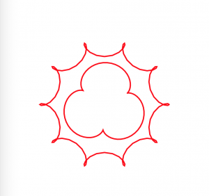
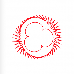
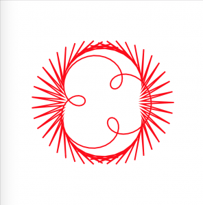
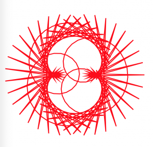
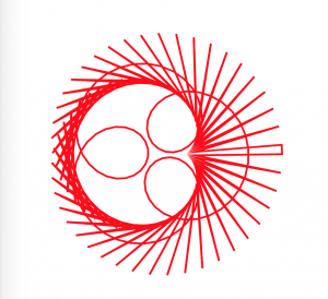
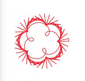
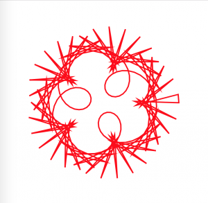
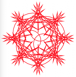
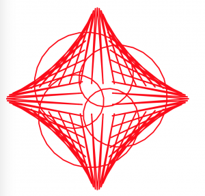
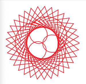
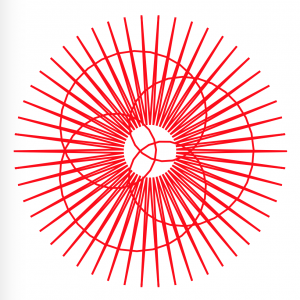
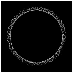
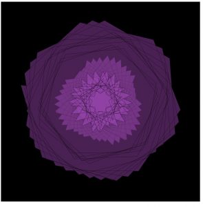
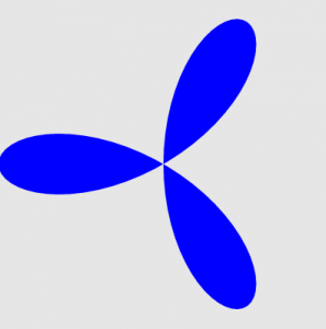
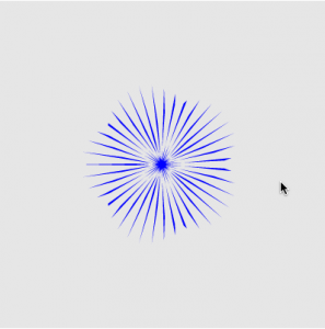
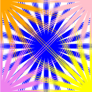
For this project, I chose the shape hypotrochoid and drew it three times to create three intersecting hypotrochoids. The parameters are the mouse X and mouse Y position, and the mouse X changes one ellipse’s radius while mouse Y changes the other. It is intriguing to watch the three intersect as they create even more curves together.

Shirley Chen-Project-07-Curves

sketch

// Shirley Chen
// Section B
// junfanc@andrew.cmu.edu
// Project-07


function setup(){
	createCanvas(480, 480);
	angleMode(DEGREES);
}

function draw(){
	background(242, 186, 176);
	curveA();
	curveB();
}

function curveA(){
//Create the Fixed-Position Astroid Curve
    noFill();
    beginShape();
    var col = mouseX * 0.3;
    stroke(221, 127, col);
    translate(100, 200);
    for (var i = 0; i < mouseX/2; i ++){ 
//The Number of Curves Will Change According to MouseX
        LimitedMouseX = constrain(mouseX, 0, width);
        var cons = map(LimitedMouseX, 0, width, 10, 100); 
//The Angle Will Change According to MouseX
        var theAngle = map(i, 0, mouseX, 20, 360);
        var x = 2 * cons * cos(theAngle) + cons * cos(2 * theAngle);
        var y = 2 * cons * sin(theAngle) - cons * sin(2 * theAngle);
        vertex(x, y);
    endShape();
//Rotate The Curves According to MouseX
    rotate(mouseX); 
    }
}


function curveB(){
//Create the Moving Astroid Curve
    noFill();
    beginShape();
    var col = mouseY * 0.5;
    stroke(col, col, 110);
    translate(150, 200);
    for (var i = 0; i < mouseY*0.7; i ++){ 
//The Number of Curves Will Change According to MouseY
        LimitedMouseY = constrain(mouseY, 0, height);
        var cons = map(LimitedMouseY, 0, width, 10, 100); 
//The Angle Will Change According to MouseY
        var theAngle = map(i, 0, mouseY, 20, 360);
        var x = 2 * cons * cos(theAngle) + cons * cos(2 * theAngle);
        var y = 2 * cons * sin(theAngle) - cons * sin(2 * theAngle);
        vertex(x, y);
    endShape();
//Rotate The Entire Astroid Curve According to MouseY
    rotate(mouseY); 
    }
}

In This Project, I created a set of stable astroid curve at a fixed position and a movable set of astroid curve that keeps rotating around a center point. For the fixed set of astroid curves, the number of curves and the angle are based on the position of mouse X; for the movable set of curves, the number of curves and the angle are based on the position of mouse Y. Therefore, I used map and constrain command to limit my X and Y positions. Moreover, the colors are also changed according to the mouse X and Y. For the fixed-position set of curves, the curves inside the set is rotating according to the mouse X. For the movable set of curves, the curves inside the set and the set itself are both rotating according to the position of Y.

Jisoo Geum – Looking Outwards 07

Interstitial Fragment Processor (2007)  – Goland Levin

link:  http://www.flong.com/projects/ifp/

Interstitial Fragment Processor is an interactive system that maps and visualizes the negative space created by our bodies. The sensor records and collects data from the silhouette of people’s body, and then animates shapes that are based on the holes created from the silouette. The shapes in the screen eventually fall down and create sound effects as it hits the bottom of the screen. Although the artist Goland Levin has numerous other works that are based on interaction design and physical computing, I found Interstitial Fragment Processor the most interesting due to its sound element. Also, I thought that the idea of visualizing and mapping the shapes of our body was a unique topic within the category of data art. I also think the artist’s vision of creating works that provide rich interactive experience is best represented through Interstitial Fragment Processor since the software urges people to make different poses in order to see more of the artwork. The artistic sensibilities are best portrayed through the sound and animation in this work since these features effectively emphasize the physical and sensible nature of the work. In terms of algorithms, the artist built a spontaneous performance system for audiovisual improvisations and a synthetic visualization of the mass created by our body. The software can somewhat accurately outline the negative space of our bodies even when they are constantly moving, which is why I appreciate the building of this system.


Universo de Emociones // PalauGea

The Universe of Emotions project by PalauGea is a data visualization project based on the concept of emotions as a cosmic network of elements. By visualizing these emotions, PalauGea hopes to help people understand their moods. This graphic map teaches emotional intelligence.

Graphic Map, Universo de Emociones, PaluaGea

There are a total of 307 emotions represented, as well as documented in their text, Dictionary of Affective Emotions and Phenomena. The emotions are then structured into four levels based on their degree of importance, starting largely with 6 main emotional basins.

The universe is the entirety of space, time and any form of substance and energy. – Eduard Punset

Not only is the project aesthetically beautiful, but it is rich in information. There are multiple layers at which the data begins to interact which in turn creates the possibility of more inferences or perspectives.

As these emotions begin to develop relationships between each other, they are grouped into trios, creating different triangulations. These relationships show their interrelated properties.

Detail: Graphic Map zoom, Universo de Emociones, PaluaGea

By using algorithms based on cosmic properties such as the idea of the circle and the halo, which are key qualities of our galaxy, the Milky Way. These networks, inspired by a system we are already familiar with, helps to create a salient visualization.

Read more about the project here!

Romi Jin – Looking Outwards 06

Gifpop is the art of transforming a gif into a one, printable image (i.e. a postcard). Gifpop utilizes a process called lenticular printing, which is a technology that uses lenticular lenses to create an illusion of depth through images, or to create the ability to see different images from different angles (aka a “moving” image). The company takes up to ten frames and merges them to create a single image on a card (slower gifs with fewer frames will have better resolution).


(Examples of gifpop cards.)

This process (including lenticular printing) has a lot of potential to grow into something even larger, and I was intrigued to learn what lenticular printing is and how it can be applied.

Project-07-Curves-Veronica

sketch

/*
Veronica Wang
Section B
yiruiw@andrew.cmu.edu
Project 07
*/

var nPoints = 100;


function setup() {
    createCanvas(480, 480);
    frameRate(10);
}


function draw() {
    background(255);
   
    // draw the curves
    push();
    translate(width / 2, height / 2);
    drawEpitrochoidCurve();
    drawHypotrocoidCurve();
    pop();


}

//--------------------------------------------------
function drawEpitrochoidCurve() {
    // Epicycloid:
    // http://mathworld.wolfram.com/Epicycloid.html
    
    var x;
    var y;
    
    var a = 60.0;
    var b = a / 3.0;
    var h = constrain(mouseY / 2, 0, width / 5);
    var ph = mouseX / 50.0;
    
    noFill();
    stroke('red');
    strokeWeight(3);
    beginShape();
    for (var i = 0; i < nPoints; i++) {
        var t = map(i, 0, nPoints, 0, TWO_PI);
        
        x = (a + b) * cos(t) - h * cos(ph + t * (a + b) / b);
        y = (a + b) * sin(t) - h * sin(ph + t * (a + b) / b);
        vertex(x, y);
    }
    endShape(CLOSE);  
}

function drawHypotrocoidCurve(){
    //Hypocycloid
    //http://mathworld.wolfram.com/Hypotrochoid.html
    var x;
    var y;

    var a1 = 200;
    var b1 = a1 / 3.0;
    var h1 = constrain(mouseY / 2, 0, width / 5);
    var ph1 = mouseX / 10.0;

    noFill();
    stroke('red');
    strokeWeight(3);

    beginShape();
    for (var i = 0; i < nPoints; i++) {
        var t = map(i, 0, nPoints, 0, TWO_PI);
        
        x = (a1 - b1) * cos(t) + h1 * cos((ph1 + (a1 - b1) / b1) * t);
        y = (a1 - b1) * sin(t) - h1 * sin((ph1 + (a1 - b1) / b1) * t);
        vertex(x, y);
    };
    endShape(CLOSE);
}


In this project, I used both the hypotrochoid and epitrochoid curves to create interesting compositions. I played around with the amplitude, divisions, diameters, etc of the curve functions. I think it’s interesting how sometimes the animation can sort of explain how the hypotrochoids were generated-when you can see a straight line rotating at the ‘beginning’ point.


Philip Gates – Looking Outwards 07

Santiago Ortiz – History Words Flow (2014)
http://moebio.com/research/historywordsflow/

I am interested not only in history, but in how we choose to engage with our history: what sticks out as important after many years? What gets emphasized? What gets forgotten?

Ortiz’s information visualization is exciting to me because it depicts exactly this: not an objective history, but an extremely subjective one, using the frequency of words in Wikipedia entries about a specific period of time as a measure. Since Wikipedia is constantly updated, this graphic is a means of representing what, at this moment, the English-speaking internet community views as the most salient details of history stretching back for millennia, and what we imagine our future to be as well.

Though no information is provided on the computational techniques Ortiz used, I imagine he has written an algorithm that scrapes Wikipedia pages and finds the words that occur with the greatest frequency. These then get a colored band proportional to their frequency. The colors Ortiz has chosen presumably speak to his own artistic sensibility, and his own subjectivity is evident in the periods of time he’s chosen to depict (when he switches from centuries to decades to years, etc).

cmhoward-project-07

sketch-131

function setup() {
  createCanvas(400, 400);
}

function draw() {
  background(0);
  fill(186, 85, 211, 100);
  strokeWeight(.25);
  stroke('black');
  drawHypocycloid();
}

function drawHypocycloid() {
  var x;
  var y;
  var theta;
  var nPoints = map(mouseY, 0, height, 50, 100);
    
  beginShape();

  for (var i = 0; i < nPoints; i++) {
    
    push();

    var a = map(mouseX, 0, width, 0, 50);
    var n = map(mouseY, 0, height, 0, 200);
    var d = map(mouseX, 0, width, 10, 20);

    theta = i;

    x = ((a / n) * (n - 1)*cos(theta)) - (d*(cos((n-1)*theta)));
    y = ((a / n) * (n - 1)*sin(theta)) + (d*(sin((n-1)*theta)));

    vertex(x + width/2, y + height/2);
    pop();
  }

  endShape(CLOSE);

  beginShape();

  for (var i = 0; i < nPoints; i++) {

    push();

    var a = map(mouseX, 0, width, 100, 0);
    var n = map(mouseY, 0, height, 400, 0);
    var d = map(mouseX, 0, width, 10, 20);

    theta = i;

    x = ((a / n) * (n - 1)*cos(theta)) - (d*(cos((n-1)*theta)));
    y = ((a / n) * (n - 1)*sin(theta)) + (d*(sin((n-1)*theta)));
    vertex(x + width/2, y + height/2);

    pop();
  }
  endShape(CLOSE);

  beginShape();

  for (var i = 0; i < nPoints; i++) {
    
    push();

    var a = map(mouseX, 0, width, 0, 100);
    var n = map(mouseY, 0, height, 0, 400);
    var d = map(mouseX, 0, width, 10, 20);

    theta = i;

    x = ((a / n) * (n - 1)*cos(theta)) - (d*(cos((n-1)*theta)));
    y = ((a / n) * (n - 1)*sin(theta)) + (d*(sin((n-1)*theta)));

    vertex(x + width/2, y + height/2);
    pop();
  }

  endShape(CLOSE);
}

For this project, I focused on the hypocycloid curve. 

http://mathworld.wolfram.com/Hypocycloid.html

The hypocycloid is based on the idea of a circle, of smaller radius, rolling along the inside of a larger circle, with a point drawing it’s curve throughout the rotation. For my project I first began exploring variations based on the number of points and how adding different variables to the equation could influence it’s shape.

I then began playing around graphically, adding in 3 layers of these hypocycloid curves, and filling in the curves, to almost recreate a flower in bloom. It’s quite interesting to me how these circles are proportional to one another but act quite differently at certain points in the canvas.

I added in the d variable, which creates even more variation, based on the Astroid curve, http://mathworld.wolfram.com/Astroid.htmlwhich is a type of hypocycloid.

Looking Outwards-07 Information Visualization-Veronica Wang

Impact of sporting events on the local economy in Hammersmith and Fulham from Habidatum on Vimeo.

I’ve always been following and interested in Habidatum’s works. They are a data analytics and consulting group that combines multiple layers of GIS data and visualize them in a custom software called Chronotope. They provide simple and easy to understand graphics to convey space-time data and their works had been applied to architecture, master planning, financial, transportation and many other fields. They believe that “by transforming contemporary planning strategies into data-driven adaptive policies, cities and businesses can generate savings, profits and opportunities.”

I think their work is incredible in how it helps the audience grasp multiple layers of data in a straightforward way, and how they can help their clients make informed decisions of their investments that can affect the city’s urban fabric.

Barcelona Tourism and Tweets


Philip Gates – Project 07 – Curves

sketch

var nPoints = 200;  //set number of vertex points for trifolium shape

function setup() {
    createCanvas(400, 400);
}

function draw() {
    background(255);
    noStroke();
   
    //draw center trifolium
    push();
    translate(width/2, height/2);
    fill("blue");
    drawTrifolium();
    pop();

    //draw upper left trifolium
    fill("violet");
    drawTrifolium();

    //draw upper right trifolium
    push();
    translate(width, 0);
    fill("violet");
    drawTrifolium();
    pop();

    //draw lower left trifolium
    push();
    translate(0, height);
    fill("violet");
    drawTrifolium();
    pop();

    //draw lower right trifolium
    push();
    translate(width, height);
    fill("violet");
    drawTrifolium();
    pop();
}

//draw Trifolium shape based on mouseX, mouseY
function drawTrifolium() {

    var x;
    var y;
    var r;
    var theta;

    var a = mouseY; //mouseY governs size of trifolium
    var petals = map(mouseX, 0, width, 2, 45); //mouseX governs number of petals
    var petalsInt = round(petals); //rounds petals to nearest integer (no partial petals)

    //create base trifolium shape using equation from Mathworld
    beginShape(); 
    for (var i = 0; i < nPoints; i++) {
        theta = map(i, 0, nPoints, 0, TWO_PI);
        r = -a * cos(petalsInt * theta);
        x = r * cos(theta);
        y = r * sin(theta);
        vertex(x,y);
    }
    endShape(CLOSE);
}

I found the trifolium curve on Mathworld and decided to see what it could do.

I discovered that changing one number in the equation would cause more “petals” to appear on the trifolium (making it not exactly a “tri”folium anymore, but it looks great), and set this to mouseX. Testing another variable, I found it governed the size of the trifolium shape, so I set this to correspond to mouseY.

To make things more interesting, I added four more trifoliums in the corners of the canvas (so only a corner of each was visible). I started with each one a different color:

…but decided I preferred the patterns that emerged when all 4 corner shapes were the same color, creating a more ambiguous web rather than 4 distinct shapes.