ChristineSeo-Project06-SectionC

sketch

// Christine Seo
// Section C
// mseo1@andrew.cmu.edu
// Project-06

var r;
var b;
var g;
var prevSec; 
var a; // set to make the text move

function setup() {
  createCanvas(480, 480);
  prevSec = second();
  r = random(130,255);
 	g = random(110,255);
 	b = random(200,250);
  a = width / 2; 
}

function draw() {
  background(197, 234, 244);
  noStroke(0);
  fill(110, 75, 3); //outer donut
  ellipse(width / 2,height / 2,430,430);
  fill(229, 155, 201);
  
  push();
  translate(width / 2, height / 2);// pink frosting shape
	ellipse(0, 0, 382, 152);
  rotate(PI / 1.0);
	ellipse(0, 0, 382, 152);
	rotate(PI / 2.0);
	ellipse(0, 0, 382, 152);
  rotate(PI / 3.0);
	ellipse(0, 0, 382, 152);
	rotate(PI / 3.0);
	ellipse(0, 0, 382, 152);
  rotate(PI / 3.0);
	ellipse(0, 0, 382, 152);
  rotate(PI / 3.0);
	ellipse(0, 0, 382, 152);
  rotate(PI / 5.0);
	ellipse(0, 0, 382, 152);
  rotate(PI / 5.0);
	ellipse(0, 0, 382, 152);
  rotate(PI / 5.0);
	ellipse(0, 0, 382, 152);
	rotate(PI / 5.0);
	ellipse(0, 0, 382, 152);
	rotate(PI / 5.0);
	ellipse(0, 0, 382, 152);
	rotate(PI / 7.0);
	ellipse(0, 0, 382, 152);
	rotate(PI / 7.0);
	ellipse(0, 0, 382, 152);
	rotate(PI / 7.0);
	ellipse(0, 0, 382, 152);
	rotate(PI / 7.0);
	ellipse(0, 0, 382, 152);
	rotate(PI / 7.0);
	ellipse(0, 0, 382, 152);
	rotate(PI / 7.0);
	ellipse(0, 0, 382, 152);
	rotate(PI / 7.0);
	ellipse(0, 0, 382, 152);
  pop();
  
  fill(229, 155, 201);//frosting base
  ellipse(width / 2,height / 2,320,320);
  ellipse(width / 2 + 5,height / 2 + 5,320,320);
  fill(110, 75, 3);//inner donut
  ellipse(width / 2,height / 2,170,170);
  fill(197, 234, 244);
  ellipse(width / 2,height / 2,150,150);
  
  push();//sprinkles
	translate(width / 2, height / 2);
  for (var p = 0; p < minute(); p += 1){ //adds a sprinkle color every minute
    rotate(PI / 3.0); 
    fill(r,g,b); 
    rect(85,95 / 30 * p - 30,35,8,20);
}
  pop();
  
  
    fill(197, 234, 244);//bites
  for(var i = 0; i < hour(); i += 1){  
    if(i < 6){
    	ellipse(120 + i * 50,40,60,70);//40=spacing
    }
    else if(i < 12){
    	ellipse(33,i * 33,70,40);
    }
    else if(i < 18){
      ellipse(450,i * 21,70,30);
    }
    else if(i < 24){
      ellipse(i * 30 - 400,440,50,70);
      
    }
}
  push();
  strokeWeight(10); //donut highlight
  stroke(255);
  noFill(0);
  curve(380, 260, 415, 186, 360, 108, 70, 60);
  pop();
  
  fill(110, 75, 3); //text 
  textSize(32);
  textStyle(BOLD);
  a = a - 2.5;
  if (a < -width) {
  a = 150;
  }
  text('yum~', 10 - a, 40);
  fill(229, 155, 201);
  text('yum!', 10 - a, 460);
  
  fill(0);
  rect(180,240,45,12); //eyebrows
  rect(260,240,45,12);
	ellipse(210,280,45,50);//eyes base
  ellipse(270,280,45,50);
  fill(255);
  ellipse(210,283,30,40); // eye whites
  ellipse(270,283,30,40);
  fill(0);
  ellipse(270,290,15,25); //eye inside
  ellipse(210,290,15,25);
  fill(255); //eye inside inside
  ellipse(208,285,5,5);
  ellipse(268,285,5,5);
  
  if(second() != prevSec){ //sprinkles color
 		 prevSec = second();
 		r =random(130,255);
 		g =random(110,255);
 		b = random(200,250);//changes color every second every time value is different from the previous second 
  fill(0);
  ellipse(210,280,45,50);
  ellipse(270,280,45,50);
 		}
}

For this project, I wanted to portray a fun and exciting theme: a donut! Every second, the sprinkles on the donut changes color. Also, there is a visual representation of minutes through the number of sprinkles. Every hour, the number of bites on the donut increases, accordingly, through 24 hours. Additionally, the eyes blink every second! I wanted it to be playful and fun with a color palette as well. I also wanted it to have some sort of randomness incorporated within my project (which can be seen in the –limited– random colors of sprinkles).

Although this clock is not the easiest to read, I think that the creativity into this abstract clock makes the assignment really interesting. I had a difficult time figuring out what to make that can relate to the number of minutes, seconds, and hours. I also first drew the eyes but thought that there could be something more; this is the reason why the eyes blink every second! It was a very fun project to work on, especially because there was a wide range of opportunities to go about making the abstract clock.
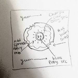
Rough sketch of donut clock

Robert Oh- Looking Outwards- 06

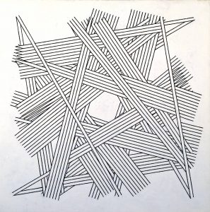
Chance, Order, Change 6 (Black) 1978-9 Kenneth Martin

This painting is one of many paintings in Kenneth Martin’s “Chance and Order” series. As the name suggests, Martin was able to create this piece using pure chance events. Out of all the other paintings in the series, I liked this one the best because the black and white contrasts really well in terms of straight lines. I really appreciate this drawing, not only because it looks mysterious and complicated, but also because of the procedure Martin went through to make it.

The article states that to create the network of lines, Martin initially marked a blank drawing with points, moving clockwise around a rectangle. Lines were then generated by taking numbers, two at a time, at random out of a bag. Martin chose eight pairs of numbers for this work. He then turned the drawing by 90 degrees and repeated the process. After being repeated twice more, the drawing was then transferred to canvas.

Martin’s artistic and “random” side truly comes into play when you look at this painting. I am very excited and curious to see how other artists can incorporate randomness in their future art pieces.

https://www.tate.org.uk/art/artworks/martin-chance-order-change-6-black-t03190


Kevin Thies – Looking Outwards 6

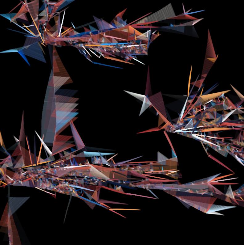
“Fireworks” by Lane Lawley (2005)

Fireworks” by Lane Lawly, is an interesting piece, partially out of the composition. and partially because on its page, there’s a github link to the source code. I definitely do appreciate the piece for its composition, there’s a good mix of color and the hierarchy’s certainly something to look at; the shapes are arranged in a dynamic fashion, but it’s not often that you see an open-source artwork.
Looking at the source code, it looks like it’s made with Processing, which is similar with the P5js we’re working with currently. In fact, I can see where it uses random floats and uses those to make “Crackers”.
Looking at his other works, Lane makes a lot of art that resembles tree-like structures. I likely wouldn’t be able to see it in the code if I looked for it, but I bargain that it’s a choice in how the numbers are positioned and iterated on.

Kevin Riordan Project-06-Abstract-Clock-Section C

kzr clock

/*Kevin Riordan
Section C
kzr@andrew.cmu.edu
Project_06_C*/
var prevSec;
var millisRolloverTime;
function setup() {
    createCanvas(480,480);
    millisRolloverTime = 0;
}

function draw() {
    background(247,202,201);
    var hours = hour();
    var minutes = minute();
    var seconds = second();
    angleMode(DEGREES);
    //making seconds smooth
    if (prevSec != seconds) {
        millisRolloverTime = millis();
    }
    prevSec = seconds;
    var mills = floor(millis() - millisRolloverTime);
    var secondsFrac = seconds + (mills / 1000);
    //making a 12 hour clock instead of a 24 hour clock
    if (hours >= 12) {
        hours = hours % 12;
    }
    //abstract hours
    push();
    translate(width/2,height/2);
    rotate(-90);
    fill(200,120,120,80);
    noStroke();
    //making arcs for the hour triangles; k=0 corresponds to the exact hour (midpoint of group of arcs)
    for (var k = 2; k >= 0; k -= 0.25) {
        fill(220 - (30 * k),120,120,80);
        arc(0,0,width * 1.5,height * 1.5,30 * (hours - k),30 * (hours + k));
    }
    pop();
    //abstract minutes
    var minutesMapped = map(minutes,0,59,0,width);
    var minutesColor = map(minutes,0,59,0,255);
    var columnWidth = width/61;
    var changeHeight = 0;
    fill(minutesColor - 50,100,minutesColor,25);
    noStroke();
    //left side of minutes pyramid
    for(var columns = -1; columns < 30; columns++) {
        push();
        translate(0,height);
        rect(columns * columnWidth,0,columnWidth,-changeHeight);
        pop();
        changeHeight+=minutesMapped/30;
    }
    //middle bar, length corresponds to minutes amount
    fill(minutesColor,150,minutesColor,90);
    rect(width/2 - columnWidth/2,height,columnWidth,-minutesMapped);
    //right side of minutes pyramid
    fill(minutesColor - 50,100,minutesColor - 30,25);
    for(var columns = 31; columns < 61; columns++) {
        changeHeight-=minutesMapped/30;
        push();
        translate(0,height);
        rect(columns * columnWidth,0,columnWidth,-changeHeight);
        pop();
    }
    //abstract seconds
    var secondsFracMapped = map(secondsFrac,0,59,0,width/2 - 15);
    var minutesMapped = map(minutes,0,59,0,width/2);
    //goes outwards from center at 0 seconds to the edge at 60 seconds
    if (minutes%2 == 0) {
    for(j = 0; j <= 360; j += 10) {
        var jColor = j;
        jColor = constrain(jColor,50,255);
        for(i = 0; i <= 360; i += 10) {
            push();
            translate(width/2,height/2);
            rotate(i);
            fill(jColor);
            noStroke();
            ellipse(j,-secondsFracMapped,4,4);
            rotate(i / 2);
            fill(100,60,60,25);
            rect(j,-secondsFracMapped / 2,3,3 + i);
            pop();
        }
    }
    }
    //odd minutes go into the center from edge at 0 seconds to center at 60.
    else {
    for(j = 0; j <= 360; j += 10) {
        var jColor = j;
        jColor = constrain(jColor,50,255);
        for(i = 360; i >= 0; i -= 10) {
            push();
            translate(width/2,height/2);
            rotate(i);
            fill(jColor);
            noStroke();
            ellipse(j,(width/2) - secondsFracMapped,4,4);
            rotate(i / 2);
            fill(100,60,60,25);
            rect(j,-secondsFracMapped / 2,3,3 + i);
            pop();
        }
    }
    }
}

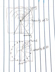
I started with a very badly drawn sketch of what I wanted to do.

initial sketch at 0 seconds, and at 59/60 seconds

This project made me think about timing a lot. I started by doing the seconds, and used the example code to make it smooth using milliseconds rollover time. The seconds go out for even minutes, and in for odd minutes. I could not get the transition from going in to going out exactly right (as well as the transition from out to in), but I am okay with how it turned out. The minutes are represented by a pyramid at the bottom that grows and changes color as the minutes increase. The hours are represented in a fairly standard way, with a bunch of arcs that converge into a line that represents the hour hand on a traditional clock. This project made me think about how much stuff I can change over time, and I learned about how to change colors over a gradient as well.

Kevin Thies – Project 6 – Abstract clock

sketch

// Kevin Thies
// kthies@andrew.cmu.edu
// Section C
// Abstrack Clock

var HDEG = 360 / 24;        // constants define ration of how many degrees
var MDEG = 360 / 60;        // around a circle per unit
var SDEG = 360 / 60;
var MSDEG = 360 / 1000;

var hDim = 50;              // define the dimension of each planetoid
var mDim = 25;
var sDim = 12;
var msDim = 6;

var starNum = 70;     // how many stars are in the background
var starX = [];       // empty arrays to etermine their size and position
var starY = [];       // an how often they twinkle
var starSize = [];
var tick = [];


function setup() {
  createCanvas(480,480);

// fill empty arrays with location and size data
  for(var stars = 0; stars < starNum; stars++) {
      starX.push(random(10, 470));
      starY.push(random(10, 470));
      starSize.push(random(3, 7));
      tick.push(round(random(0, 10)));
  }
}

function draw() {

    angleMode(DEGREES); // this makes things easier for later
    background(20);
    push();

    // add a new tick value for each star, if tick is randomly 0, twinkle
    for(var stars = 0; stars < starNum; stars++) {
        tick.shift(1);
        tick.push(round(random(0, 10)));
        if(tick[stars] == 0) {
            starSize[stars] = random(3, 7);
        }

    // place stars
        fill(70);
        ellipse(starX[stars], starY[stars], starSize[stars], starSize[stars]);
    }

//==================== Hours ==============================================
    translate(240, 240); // moving origin to center of screen
    rotate(HDEG * hour());

    stroke(50, 0, 0);
    strokeWeight(3);
    noFill();
    line(0, 0, 0 , 120);    // make the hour hand
    ellipse(0,0, 240, 240); // make the orbit

    noStroke();
    fill("orange");
    ellipse (0, 0, hDim, hDim); // make the hour planetoid

//==================== Minutes ============================================
    translate(0, 120); // moving origin to end of hour hand
    rotate(MDEG * minute());

    stroke(50, 0, 0);
    strokeWeight(3);
    noFill();
    line(0, 0, 0, 50);      // make the minute hand
    ellipse(0,0, 100, 100); // make the orbit

    noStroke();
    fill("lightBlue");
    ellipse (0, 0, mDim, mDim); // make the minute planetoid

//==================== Seconds ============================================
    translate(0, 50); // moving origin to end of minute hand
    rotate(SDEG * second());

    stroke(50, 0, 0);
    strokeWeight(3);
    noFill();
    line(0, 0, 0, 20);      // make the second hand
    ellipse(0, 0, 40, 40);  // make the orbit

    noStroke();
    fill("mediumAquamarine");
    ellipse (0, 0, sDim, sDim); // make the second planetoid

//==================== Milliseconds =======================================
    translate(0, 20); // moving origin to end of second hand
    rotate(MSDEG * millis());

    stroke(50, 0, 0);
    strokeWeight(3);
    noFill();
    line(0, 0, 0, 10);      // make the millisecond hand
    ellipse(0, 0, 20, 20);  // make the orbit

    noStroke();
    fill("fireBrick");
    ellipse (0, 0, msDim, msDim);   // make the millisecond planetoid


    // add a little dot on the end of that hand
    translate(0, 10);
    fill("khaki");
    ellipse(0, 0, 4, 4);

    pop();
}

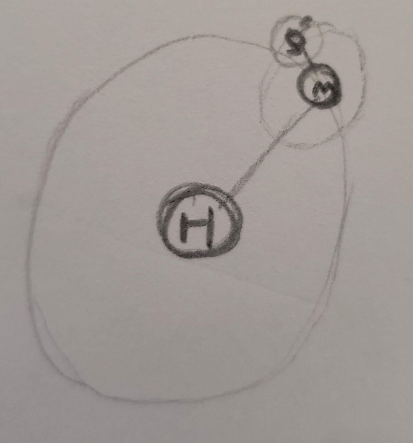
Orbit clocks are cool with their circles inside circles, but they’re easy to read and overdone, so I made a clock where each unit orbits the next highest one. The centermost one is hours, orbited by minutes, orbited by seconds, orbited by milliseconds.
It was quite a challenge putting this together, as some arrays were being really finnicky, so even though the hours, minutes, seconds, and milliseconds could have been one operation on an array, I had to brute-force it. However, what would a space-y clock be without some twinkling stars!

As far as clocks go, I like how this ended up looking, even though it would take more effort than I’d be willing to put in to read.

my first concept sketch

ChristineSeo- Looking Outwards 06 – Section C

Photograph of the projector glitch in the dark room
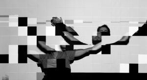
Photography of tiles with mixture of a variety of exposure, speed, and frame rates
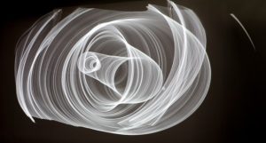
Photograph of a digital drawing that was “waved” back and forth

Ishac Bertran, an artist from Barcelona, focuses his work around the relationship between people and technology. There were digital drawings that were photographed in a dark room, with long exposure times. Randomness is shown through the rendering of imperfections and the asynchrony between the frame rate of the video signal and the refresh rate of the projector. He ran the Processing sketch and then photographed it after there was a random glitch from the computer monitor or graphics card and occasionally what was caught in between the digital and analogue mediums.

I thought it was very interesting how he used various photographic techniques such as exposure, speed, and frame rates to seek out the glitches. I especially thought that it was intriguing how the camera could capture these imperfections, while the naked eye could not. The random graphic glitches added a meaning to the artwork as it captured their unpredictable beauty. Originally, he was inspired by the aesthetics of physics and computation, which drove him to create this artwork; he wanted to make his digital drawings more meaningful. He also claims that he finds “beauty in complex systems that are driven by simple principles.” I wish that he would have experimented further, with even more various materials and mediums to capture these photographs.

https://www.creativeapplications.net/processing/generative-photography-processing/

Connor McGaffin – Looking Outwards – 06

The work of Siebren Versteeg caught my attention this week due to its playful deceit. Versteeg creates work that emulates the style of contemporary abstract artists through writing code which, with a series of randomized variables, creates unique pieces of art. Versteeg explains that although he considers his work randomized, there is still human bias of beauty in his work present in his ensuring that the pieces still looked, “dripped”, and “stuck” like a physical painting.

With this being said, it is evident that Siebren Versteeg used code with variables limited within a certain range. For example, the colors depicted in his work do not mix as they “normally” would digital, for mediums like oil or acrylic behave differently. Versteeg’s artistic sensibility is definitely self-aware, as his work is just as much about the process and product as it is commentary on the art world at large. The lines between human expression and randomized calculations is thoroughly blurred.

source

Sophia Kim – Looking Outward 06 – Sec C

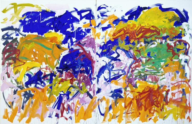
Ici, 1992 - Joan Mitchell

As a member of the American abstract expressionist movement, Joan Mitchell was one of the few female artists of this movement to gain acclaim for her work. In this painting “Ici,” Mitchell used oil paint to show emotion through color, brush stroke, and movement. I can sense a variety of emotions through the random brush strokes, specifically through angles and the amount of pressure on the brush.

Image result for Joan Mitchell

Playing sports as a child, Mitchell took her passion for diving and skating into her works. I believe her athleticism led her to have no restrictions in her art. For example, in all her pieces, especially in “Ici,” she does not use rulers, but uses her movements to create. She embraced the randomness and flexibility of the paint brush to create symbolic works of art. I really admire “Ici” the most out of all her paintings, because she balances the use of saturated and desaturated colors perfectly. Also, I love how random Mitchell’s lines and shapes are in this painting, which oddly harmonize together.

Joanne Lee – Looking Outward 05

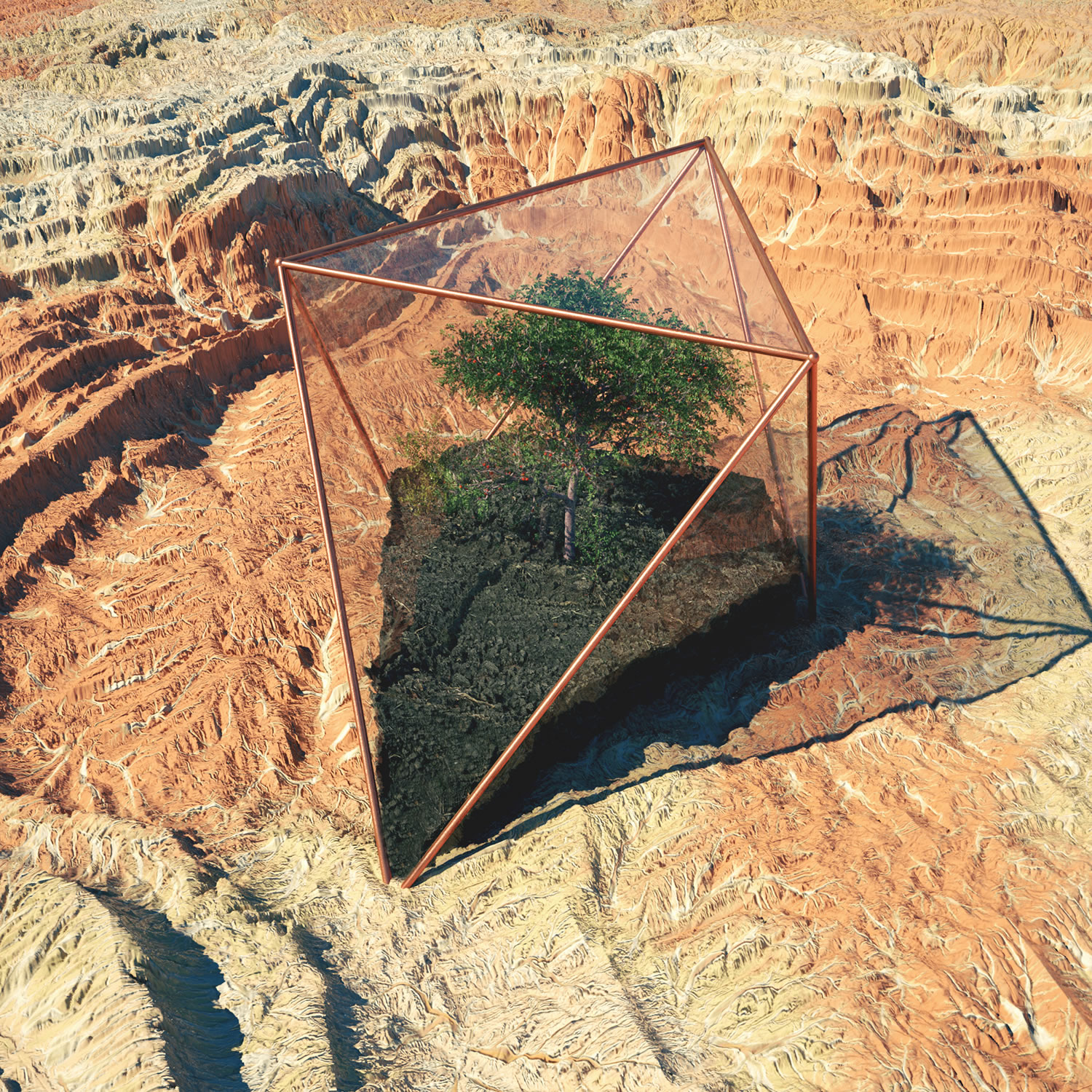
Inner Growth” created using Cinema 4D, Photoshop and Octane Render (2016).

Andrew Williams, better known as Gohmn, creates surreal and detailed 3D worlds by using Cinema4D, Octane Render, and Photoshop. He gets his inspiration from daily art makers that he follows on platforms like Instagram, Tumblr, and Ello. His real life inspiration is the southwestern area of the US, particularly Arizona. The above photo is called “Inner Growth” and although it is a quite literal interpretation of it, I’m very intrigued by how realistic the image looks. There’s something very peaceful about the realistic greenery in the photo and the way he portrays inner growth. The photo below also caught my intention in his portfolio. You can see that it is clearly inspired by the southwestern states in the US with an isolated compartment with dirt and trees growing in the middle of the dry, rocky terrain. There is something futuristic about his works and seems like a world very similar to ours yet different — which is personally the most intriguing part to me. Gohmn has been recognized for his works and gone on to create live visuals and stage renders for many big name artists such as Katy Perry, San Holo, and G-Eazy. He has a Vimeo where he uploads “making” videos of some of his most popular art pieces.

Arium” created using Photoshop and Cinema 4D.

Hannah Cai—Looking Outwards—05

This music video for Damon Albarn’s (you might know him from the Gorillaz) song “Everyday Robots” is actually a sculpture video. I don’t know the actual software being used for it, but I really love the way the music and the video go together, even through some unexpected moments. Focusing on the 3D graphics portion of this prompt though, it’s really amazing how detailed the skull is, as well as how realistic you can get with the final sculpture, including lighting effects. In theory, it makes sense for 3D graphics to be easy to compute—instead of just having x and y, there’s just another axis added on. But I never understood textures, lighting, and basically everything else that make 3D graphics look realistic. If I had to guess how those things were programmed, I’d guess that textures might be able to be implemented with for loops and randomization, and lighting could be some kind of vector with a gradient, but I really don’t know. I know there are lighting and texture functions in p5 as well; now that my curiosity has been piqued, I might do some research into how and why those functions work.