Looking Outwards 09 – Sara Frankel


caption: Terry Riley’s “In C” results in a different performance guaranteed eery time played.

The looking outwards assignment I am reviewing is Kyle Leve’s week 6 post about In C by Terry Riley. Listening to it, at first it sounded kind of jarring and unsettling because of the lack of harmonic progression, but the more I listened to it the more I appreciated it. Kyle mentions that this “piece… allows each player to make their own artistic decisions and have freedom from the written page”. I agree with this comment as there are legitimately infinite combinations and interpretations as it is dependent on how many or littles musicians there are and their own musicianship. I do agree with Kyle though to a degree about randomness as if one listens to it in passing, it would really not make sense. However, if you stop and listen and allow yourself to be open minded to the momentum of the music, the music should not feel random at all but in fact, the nonsense you hear should seem coherent.

Project 09 – Sara Frankel

sketch

// Sara Frankel
// sfrankel
// Project 09 Portrait
// section A 

var underlyingImage; //variable to help display the image being shown
var circx = 0; //circle starting position is 0,0
var circy = 0;

function preload() {
    var myImageURL = "https://i.imgur.com/a3mX8Atl.jpg";
    underlyingImage = loadImage(myImageURL); //loads the image into the variable provided
}

function setup() {
    createCanvas(480, 480);
    background(0);
    underlyingImage.loadPixels(); //loads image
    frameRate(10);
}

function draw() {
    var px = random(width);
    var py = random(height);
    var ix = constrain(floor(px), 0, width-1);
    var iy = constrain(floor(py), 0, height-1);
    var theColorAtLocationXY = underlyingImage.get(ix, iy);

    //strokeWeight(5);
    fill(theColorAtLocationXY);
    text("twins", px, py);//inserts text randomly to draw the image

    if (mouseIsPressed) {
    	var theColorAtPos = underlyingImage.get(circx, circy);
		fill(theColorAtPos);
		ellipse(circx, circy, 5, 5); //draws ellipse at circx and circy
		circx = (circx + 5) % width; //increments circx accross the row and goes back to 0 when it reaches width
		if (circx === 0) { 
			circy += 5;// when circx reaches width, circy will increment
		}
	}
    
}

I chose to upload a picture of my sister and I. Being a fraternal twin, most of the time people do not believe or suspect that we are twins. At times, this can be quite fun to point out to people, but most of the time it is not. So I thought it would be ironic to use this picture of us in elementary school in such an abstract image that legitimately spells and draws out the truth with the text and circles. As when you press the canvas, ellipses will be drawn to almost “clearly” draw it out for you.


Here is the original picture.


Here is a final image shot.

Hannah Cai—Looking Outwards—09


link to the article

This post is a response to rjpark’s Looking Outwards 04 on the Artist Andrius Šarapovas’ room-sized interactive musical sculpture. The installation uses an algorithm to take 4G data and convert it into sound, consisting of 16 notes: C, D, F and G, spread across four octaves.

rjpark commented mostly on the inherent simplicity yet external complexity of the project—how the 77 individual units combined and placed throughout the room created such a complex soundscape. While I agree on the impressiveness of the generated soundscape, I think the installation is actually inherently pretty complex, due to all the filters and “instruments” those 16 notes are being played from (a metal bar, sound activator, sound damper, resonator, and mechatronics). I’m actually really curious how the network data was converted into sounds, and what choices were made in the formulation of the algorithm. Do the four notes mean anything in correlation to the data, or were the just chosen to create an appealing chord? What do the different textures of sound stand for? Overall, I like the end product a lot, but like many other projects which map data to a different output (sculpture, sound, visuals, etc), I wish there was more correlation between the input and output; otherwise the end products feel beautiful, but arbitrary.

John Legelis – Project 09 Portrait

sketch

// John Legelis
// Section D

var imgH = 480
var pR = 10
var colorList = []
var cWidth = 360
var cHeight = 480
var sourceimg = "https://i.imgur.com/PHP8Htm.jpg"
var pimg = "https://i.imgur.com/R1D8XFS.jpg"
var Ploaded
var Sloaded;

function preload() {
    Sloaded = loadImage(sourceimg)
    Ploaded = loadImage(pimg)
}
function setup() {
    createCanvas(360, 480);
    background(0);
    Sloaded.loadPixels()
}
function draw() {
    for (x=0; x < cWidth/pR; x++){
        colorList[x] = []
        for (y=0; y < cHeight/pR; y++){
            colorList[x][y] = Sloaded.get(x*pR, y*pR)
            noStroke(0)
            tint(colorList[x][y])
            image(Ploaded, x*pR, y*pR, pR, pR)
        }
    }
    noLoop()
}

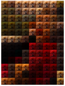
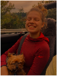
This week’s project seemed at first a bit intimidating but after thinking about it, I decided creating a mosaic representation of a portrait using “tiles” of another image would be an approachable yet interesting approach. The portrait photo this project is based on is a photo I took of my friend in a car holding her small dog named Rocky. The tile photo I used for the mosaic was a close up of Rocky’s face.

The Tile Image
Screenshot of mosaic with tile size 40 pixels.
Screenshot of mosaic with tile size 4 pixels.

Tanvi Harkare – Project 09 – Portrait

tanvi09

/* Tanvi Harkare
tharkare@andrew.cmu.edu
Section B
Project-09*/

var img;
var ix;
var iy;
var px;
var py;
var sizeC = 10;
var colAtLoc;

function preload(){
    var url = "https://i.imgur.com/yJADhdn.jpg"
    img = loadImage(url);
}

function setup() {  
    createCanvas(480, 480);
    background(255);
    img.loadPixels();
}

function draw() {
    //x and y locations for ellipses
    px = int(random(0, 480));
    py = int(random(0, 480));
    //saving x and y locations of mouse
    ix = mouseX;
    iy = mouseY;
    //colors for circle and text
    colAtLocCircle = img.get(px, py);
    colAtLocText = img.get(ix, iy);
    //drawing text based on mouseX and mouseY
    noStroke();
    fill(colAtLocText);
    textSize(6); 
    text("PK", ix - 3, iy + 3); //so mouse is in center of text
    //setting random size and drawing circles
    randomSize();
    fill(colAtLocCircle);
    ellipse(px, py, sizeC, sizeC);
}

function randomSize(){
    sizeC = int(random(0, 10));
}

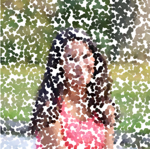
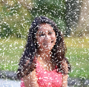
For this project I chose a picture of my friend Prerana that I took myself last year! Circles appear on the canvas in a random order, and also vary in size because of the randomSize function. In addition to the points, if you run the mouse over the canvas, her initials appear in the color of wherever the mouse position is located based off the image pixel color.

original photo
If the circles were set to the same size each frame
how the final image could potentially look

Jisoo Geum – Looking Outwards 08


http://thesystemis.com/

Zach Lieberman is a new media artist, researcher, and a computer programmer. In the past, Liberman has worked and launched a variety of projects such as ‘Opneframeworks’, a c++ library for creative coding. He also worked on the Eyewriter project, an opensource hardware and a software that allows people to draw with their eyes (the project that inspired assignment 08 – A). As an artist, Liberman also works with performance and installation art using buildings and also teaches at Parsons School of Design. An interesting fact about his resume was that he has collaborated with Golan Levin, an artist/programmer whom I personally admire. A common topic that shapes Lieberman’s body of work is the mapping of movement and the human body, as can be seen in the first project he showed in the presentation. Lieberman also applied the mapping software into collaborative works with Nike, Golan Levin, Olympic coordinators, and musicians. Although Lieberman stated during the presentation that he struggled with operating the music video project, I thought the project was very admiring. As a student aspiring to work in the fields of cinematography, it was interesting to watch coding merging into a motion picture. Lieberman also talked about how his open source programs – Openframeworks and Eyewriter – are being used as foundations for new software made by students and programmers. Overall, Lieberman’s presentation was very intriguing since he showed various demonstrations of his projects during instead of showing a documentation of his work. I think this method worked effectively in communicating with the viewers due to the nature of his works.

Connor McGaffin – Looking Outwards – 08

Jen Lewin is a designer and installation artist who works to create interactive pieces with a common motif of playing with light. In 1974, Lewin was born in Boulder Colorado, she attended a local elementary school where she was introduced to primitive coding practices in the third grade. where she was trained in classical ballet before studying architecture at the nearby University of Colorado campus.

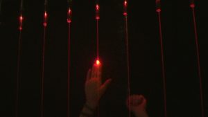
Lewin began to explore an intersection between these disciplines through her work on the Light Harp project. These public installations projected “strings” of light which, when broken, play a sound at a nuanced volume and frequency. Because of their invisible nature in daylight, many are intiaill surprised when walking into her playful trap, before turning back around and engaging with it more. This activity sparks the attention of curious bystanders, who are pulled into the piece and join an impromptu, dadaist symphony for those passing by to hear.

A demonstration of music being played on  Long Harp (Jen Lewin, 2006)

I am drawn to how Lewin talks of her work, and how those who interact with it interact with the piece, which actually allows them to communicate with others that are playing with the piece. I am fascinated by how quickly her work is able to suddenly open up a side of people that is so vulnerably human and playful. Kids and adults alike interacted with the piece, too filled with wonder to engage in any kind of judgement.

The presentation that Lewin gave on her work was really well done, where she was able to keep a controlling, yet conversational tone with the audience leading up to an open Q&A. I think she communicated her ideas articulately, and her ability to do so while simultaneously queueing videos, action shots, and process photographs contextualized everything nicely.

Jen Lewin


Alexandra Kaplan – Looking Outwards 08


Lecture at Eyeo given by Neil Mendoza

  An artist that stood out to me is Neil Mendoza, who has an MA in math and computer science from Oxford University and an MFA in design media art from UCLA. He only started to self-describe himself as an artist in 2014 and often imbues his art with humor, which is why I really like his work. I admire his approach to his work, in his lecture, he often talks about getting a simple idea from a single idea or object, thinking about it, then expanding upon in a whimsical way.

An example of Neil Mendoza’s work I found particularly amusing.

    One project that really stood out to me was his “Hamster Powered Hamster Drawing Machine. His thought process started with the idea of selfies, which led down the rabbit hole of why selfies are limited to humans. He then took this concept and built a contraption that, when a hamster runs on its wheel, it draws a picture of a running hamster. The way it combined technological software (the cams were needed to draw a hamster) and the physical (a hamster controlling the drawing device) is really inspiring and opens my mind to the different possibilities programming, code, and computer science can offer even outside the technological world.

Jenni Lee — Looking Outwards — 08

Eyeo 2018 – Giorgia Lupi from Eyeo Festival on Vimeo.

The artist I chose for this week’s looking outwards is Giorgia Lupi. She is an information designer who designs engaging visual narratives in a humanistic way that re-connects numbers with stories, people, and ideas. She creates work that emphasizes the notion that data can not only describe the objective world, but can also illustrate aspects of human life, which are not commonly associated with numbers. I was particularly drawn to her work, as she uses design methodologies, particularly user empathy and designing for emotion, in order to transform quantitative analysis into beautiful, playful moments of emotion, humanity, poetry, and art. She does so by creating work through very hand-drawn, analog, and raw forms, which strongly appeal to me. As someone who is interested in user experience, information design, and design methodologies, this lecture allowed me to view information design and data from a different perspective– one that is empathetic and humanistic rather than purely quantitative. From this lecture, my main takeaway was that we can inspire empathy through data, data is the eye of the beholder, data is never the point but always a medium we have to abstract, data can unite us, and ultimately, that data has the potential to transform the uncountable into something that can be reconnected to our lives and to our behaviors.

Lupi’s project titled “Bruises — the Data We Don’t See” initially drew me in through its aesthetics and color palette. At first, the image’s pastel colors and floral texture make it appear as a cherry blossom illustration. However, as I began to read the artist statement, I realized that they were not flower petals, but platelet counts, showing the amount of petechiae. This project highlighted how clinical records alone can hardly capture the impact the illness of a child has on a family. This project was moving to me, as it demonstrates how data visualization can evoke empathy and activate us on not only a cognitive level, but also an emotional level.

Giorgia lupi’s website