// Nadia Susanto
// Section B
// nsusanto@andrew.cmu.edu
// Project-07-Curves

var angle = 0;

function setup() {
    createCanvas(480, 480);
    background(220);
    angleMode(radians);
}

function draw() {
    //making the fill to be a combo of random colors
    var r = random(0, 100);
    var g = random(100, 150);
    var b = random(200, 275);
    frameRate(5);
    push();
    fill(r, g, b);
    translate(width/2, height/2); //drawn to be in the middle
    //rotating the asteroid
    angle += 1;
    rotate(angle);
    drawCurve(); //calling function
    pop();

}

function drawCurve() {
    var b = mouseY/2;
    var t = map(mouseY, 0, 200, 40, 120); //constraint

    //creating the astroid
    beginShape();
    for (var i = 0; i < 100; i++) {
      t = map(i, 0, 100, 0, TWO_PI);
      //reference from http://mathworld.wolfram.com/Astroid.html
      var x = 3 * b * cos(t) + b * cos(3 * t);
      var y = 3 * b * sin(t) - b * sin(3 * t);
      vertex(x, y);
    }
    endShape();


}
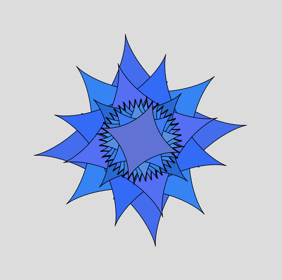
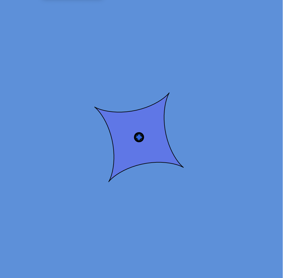
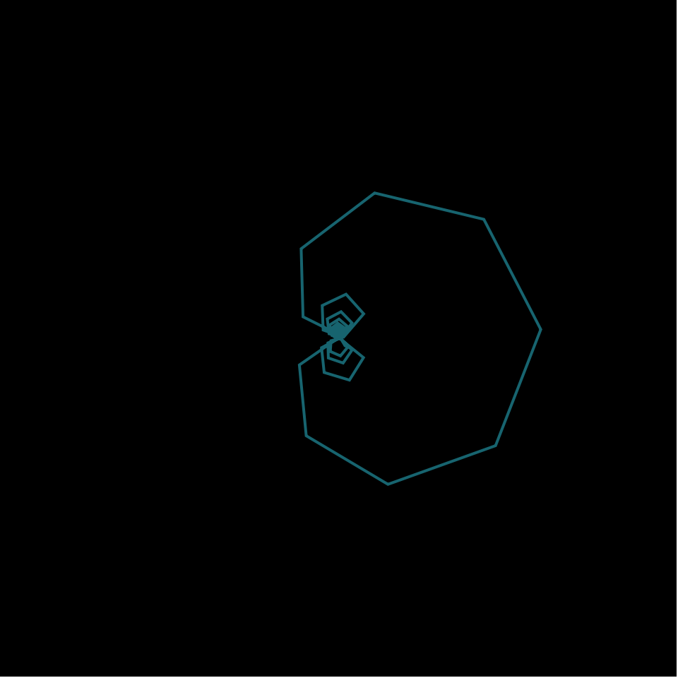
It was hard figuring out which curve to use as there were so many that were pretty, but I ended up choosing to go with the asteroid curve. I figured that a star-shaped curve could be beautiful especially when rotating. With the rotation it looks like a christmas tree star or it even looks flowerly-like. I also played around with the random colors and constrained it to be only blue/purple shades. I then used mouseX and mouse Y in order to determine the size of the asteroid. Overall, I am pretty happy with the result and it looks beautiful.
An example of this “flower-like” asteroid with multiple rotationsAnother possible asteroid curve that looks like a ninja star
I decided to read about Mary Huang, one of two joint speakers at the 2013 Eyeo festival that founded a software-based apparel creation company called Continuum Fashion. Huang graduated with a BA in Design/Media Arts from UCLA, and went on to receive a MA from the Copenhagen Institute of Interaction Design.
Eyeo 2013 – Huang & Fizel
I really admired Mary’s projects under Continuum Fashion, which served as a reflection the emerging role of technology in society while also giving the masses an accessible outlet with which anyone could design their own apparel and see it come to life. I really liked that Mary considers her work a continuation of the constantly evolving definition of “fashion” and the social commentary behind her work. I also really liked that she put a lot of effort into the user-interface design of these projects so that they were easy for people with no coding experience to use.
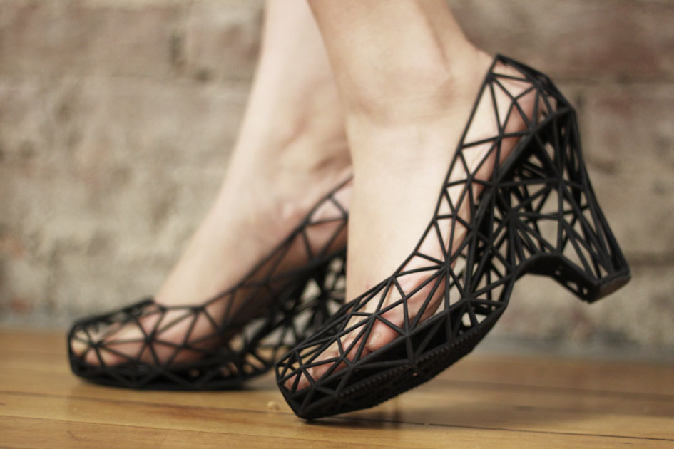
Strvct, Continuum’s first collection of 3D-printed shoes.
Some of the strategies in her presentation that I thought were most effective were that she gave a lot of visuals and included examples of some concepts and projects (2-dimensional pictures to knitwear, different types of weaves) that served as the foundation on which her work was based. I think it did a lot to enhance my understanding of her goals for these projects and her thought process behind them. I also liked that she went in and actually gave her audience a look inside the user interface of her apparel-making programs, so they could see some of the customizations and adjustments available for the users to make on their pieces.
Meejin Yoon is an architect and designer based in Boston, Massachusetts whose practice revolves around the intertwining between architecture and the public realm. She studied architectural design and architectural practice at Cornell University. She didn’t have a background in technology until she became a faculty member in MIT, and then using her new-found knowledge to combine technology, architecture, and the public space to question how design fits into contemporary culture and creating a sense of place and environmental awareness.
Yoon is very focused on the separation between public space
and personal space as she is a very private person. Yoon believes that in order
to create a truly engaging public space, the artist must create something
unfamiliar – defamiliarize the context such that the rules of engagement are
less clear. These two values that Yoon holds throughout her work are what I
admire about the way she works. This contradiction that her art is made for the
public, yet she is so defensive and closed off as a person is very intriguing
to me because in a sense, she is more of an open person than she thinks she is.
My favorite piece from her is “White Noise/White Light” because it encompasses everything that I try to include in my own installation work: human interaction with light, playing with sound in an installation, and exploring ways to incorporate technology and art. Another thing I really like about this piece is the fact that she created this work with a specific idea in mind in how people will interact with this work, but, in reality, people interacted with the work completely different than what she imagined. I love the idea of how once an artist puts one of their works in public, the work becomes something completely different than what the artist first envisioned. Another piece I really liked was “Aviary”, which was an installation that explored human engagement and human touch within a public space, combined with light fixtures, and a soundscape of bird songs. What I admired about this piece was her way of abstracting everything to the point that the audience physically interacting with the piece wouldn’t exactly understand what the installation was unless Yoon explained it. Compared to another piece she did, “Swing Time”, I enjoy “Aviary” more because “Swing Time” is very familiar and to me, kind of boring, as it is just beautiful tire swings that light up, versus “Aviary” which is very unfamiliar, yet also beautiful.
I really liked the way Yoon presented her work in this presentation. She would first discuss another artist/piece of work and what it was about, and then she ties that in as her source of inspiration in creating one of her projects, showing the connection between the two, yet how she explored and expanded that theme that she was inspired by. As she presents, she includes many photos of the materials that uses – especially the technological materials – as well as videos that document the work in the public space once it was installed. This helped me understand how I should present my work because now I know that as an artist, it is important to convey every step that I took to reach my final product.
//Shannon Ha
//sha2@andrew.cmu.edu
//Section D
//Project 07 Curves
var nPoints = 200
var angle = 0

function setup() {
    createCanvas(480, 480);
}

function draw() {
	background(0);
	push();
	translate(width/2, height/2); // moves around center point
    if(mouseX > width/2){

        rotate(radians(angle)); //rotating curves and stop motion effect
        angle += 2 * mouseY/250;
    }
    drawCoch();
	pop();
}


function drawCoch(){
    //color change in stroke
    colorR = map(mouseX, 0, width, 0, 255);
    colorB = map(mouseY, 0, height, 0, 200);

    //stroke & fill
    strokeWeight(2);
    stroke(colorR, 100, colorB);
    noFill();

    //variable that change the size, shape, num of edges in curve
    a = map(mouseX, 0, 200, 0, width);

    beginShape();
    for (var i = 0; i < 200; i ++) {

        // set angle/t to loop in relation to mouse and positions curve
        var t = map(i, 0, 20, mouseY/20, mouseX/50);

        //paratmetric equation for cardioid
        x = (a * sin(t)*cos(t))/t ;
        y = a * sq(sin(t))/t;
        vertex(x,y);
    }
    endShape();
}
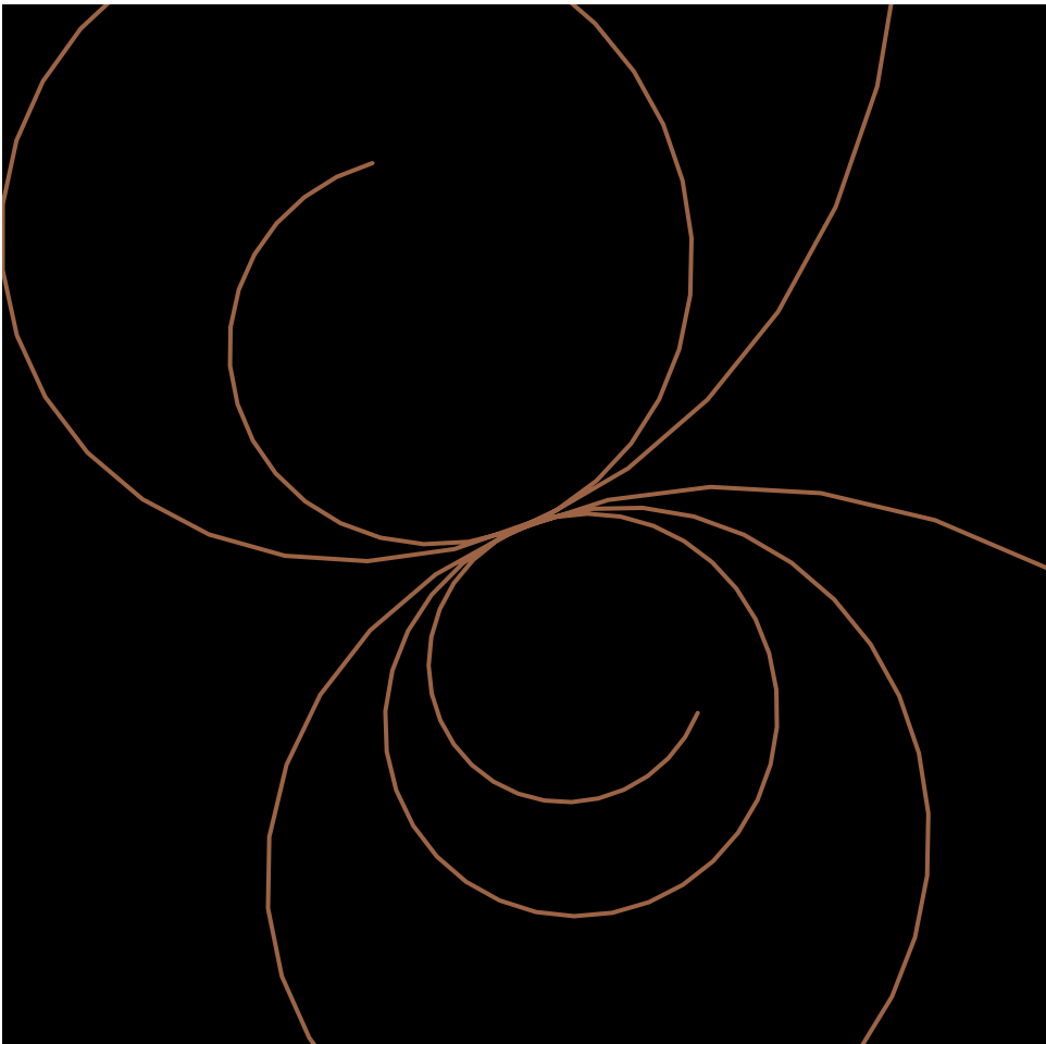
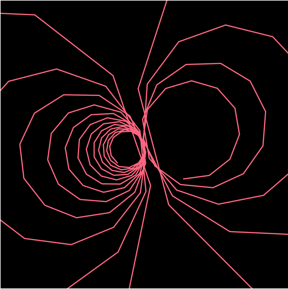
For this project, I spent a lot of time trying to find the right curve to use, and when I came across the Cochleoïd curve, I figured it would be interesting to create some sort of spiral hypnotic effect by mapping the variables and angles to the position of the mouse. As I experimented with this, I realized that I can play around with the mapping values to change the smoothness of the curve. I display this by changing smoothness of the curve according to mouseY. Overall it was a bit of a struggle trying to figure out how to change the variables in order for it to move while adding/detracting to the curve , but it was also an interesting and fun learning experience!
As you can see in these screenshots, the number of edges changes depending on mouse position!!!
Video portrays the public art piece in the context of its place (Calgary, Alberta)
Twenty-two thousand years ago, the Bow Glacier slowly carved its way east from the Rocky Mountains, briefly sculpting the land on which the city of Calgary sits upon today. Today, the glacier melts into Bow Pond before finding its way to Bow Lake, leaving waterfalls at many of these intersections. Drinking water in Calgary commonly originates from the melted ice of the glacier, so the glacier quite literally resides in the residents of the city.
Collaborators Ben Rubin, Shah Selbe, and Dr. Jeffrey Kavanuagh curated a data visualization of the interrelationship between the Bow Glacier’s everchanging physical transformations and human activity in Calgary. The visualization connects the urban fabric with nature, suggesting that humans are never actually without it.
To visually represent the “heartbeat” of the glacier, the collaborators wrote programs that produced a cardiotocograph, turning live seismic feed recorded at the glacier into crisp lines against a white background.
This public piece is compelling because it demonstrates the record of data in a style that appears much less crisp and neat than is typically in data visualizations; it aims to suggest a correlation.
edit (forgot to put this earlier) – I am using 1 of my grace days for this late submission.
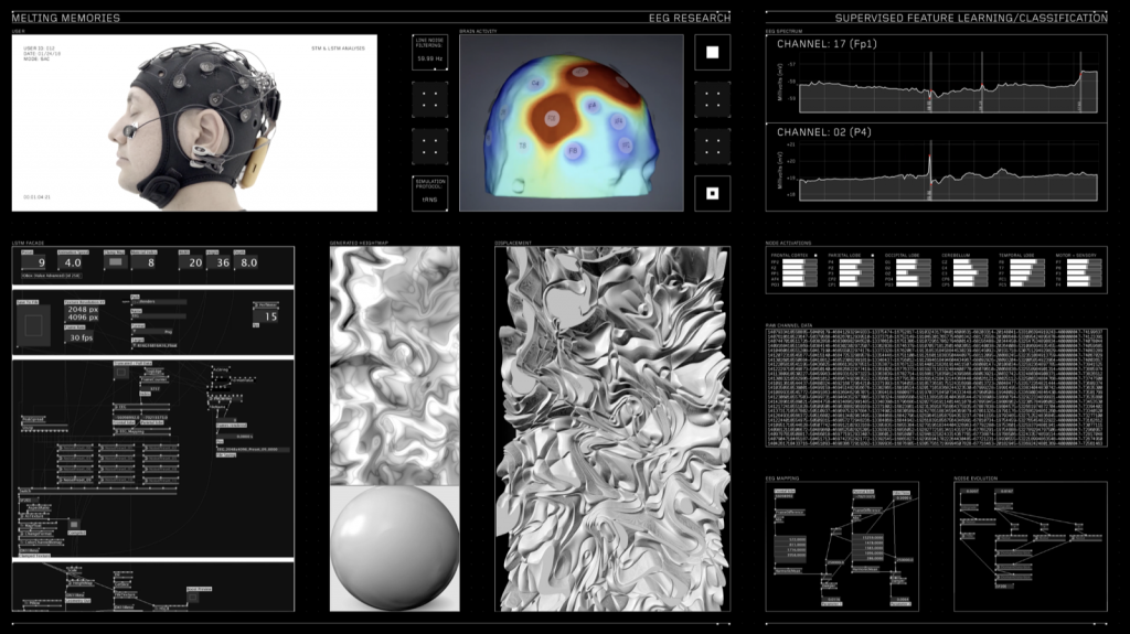
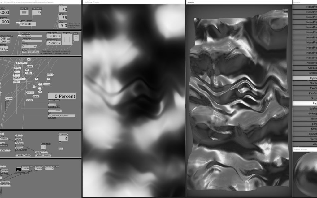
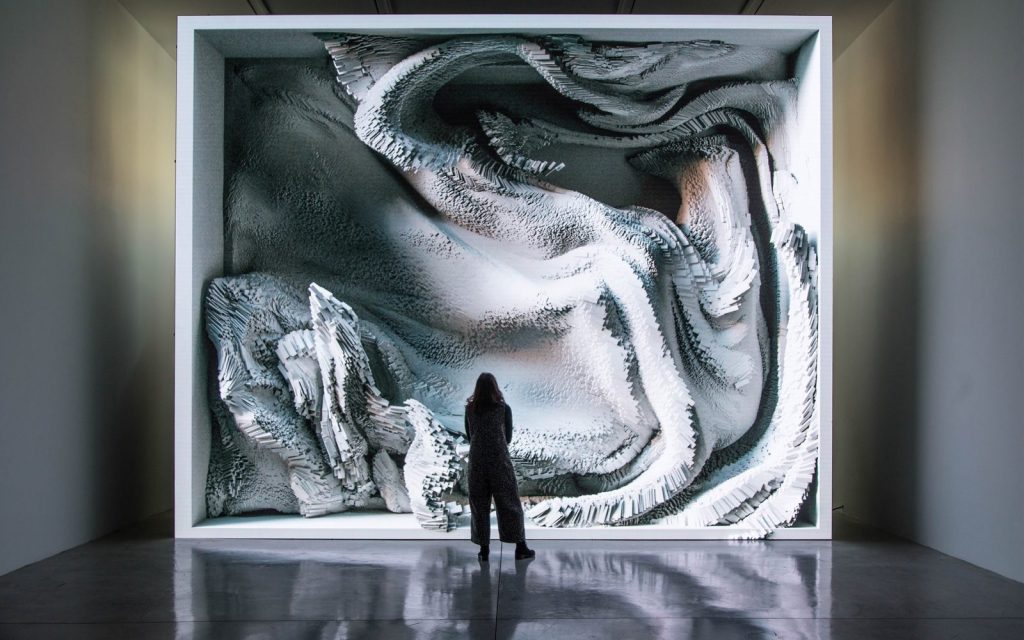
The project “Melting Memories” by Refik Anadol Studio created in 2017 is a beautiful series of artworks created from visualizing different EEG data collected. By representing the EEG data gives it a tactility that emphasizes the materiality of memory. The EEG data collected was based off of the prompt to focus on recalling specific moments of childhood.
I think it is beautiful and admirable that the project has this large scale, and this sense of having an organic life of itself. It is interesting to me how the data was able to have such a sculptural form. This sculptural form makes me think about how all EEG data is collected from the flesh of our being, and that the integration of data into this piece allows one to understand this generated sculpture as part of one’s own personal world.
I suppose the algorithms that generated this work broke down the EEG data into several characteristics like the amplitude of the wave, the duration of the spikes, and used these broken down variables in order to also cue the drawing for the moving image.
The artist’s sensibilities for simplicity and emotional impact are clear through the clean documentation for this piece in the photographs and the video of this work.
Capturing EEG data, process image data visualization process image of person standing in front of EEG data map
<!DOCTYPE html>
<html>
  <head>
    <meta charset="UTF-8">
    <title>p5.js vers 0.7.1, Edit index.html to Change This Title</title>
    <script src="https://cdnjs.cloudflare.com/ajax/libs/p5.js/0.7.1/p5.js"></script>
    <script src="https://cdnjs.cloudflare.com/ajax/libs/p5.js/0.7.1/addons/p5.dom.js"></script>
    <script src="https://cdnjs.cloudflare.com/ajax/libs/p5.js/0.7.1/addons/p5.sound.js"></script>
    <script src="sketch.js" type="text/javascript"></script>
  </head>
  <body>
  </body>
</html>
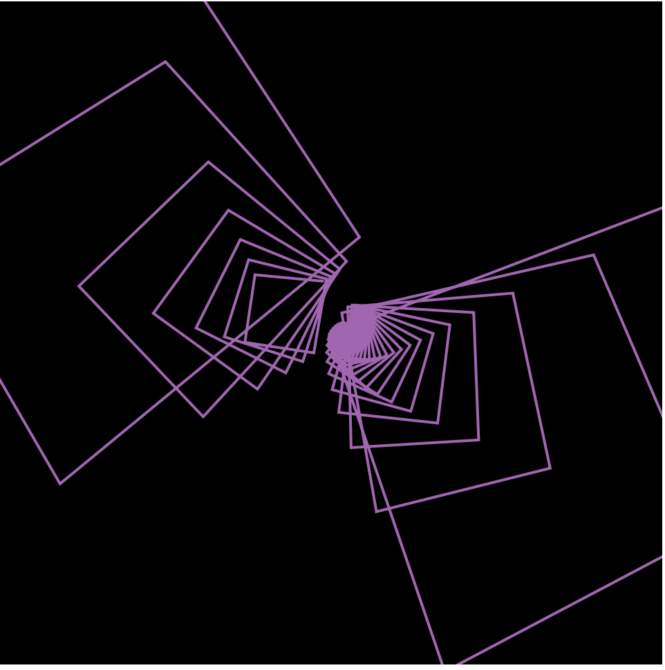
In this project I created used the Conchoid of de Sluze curve to create continuously changing circle which is controlled by the mouse. The equation of the curve was x=(sec t +acos t) cos t, y=(sec t +acos t) sint in parametric form. The tricky part of the project was that p5js did not understand “sec t” so I had to rewrite it in cosine form.
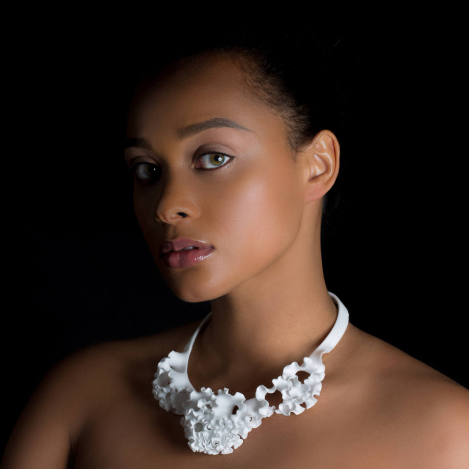
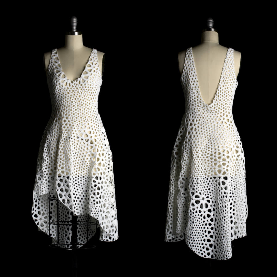
Jesse Louis-Rosenberg and Jessica Rosenkrantz are generative artists who founded the design studio Nervous System (New York) in 2007. They created this studio as an outlet for interdisciplinary experiments that did not fit within their respective educations (Rosenberg was studying math and computer science while Rosenkratz was studying biology and architecture). Their body of work emphasizes an interaction between science, art and technology.
One of the projects highlighted in their video: Flora Collar(2015), uses the concept of computation geometry, plant morphogenesis, differential growth
I find their work inspirational because of the methods they use to create computer simulations and digitally fabricate designs and products that draw inspiration from nature. In their Eyeo video, the artists talk about their interest in digital fabrication techniques, plant morphogenesis and differential growth, algorithmic gardening and the creation of objects such as jewelry and clothes using these processes. This video was interesting because it showed multiple experimental fabrication and computational techniques. Both artists also touched upon their interest in making these objects affordable and functional rather than just aesthetically pleasing.
Another project talked about in their video is Kinematic Dress(2015), which is a 3D printed dress consisting of interlocked panels
The Architecture Radio shows the user a visualization of the network traffics of cell phone towers, wifi routers, navigation and observation satellites, and their signals. We currently live in a world where our visual experience is generated through invisible transfers that takes place without us understanding them.
I have no idea how it sees different networks and visualizes them. The only way that I can imagine is having a predetermined location and data about different sources of network signals and just showing them on the display. I wonder if this visualization process happens realtime or not.
This application is available on App Store for iPads and can be downloaded easily and brings to the user’s fingertips an entrance to a world unseen.
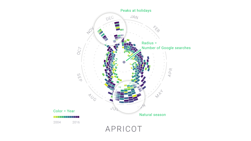
The Rhythm of Food is a visualization project led by creative director Moritz Stefaner in collaboration with Google News Lab. It takes 12 years of google search data and analyzes food seasonality. They developed a radial “year clock” chart to reveal season trends for specific food items like an apricot. The distance from the center shows the relative search interest and the different colors indicates a specific year. By having this, it allows an easier visualization of the year by year trends and rhythms.
Closer look into an example of a “clock” for apricots in which the years are shown through the various colors and the radius is clearly visible.
Video that demonstrates how the chart/”clock” should be read. It answers the question of how to go from simple bar charts to the radial chart.
In order to make this project, Moritz used many different softwares like ES2015, webpack, react, Material UI, and d3 v4. What I admire is that Moritz took something usually boring and difficult to read in chart data, but now it is very aesthetically pleasing and easy to understand.
If you want to learn more about this amazing project, click this link:
![[OLD FALL 2019] 15-104 • Introduction to Computing for Creative Practice](../../../../wp-content/uploads/2020/08/stop-banner.png)