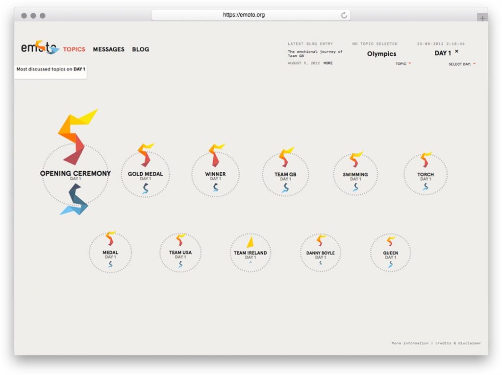
Looking Outwards Week 8

His talk:

One of his works I liked from his instagram:

His website: http://thesystemis.com/

Zach Lieberman describes himself as an “artist, researcher, hacker dedicated to exploring new modes of expression and play.” He studied Fine Arts at Hunter College and has a BFA and MFS in Design and Technology from Parsons, where he currently teaches. His works use technology in a way that augments the body’s ability to communicate, focusing on computer graphics, human-computer interaction, and computer vision.

Throughout the talk, Lieberman was very humorous, genuine, and relatable with his audience. He introduces himself by first talking about his relationship with his father and how his father inspires him. “The world needs stories. Storytelling isn’t about technique, it’s about being fully human.” His personal story is important in contextualizing his work.

I like the way he chose to introduce himself because I feel like it rang true for his work as a whole and the idea of human connection that he works toward.

He uses drawing (live demonstrations of drawing with code) as a vehicle to talk about his projects, as well as introducing other artists and works he likes. For example, using airplane wallpaper to introduce idea of connecting to other places and then connecting that to his project “Play the World”. I liked that project a lot, especially because of the surround sound speakers that serve as a reminder of your physical location in the world.

Mihika Bansal – Looking Outwards – 07

For this assignment, I analyzed the project, The Hindu Temple as a Fractal of Cosmology. This is a study of recursion within architecture. The article that I am looking at specifically is looking at the patterns that the architectures of these spaces have used when making these spaces.

Specifically the author of this article comments that the manner in which these temples is using the fundamentals of parametric architecture. They use a system called “Tala” which allow them to compute dimensional analysis of proportions. The way the recursion works in verbal times is expressed through this quote:

The layer of prahara (projection) will be above the chadya (eave of the roof). This is to be repeated again and again on the spire over the spire. A fraction of the prahara is to be constructed and again the spires are to be constructed. Each of the upper spires will be sprouted out with a measurement equal to half the size of the lower spire – Ksirarnava, 7.113

Indian Temple Fractals
An example of the temple in its recursive state

Link to post: https://www.dataisnature.com/?p=2138

Hyejo Seo – Looking Outwards 07

Data Visualization of Mortality Rates in Sweden across 264 years.

A data explorer, Wesley Bernegger, created the above data visualization for the Swedish Human Mortality Database. First, he had to decode the database that consisted of 264 years worth of data. He focused on basic trends in mortality such as deaths increasing with older age, highest observed mortality during war times. Then, slowly, he moved onto more specific patterns such as infant mortality spikes, higher mortality events, and he studied more of the Swedish history in order to get a better understanding of these trends. Finally, he included additional variables: male to female mortality ratio by age across all years and cumulative deaths observed during a year for each age group.

First sketch, exploring different types of data visualization such as tornado charts, parallel diagrams, and etc.

Then, further in the process of data visualization, he included the z axis, making the graph more 3D, in the hopes of better understanding the plots within the context of total mortality. Finally, they added gradient of colors to distinguish mortality rate of female and male. 

This particular project was interesting to me because I have never seen one like it. It is very interesting because each data point might seem obscure, but it is effective in giving the big picture of mortality rates in Sweden across the years with additional variables such as gender, different historical events and age groups. 

The same data visualization, but with different causes showing

Jamie Park – Looking Outwards 07

Studio NAND’s Emoto (2012)

I was deeply inspired by Studio NAND’s Emoto, a data visualization for the 2012 London Olympics. This KANTAR-Information is Beautiful Awards winner collected responses to the Olympics through Twitter. The collected data was then used to determine the collective sentiment on individual topics, such as events, players, and teams. Unfortunately, the studio’s website does not specify which algorithm the team used to organize the data. I think it is really interesting that the studio decided to generate visuals using Twitter, and I am curious if they ever looked into other social media, such as Facebook or Instagram, for responses.

The studio also created a physical installation of the data that represents all responses over time with overplayed information from posted Tweets. I am, again, curious to know if the team had drafts of their installation before creating the data. The way they have represented the data is very particular, and I would like to know their thought process before designing it.

Sean Meng – Looking Outwards – 07

Northeast FAA Data Visualization
Aaron Koblin
Link: http://www.aaronkoblin.com/work/flightpatterns/index.html

The Flight Patterns visualizations are the result of experiments leading to the project Celestial Mechanics by Scott Hessels and Gabriel Dunne. FAA data was parsed and plotted using the Processing programming environment, which is a flexible software sketchbook and a language for learning how to code within the context of the visual arts. And the frames were composited with Adobe After Effects and/or Maya. The project does not only represent data visually but also experiments with the possibility of representation technique. As a result, the outcome turns out to be more than just information but is also informative art piece that has aesthetic value. 

Minjae Jeong-LO-06

http://www.chrisharrison.net/index.php/Visualizations/ColorFlower

I was in Chris Harrison’s class, designing human centered software, last semester and he does many interesting and innovative projects that I find very valuable. One of my favorite information visualization project he did is the “color flower”, because even with such large amount of data, the visualization of the data is really easy to understand, and also the patterns and position of colors really create a theme that fits well with color. Chris is a very brilliant engineer and designer, that I think there are many things we can learn from him in both technical and design thinking process.

Timothy Liu — Looking Outwards — 07

This is Professor Harrison’s “Wikipedia Top 50” from 2006-2007.

For this week’s Looking Outward on informational visualization, I looked at a chart developed by CMU professor Chris Harrison on Wikipedia article popularities over a 10-month span. Wikipedia has long been an infamous news source, but the influence it’s had on information gathering and research is undeniable. Thus, Professor Harrison saw Wikipedia as a way to better understand how users browsed the internet in 2006. As he described it, visualizing this information allowed us to get a better read on the internet’s “pulse” and what activity was trending at the time. 

The graph is organized by month for every month from August 2006 to May 2007. Each month is organized into its top 50 search categories/results, sorted by descending order of frequency. In total, each of these bars represents all the traffic to Wikipedia for top 50 pages. For example, in September 2006, the top Wikipedia search result was “Steve Irwin” (the Crocodile Hunter sadly passed away during this month), while the 50th most popular result was “Podcasting” (huh!).

Prof Harrison’s information visualization does an excellent job utilizing design principles to convey meaning. He uses visual hierarchy, both through font size and bar size, to show which search results were prominent each month. He uses color to help differentiate “blips” from “mid-life,” “new,” and “end.” He also uses gray trend-lines to showcase which search results are common across months to show changes in activity. And finally, he utilizes a consistent scale with clear labels and axes to indicate the magnitude of the different search results. Overall, Prof Harrison’s information visualization display utilizes both design principles and data-management strategies that make it a compelling and power piece of information.

SOURCE:

http://www.chrisharrison.net/index.php/Visualizations/WikiTop50

Xu Xu – Looking Outwards – 07

Building visual tools to manage Germany’s rail network and its hundreds of thousands of daily passengers.

The project Peak Spotting was created by Studio NAND in collaboration with Moritz Stefaner, intended to provide visualization to passenger loads and identify potential bottlenecks early on. This web application collects millions of data-points over 100 days into the future, then these data-points are integrated into custom developed visual tools such as animated maps, stacked histograms, path-time-diagrams and lists with mini visualizations.

The application is split into 4 sections horizontally: Calendar, Day view, Train collection, and Train details. This application was designed with the team at Deutsche Bahn and the later users. According to Stefaner, prototyping with Tableau proved very useful to learn quickly if specific features would prove useful and in which form.

This project had my interest because of it’s various forms of data visualization. Through a combination of graphs and animations, the user is able to grasp data quickly and make judgement early on. The visualizations communicate information while also being aesthetically pleasing to the eye.

Sewon Park – LO – 08

The artist that I have selected from the EYEO presentations is Meejin Yoon. As I have several friends that are enrolled in the architecture program, I have developed significant interest in the field of architecture. Yoon’s Korean descent led me to select and view the project, which was both aesthetically mesmerizing and technologically inspiring

Meejin Yoon is currently the dean of architecture at Cornell University and heads the Howeler + Yoon studio, completing architecture projects ranging from from memorials to olympic infrastructures. Yoon studies architecture and likes to incorporate modern technology in her work.

http://www.howeleryoon.com/work/49/circus-conservatory (Link to her studio website)

During her lecture, she gives an effective presentation of her work through discussing why the use of technology was important in her work. She uses reusable energy for the environment and interactive technology to engage the viewers. I admire that she not only uses technology for aesthetics but also for practical purposes.

Meejin Yoon’s lecture at EYEO 2015

Raymond Pai-Looking Outwards-07

Artificial Arcadia is an installation by Swiss-based art collective Fragmentin. The installation visualizes the Swiss mountain range using moving poles and a white cloth. They appear as mountain peaks to visitors, who’s movement appears as a heat map on a screen behind the mountain range. This is an interesting use of live user data and data regarding how much human-made construction is impacting the environment of Sweden. As people move around the exhibit, they generate ‘heat’, which is visualized as a red cloud on the mostly blue screen. This, in turn, lowers the peaks of the ‘mountains’, which represents melting icecaps in the Swiss mountains.

There are many sensors and computers working to achieve this exhibit. There must be at least motion sensors, live data collection on construction sites, and perhaps even carbon footprints. This data is also computed as vertical heights of the poles that create the mountain peaks. I admire the simplicity and multilayered nature of this installation. Every part is a metaphor, and Fragementin‘s work all tend to have many layers of meanings.

The piece: