A visualization of the Global Exchange of Information (IP traffic)
The New York Talk Exchange, a project worked on by Aaron Koblin, illustrates the global exchange of information. It does this in real time by using data collected from long distance telephone and IP data flowing between New York and the rest of the world. The project is on display at the Museum of Modern Art.
In the above image, the weight of the glow corresponds to the amount of IP traffic flowing between a particular city and New York. A greater glow means a greater IP flow. Other pieces in this project show a similar connectivity using data collected from New York’s telephone network.
The purpose of this project was to show how connected New York is to the rest of the world, especially in the information age with the wide accessibility of telecommunication and internet connectivity. The project shows which cities New York has the strongest connections to. I admire that the project aims to show how connected the world is, despite the constraint of distance.
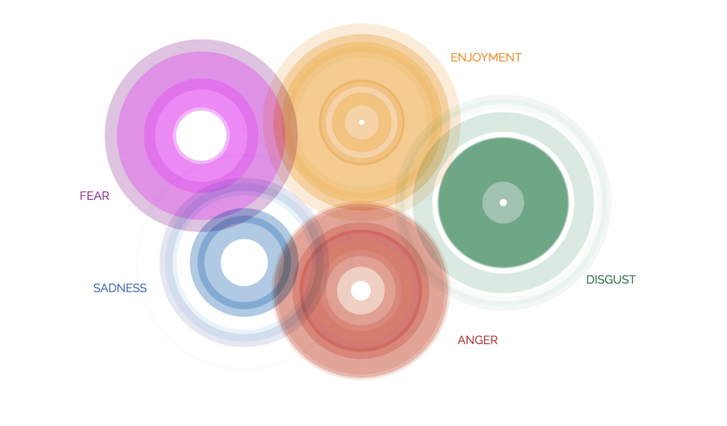
This project was a commission for the Dalai Lama, a news religious source of Tibet, in 2014. His Holiness had very interesting conversations with a friend and scientist Dr. Paul Ekman about the subject of emotion and asked of an “Atlas of Human Emotion”. Stamen didn’t only illustrate an atlas of Human Emotion, he illuminated the emotional world.
The atlas is programmed to be an interactive tool that helps you learn more and be more conscious about your emotions. There are series of questions about your emotional states and corresponding actions. The program will create a map of all your emotions and actions as well as unpack the reasoning or cause and effects throughout your timeline. The goal is to gain consciousness of what triggers your emotion in order to be more in control of your emotional world.
Timeline of emotions: cause and effect.
In this atlas, each emotion is represented as a continent, and within each emotion is a number of related emotional states. Next, each emotional state leads to actions, which then leads to triggers. He also mapped out the “cousin” of emotion, mood. Finally, he included a visualization of “calmness”, or a neutral state of emotion.
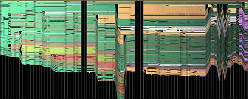
image on the edit history of abortion by Martin Wattenberg
In collaboration with Fernanda Viegas, the set of visualizations titled History Flow are representations of the edit history of Wikipedia articles. With these visualizations, it is interesting to see how a pattern emerges. For example, with the abortion visualization above, the zig zag pattern on the right delineates an argument of differing opinions. The black columns that cut through the graph shows when the article was erased and instead substituted with something offensive, which Wattenberg states is not uncommon on controversial topics. I’m curious to see what the colors in each visualization represent, and if it was words that were plotted onto the graph or ideas.
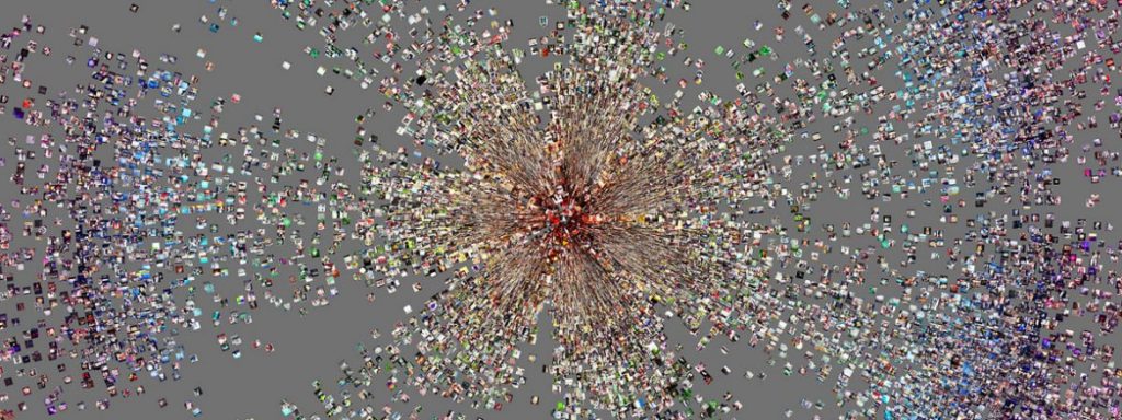
Phototrails by Lev Manovich is a research project that uses media visualization techniques for exploring visual patterns, dynamics and structures in approximately 2.3 million user-generated photos from Instagram. This data visualization project scales the images to any size and organize them in any order, presenting, for example, all the images in a collection sorted by their dates, locations, or visual characteristics. There are many ways the images were laid out to visualize different aspects of the data. Techniques include radial, montage, photoplot, and points and lines layouts.
This project drew my attention because of the way it presents data of photographs is through the photographs themselves. The unique characteristic of this data visualization is that it uses singular images to depict larger images that show patterns across a global scale.
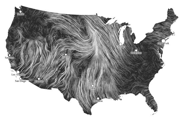
The project Wind Map, is a data visualization by Martin Wattenberg that became the first web art to be included in the MoMA’s permanent collection. The project shows winds flowing over the US from day to day with speed and direction of the lines representing wind behavior pulled from the National Digital Forecast database updating once per hour. While the representation is slightly abstracted to increase readability of the map, the overall patterns it captures are very informative and show the overall wind trends across the country in an informative and beautiful way. The project is created entirely in Javascript and HTML and shows the possibilities of computational techniques to visualize data. I found the project to be a fairly simple yet very well executed example of information visualization and thought the use of animation made understanding the previously less interesting raw wind data very intuitive and engaging.
The Atlas of Emotion as designed by Stamen Design, with 5 universal emotions.
The Atlas of Emotions by Dr. Paul Ekman in collaboration with Stamen Design intrigues me because of its subject on emotion. When I think of data visualization, I typically imagine quantitative data, and while this project did incorporate some quantitative data, the categorization of emotions is much more qualitative. I was intrigued by this project because of how layered the research was. Not only did the team investigate emotions, they conducted research on moods (vs. emotions), triggers, intensity of emotion, and all these factors came into play in their final data visualization. The visuals were largely based off of circles so their algorithms must include ellipses that gradually grow when mouseX, mouse Y in the vicinity. I think their artistic sensibilities manifested in using primitive shapes to represent emotions and story rather than more iconic representations. I really enjoyed how they combined words and visuals to tell a compelling, universal story.
I was really interested in one of Stamen Designs recent data visualization projects that was set in collaboration with Victoria and Albert Museum. The project is called the Big Glass Microphone which looks at the cross or the intersection between two types of infrastructure. The machine does so by visualizing the vibrations of the structures in a five kilometer long fiber optic cable buried underneath the campus of Stanford University. The cable is mostly used for analyzing seismic waves as they pass through campus but they wanted to focus more on looking closer to activities closer them.
More of a reason I was really fascinated by this project was because it is focused on underground infrastructure. It is not visible above the basement of where they are testing at Stanford. The representation of the model shows the collected data by highlighting the pathway as well as having the pathway grow in size. I don’t really know how they came to create this code but my guess would be that they used a various amount of if statements as well as what we are learning this week, Object Oriented Programming.
This is a screenshot of the data visualization when it starts to play the stimulation.
/*
Emma Nicklas-Morris
Section B
enicklas
Project-07
Curves
*/
var numP = 200;
function setup() {
createCanvas(400, 400);
}
function draw() {
background("#F9CDAD");
// curve name
noStroke();
textAlign(CENTER);
textSize(24);
fill("black");
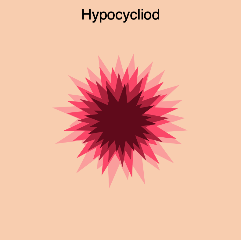
text("Hypocycliod", width / 2, 35);
// draws hypocycloids
drawHypocycloid(10, 0, "#FC9D9A"); // light pink one
drawHypocycloid(7, 30, "#FE4365"); // bright pink one
drawHypocycloid(4, 60, "#AE1F3A"); // dark pink one
drawHypocycloid(1, 90, "#610819"); // maroon one
}
function drawHypocycloid(scale, rotation, color) {
// Hypocycliod:
// http://mathworld.wolfram.com/Hypocycloid.html
// effects number of points and the shape of the hypocycloid and size
var a = constrain(mouseX, 118, 300) / 20;
// as the mouse moves down, number of points decrease
var b = constrain(mouseY, 20, 200) / 100;
var n = a / b;
var o = mouseY - (mouseX / 75); // outline size on shape
strokeWeight(o);
stroke(color);
noFill();
push();
translate(width / 2, height / 2); // center of canvas
rotate(rotation);
beginShape();
for (var i = 0; i < numP; i++) {
var p = map(i, 0, numP, 0, TWO_PI);
// equation for hypocycloid
var x = ((a / n) * ((n - 1) * cos(p) - cos((n - 1) * p)));
var y = ((a / n) * ((n - 1) * sin(p) + sin((n - 1) * p)));
vertex(scale * x, scale * y);
}
endShape(CLOSE);
pop();
}
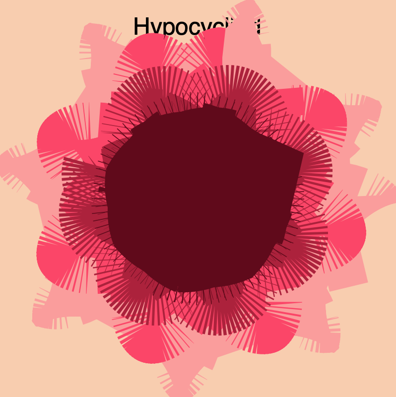
This project seemed daunting at first because I have not done any math in awhile, but once I realized that I could just type the equation for creating a curve it became more exciting. It took me a while to choose a curve. I was interested in one that had multiple points or leafs. I also wanted to use mouseX and mouseY to control how many points/leaf were show at a time. Then, I thought about using mouse position to also control the outline size. Finally, I decided to use scale to make several hypocycloids to make the drawing more interesting. I find the upper right hand corner most interesting and the lower right hand corner the least interesting. Ideally, I wish the maroon hypocycloid didn’t look like such a big blog when the mouse is in the bottom right hand corner because the lines beneath it seem interesting, but the top one block it. I think this was a fun assignment to play with.
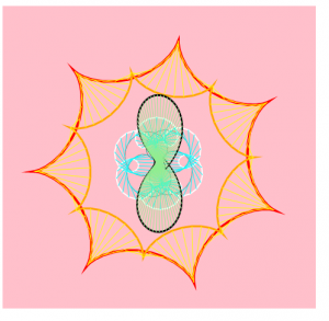
For this project, I was fascinated with the curves generated by those functions to breakdown the x and y coordinates. Then I started to play it around with mouse positions to create a growing, blooming effect. Generally, I used 2 types of curves — hypocycloid and hypotrocloid — to construct the imaginary veins and flowers. The central “mark-pen” drawing of the hypotrocloid was discovered accidentally when I tried to add varying thickness to the lines and now it gave a more realistic and 3D effect when combined with the light green lines. The blooming process integrates a series of overlappings among different elements. The white, cyan, and grey lines are related to give an impression of how the flowers can “squeeze” and “expand” during the process. The outer red,orange, and yellow lines give the basic pedestals for the drawing.
State0, blooming begin
state1, blooming
original sketch of using curves to generate a spatial drawing
//Steven Fei
//Section A
//zfei@andrew.cmu.edu
//Project-07
var nPoints = 100;

function setup() {
    createCanvas(480, 480);

}


function draw() {
    background("pink");
    push();
    translate(width/2, height/2);

    hypocycloidInvolute();
    hypotrochoid();

    pop();

}
function hypotrochoid(){
    //http://mathworld.wolfram.com/Hypotrochoid.html
    var x;
    var y;
    var x2;
    var y2;
    var a = constrain(mouseX,60, 180) ;//variable for hypotrochoid with 1/6radius
    var b = a/6; //variable for hypotrochoid with 1/6 radius
    var h = constrain(mouseY/8, 0, 2*b); // control the size of the radius
    var ph = mouseX/20; // control the starting angle of the radius
    var a2 = map(mouseY,0,480,30,80); // variable for hypotrochoid with 1/2 radius
    var b2 = a/2; // variable for hypotrochoid with 1/2 radius
    var a3 = a-20;//variable for the grey hypotrochoid
    var b3 = a3/4;//variable for the grey hypotrochoid
    var h3 = constrain(mouseY/8,0,2.5*b3);//variable for the grey hypotrochoid
    var lineV1x = []; // arrays to collect the hypotroid coordinates with 1/2 radius
    var lineV1y = []; // arrays to collect the hypotroid coordinates with 1/2 radius
    var lv2x = [];//arrays to collect the white hypotrochoid coordinates
    var lv2y = [];//array to collect the white hypotrochoid coordinates
    var lv3x = [];//arrays to collect the grey hypotrochoid coordinates
    var lv3y = [];//arrays to collect the grey hypotrochoid
    noFill();
    //draw the grey hypochocoid with 1/4 radius
    beginShape();
    stroke("grey");
    strokeWeight(1);
    for (var z = 0; z<nPoints; z++){
        var tz = map(z, 0, nPoints, 0, TWO_PI);
        x2 = (a3-b3) * cos(tz) - h3*cos(ph + tz*(a3+b3)/b3);
        y2 = (a3-b3) * sin(tz) - h3*sin(ph + tz*(a3+b3)/b3);
        vertex(x2,y2);
        lv3x.push(x2);
        lv3y.push(y2);
    }
    endShape(CLOSE);

    //begin drawing the hypotrochoid with 1/6 radius
    beginShape();
    stroke("white");
    strokeWeight(2);
    for (var i = 0; i<nPoints; i++){
        var t = map(i, 0, nPoints, 0, TWO_PI);
        x = (a-b) * cos(t) - h*cos(ph + t*(a+b)/b);
        y = (a-b) * sin(t) - h*sin(ph + t*(a+b)/b);
        vertex(x,y);
        lv2x.push(x);
        lv2y.push(y);
    }
    endShape(CLOSE);
    //draw the blue vains
    for (var d = 0; d<lv2x.length; d++){
        stroke("cyan");
        strokeWeight(1);
        line(lv2x[d],lv2y[d],lv3x[d],lv3y[d]);
    }

    //begin drawing the hypotrochoid with 1/2 radius
    beginShape();
    stroke(0);
    strokeWeight(1);
    for (var j = 0; j<nPoints; j++){
        var t2 = map(j, 0, nPoints, 0, TWO_PI);
        x = (a2-b2) * cos(t2) - h*cos(ph + t2*(a2+b2)/b2);
        y = (a2+b2) * sin(t2) - h*sin(ph + t2*(a2+b2)/b2);
        vertex(x,y);
        lineV1x.push(x);
        lineV1y.push(y);
    }
    endShape(CLOSE);
    // creating the mark pen effect by adding lines with 4 spacings of the inddex
    for (var j2 = 0; j2 < lineV1x.length-1; j2++){
        strokeWeight(1);
        stroke(0);
        line(lineV1x[j2], lineV1y[j2],lineV1x[j2+4],lineV1y[j2+4]);
        stroke("lightgreen");
        line(0,0,lineV1x[j2],lineV1y[j2]);//drawing the green veins
    }
}
function hypocycloidInvolute(){
    //http://mathworld.wolfram.com/HypocycloidInvolute.html
    var x1;//vertex for the red hypocycloid
    var y1;//vertex for the red hypocycloid
    var x2;//vertex for the orange hypocycloid
    var y2;//vertex for the orange hypocycloid
    var lx1 = [];//array for collecting the coordinates of the red hypocycloid
    var lx2 = [];//array for collecting the coordinates of the red hypocycloid
    var ly1 = [];//array for collecting the coordinates of the orange hypocycloid
    var ly2 = [];//array for collecting the coordinates of the orange hypocycloid
    var a = map(mouseY,0,480,90,180);//size of the red hypocycloid
    var b = a/7; //sides for the red hyposycloid
    var h = b; //determine the sharp corners
    var ph = mouseX/20;
    noFill();
    // red hypocycloid
    beginShape();
    stroke("red");
    strokeWeight(4);
    for (var i = 0; i<nPoints; i++){
        var t = map(i, 0, nPoints, 0, TWO_PI);
        x1 = a/(a-2*b) * ( (a-b)*cos(t) - h*cos( ph + (a-b)/b*t) );
        y1 = a/(a-2*b) * ( (a-b)*sin(t) + h*sin( ph + (a-b)/b*t) );
        vertex(x1,y1);
        lx1.push(x1);
        ly1.push(y1);
    }
    endShape(CLOSE);
    // begin drawing orange involute of the hypocycloid
    beginShape();
    stroke("orange");
    strokeWeight(3);
    for (var j = 0; j<nPoints; j++){
        var th = map(j, 0, nPoints, 0, TWO_PI);
        x2 = 1.5*((a-2*b)/a * ( (a-b)*cos(th) + h*cos( ph + (a-b)/b*th) ));
        y2 = 1.5*((a-2*b)/a * ( (a-b)*sin(th) - h*sin( ph + (a-b)/b*th) ));
        vertex(x2,y2);
        lx2.push(x2);
        ly2.push(y2);
    }
    endShape(CLOSE);
    // drawing the connection of the two hypocycloids
    for (var k = 0; k < lx1.length; k++){
        stroke("yellow");
        strokeWeight(1);
        line(lx1[k],ly1[k],lx2[k],ly2[k]);
    }

}
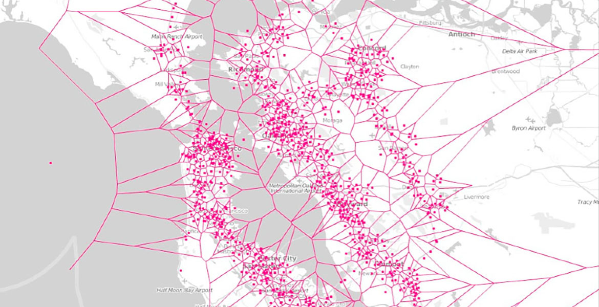
I chose to write about Stamen Design’s Cell Phone Coverage in the Bay Area. I do admire the firm’s work as a whole, but I thought that the designs they chose to generate from this particular dataset was really interesting to look at. I really liked how they took as mundane of a topic as cell phone coverage and made it into something visually appealing and beautiful. It was also really fascinating to see the variety in the different kinds of designs that they made out of the same type of data. I think that this set of designs is a really good representation of Stamen Design’s artistic sensibilities in that the firm considers itself to be sitting at the intersection between design and data science, and the collection embodies that combination.
Cell Phone Coverage in San Francisco, Carrier 1
Specifically, the Cell Phone Coverage in San Francisco is meant to visualize cellular network strength across four major carriers in the Bay Area through data-driven algorithms and interactive sketches. Although I’m not really sure about this, I think that this kind of data-derived design algorithm would involve importing data into the code editor and then inputting the values into some type of array structure to generate the patterns. It also looks like there are preset color and shapes that go with the information, so I would assume those use some type of array as well.
![[OLD FALL 2019] 15-104 • Introduction to Computing for Creative Practice](../../../../wp-content/uploads/2020/08/stop-banner.png)