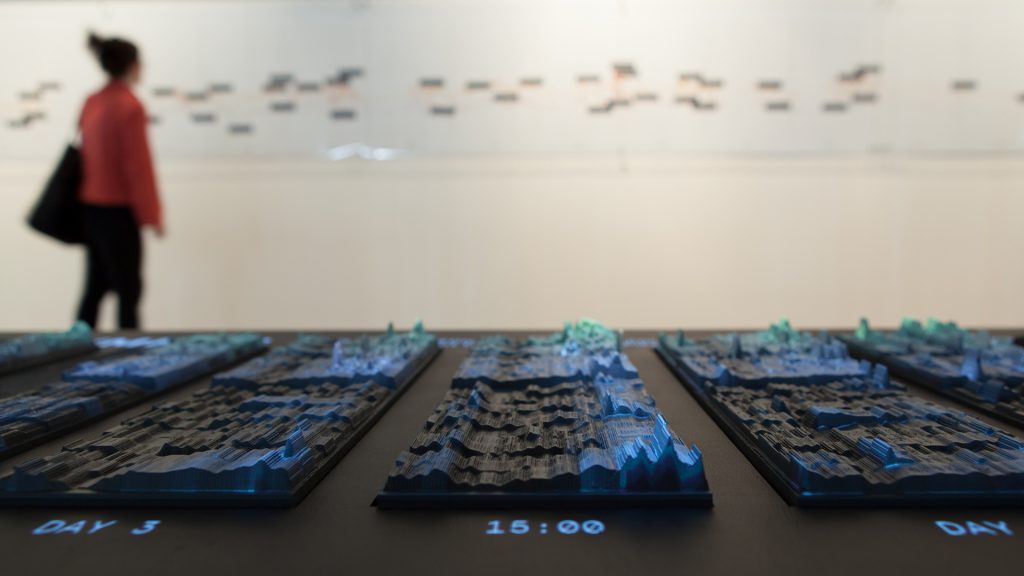
Emoto Installation, created by Studio NAND, is a computational information visualization project that executes the global response/data collected from Twitter around the London 2012 Olympic Games in an interactive online visualization and physical data sculpture. Based on approximately 12.5 million Twitter messages which were collected in real-time, this project recorded trending topics and how they were discussed online in an interactive visualization which was running live during the same time as the Games in July and August 2012. Each Tweet was annotated with a sentiment score by the project’s infrastructure using software provided by Lexalytics. This data formed the basis for an extensive profiling of London2012 which was finally documented in this interactive installation and physical data sculpture at the WE PLAY closing exhibition of the Cultural Olympiad in the Northwest. I was drawn into this installation because not only it was executed well online, but it was also presented in a physical form/installation. It was easily recognizable and accesible to understand the project and the data visualization. The video captures the intentions and content of the project really well and it helped me to understand Emoto Installation more. I love the details of the usage of light projection, color, laser cut, and text all incorporated very well into one installation. I admire the level of detail and effort that was put into this project, the depth of the research and data visualization is very inspiring.
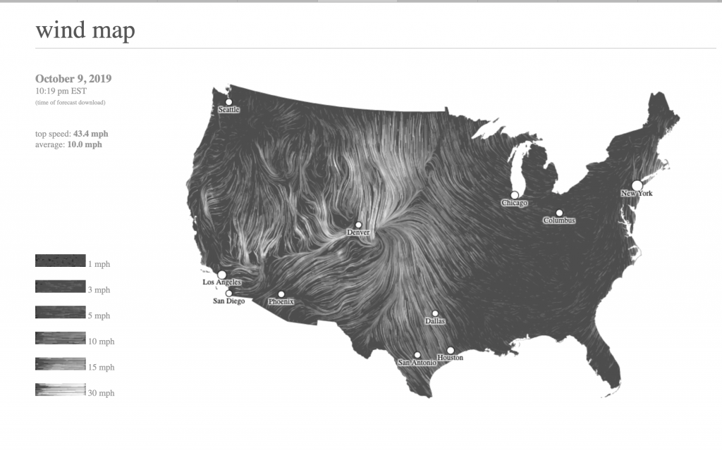
wind map simulation from http://hint.fm/wind/ created by Wattenberg and Viegas
This map shows the delicate tracery of wind flowing over the US. From this data visualization, there are a number of information that have been weaved together to show the flow of wind in a visually aesthetic way. From the map, we can understand the directionality, speed, as well as the top and average speed. As indicated in the website, the wind map website has used National Digital Forecast Database. These are near-term forecasts, revised once per hour. So the map is a live portray of the wind current condition over us.
This is a really interesting project to me as it gives a strong and dynamic visualization of how the wind moves and from the map so that we can potentially assume how the wind might have responded to the particular terrain and topology condition of US. Also for natural disaster such as hurricanes, the map would indicates the progress of a natural disaster and serving as a educational tool for viewers.
//Fanjie Jin
//Section C
//fjin@andrew.cmu.edu
//Project 7

function setup(){
    createCanvas(480, 480);
//set a initial start x and y value
    mouseX = 100;
    mouseY = 100;
}

function draw(){
    background(100);
    push();
//tranlate geometry to the center of the canvas
    translate(240, 240);
//constrain the mouse x value
    var x = constrain(mouseX, 5, 480);
//constrain the mouse y value
    var z0 = constrain(mouseY, 0, 240);
//constrain the mouse y value
    var z1 = constrain(mouseY, 0, 240);
//constrain the mouse y value
    var z2 = constrain(mouseY, 0, 360);

//remap the value of mouse X
    var a = map(x, 0, 480, 0, 200);
//remap the value of mouse X
    var b = map(x, 0, 480, 60, 60);
//remap the value of mouse X
    var c = map(x, 0, 480, 0, 100);

    noFill();
    beginShape();
//inside circle size variable
//Hypotrochoid Variation 1
    for (var i = 0; i < 120; i++) {
//defining the positions of points
//parametric eq1
        x1 = (b - a) * sin(i) + z0 * sin((b - a) * i);
//parametric eq2
        y1 = (b - a) * cos(i) - z0 * cos((b - a) * i);
//color variation
        stroke(b * 2, a * 3, a + b);
        vertex(x1, y1);
    };
    endShape();
//Hypotrochoid Variation 2
    noFill();
    beginShape();
    for (var i = 0; i < 120; i++) {
//parametric eq3
        x2 = (b - a) * cos(i) + z1 * cos((c - a) * i);
//parametric eq4
        y2 = (b - a) * sin(i) - z1 * sin((c - a) * i);
        stroke(b , c, a + b);
        vertex(x2, y2);
    };
    endShape();
//Hypotrochoid Variation 3
    noFill();
    beginShape();
    for (var i = 0; i < 120; i++) {
//parametric eq5
        x3 = (b - a) * sin(i) + z2 * sin((a - c) * i);
//parametric eq6
        y3 = (b - a) * cos(i) - z2 * cos((a - c) * i);
        stroke(a , c, b);
        vertex(x3, y3);
    };
    endShape();
    pop();
}
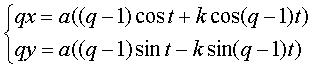
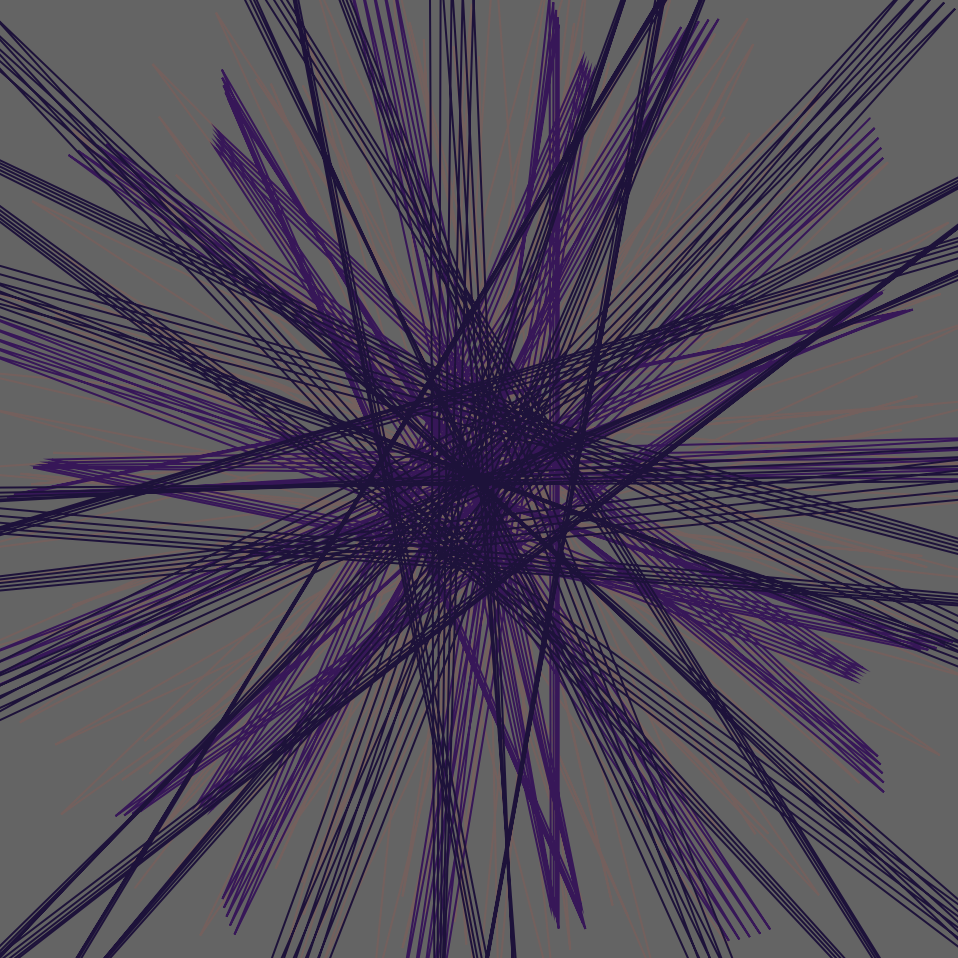
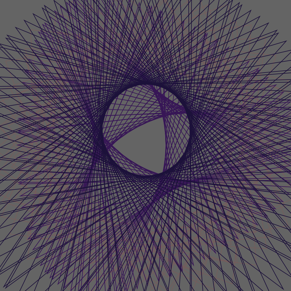
In this project, I have tried to use the equation for Hypotrochoid to generate some mathematically interesting compositions. The equation express is above; however, I have simplified and add another parameter to the equation so that more parametric shapes would be generated. I really enjoyed this project as I think it is really great to learn how to actually use these mathematical to generate patterns and sometimes when you move the mouse a tiny bit, the entire composition will be drastically changed. In this project, there are three rings and each of them has a different equation and they would move simultaneously once the mouse position is changed.
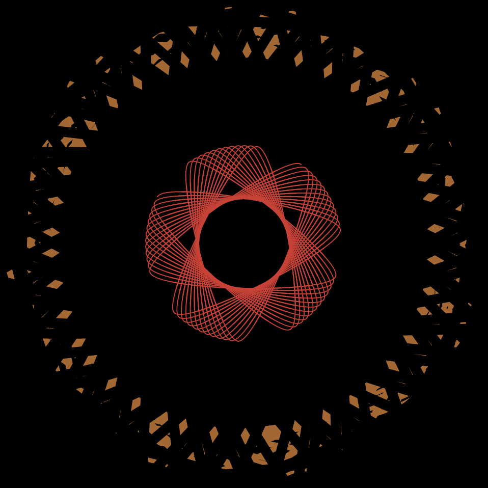
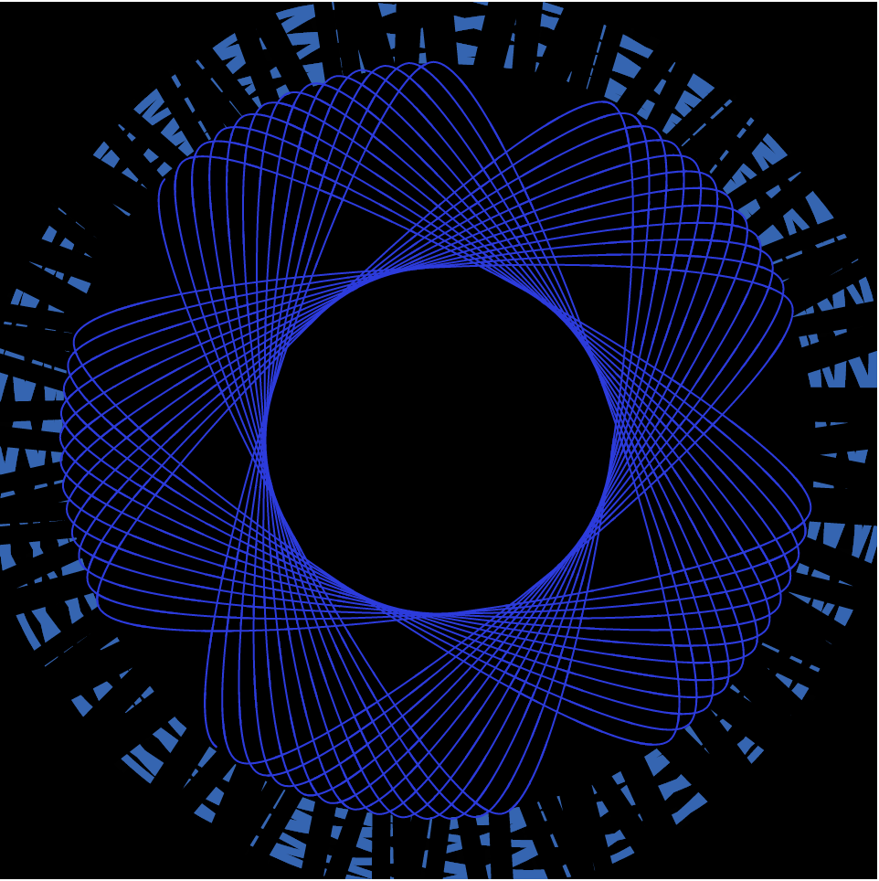
x = 240 , y = 120x = 200 , y = 160x = 100 , y = 360
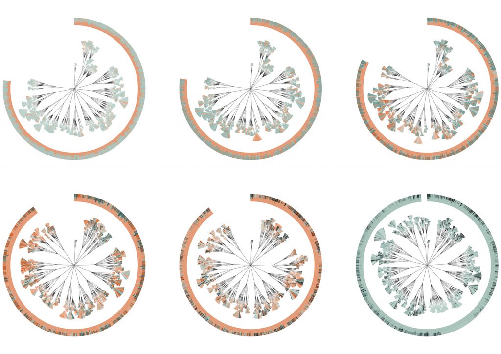
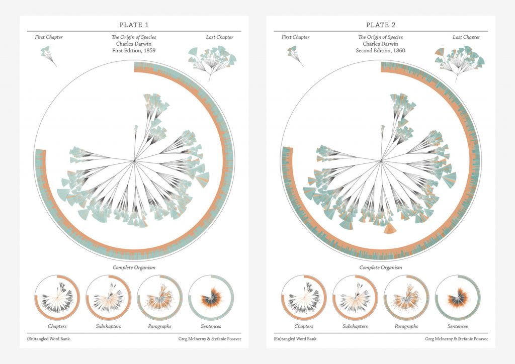
The piece I chose this week is a collaboration between Stefanie Posavec and Greg McInerny. These pieces were created by analyzing insertions and deletions that occurred between six editions of The Origin of Species by Charles Darwin. On her website, Posavec outlines that McInerny completed all of the programming and gathering of data and together they worked on the visual form. While it does not describe the particulars of the programming used to analyze all of the editions, it says that C++ and R were used in terms of programming languages. My guess is that an algorithm was used that analyzed all the sentences within each edition and then checked how many times that sentence was seen again in future versions.
Posavec modeled this form after another project that she did while working on her Masters in Communication Design. She calls the structure a ‘literary organism.’ Each diagram represents an edition, which is then broken down into chapters and subchapters. After that, the subchapters are divided into the paragraph ‘leaves,’ which are then broken into sentence ‘leaflets.’ The sentences in each edition are colored to indicate whether they survive to the next edition (blue) or have removed (orange).
Banners created for Darwin Anniversary Festival at the University of Cambridge
I enjoyed this project because it’s not a dataset that would come to mind when I think about content usually depicted in data visualization. It is interesting to see the way that the content within the editions changes over time. It shows a progression in both scientific thought and how Darwin was developing his theories and knowledge. I think that the form is also pretty interesting. It feels heavily inspired by natural forms and the way that natural species are charted based on relations.
//Mihika Bansal
//mbansal@andrew.cmu.edu
//Section E
//Project 5


function setup() {
    createCanvas(480, 480);
}


function draw() {

    var mx = constrain(mouseX, 0, 480); //constraining variables
    var my = constrain(mouseY, 0, 480);

    background(0, 0, 0, 75);

    drawHypotrochoid(); //color one
    drawBlackHypotrochoid(); //black one
    drawBlackHypotrochoid2(); //black one
    drawCenter(); //center flower ellipse
    frameRate(500);

}

function drawHypotrochoid(){

    push();
    translate(width / 2, height / 2);
    var mx = constrain(mouseX, 0, 480); //constraining variables
    var my = constrain(mouseY, 0, 480);

    var rad1 = 230; //radius and parameters

    var r = my * 0.4; //color variables
    var g = 100;
    var b = mx * 0.4;

    noFill();
    stroke(r, g, b);
    strokeWeight(4);

    var a1 = map(mx, 0, width, 0, 20);
    var b1 = map(my, 0, height, 0, 1);

    beginShape();
    rotate(radians(angle));

    for(var i = 0; i < 360; i += 5){
        var angle = map(i, 0, 360, 0, 360);

        var x = (a1 - b1) * cos(angle) + rad1 * cos((a1 - b1 * angle)); //equations of math functions
        var y = (a1 - b1) * sin(angle) - rad1 * sin((a1 - b1 * angle));

        curveVertex(x, y); //drawing points

    }

    endShape();
    pop();

}

function drawBlackHypotrochoid(){

    push();
    translate(width / 2, height / 2);
    var mx = constrain(mouseX, 0, 480); //constraining variables
    var my = constrain(mouseY, 0, 480);

    var rad1 = 380; //radius and parameters


    noFill();
    stroke("black"); //overlapping the first function with a black one so that it cuts through it
    strokeWeight(10);

    var a1 = map(mx, 0, width, 0, 25);
    var b1 = map(my, 0, height, 0, 5);

    beginShape();
    rotate(radians(angle));

    for(var i = 0; i < 360; i += 5){ //determines numnber of times loop runs
        var angle = map(i, 0, 360, 0, 360);

        var x = (a1 - b1) * cos(angle) + rad1 * cos((a1 - b1 * angle)); //equations of math functions
        var y = (a1 - b1) * sin(angle) - rad1 * sin((a1 - b1 * angle));

        curveVertex(x, y); //drawing points

    }

    endShape();
    pop();

}
function drawBlackHypotrochoid2(){

    push();
    translate(width / 2, height / 2);
    var mx = constrain(mouseX, 0, 480); //constraining variables
    var my = constrain(mouseY, 0, 480);

    var rad1 = 300; //radius and parameters


    noFill();
    stroke("black"); //overlapping the first function with a black one so that it cuts through it
    strokeWeight(10);

    var a1 = map(my, 0, width, 0, 30);
    var b1 = map(mx, 0, height, 0, 2);

    beginShape();
    rotate(radians(angle));

    for(var i = 0; i < 360; i += 5){ //determines numnber of times loop runs
        var angle = map(i, 0, 360, 0, 360);

        var x = (a1 - b1) * cos(angle) + rad1 * cos((a1 - b1 * angle)); //equations of math functions
        var y = (a1 - b1) * sin(angle) - rad1 * sin((a1 - b1 * angle));

        curveVertex(x, y); //drawing points

    }

    endShape();
    pop();

}

function drawCenter(){
    translate(width / 2, height / 2);
    noFill();

    var mx = constrain(mouseX, 0, 480); // define constrain variables
    var my = constrain(mouseY, 0, 480);

    var angle = map(mx, 0, width, 0, 360);// define draw parameters
    var a2 = 70 + (.3 * mx);
    var b2 = 70 + (.3 * mx);

    var r = my * 0.5; //color variables
    var g = 50;
    var b = mx * 0.5;

    // define stroke
    strokeWeight(1);
    stroke(r, g, b);
    // define shape parameters
    beginShape();
    rotate(radians(angle));
    for (var t = 0; t < 160; t += 2.5){

        var x = a2 * (cos(t)); //equation function
        var y = b2 * (sin(t));
        curveVertex(x,y);
        }
    endShape();
}
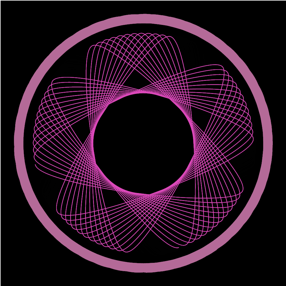
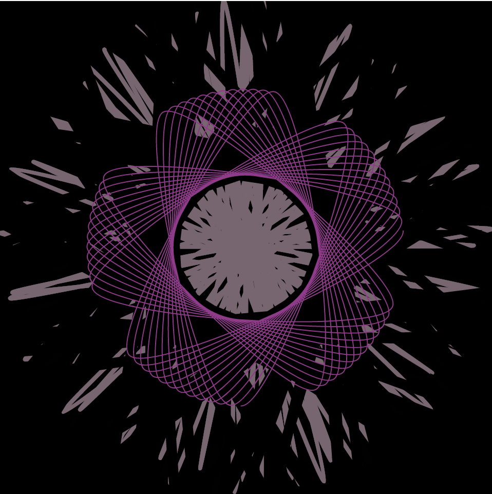
This project was quite confusing to grasp at first, but once I had an idea of what I wanted to do, I was able to explore the functions in an interesting manner. I spent a good amount of time playing around with my numbers in my code to get interesting interactions with the way that the curve moves, and forms. I was also able to layer curves in a way that created fun patterns. Here are some screen shots from the project at different states of the mouse location.
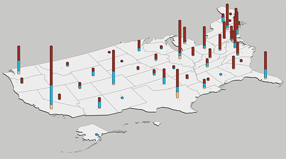
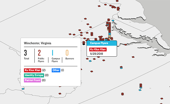
Wes Grubbs created an interactive data visualization software to collect data about Hate Flyering across the USA for the Southern Poverty Law Center.
Users are able to zoom to view, select each state to see the statistics, and also see the change in Hate Flyering over time. The interactive visualization allows you to select the time range from 2018-2019, see the different groups of flyers and the types of flyering.
I really admire that Grubbs created an interactive visualization for something very prevalent in today’s society. I don’t know what algorithms generated this work, but I am astounded by the creativity of Grubbs to create an actual map drawing of the USA with 3D bar graphs. The bar heights increase with the number of Hate Flyerings. In addition, the bay is specifically located (on the map) on the location (in the US) where the data was gathered. This seems like such a simple idea, yet the creativity manifests in this form of presentation.
Grubbs Interactive Data Visualization (n.d.): USA Map Hate Flyering Bar Graph Grubbs Interactive Data Visualization (n.d.): Winchester Hate Flyering Statistics in 2018
//Lanna Lang
//Section D
//lannal@andrew.cmu.edu
//Project 07 - Curves

var nPoints = 100;
var angle = 0;

function setup() {
    createCanvas(480, 480);
}

function draw() {
    background('#ffc5a1'); //pastel orange

    //call, translate, and rotate
    //the epitrochoid curve
    push();
    translate(width/2, height/2);
    rotate(radians(angle));
    drawEpitrochoid();
    angle += 10;
    pop();

    //call and translate the hypotrochoid curve
    push();
    translate(width/2, height/2);
    drawHypotrochoid();
    pop();
}

//Epitrochoid curve (biggest curve)
function drawEpitrochoid() {
    //http://mathworld.wolfram.com/Epitrochoid.html

    var x1;
    var y1;

    //scale and rotation based on mouseY and mouseX
    var a1 = map(mouseY, 0, 480, 10, 70);
    var b1 = 20;
    var h1 = mouseX;

    strokeWeight(4);
    stroke('lightyellow');
    fill(mouseX, 150, mouseY); //fill based on the mouse
    beginShape();
    for (var i = 0; i < nPoints; i++) {
        var t1 = map(i, 0, nPoints, 0, TWO_PI);
        //epitrochoid equation
        x1 = (a1 + b1) * cos(t1) - (h1 * cos((a1 + b1 / b1) * t1));
        y1 = (a1 + b1) * sin(t1) - (h1 * sin((a1 + b1 / b1) * t1));
        vertex(x1, y1);
    }
    endShape(CLOSE);
}

//Hypotrochoid curve
function drawHypotrochoid() {
    //http://mathworld.wolfram.com/Hypotrochoid.html

    //rainbow filled hypotrochoid
    var x2;
    var y2;

    //scale and rotation based on the mouse
    var a2 = map(mouseY, 0, 480, 80, 200);
    var b2 = 20;
    var h2 = mouseX / 10;

    strokeWeight(4);
    stroke('hotpink');
    fill(mouseX, mouseY, 200);
    beginShape();
    for (var i = 0; i < nPoints; i++) {
        var t2 = map(i, 0, nPoints, 0, TWO_PI);
        //hypotrochoid equation
        x2 = (a2 - b2) * cos(t2) + h2 * cos((a2 - b2) / b2 * t2);
        y2 = (a2 - b2) * sin (t2) - h2 * sin((a2 - b2) / b2 * t2);
        vertex(x2, y2);
    }
    endShape(CLOSE);

    //green hypotrochoid with lines
    var x3;
    var y3;

    var a3 = 180;
    var b3 = map(mouseY, 480, 0, 180, 20);
    var h3 = -mouseX / 10;

    //array for the lines inside the curve
    var lineX = [];
    var lineY = [];

    strokeWeight(3);
    stroke('lightgreen');
    noFill();
    beginShape();
    for (var i = 0; i < nPoints; i++) {
        var t3 = map(i, 0, nPoints, 0, TWO_PI);
        //hypotrochoid equation
        x3 = (a3 - b3) * cos(t3) + h3 * cos((a3 - b3) / b3 * t3);
        y3 = (a3 - b3) * sin(t3) - h3 * sin((a3 - b3) / b3 * t3);
        vertex(x3, y3);
        lineX.push(x3);
        lineY.push(y3);
    }
    endShape(CLOSE);

    //draw the lines inside the curve with a for loop
    for (var i = 0; i < lineX.length - 1; i++) {
        strokeWeight(2);
        stroke(mouseX + mouseY, mouseY, 120);
        line(0, 0, lineX[i], lineY[i]);
    }
}
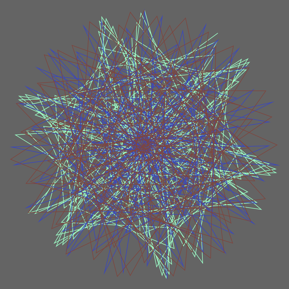
I was intimidated at first looking at the instructions that said we had to create an image based on math curve functions, and I thought it would be very difficult to do, but it turned out to be pretty simple. I had a lot of fun researching the different roulette curves and seeing which ones did cool things with code. I played a lot with mouseX and mouseY, as well as scale, map(), and color. My favorite part of this project is that if you stop your mouse at a different point on the canvas, the epitrochoid curve changes into a completely different curve each time; it’s so interesting to see the crazy curves it can create by changing its a, b, and h values with the mouse’s coordinates.
First state: only one hypotrochoid curvesSecond state: with both hypotrochoid curves
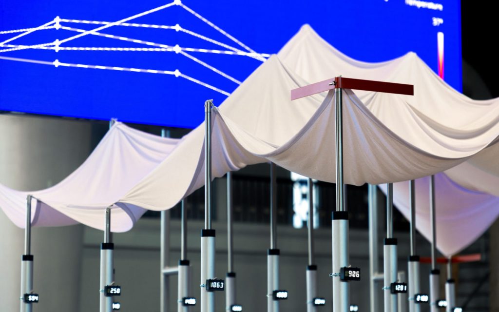
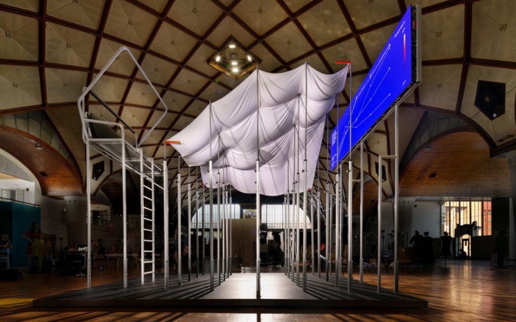
Artificial Arcadia is a collaborative project between the KOSMOS architects and Fragmentin, an art practice based in Switzerland. With its spatial design inspired by the Swiss infrastructures like snow cannons, irrigation systems, and more, Artificial Arcadia inspires visitors to interact with the dynamic landscape in a performative scenographic landscape. This landscape is mapped with “bauprofile” markers, which are construction poles that show the intended location of future buildings, and they are topped with a white textile roof evoking the Swiss mountain range. The interactive element comes alive as visitors enter and move through the installation, where the poles position themselves at different heights and gradually fall to reference the melting levels of ice. The algorithms derives from the Swiss topography data, where a new portion of the Alps snow level map is randomly selected and analyzed every few minutes, then translated within the landscape. This project was inspiring as it provides a perspective towards our environment, particularly how it sparks debate regarding the artificial integration to a natural area. Likewise, Fragmentin’s work crosses the boundary between art and engineering, exploring the complex systems through form and interaction.
“bauprofile” markers (Fragmentin)Interactive installation space prompts visitors to move through (Fragmentin)
Stamen design is a visualization design studio that provides for clients across different industries such as artists, architects, and museums. One of their projects that I find particularly interesting is the “Facebook Flowers”.The project took the activities on Facebook of the American actor George Takei and translated it into a digital art piece where a flower grows following the activity of the actor. The team looked at one facebook post specifically, and translated the shares to a flower as each follow-on shares becomes a strand on their own. The pattern created drew relationship to a living organism when the evolving movement is captured to create a video. I find the work of Stamen design very eye opening since it interpreted a technological flow and transformed it to resemble nature. It is fascinating how we as humans are constantly surrounded by the theme of nature even in this ever changing world.
//Siwei Xie
//Section B
//sxie1@andrew.cmu.edu
//project-07

var nPoints = 500;
var t;
var angle = 0;
var adj = 2;

function setup() {
    createCanvas(480, 480);
}

function draw() {
	background(220);
    noStroke();

	//draw Quadrifolium with variant colors
    push();
    fill(mouseX, mouseY, 80);
    translate(mouseX, mouseY);
    rotate(radians(angle));
    drawQuadrifolium();
    angle = (angle + adj) % 360;
    pop();

    //draw Epitrochoid with variant colors
    push();
    fill(80, mouseX, mouseY);
    translate(200, 200);
    drawEpitrochoid();
    pop();
}

//draw rotating & moving windmill
function drawQuadrifolium() {
    var a = 70;

    beginShape();
    for (var i = 0; i < nPoints; i++) {
        var t = map(i, 0, nPoints, 0, TWO_PI);

        //http://mathworld.wolfram.com/Quadrifolium.html
        r = a * sin(2 * t);
        x = r * cos(t);
        y = r * sin(t);
        vertex(x, y);
    }
    endShape(CLOSE);
}

//draw variant curve in the middle
function drawEpitrochoid(){
    var a1 =  40;
    var b1 = 200;
    var h = constrain(mouseY/ 10.0, 0, b1);
    var t;
    var r = map(mouseX, 0, 600, 0, 1);

    beginShape();
    fill(200, mouseX, mouseY);
    for (var i = 0; i < nPoints; i++) {

        stroke("black");
        vertex(x, y);
        var t = map(i, 0, nPoints, 0, TWO_PI * 2); // mess with curves within shapes

        //Parametric equations for Epitrochoid Curve
        x = r* ((a1 + b1) * cos(t) - h * cos((t * (a1 + b1) / b1) + mouseX));
        y = r* ((a1 + b1) * sin(t) - h * sin((t * (a1 + b1) / b1) + mouseX));

    }
    endShape(CLOSE);

}
I had fun creating this image. I used Quadrifolium and Epitrochoid in my drawing, and adjusting them according to the position of mouse.
Quadrifolium is a type of rose curve with n=2. It has the polar equation. Epitrochoid is a roulette traced by a point attached to a circle of radius r rolling around the outside of a fixed circle of radius R, where the point is at a distance d from the center of the exterior circle.
By modifying the limits of parameters and changing value of parameters in the formula, I was able to play with the curves.
Screenshot after I finished drawing the Quadrifolium.
![[OLD FALL 2019] 15-104 • Introduction to Computing for Creative Practice](../../../../wp-content/uploads/2020/08/stop-banner.png)