Kimberlyn Cho- Looking Outwards 07

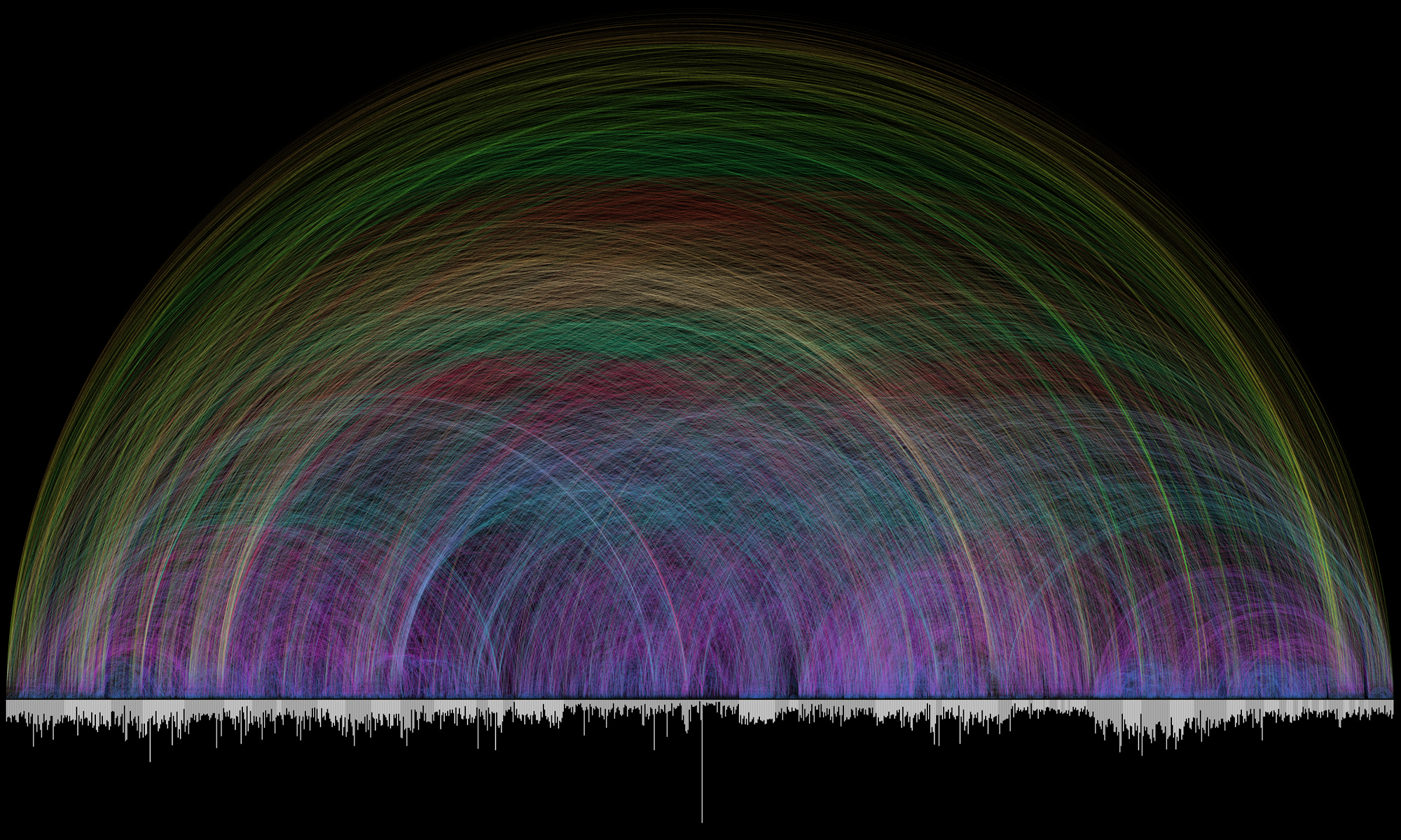
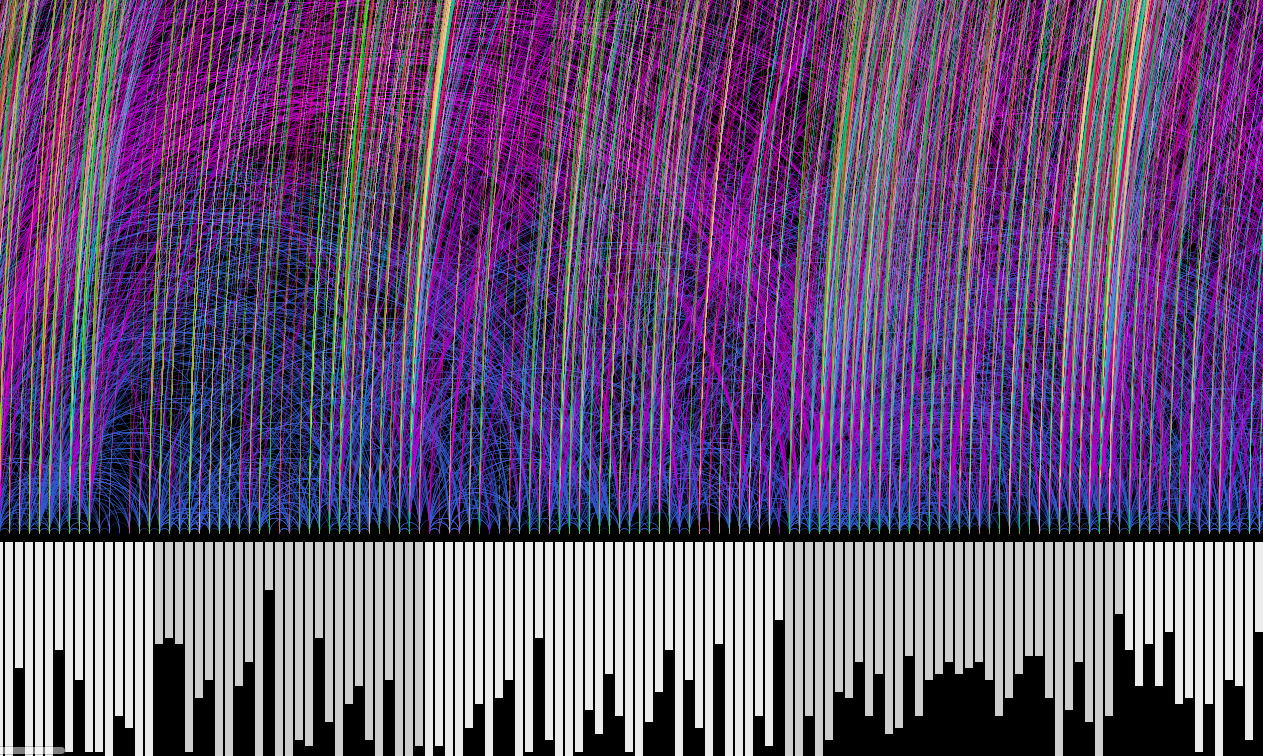
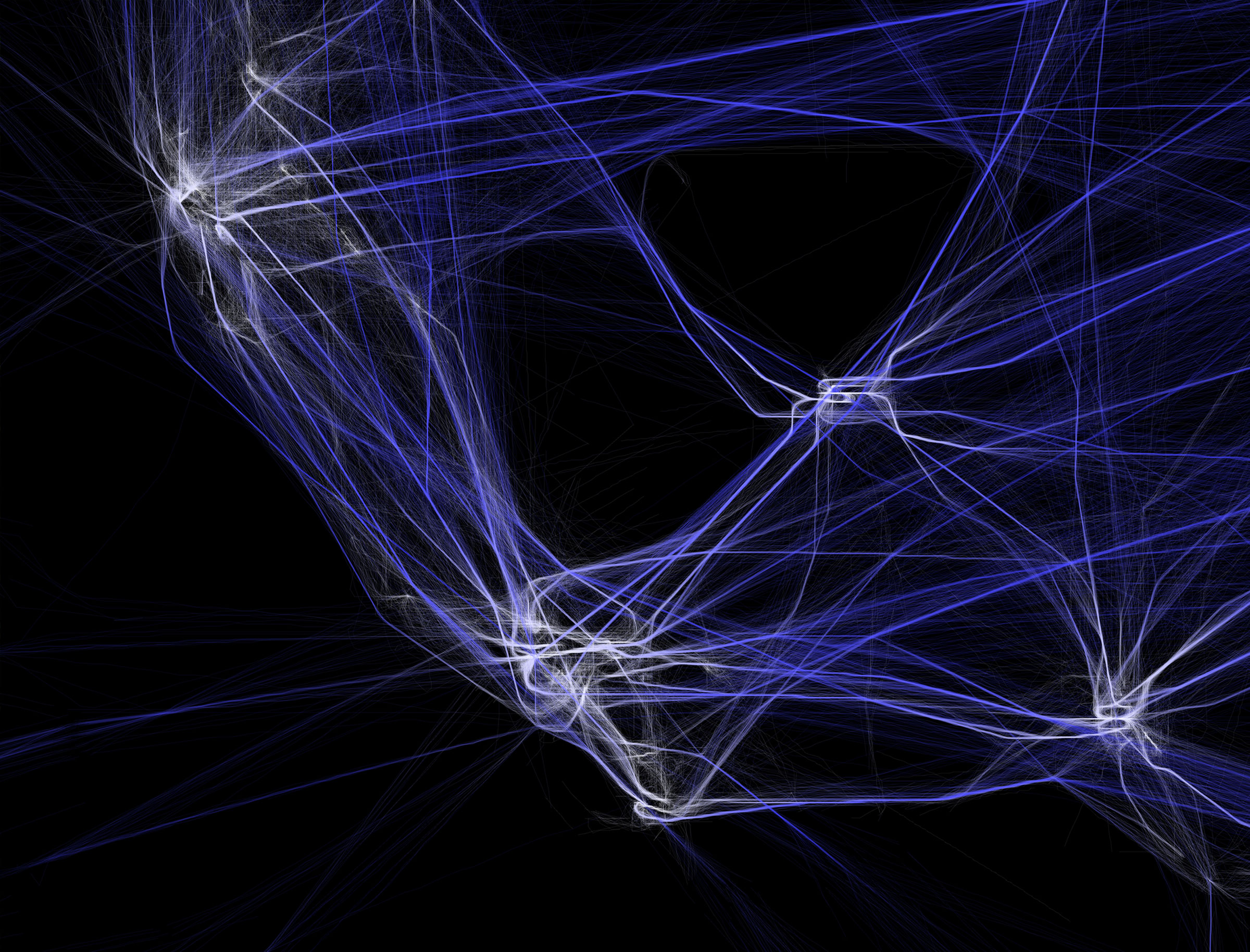
Virality by Rachel Binx visualizes the spread of facebook stories by analyzing the origin of the story to its various branchings. Her team focused on the three most shared images on facebook (all from George Takei’s page) and tried to emulate the energy of these images using WebGL.

With the help of Zach Watson, Binx uses WebGL as a framework for her project to produce the visualization as well as iterate on various animation styles. WebGL, short for Web Graphics Library, is a JavaScript interface for rendering interactive graphics on a web browser. It uses a 3d project exported from various 3d softwares such as Blender or Autodesk Maya to produce an interactive visualization accessible from most, if not all, browsers. The software allows Binx to experiment with different rendering options such as the color, opacity, degree, density of the branches

Virality (female) by Rachel Binx 2012
Virality (male) by Rachel Binx 2012

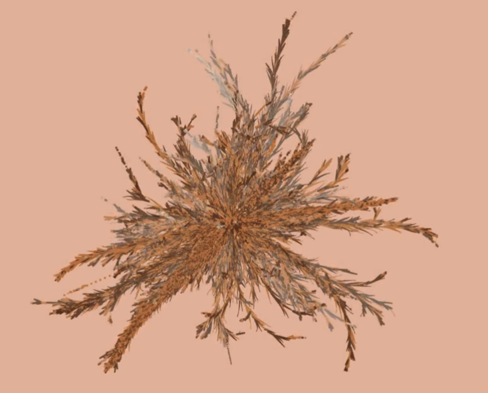
The animated data visualization starts from the origin of the viral facebook images and analyzes its various branches, with each re-share of the image becoming its own branch. Some re-shares show a burst of energy with the re-share almost becoming its own viral element, while others create new branches in the visual form of arcs of various angles.

I found this work to be interesting in its relevance to modern day social media tactics and its resourcefulness. Social media can be considered one of the most efficient ways to spread information to various groups of people today. Many businesses and corporations take advantage of the excessive use of social media to exploit users as well as spread data or any other types of information. To be able to track the pathway of a viral image on facebook can indicate useful advertising tactics, as well as interesting feedback and conclusions for not only companies, but also for the average social media user.

virality

Min Ji Kim Kim – Looking Outwards – 07


Chris Harrison’s Bible Cross-References data visualization

Bible Cross-References is a collaboration piece between Chris Harrison and Pastor Christoph Römhild. Pastor Römhild had begun putting together data on cross-references within the Bible and wanted to visualize them with the help of Harrison. Together, they were able to take over 63,000 cross references to create this beautiful rainbow. The bottom bars are the different books of the Bible (alternating color between white and gray) and the bar length is how many verses each chapter has. The arc color denotes the distance between the cross-referenced chapters.

Closeup of a portion of the Bible Cross-References data visualization piece.

I am a Christian, and while reading my study Bible there have been multiple times I have thought, “There are so many cross-references to other books, I wonder if we could analyze them… that would be amazing”. When I found this piece, I was fascinated. Looking at these cross-references visually though Harrison’s work has really shed a light on how extensively connected the Bible is and I am in awe. I really appreciate how Harrison and Römhild were able to create such a beautiful piece using data from the Bible.

You can see his other data visualization projects here.

Sarah Choi – Looking Outwards – 07

Flight Patterns from Aaron Koblin on Vimeo.


Aaron Koblin: artist, designer, programmer, and entrepreneur

For this week’s Looking Outwards, we are focusing on computational information visualization, which is why I decided to focus on Aaron Koblin. He is an artist, designer, programmer, and entrepreneur specializing in data and digital technologies. I decided to focus on his Flight Patterns project, documenting his own custom software with computational and interactive information visuals of the paths of air traffic over North American through color and form. This project intrigued me as a pretty heavy traveler and growing up in South East Asia, the art of having technical engineering skills to fly all over the world has been an important aspect.

The algorithms generating the work were parsed and plotted using a form of process programming. This project first started as a series of experiments for a project called “Celestial Mechanics” with his colleagues at UCLA. However, during the process, Koblin wanted to make a project of his own using his artistic skills. 

The project’s final form was manifested through his artistic ability to make interactive visualizations but also was made through technical computing skills that went along with flight patterns over the United States. 

Paths of air traffic over North America visualized in color and form.

Taisei Manheim – Project 07 – Composition with Curves


sketch

For this project, I was intimidated at first because I was not sure how some of the mathematical equations for the lines worked because I haven’t taken a math class in a while.  However, I realized that just by plugging different equations into the for loop it created interesting results that I was not expecting.  In the end I chose to use a Hypotrochoid and a Ranunculoid.  The combination of the overlapping  geometries, along with the changing colors according to the mouse location give it a bit of a psychedelic vibe.

//Taisei Manheim
//Section C
//tmanheim@andrew.cmu.edu
//Assignment-07


function setup() {
    createCanvas(480, 480);
}

function draw() {
    //background color determined by mouse
    background(mouseX, mouseY, mouseX - mouseY);
    drawHypotrochoidCurve()
    drawRanunculoidCurve()
}

function drawHypotrochoidCurve() {
    //http://mathworld.wolfram.com/Hypotrochoid.html

    //mouse only affects image while on canvas
    var x = constrain(mouseX, 0, width); 
    var y = constrain(mouseY, 0, height);

    //changes speed in which it changes so that as you move away from center image changes
    var a = map(x, 0, width, 0, width / 64); 
    var b = map(y, 0, height, 0, height / 64);
    var h = width / 2;

    push();
    translate(width / 2, height / 2); // starts in the center of the canvas
    noFill();
    beginShape();
    for(var i = 0; i < 360; i += 1) {
        var x = (a - b) * cos(i) + h * cos((a - b) * i);
        var y = (a - b) * sin(i) - h * sin((a - b) * i);
        vertex(x, y);
    }
    endShape();
    pop();
}

function drawRanunculoidCurve() {
    //http://mathworld.wolfram.com/Ranunculoid.html
    
    //mouse only affects image while on canvas
    var x = constrain(mouseX, 0, width); 
    var y = constrain(mouseY, 0, height);

    //changes speed in which it changes
    var a = map(x, 0, width, 0, width / 8); 
    var b = map(y, 0, height, 0, height / 8);

    push();
    translate(width / 2, height / 2); // starts in the center of the canvas
    rotate(mouseX/ mouseY);
    noFill();
    beginShape();
    for(var i = 0; i < 360; i += 1) {
        var x = a * (6 * cos(i) - cos(6 * i));
        var y = a * (6 * sin(i) - sin(6 * i));
        vertex(x, y);
    }
    endShape();
    pop();
}

Lanna Lang – Looking Outwards – 07

Aaron Koblin’s “Amsterdam SMS” // 2007

This project is a dynamic visualization of the mass volume of SMS messages that were transmitted on the night of New Year’s Eve across Amsterdam, revealing the city’s buildings and structures. This interactive tool was built with Processing and OpenGL. What inspires me about this project is that it usually isn’t the type of art I would normally gravitate towards, but it’s unique concept of taking the data of all the SMS messages from one of the busiest nights ever and forming a city’s cityscape with its volume is very intriguing and out-of-the-box.

I appreciate how Koblin includes a timelapse of how the SMS messages varied across the month of December, so that the drastic jump on January 1st  is exaggerated even further, displaying how many people were looking at their phone screens at the time of change of the new year. What Koblin got right was the message that this sends across by freezing the frame as soon as the date turned January 1st, and I would love to see this project redone now, and how modern technology has affected society even further than it did in 2007.

In general with Koblin and his use of data visualization art, Koblin was inspired by his interest in computer gaming and being exposed to the rich data of society that we live in, as well as learning from the two professors from UCLA who created Processing.

Aaron Koblin’s “Amsterdam SMS”

Xiaoyu Kang-Looking Outwards-07


Every IP, 1999

This project is called 1:1. It is a project that was created in 1999 as a collection of database. The database was created to eventually contain the addresses of every website in the world. The data was collected through sending out a crawler, which will determine if there is a website at a specific numeric address, which is called IP and range between 0.0.0.0 and 255.255.255.255. The crawler also determines whether the website is open to public or not. When this project first started in 1999, around two percent of the website, which is around 186100 sites were included in the database. However, the internet world in changing at a speed faster than anticipated in 2001 so the first version of this project is out of date.

1:1 (2) is then created as a continuous project based on the first version. This project consists of the database of the website addresses generated between 2001 and 2002. This second project also includes interfaces that compare the data between the first and the second database.

Every IP, 2001

Caroline Song-Looking Outwards-07

Created by Nicholas Felton and Ryan Case in 2008, Daytum is a web application, as well as a phone app, developed to allow users to quickly capture any personal data and share that information with others. It communicates such information through custom chosen data visualizations, charts, as well as different colors to represent the user’s desired information.

Image result for daytum
A look into the Daytum app’s functions by Nicholas Felton and Ryan Case

I’m intrigued by this app because of the functions. The purpose of it being to display absolutely any information the user wants is interesting. Furthermore, the way the information is displayed is also up to the user. I think I am intrigued by the app because it all depends on the user and therefore, the way people use it will vary from user to user. I find it interesting that even though the app will still look coherent overall, because the fonts and the style of the layout will probably stay the same, it is still personal/customizable for each person. It is interesting because Felton and Case seems to be playing with the idea of having his design be both coherent but distinguishable for each person.

Though I am not entirely sure of the algorithms that went into this work, I assume there were algorithms that changed the written information that the users put into the systems to a base format of visual information, and from there, the users decide what the visuals look like, which would change which algorithm the app was working with.

I see both Felton and Case’s artistic sensibilities come out through this app because both of them are passionate about the different ways written data can be visualized, and because this is the purpose of Daytum itself, the app existing even shows Felton and Case’s interest in this subject of design.

Ammar Hassonjee – Looking Outwards – 07

Video showing Aaron Koblin’s Flight Pattern visualization as a graphic animation.

The project above is called “Flight Patterns” by Aaron Koblin. It is a graphical visualization which uses a software to represent flight patterns and routes running across America through representational means of form variation and color. Koblin developed the project as part of a larger study called “Celestial Mechanics” in partnership with two other scientists at UCLA. According to Koblin’s website, the project leaders took FAA data of flight patterns and parsed it using an algorithm. The parsed data was then processed using another program and visually edited with software such as Maya and Adobe AfterEffects.

I like this projects interest in utilizing a data set like flight patterns and turning it into a very interesting and compelling visual graphic. I think the author’s original intent in creating the graphic was recognized as they wanted to study celestial data and represent it.

Static image of visualization.

Ellan Suder Looking Outwards 07

Chris Harrison’s “Word Associations Visualizing Google’s Bi-Gram Data” displays information from a dataset in a really cool and artistic way. The project gathers information from the web to make the graphics.

Here is what Harrison said about how the project processes data: Each of [the rays] represent a different tendency of use (ranging from 0 to 100% in 4% intervals). Words are sorted by decreasing frequency within each ray. I render as many words as can fit onto the canvas. There is a nice visual analogy at play – the “lean” of each ray represents the strength of the tendency towards one of the two terms. As in the word spectrum visualization, font size is based on a inverse power function (uniquely set for each visualization, so you can’t compare across pieces).

One of the visualizations — this one shows the word associations for ‘cold’ and ‘hot’

Words closest to one side are used more for that term (so we can see from the graphic that ‘turkey’ is closely associated with cold, and the ‘water’ is used almost evenly for both cold and hot). I enjoy looking at the graphic and seeing what words usually ‘belong’ together — I imagine something like this is used for predictive text search.

I would also like to see something like this for a different dataset, where instead of gathering word frequencies from the web, you present the terms to many people and ask them to say the first word that comes to their mind.

This was a continuation from his previous Word Spectrum project, which looks more like a typical word cloud. They use the same dataset, but I prefer this one to ‘Spectrum’ since it looks more readable. He has more infographic projects on his site –– I also thought his Wikipedia Top 50 Visualization was interesting to look at.

Julia Nishizaki – Looking Outwards – 07

This week, I chose to look at Stefanie Posavec’s art.park.data, a 32.5m long data visualization drawing in Queen Elizabeth Olympic Park, created from data collected by students participating in Space Studios’ “School’s (Not Quite) Out for Summer.” The students, who were from the nearby neighborhoods, and transitioning from elementary to middle school, explored the park with Raspberry Pis fitted with special sensor Hardware Attached on Top (HATs), in order to collect data like the latitude and longitude of their locations, the humidity and temperature, the sounds they heard, the types of plants around them, and even the emotions they felt in that place.

Stefanie Posavec’s art.park.data, at the East London Canvas in Queen Elizabeth Olympic Park
A section of Posavec’s art.park.data, a visualization of data collected by students in the park

I particularly admire this project, as the students were able to explore the park, make observations, write down notes, and afterwords, use arts and crafts materials to create their own personal visualizations of the data, making this experience more meaningful for the students, and centered solely around them and their perspectives. Although data visualization can sometimes seem impersonal or distant, through Posavec’s use of bright colors, graphic forms, and simple composition, she was able to create a friendly, interesting, and playful snapshot of the park through the eyes of the children who visit it.