Sarah Choi – Looking Outwards – 02

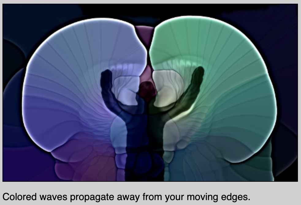
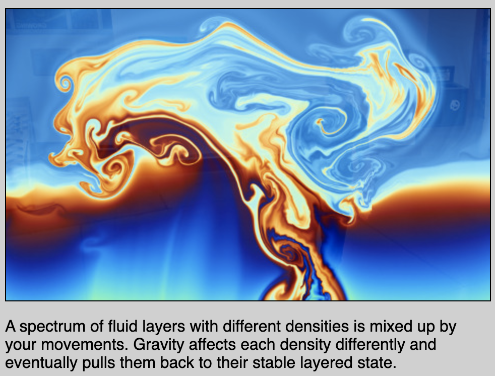
I chose Karl Sims’ Flow, a 2018 interactive exhibit showcased at the MIT Stata Center in Cambridge, Massachusetts. The project used “various fluid flow, particle systems, and image processing simulations” which reacted to the audience’s movements incorporated with special effects in order to let the viewers feel as if they are simulated into the environment the art is trying to portray. I love the color and visual effects used in this exhibit because it brings out inspirations from different forms of nature, showcasing the aspect of fluid flow of gravitational, light, and liquid effects. I assume that the algorithm that generated the work is a mixture of patterns and randomization. The natural motions of nature such as the circular direction of gravity or ripples from waves all follow a consistent pattern; while the dispersion of colors getting mixed follow a more random algorithm. However, Karl Sims depicted his artistic creation through the interaction of his audience. Through this exhibit, he allowed his viewers to appreciate natural patterns of everyday life which aren’t necessarily seen through the naked eye. 
http://www.karlsims.com/flow.html

Flow by Karl Sims

MIT Stata Center 2018

Looking Outwards – 02

One piece of generative art that has always amazed me is the game by Mossmouth studios titled Spelunky. Initially a browser game, it was defined by its dungeon structure program, which built a large 4 by 4 for room for each level, building a cohesive and constantly different game as you play through its 16+ levels. The game itself is an excellent work of programming and code design, but its most impressive feature is how the game knows how it creates a path within its trap filled, maze like dungeon algorithm to create a fun, non confusing experience for the player that allows them to explore and move forward in their own way. The code is variable enough to create a new experience each time you play, but not too confusing where the player feels lost. The algorithm plays such a huge role in the experience, but it is overshadowed by the unique visuals and immersive music.

https://store.steampowered.com/app/239350/Spelunky/

Cathy Dong – Looking Outwards – 02

This ongoing project is called “Quantum Fluctuations: Experiments in Flux,” and created by Markos Kay. Markos Kay is a visual artist, creative director, illustrator, and lecturer in London. The artwork is made by enlarging and observing the quantum world. Kay “measures the spoils of a proton collision and compares the findings with data collected from supercomputer simulations.” Quantum simulations become the paint brush which helps visualize the proton collision, a process that cannot be seen with bare eyes. The art pieces are chaotic, ambiguous, and exciting.

With visual particle simulations, Kay records and documents the beauty by selecting moments with his own instinct. In this case, it is hard to say who is the real artist, Kay or the quantum.

source: http://www.mrkism.com/quantum.html

Ilona Altman – Looking Outwards – 02

The work, Condensation Cube

I was interested in the definition of a generative piece not necessarily having to be technological. Though technology and coding allows for systems to change depending on their environment, so can some physical structures. This piece is called Condensation Cube, and it was made by Hans Haacke in 1963. It is composed of sheets of plexiglass combined to make a square container, as well as some water and air. This piece is generative as within the system of this box, which can exist in a space with variable temperature, the pattern of the condensation changes. The artwork depends entirely on the place it exists in.

I find this piece interesting and beautiful, as its brings a natural process into focus. It makes me think about how all art in a way changes depending on the context in which it is placed.

https://www.macba.cat/en/condensation-cube-1523

Sydney Salamy: Looking Outwards-02


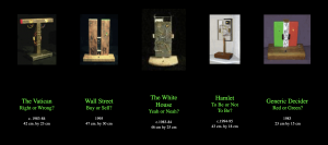
The project is called “A DECISION MACHINE SUITE” by Roman Verostko. It features a number of machines of simple rectangles of varying sizes and positions. Despite these variations, all the machines have one thing in common: blinking lights. They each have two lights that blink on and off, representing an answer to a question. The names of the machines are the questions, and range from “The Vatican: Right or Wrong?” and “Hamlet: To Be or Not To Be?” to just “Generic Decider: Red or Green?”. Whichever light is kept on is random, thus the answer cannot be predetermined. The project is a nod to Norbert Wiener (the “Father of Cybernetics”), who played a role in the information revolution of the 1900s and who noticed that even physics has uncertainty and chance.


  • I admire how the project is so simple yet is based around offering answers to some complex questions. I guess I like this because these questions, at least some of them, are highly debated and have been for years, and so to leave the answers all up to a small little machine that picks lights at random is just very interesting and entertaining to me. I know I shouldn’t say this in an assignment, but it’s almost like a giant middle finger to all the great thinkers who have spent so much time thinking them over, only to have people do a complicated version of a coin toss for the answer. I also find the machine designs very interesting. Verostko decided to incorporate their questions into them. The “Red or Green” one is obvious, with each color being displayed behind one of the lights, and “Wall Street” is similar except with a “B” and “S”. But the others are a bit more subtle. “The Vatican” holds gold leafed lamp reflectors, and is shaped almost like a cross except without the top part (although I’m not sure if the cross was intentional). “The Whitehouse” includes its own colors, except they are black and white and are balloting marbles. More impressive than that, the wood the circuits rest on is actually from the Whitehouse from when it was renovated in the 40s. I admire the designs because Verostko could have just had a consistently simple design for all his machines, but instead he chose to spice things up and make them more interesting. The designs don’t just improve their look, but also gives the viewers something deeper to look into.
  • Based off his the website hosting online versions of his work, it seems like his schematic was based on some else’s manual. The drawing he made of  the circuit made it seem like it was very simple. However, what makes this project more interesting is that the online version doesn’t use circuits since its online. It just uses regular code, which he said Tamara Temple helped him with. The algorithm would probably be very simple as well, since its just two lights going on and off and a button which stops them. 
  • I don’t know much about the algorithm, but the circuits for the real machines have artistic sensibilities attached to them. For instance, the circuit for “White House” was placed on an actual piece of the White House. Also, the colorful wiring served both practical and aesthetic purposes.
  • A DECISION MACHINE SUITE” by Roman Verostko, 1983-1995

“Decision Machine Suite” by Roman Verostko


Screenshot of the “Decision Machine Suite” by Roman Verostko


CJ Walsh – Looking Outwards – 02

Blooms by John Edmark

The generative art that I was super drawn to was the work of John Edmark. I have seen his projects, and every time things he has created amaze me. What interests me is the combination of media and the way he is able to confuse the viewers, while also instilling a sense of wonder. In some artworks, when the work is confusing it is hard to keep a viewers interest. But, his work leaves us wanting to know more. The other important element is the use of different media. His work utitilizes 3D making, light, movement and often sound edited over the finished videos.

His work is made using the golden ratio, the algorithmic ratio that is present in spirals within natural objects, ie. pinecones. Once he generates the forms, he coordinates the rate at which the object spins and the rate of the strobe to create the illusion of movement. Each of his objects utilizes unique and specific rates and combinations of forms within the golden ratio.

He outlines in his artist statement that a lot of his work explores patterns of space and growth, so it makes sense that utilizing a natural ratio is of interest to him. In my opinion, the work truly speaks to the creation of an innovative process and its exciting to see a piece of artwork that is unique from other works I have seen.

Artist Website: http://www.johnedmark.com/

Shannon Ha – Looking Outwards 02

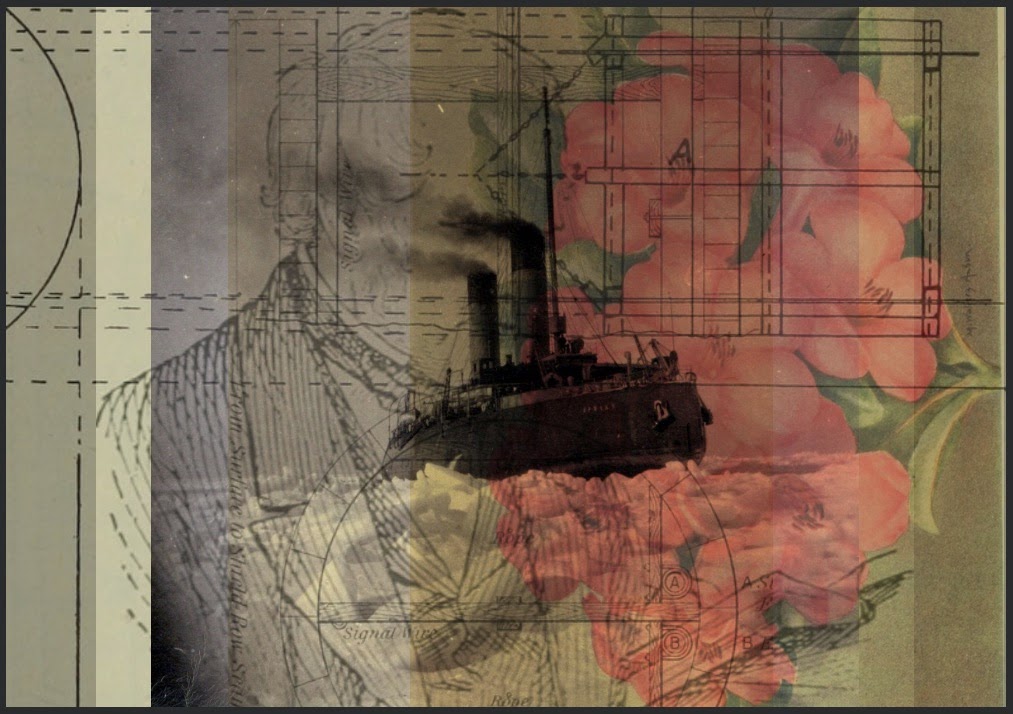
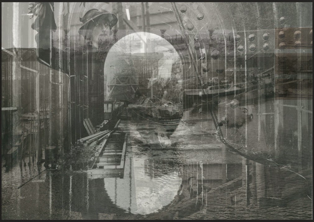
Mitchel Whitelaw’s generative art piece, Succession, is a documentation of ‘digital fossils’ that represent the history and growth of the city of Newcastle. What I admire most about this piece of work is that it manages to use an incredibly simple algorithm to convey the complexity of its subject, which centers around visualizations of the city’s role in Britain’s industrialization. 

Rhodendron by Mitchel Whitelaw
Taken from Teemingvoid.blogspot.com

The algorithm is able to condense the representation of Newcastle’s culture by using two thousand images sourced by Flickr commons, then it uses these images to generate composite images using HTML Canvas. The generative process uses 5 randomly selected images and then placed into a frame using semi-random rules for positioning. This creates a palimpsest effect as the opacity of all the images are low and the layers of images seem to work as a whole and by itself at the same time.

 The indistinguishable boundaries between layers synthesizes the different walks of life, ranging from economy to architecture, that make up the city of Newcastle, and essentially preserves it through the IDs and permalinks assigned to these composites.

Sponsor Tunnel by Mitchel Whitelaw
Taken from Teemingvoid.blogspot.com

Lauren Park-Looking Outwards-02

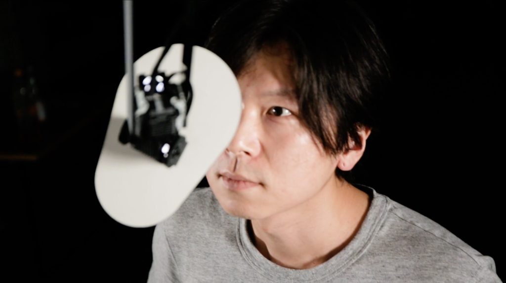
Encounter is an arm-like robotic machine that has a mirror that reacts naturally and in a human-like way to those who physically approach it. The mirror is used to track the face of a person that comes close.  I really admire this piece because it is intriguing to see works that combine technology and human behaviors. There is something odd and eery about taking a man-made object and try to give it human qualities and interact with other people. It makes me think about how I can approach this machine to have a communication with it and see how far it can go. This machine functions based off of smart servomechanisms and inverse kinematic algorithms. This piece seems to achieve the artist’s goals in many different ways through the algorithms. There is commentary on how social relationships are created or function by placing humans and robots to start a conversation with each other. There are many differences robots and people have but it seems that such barrier is being dissolved through this interaction. 

Artist: Piet Schmidt

Title: Encounter

Year of creation: 2018

Nawon Choi— Looking Outward 02

Generative Art— Georg Nees

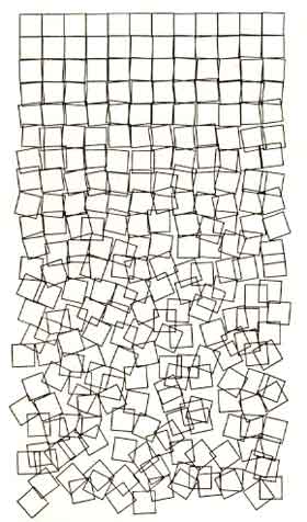
After looking through various generative art/artists, I found one that really stood out to me. It was Georg Nees’ Schotter. I admire its simplicity— the algorithm incrementally increases the amount of disorder in two variables: position and rotation. All other factors remain the same, the size of each square, and the number of squares in each row. I love the way that the orderly squares gradually descend into chaos, as if it’s falling apart, or crumbling away.

Georg Nees was actually a mathematician and physicist who also worked as a software engineer at Siemens. He is known today as one of the pioneers of computer graphics and art. It’s fascinating to see how someone with a non-traditional “art” background could be one of the first to create generative computer art. It’s also interesting to see the way his background informed his art— his works are very well thought-out and calculated to create aesthetic compositions.

Gretchen Kupferschmid – Looking Outward – 02

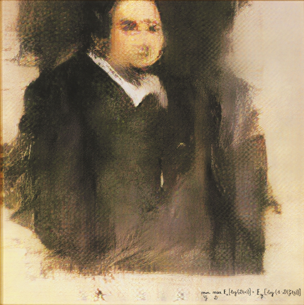
https://obvious-art.com/edmond-de-belamy.html

Portait of Edmond de Belamy created by Obvious

Created by the art collective studio based in Paris called Obvious, the painting titled Portait of Edmond de Belamy was generated by an AI algorithm. I find this project to be so intriguing because it replicates a style of art that I don’t typically associate with technology as well as combines historical art styles with new technological developments. It also begins to question the role of creativity in machines and how we can distinguish the human brain and algorithm’s creative processes. The algorithm works using the Generative Adversarial Network algorithm and takes information from 15,000 portraits. The generator is fed the data from 14th and 15th century portraits to produce art and the discriminator reviews these outputs. The artistic sensibilities of this piece are reflected through the 14th and 15th century art styles and also through what the algorithm begins to learn about these styles and techniques.

A video showing the creative process of the painting