Alice Cai LookingOutwards 08

https://shiffman.net/about/

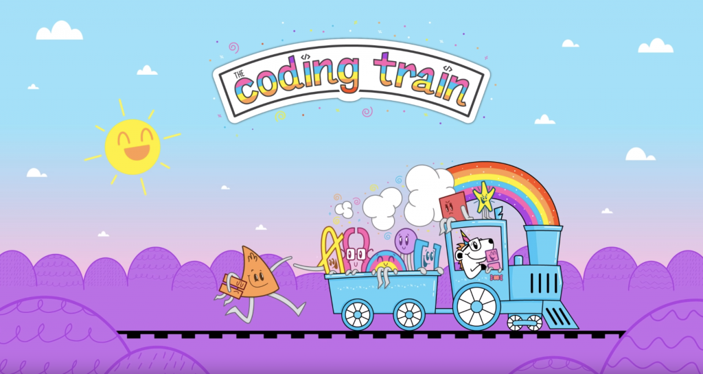
Daniel Shiffman an Associate Arts Professor  at NYU with degrees in math and philosophy from Yale and a master degree from the ITP. He works with the Interactive Telecommunications Program at NYU. He also wrote two books about processing: Learning Processing: A Beginner’s Guide to Programming Images, Animation, and Interaction and The Nature of Code . Perhaps his most well know the platform is youtube, where he has a channel with only 99k short of a million followers. This account is called The Coding Train, with a very fun and youthful theme with highlights of magenta throughout his videos and images (including his profile picture!). Here, he posts tutorials on coding for web, games, etc. with languages such as p5js, java, and more. He also posts challenges and other varieties of coding videos, Since youtube is so popular and accessible these days, I find his channel helpful in inspiring younger children ( or any beginner) to learn how to code. His fun theme of the train and bright colors makes coding seem inviting and welcoming. He also uses a green screen in all his videos so that he is shown talking in the corner with his laptop. It makes his videos, and especially his live streams, seem more personal and well edited. Overall, not only does Daniel work in a university setting and is very accessible to students, his platform on youtube and social media makes him even more influential in the coding community. 

Angela Lee – Looking Outwards – 08

A video of Alexander Chen presenting his work at Eyeo 2017.

For this Looking Outwards, I decided to focus on the designer Alexander Chen (http://chenalexander.com/), who is a creative director at Google Creative Lab. He studied Engineering and Digital Media Design at the University of Pennsylvania and is currently working in Cambridge, Massachusetts. He also is a musician, and much of his work integrates his passion for visual design and music. One of his key projects was MTA.ME, in which he translated the New York City subway map into a string instrument. He has also created visualizations of the first Prelude of Bach’s Cello Suites. I particularly enjoy his Bach’s cello suite visualizations because how sophisticated yet natural looking the motions are. I enjoy how his works are very explorative and experimental in nature. While they may not act as solutions to a defined problem, they suggest new and thoughtful ways of visualizing sound that may influence other people’s work. What I enjoyed about his presentation was his conversational tone–it made him as a designer and his work seem very friendly and approachable. Also, he constantly referred to the work and specific parts of a piece he was talking about, so I didn’t have to speculate but could see it for myself. I also admired the straightforwardness and simplicity of his website. I found it easy to navigate and it allowed the work to shine rather than my focus being on the website.

Joseph Zhang – Looking Outwards – 08

Website: https://nicolation.net/

This week, I wanted to look at Eyeo 2019 speaker Nicole Aptekar. Nicole Aptekar is a computational designer who utilizes three-dimensional rendering techniques and transfers them to physical mediums through lazor cutting techniques. For many of her works, Nicole develops custom software to generate these design. One of my favorite series is Metaflux, which is shown below. The compositions below consist of layers of paper stacked on top of each other to develop these beautiful forms that take advantage of light and shadows. As you can see, Nicole is really focused on geometric form and geared towards understanding how these forms and work in harmony with each other.

https://nicolation.net/category/metaflux

Project from Metaflux Series

In her talk, Nicole talks a lot about how her work revolves around finding that middle ground where the physical and digital mediums meet. She tells her story through visually and verbally showcasing her work and how it relates to her as a designer and human. In her presentation, she also breaks the fourth wall and really talks to the audience as a friend. Her use of both digital and physical technologies to create novel art embodies her mission of pushing fabrication techniques and conventions.

Caroline Song-Looking Outwards-08

Eyeo 2015 – Chris Sugrue from Eyeo Festival on Vimeo.

For this post, I decided to look at Chris Sugrue, who is currently based in Paris, France, teaching at Parsons Paris. She describes herself as “an artist, developer, and programmer” who creates installations which are interactive. Sugrue seems to be particularly passionate about where technology can meet art, a lot of her projects having to do with exciting storytelling, eye-tracking, artificial life, and optical illusions. She has a Masters in Fine Arts and Technology from Parsons.

One of the projects of Sugrue’s that I most admire is her piece: Delicate Boundaries, the video I have embedded below. Bugs made of light crawl on the digital screen, and when putting the user’s hand on the screen, the bugs move towards the hand and eventually cross over from the screen onto the hand. This installation dealt with both digital and physical space and the crossover that objects can have in between, which is the idea I most admire. This idea is particularly interesting for me because the interaction between digital and physical space is what I have currently been studying in design and the cross over that can happen between objects going one virtual space to a physical space is an idea that I had not considered before, and yet is intriguing to think about and explore.

The biggest strategy that Sugrue seems to use in her presentation is how she shows her decision making process. She shows the audience both her installations, and all the decisions and choices she made in order to create it. Sugrue answers all the questions of “why” she chose to go in this direction with her installation, which allows the audience to be further convinced in supporting her installation because they understand the intent she had in her decision-making. Using those observations, I see how important it is to explain your choices in a design and being able to communicate that with the audience will help them be swayed to support your idea.

Jamie Park – LO – 08

INST-INT 2013 – Mike Tucker from Eyeo Festival on Vimeo.

Mike Tucker is a special effects expert who combines coding with art. He has been working as an interaction designer who specializes in VR design. Now, he is an interactive director at Magic Leap, a company that focuses on the future of Spacial Computing. He combines interactive arts and music, making the spacial experience more meaningful. Using this VR device, one can watch TV, play games, and chat with friends as if they are in front of the person. Additionally, his VR device allows other developers to publish their apps, allowing the users to have fun with more than what the company offers.

His previous VR experience includes creating Tana Pura with Radiohead’s Jonny Greenwood, working with Encyclopedia Pictura for Kanye West video game, and working at Universal Everything for a variety of projects.

I admire how he uses coding to create interactions: I did not know that you can create sophisticated interactions using code. Researching him made me realize that coding is a very important skill to have and will continue to have a significant impact on the entertainment industry.

Mihika Bansal – Looking Outwards – 08

The creative person I am analyzing with this post is Rachel Binx. Currently Rachel Binx is working at Netflix with the Content and Data team in Los Angeles. Before that Rachel worked at Mapzen, NASAJPL, and Stamen. Rachel describes herself as a data visualizer, developer, and designer.

In the lecture, Rachel specifically talks about new ways to visualize data, methods that transcend the way that we have typically thought about data in the past. She emphasizes the importance of the practicality of the manner in which the data is visualized, not just creating something that is “eye candy.” One of her projects that I find to be particularly interesting is the GPX Jewelry project, which creates interesting jewelry based on maps that she has used before.

She is a very engaged presenter which makes it more interesting to watch her work being presented as it engages the user and the audience.

Link to website: https://rachelbinx.com

Rachel’s Lecture

Charmaine Qiu – Looking Outwards 08

Interactive Play In Public Space

Meejin Yoon is a designer and architect. Fascinated by the ambiguity between public and private spaces, Yoon’s work mainly focus on interactive play in public spaces that utilizes the properties of technology. In the lecture, she mentioned how based on the various cultures that people are from, we tend to define personal and public spaces in different ways, yet Yoon is passionate about exploring the boundaries of these spaces. With an architecture degree from Cornell University and a masters degree from Harvard University, Yoon created projects on museum interiors, light installations, interactive technologies, and many more. While designing, she constantly kept in mind the experiences of the users and the context of the designs, while attempting to showcase elements that portray the theme of the surroundings. When presenting her work, Yoon used many visual elements and processes to support her explanations, and I find it helpful to learn from her illustrative manner of presenting work process. The wide range of work that Yoon takes part in is very fascinating to me, and I am inspired by her flexibility in utilizing her skillset to the fullest extent. 

Here is a link to her website:  http://www.howeleryoon.com/

“Interactive Play In Public Space” on Eyeo 2015

William Su – Looking Outwards 07 – Data Visualization

http://fontmap.ideo.com/

This is a data visualization made by IDEO for mapping a wide variety of fonts. It’s really interesting to see a spectrum of typography laid out in front of you. From calligraphic and more abstract letters to more orderly and well recognized stuff like Roboto or Helvetica, I can imagine this being somewhat useful in helping designers or people working with type to visually see what kinds of fonts they can use. Whats also interesting to note is that the designers at IDEO used an AI that is trained on all kinds of fonts and used it to categorize them in this visualization. While it might be hard for humans to define something mundane like a letter “A”, an artificial intelligence can come up with its own definitions and generate an easy to understand visual for us.

Yoshi Torralva-Looking Outwards-07

The glasses are the product to visualize the data on air quality.
Pattern created through data provided by air quality sensors.

Air Transformed: Better with Data Society Commission is a project by Stefanie Posavec and Miriam Quick in 2015 to use data visualization techniques to communicate air quality. In this looking outwards post, I will be focusing on the aspect of this project called Seeing Air. These are physical acetate glasses that people wear to visualize large particles, small particles, and nitrogen dioxide in Sheffield, UK. These elements were assigned specific icons that are etched onto a layer of the lense. Data is provided through air quality sensors owned by the Sheffield City Council. Stefanie Posavec and Miriam Quick most likely created an algorithm that interprets the data and assigns the scale in which the patterned icons would be set. What I admire is how this data visualization piece is how immersive it is. One can view the designs when not worn but truly experience what it’s like to see out of metaphorical air quality. People may not understand how severe air quality is. Through visualizing this data, people can see the world through a lens that makes people aware of the importance of taking action on climate change.

Yoshi Torralva-07-Curves

sketch

// Yoshi Torralva
// yrt@andrew.cmu.edu
// Section E
// Project-07-Curves

// rotation variable speeds
var angle = -1;
var angle1 = -1;
var angle2 = -1;
function setup() {
    createCanvas(480, 480);
}
function draw() {
    // calling five hypotrochoids 
    // from the same drawhypotrochoid function
    //upper left hypotrochoid
    background(210);
    push();
    rotate(angle2);
    angle2 = angle2 + 0.01;
    drawHypotrochoid();
    pop();
    //center hypotrochoid
    push();
    translate(width/2, height/2);
    rotate(angle1);
    angle1 = angle1 + 0.01;
    drawHypotrochoid();
    pop();
    //right hypotrochoid
    push();
    translate(480, 0);
    rotate(angle2);
    angle2 = angle2 + 0.01;
    drawHypotrochoid();
    pop();
    //bottom right hypotrochoid
    push();
    translate(480, 480);
    rotate(angle2);
    angle2 = angle2 - 0.02;
    drawHypotrochoid();
    pop();
    //bottom left hypotrochoid
    push();
    translate(0, 480);
    rotate(angle2);
    angle2 = angle2 - 0.02;
    drawHypotrochoid();
    pop();
}
// Hypotrochoid
function drawHypotrochoid(x, y) {
    //setting a, b, and h variables
    // radius
    a = map(mouseX, 0, width/6, 0, 50);
    // radius of rotating circle
    b = a / constrain(mouseY, 0, height);
    // starting height 
    h = 100;
    points = 10000;
    push();
    beginShape();
    translate(0, 0);
    noFill();
    // variables to create shifting greyscale
    // depending on mouseX and mouseY positions
    var limitto255 = mouseX - 500;
    var limitto255y = mouseY - 450;
    stroke(0 + limitto255, 255 - limitto255y);
    // for loop to create multiple lines up to 10000
    for(var i = 0; i < points; i++) {
        // constrains on mouseX and Y on variables
        a = constrain(mouseX, 0, width);
        b = constrain(a/mouseY, 0, width);
        h = constrain(mouseY, 0, height);
        var t = map(i, 0, points, 0, TWO_PI);
        x = (a - b) * cos(t) + h * cos(((a + b)/ b) * t);
        y = (a - b) * sin(t) - h * sin(((a - b)/ b) * t);
        // half of original size 
        strokeWeight(0.05);
        vertex(x/2,y/2);
    }
    endShape();
    pop();
}

Circles visible at the top part of the canvas.
Square forms when the mouse is as the left side of the canvas
Five hypotrochoid curves intersect creating a dynamic form.

With this project, I was inspired to emulate the qualities of fabric like tulle and mesh. Using these mathematical curves afforded the opportunity to explore this. I decided to use the hypotrochoid curve as it offered the ability to create overlapping curves like the Guilloché Pattern. Going beyond my inspiration for fabric, I wanted to convey the feelings of hardness and softness. When the mouse is moved to the right, the hypotrochoids turn into squares. When the mouse is moved to the left, the hypotrochoids take a dynamic shape. I implemented rotation to allow for interactive intersections and organic forms to come to life. I chose to make this project at a greyscale as I wanted the viewers to focus to be on the form. Variations on the greyscale are achieved through mouse positioning.