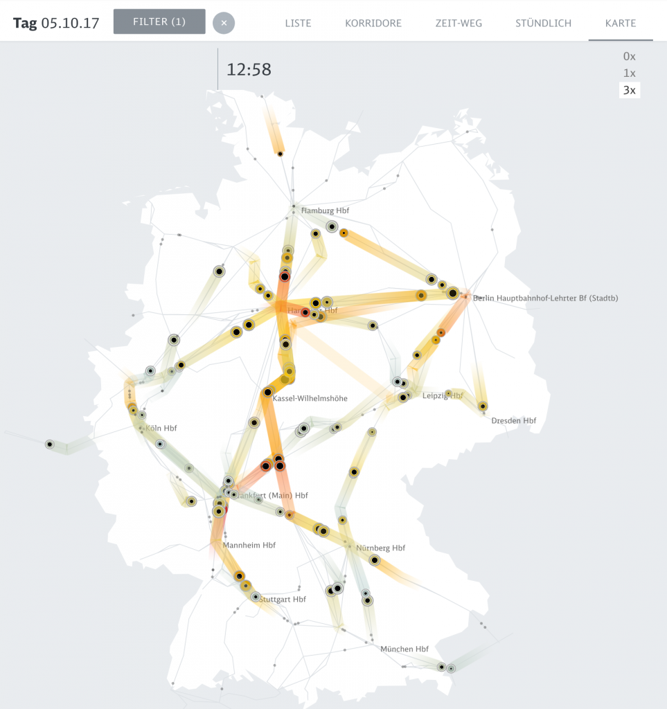
The animated map allows to see the big picture in train movements and to spot systemic effects. Peak Spotting by Christian Au, Moritz Stefaner, Stephan Thiel, Christian Laesser, Gabriel Credico, Lennart Hildebrandt, and Kevin Wang
The computational information visualization that I looked at is “Peak Spotting.” This is a means to combine machine learning and visual analytics methods to help manage the passenger loads on trains in Germany. It has a futuristic elements in the web application that integrates millions of datapoints over 100 days in the future to make predictions, and custom developed tools such as animated maps, path-time-diagrams, and stacked histograms create a vast range of types of data. The clearly color-coded visualizations point out what the critical bottlenecks are within the traffic difficulties. I think that the overall aesthetics is very helpful for understanding the data because it is subtle and readable with highly effective key colors. I can immediately know what kind of data I am looking at, and what time period the data are relevant to. Navigation also gives a good guidance.
//Jina Lee
//jinal2@andrew.cmu.edu
//Section E
//Project 07

var numLines = 30;
var angle = 0;
var angleX;
var circleW;
var r;
var g;
var b;

function setup() {
    createCanvas(480, 480);
}

function draw() {
    background(0);
    //r is a random number between 0 - 255
    r = random(255);
    //g is a random number betwen 0 - 255
    g = random(255);
    //b is a random number between 0 - 255
    b = random(255);
    for(var i = 0; i < numLines; i++){
        noFill();
        push();
        //changing the speed of ellipse
        angleX = map(mouseX, 0, 400, 0, 90);
        //changing the amount of lines drawn
        numLines = map(mouseY, 0, 400, 5, 50);
         //changing the ellipse width
        circleW = map(mouseY, 0, 400, 200, 50);
        //color is random
        stroke(r, g, b);
        strokeWeight(5);
        //move it so it is random
        translate(width / 2, height / 2);
        rotate(radians(angle));
        ellipseMode(CENTER);
        ellipse(0, 0, circleW, 470);
        pop();
        angle += angleX;

    }
}
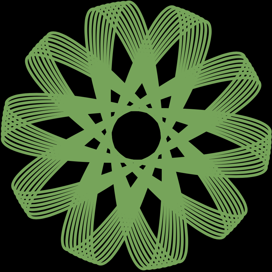
For this project, I was really worried on how to start because the shapes seemed so difficult and complex. As I was working, I realized that it was not as bad as I thought. as long as I defined my variables properly and used a for loop to draw the pattern, it worked. I used the map function to control the to control the speed, number of lines, and width of ellipse.
When the mouse is at the top left corner. When the mouse is at the center. When the mouse is at the bottom corner. When the mouse is at the right side of the canvas. When the mouse is at the bottom right corner. When the mouse is at the bottom left corner. When the mouse is at the top right corner.
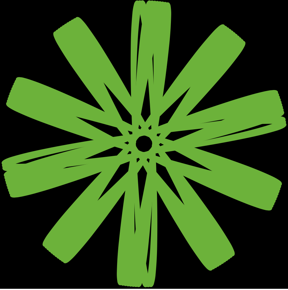
This project I was inspired by some of the shapes shown as examples on the project description. I thought the round shapes were really cute and I could imagine them as a pattern. I made it so that each shape you could manipulate individually by clicking on them. This way there could be more options for what you could create based on the mouse.
/* Youie Cho
   Section E
   minyounc@andrew.cmu.edu
   Project-07-Composition-with-Curves*/

var nPoints = 500;

function setup() {
    createCanvas(480, 480);
}

function draw() {
    //background color changes based on mouse location
    background(mouseX / 2, 50, mouseY / 2);
    Epitrochoid();
}

function Epitrochoid() {
    stroke(255);
    strokeWeight(0.5);
    //fill color changes based on mouse location
    fill(mouseX, mouseX / 2, mouseY);
    push();
    //begin at the center of the canvas
    translate(width / 2, height / 2);
    //constrain through mouseX and mouseY
    var consx = constrain(mouseX, 0, mouseX, 0, width);
    var consy = constrain(mouseY, 0, mouseY, 0, height);
    //define constants that depend on mouse position
    var a = map(consx, 0, width, 0, width / 3);
    var b = map(consy, 0, width, 0, width / 5);
    var h = map(consy, 0, height, 0, 400);
    //draw primary epitrochoid curve
    beginShape();
    for (var i = 0; i < nPoints; i ++) {
        var t = map(i, 0, nPoints, 0, TWO_PI);
        var x = (a + b) * cos(t) - h * cos((a + b) / b * t);
        var y = (a + b) * sin(t) - h * sin((a + b) / b * t);
        vertex(x, y);
        //draw secondary epitrochoid curve rendered with small rectangles
        rect(x * 1.5, y * 1.5, 15, 15);
        //draw terciary epitrochoid curve rendered with large rectangles
        rect(x * 3, y * 3, 30, 30);
    }
    endShape(CLOSE);
    pop();
}
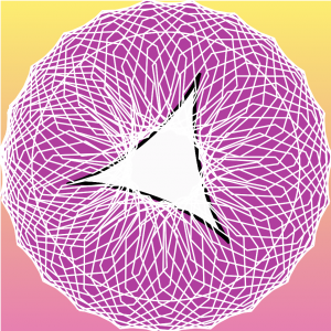
I chose to use the Epitrochoid curve. I chose this curve because first, I wanted to play around with many constants, and second, I thought that the curly movement is interesting. Because of the way the curve draws in a curly and dynamic way, I though it would be more harmonious to use differently rendered curves derived from the primary curve, instead of adding new Epitrochoid curves that would overlap with the primary curve. It was difficult to understand the different values in the equation, and which valuables controlled the curve in what ways, but after studying it for a while, I could make it so that the details that I wanted were being displayed on the canvas at an appropriate scale. It was very fun to be able to create something very complex and dynamic with the help of a mathematical equation.
In this project, it was fun to explore the different kinds of curves that can be created with math equations, and it intrigues me how interesting patterns can be generated through math. I took a pop art approach to my project by using bright colors and thick outlines.
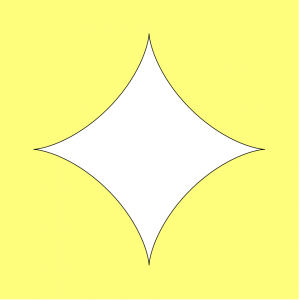
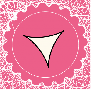
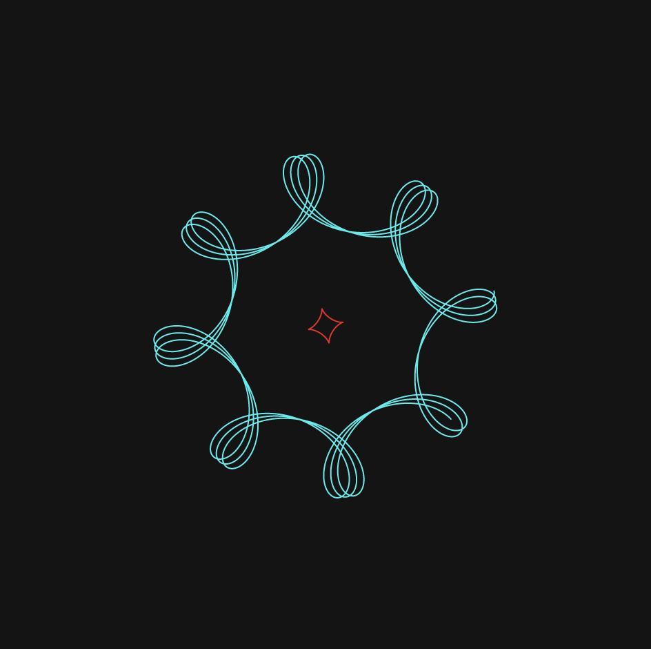
The Hypotrochoid curve
The Astroid curve
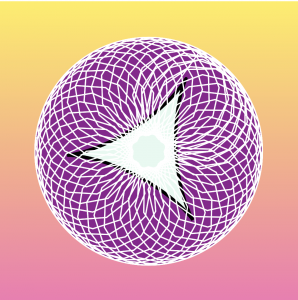
//Charmaine Qiu
//charmaiq@andrew.cmu.edu
//section E
//Project - 07 - Composition Curve

function setup() {
    createCanvas(480, 480);
}

function draw() {
    //set color to change with movement of mouse
    background(mouseX, mouseY, 100);
    drawHypotrochoid();
    drawAstroid();
}

function drawHypotrochoid() {
  //http://mathworld.wolfram.com/Hypotrochoid.html
  //constraining the mouse action to the canvas
  //map the variables in equation to a fit proportion of the curve
    var x = constrain(mouseX, 0, width);
    var y = constrain(mouseY, 0, height);
    var a = map(x, 0, width, 150, 200);
    var b = map(y, 0, height, 0, 50);
    var h = map(x, 0, width, 0, 50);

  //draw the first curve
    push();
    strokeWeight(10);
    beginShape();
    //rotate so that the beginning of curve does not show
    rotate(radians(120));
    //for loop that makes the shape
    for(var i = 0; i < 300; i += .045){
      var t = map(i, 0, 300, 0, TWO_PI);
      //equation of the curve
      x = (a - b) * cos(t) + h * cos(((a - b) / b) * t);
      y = (a - b) * sin(t) + h * sin(((a - b) / b) * t);
      vertex(x, y);
    }
    endShape(CLOSE);
    pop();

  //drawing the sencond curve
    push();
    //place it at the right bottom corner of canvas
    translate(width, height);
    strokeWeight(10);
    beginShape();
    //for loop that makes the shape
    for(var i = 0; i < 300; i += 0.045){
      var t = map(i, 0, 300, 0, TWO_PI);
      //equation of the curve
      x = (a - b) * cos(t) + h * cos(((a - b) / b) * t);
      y = (a - b) * sin(t) + h * sin(((a - b) / b) * t);
      vertex(x, y);
    }
    endShape(CLOSE);
    pop();
}


function drawAstroid(){
  //http://mathworld.wolfram.com/Astroid.html
    //draw first curve
    push();
    //place curve at center of canvas
    translate(width / 2, height / 2);
    strokeWeight(10);
    //constraining the mouse action to the canvas
    //map the variables in equation to a fit proportion of the curve
    var x = constrain(mouseX, 0, width);
    var y = constrain(mouseY, 0, height);
    var a = map(mouseX, 0, width, 150, 200);
    beginShape();
    //for loop that makes the shape
    for(var i = 0; i < 2 * PI; i += 0.045){
      //rotate with the increment of mouseX
      rotate(radians(x));
      //equation of the curve
      y = a * pow(sin(i), 3);
      x = a * pow(cos(i), 3);
      vertex(x, y);
    }
    endShape();
    pop();

    //draw first curve
    push();
    //place curve at center of canvas
    translate(width / 2, height / 2);
    strokeWeight(10);
    //constraining the mouse action to the canvas
    //map the variables in equation to a fit proportion of the curve
    var x = constrain(mouseX, 0, width);
    var y = constrain(mouseY, 0, height);
    var a = map(mouseX, 0, width, 20, 70);
    beginShape();
    //for loop that makes the shape
    for(var i = 0; i < 2 * PI; i += 0.045){
      //rotate with the increment of mouseY
      rotate(radians(y));
      //equation of the curve
      y = a * pow(sin(i), 3);
      x = a * pow(cos(i), 3);
      vertex(x, y);
    }
    endShape();
    pop();

}
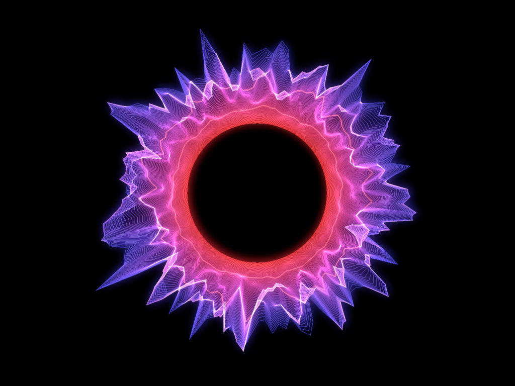
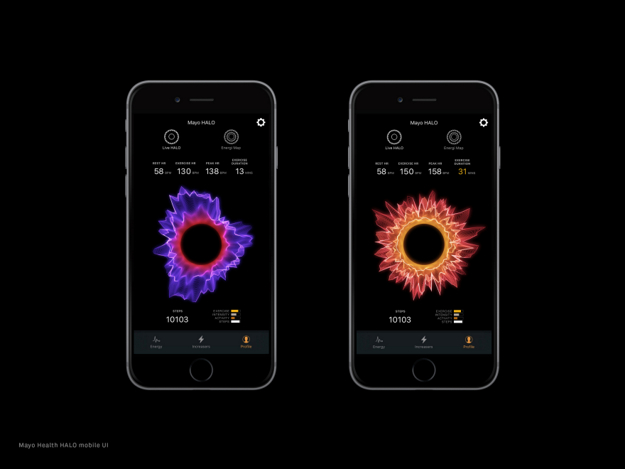
an example of a data visualization generated by Halo representing various data
Created by Ora Systems, the project “Halo” is a visualization platform that can combine up to ten different data sets into a fluid multi-dimensional band of light. Ora currently works to develop “halo”s that represent patient’s health status, working with health companies such as Mayo Clinic to enhance the way we look at the health data of patients by creating responsive wearable-driven health identities through an app. Through familiarizing yourself with the visualization, the user should be able to easily understand and compare vast data sets. I appreciate the way this project combines both a creative and artistic approach to the output of the visualization with a technical advancement in its combination of so many different data inputs/sets. I also appreciate that this project can be used to solve problems through its design and not just be a visual.
reated by Ora Systems, the project “Halo” is a visualization platform that can combine up to ten different data sets into a fluid multi-dimensional band of light. Ora currently works to develop “halo”s that represent patient’s health status, working with health companies such as Mayo Clinic to enhance the way we look at the health data of patients by creating responsive wearable-driven health identities through an app. Through familiarizing yourself with the visualization, the user should be able to easily understand and compare vast data sets. I appreciate the way this project combines both a creative and artistic approach to the output of the visualization with a technical advancement in its combination of so many different data inputs/sets. I also appreciate that this project can be used to solve problems through its design and not just be a visual.
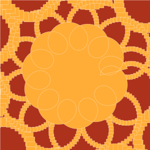
//Gretchen Kupferschmid
//Section E
//gkupfers@andrew.cmu.edu
//Project-07-Curves

function setup() {
    createCanvas(480,480);
}
 function draw (){
    //gradient picking color
    var gradient1 = color(255, 238, 87);
    var gradient2 = color(247, 119, 179);
    createGradient(gradient1, gradient2);

    push();
    //moves all objects to center of canvas
    translate(width/2, height/2);
    //rotates shapes with movement of mouse X value from values 0 to pi
    rotate (map(mouseX, 0, width, 0, 10));
    circlePedal();
    deltoidCata();
    hypotrochoid();
    pop();
 }

function deltoidCata(){
    //mapping colors to mouse
    colorR = map(mouseX, 0, width, 200, 255);
    colorB = map(mouseY, 0, height, 200, 255);

    //mapping factor of deltoid to mouse
    g = map(mouseX, 0, width, 0, 100);
    g = map(mouseY, 0, height, 25, 50);

    //stroke & fill
    strokeWeight(5);
    fill(colorR, 250, colorB);
    stroke(0);


    // creating deltoid catacaustic
    beginShape();
    for (var i = 0; i < 200; i ++) {

        var angle = map(i, 0, 200, 0, 2*(TWO_PI));
        //formula for deltoid catacaustic
        x= ((2 *(cos(angle))) + (cos(2*angle)))*g ;
        y= ((2 *(sin(angle))) - (sin(2*angle)))*g ;
        vertex(x,y);
    }
    endShape();
}

function circlePedal(){
    //mapping colors to mouse X & Y
    colorR = map(mouseX, 0, width, 80, 200);
    colorG = map(mouseX, 0, width, 0, 50);
    colorB = map(mouseY, 0, height, 70, 170);

    //mapping factor multiplied by to mouse X & Y
    t = map(mouseX, 0, width, 150, 250);
    t = map(mouseY, 0, height, 130, 200);

    //stroke & fill
    strokeWeight(2);
    fill(colorR, colorG, colorB);
    stroke(255);

    //creating circle pedal
    for (var i = 0; i < 500; i ++) {

        var angle = map(i, 0, 500, 0, 2*(TWO_PI));
        //formula for circle pedal
        var x1 = cos(angle);
        var y1 = sin(angle);
        var x2 = t *((cos(angle)) -( y1 * cos(angle) * sin(angle)) + (x1 * pow(sin(angle),2)));
        var y2 = (.5* (y1 + (y1 * cos(2*angle))+ (2*sin(angle))- (x1 * sin(2*angle)))) * t;
        vertex(x2,y2);
    }
    endShape();

}

function hypotrochoid(){
    //mapping size of hypotrochoid to mouse
    a = map(mouseX, 0, width, 200, 350);
    b = map(mouseY, 0, height, 100, 200);
    h = map(mouseY, 0, height, 2, 105);

    //stroke & fill
    strokeWeight(2);
    noFill();
    stroke(255);

    // creating hypotrochoid
    beginShape();
    for (var i = 0; i < 500; i ++) {
        // hypotrochoid formula
        angle = map(i, 0, 500, 0, TWO_PI);
        var x = (a - b) * cos(angle) + h * cos((a - b) / b * i);
        var y = (a - b) * sin(angle) + h * sin((a - b) / b * i);
        vertex(x, y);
    }
    endShape();
}

//function gradient
function createGradient(top, bottom) {
    for(var i = 0; i <= height; i++) {
      var mapColor = map(i, 0, height, 0, 1);
      var interA = lerpColor(top, bottom, mapColor);
      stroke(interA);
      line(0, i, width, i);
    }
}
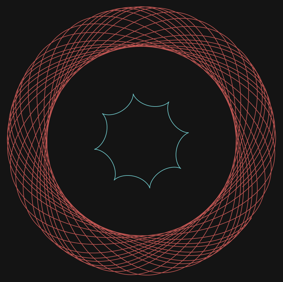
I started the project with just creating the deltoid curve and the circle pedal curve, but realized that just them two together weren’t creating a very interesting composition even though the formulas to create them were pretty complex. Even with altering numbers, mapping values, and angle amounts, I still wasn’t getting anything particularly interesting or complex looking. So, I decided to add a more circular and dynamic curve of the hypotrochoid, which can be altered by various radii values and its repeating structure.
For this project, I wanted to play with hypotrochoid forms and astroids in hopes of making something pretty dynamic. I had really brief understanding of roulettes from high school mathematics so a lot of my learning came from going through the Wolfram Alpha website and learning about each form. At the end, these were the two that I wanted to continue playing with.
Quiet honestly, I had no idea how it would come out at the end and much of the process just came from experimenting with mouse positions, mapping, and tweaking with equations. Below are some screenshots of its different forms.
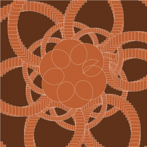
//alcai@andrew.cmu.edu
//alice cai
//section E
//Project Week 7

//spinning speed
var speed = 0;

function setup() {
    createCanvas(500,500);
}

function draw() {
    frameRate(30);
    background('black');

    push();
    //draw at middle of canvas
    translate(width/2, height/2);
    //rotate speed, rotates on its own but also adjusted by mouse X
    rotate(speed + mouseX, 0, 200, 0, TWO_PI);
    speed = speed + 1;
    //call droid draw functions
    epicycloid();
    astroid();
    epitrochoid();
    pop();

}


function epicycloid(){
    noFill();
    strokeWeight(2);
    stroke(mouseX, 100, 130,150);


    beginShape();
    //defining variables, size is corntroled by mouseX/mousY
    a = map(mouseX, 0, width, 50,300);
    b = map(mouseY, 0, width, 50,300);
    //forloop that repeats shape
    for (var t = 0; t < 40; t ++) {
    var x = (a / (a + 2 * b)) * cos(t) - b * cos(((a + b) / b) * t);
    var y = (a / (a + 2 * b)) * sin(t) - b * sin(((a + b) / b) * t);
    vertex(x ,y);
    endShape();

}
}

function epitrochoid (){
    noFill();
    strokeWeight(5);
    stroke(200,10,100, 5);

    beginShape();

    //forloop that repeats shape
    for (var i = 0; i < 100; i ++) {

    //defining variables, size is corntroled by mouseX/mousY
    a = map(mouseX, 0, width, 50,300);
    b = map(mouseX, 0, width, 50,300);
    h = map(mouseX, 0, width, 50,200);

    x = (a + b) * cos(i/2) - (h * cos((a + b / b) * i));
    y= (a + b) * sin(i/2) - (h * sin((a + b / b) * i));
    vertex(x, y);
    endShape();
    }
}


function astroid(){
    noFill();
    strokeWeight(5);
    stroke(130, 100, 150,150);


    beginShape();

    //forloop that repeats shape
    for (var t = 0; t < 20; t ++) {

    //defining variables, size is corntroled by mouseX/mousY
    z = map(height - mouseY, 0, width, 50,200);
    var x = z * cos(t)^ 3 ;
    var y = z * sin (t)^ 3 ;
    vertex(x ,y);
    endShape();

    }

}
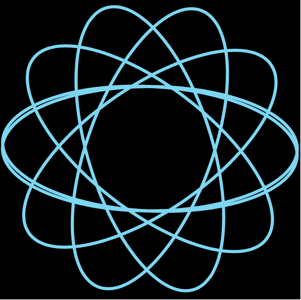
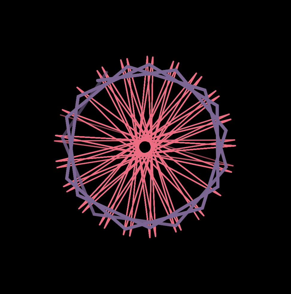
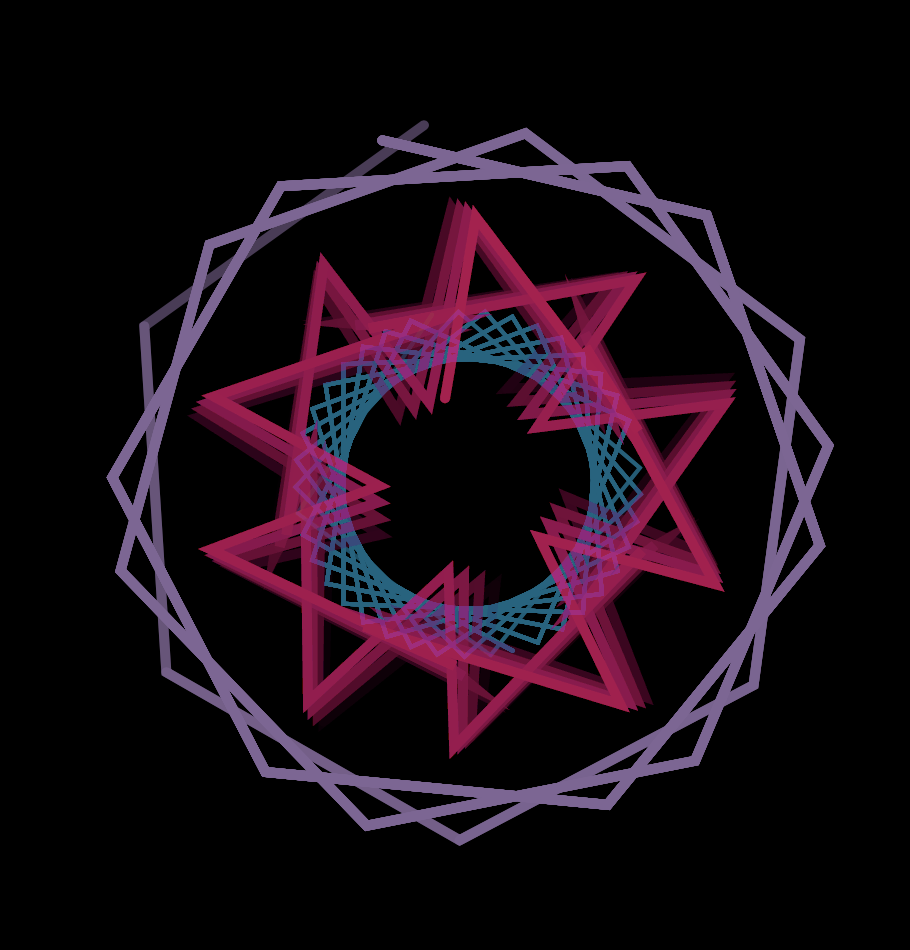
This project seemed really daunting because all the shapes looked complex and there was a lot going on on the screen, especially those with mouse interaction. Turns out, it’s not as complex as it seems. Although the equations may seem complex, they are also given to us. After that, it’s just about defining the variables in the equation and calling a for loop to draw a pattern with the shape! I used a map function to control the size of the shape with mouseX and mouseY. I also changed the opacity of the line strokes for a more transparent and three-dimensional looks.
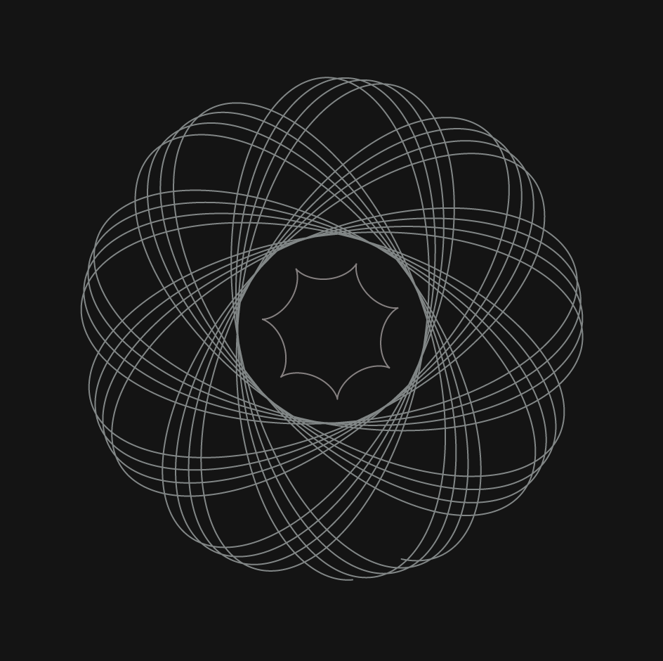
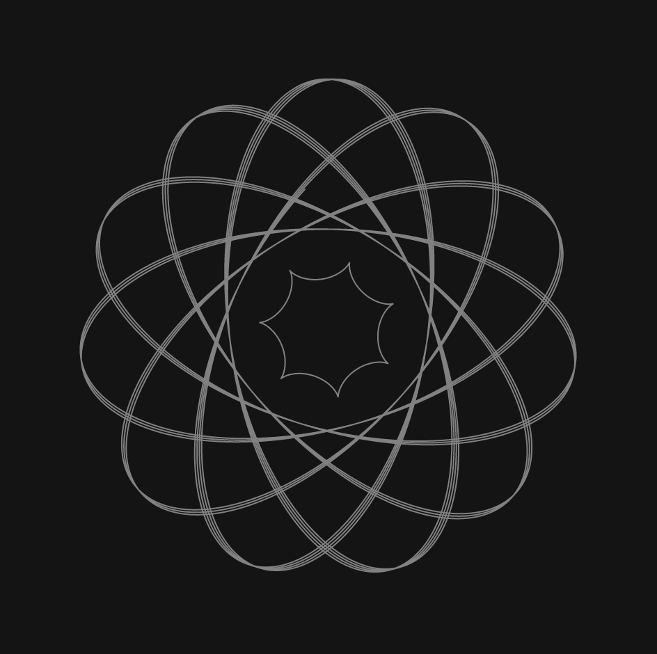
TWO SHAPES THREE SHAPES with varying opacityA better capture of the visual effect of lower opacity
As I scoured the internet for computational data visualization projects, I happed to find this installation, a physical project that I’ve walked by countless times on my way to various cities across the United States. This project is called eCloud, a data-driven project located in San Jose Airport that changes according to live weather patterns across the world. eCloud is a sculpture inspired by the formation and properties of an actual cloud, hence the clor and positioning in space. The design takes into account the sky weather, temperature, wind speed, wind direction, relative humidity, and visibility. With this information the polycarbonate tiles transition from full transparency to opaqueness, creating an elegant array of floating components. Some of the cities include Prague, Berlin, Los Angeles, and Rio De Janeiro
Complimentary digital interface
To accompany the installation, there’s a digital interface that shows all of the data currently used. This project really fascinated me because it takes a form in nature and abstracts it into something so artistic, yet still computational. This project is a good example of a design system—that is alone, each tile means nothing. However, when together, you get a beautiful cluster of data titles.
![[OLD FALL 2019] 15-104 • Introduction to Computing for Creative Practice](../../../../wp-content/uploads/2020/08/stop-banner.png)