Charmaine Qiu – Looking Outwards – 05

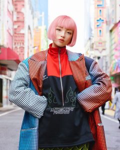
ModelingCafe is a CG company in Tokyo that focuses on 3d modeling and character concept design. They aim to break the current constraints of modeling, and does work in a huge variety of representation methods or genres. The company recently introduced the world’s first computer generated fashion model “Imma” (means “now” in Japanese) who took over magazine covers in Japan.

From a live body and background, Imma’s head are being transposed onto the body, and that is how her images are created. As a hot topic in current Japan, she also has a instagram and Twitter account, where she posts photos and stories almost mimicking a real life human. Though 3d generated fashion models can bring perfection towards the human body, the gap between what is presented in the media and the everyday world would become further apart. This could also damage the modeling industry for real life models. As a designer, I think it is important for the current world to realize the possibility of designs that could people to comply to the innovative world.

Jamie Park – Project 05 – Wallpaper

sketch

//Jamie Park (jiminp)
//15-104 Recitation E
//Project 5

var rectSize = 50;
var spacing = 160;

function setup(){
    createCanvas(500, 500);
    background(212, 230, 135);

    //odd row of roses
    for (var xWidth = rectSize; xWidth < width + rectSize; xWidth += spacing){
        for (var yHeight = rectSize; yHeight < height + rectSize; yHeight += spacing){
            rose(xWidth, yHeight);
        }
    }
    //even row of roses
    for (var xWidth2 =  -rectSize * 0.6; xWidth2 < width + rectSize; xWidth2 += spacing){
        for (var yHeight2 = rectSize * 2.6; yHeight2 < height + rectSize; yHeight2 += spacing){
            rose(xWidth2, yHeight2);
        }
    }

    noLoop();
}

function draw(){
    //nothing in draw because called noLoop
}

function rose(x, y){
    noStroke();
    //rectangle set to the center to make rotation easy
    rectMode(CENTER);

    //RED ROSE
    //largest square
    fill(209, 67, 56);
    rect(x, y, rectSize, rectSize);
    //second square
    push();
    translate(x, y)
    rotate(radians(45));
    fill(217, 95, 87);
    rect(0, 0, rectSize * 0.7 , rectSize * 0.7);
    pop();
    //third square
    fill(209, 67, 56);
    rect(x, y, rectSize * 0.5, rectSize * 0.5);
    //fourth square
    push();
    translate(x, y)
    rotate(radians(45));
    fill(217, 95, 87);
    rect(0, 0, rectSize * 0.3 , rectSize * 0.3);
    pop();
    //leaf on the left
    push();
    translate(x - (rectSize * 0.8), y);
    rotate(radians(45));
    fill(127, 191, 54);
    rect(0, 0, rectSize * 0.4, rectSize * 0.4);
    pop();
    //leaf on the top
    push();
    translate(x, y - (rectSize * 0.8));
    rotate(radians(45));
    fill(66, 171, 31);
    rect(0, 0, rectSize * 0.4, rectSize * 0.4);
    pop();

    //YELLOW ROSE
    //largest square
    fill(237, 209, 116);
    rect(x + rectSize * 1.6, y, rectSize, rectSize);
    //second square
    push();
    translate(x + rectSize * 1.6, y)
    rotate(radians(45));
    fill(250, 236, 147);
    rect(0, 0, rectSize * 0.7 , rectSize * 0.7);
    pop();
    //third square
    fill(237, 209, 116);
    rect(x + rectSize * 1.6, y, rectSize * 0.5, rectSize * 0.5);
    //fourth square
    push();
    translate(x + rectSize * 1.6, y)
    rotate(radians(45));
    fill(250, 236, 147);
    rect(0, 0, rectSize * 0.3 , rectSize * 0.3);
    pop();
    //leaf on the left
    push();
    translate(x + (rectSize * 0.8), y);
    rotate(radians(45));
    fill(127, 191, 54);
    rect(0, 0, rectSize * 0.4, rectSize * 0.4);
    pop();
    //leaf on the top
    push();
    translate(x + rectSize * 1.6, y - (rectSize * 0.8));
    rotate(radians(45));
    fill(66, 171, 31);
    rect(0, 0, rectSize * 0.4, rectSize * 0.4);
    pop();
}

I wanted to create alternating rows of “roses” using squares. I am content with the final product, and I wonder what it would look like to have an entire room full of this wallpaper pattern.

Mihika Bansal – Project 05 – Wallpaper

sketch

//Mihika Bansal 
//mbansal@andrew.cmu.edu 
//Section E 
//Project 5

var diam = 66; //diameter
var Cdist = 198; //distance between 3 circles
var rad = 33; //circle radius 


function setup() {
    createCanvas(594, 582);
    background(255, 238, 173); // making my background canvas
    

    for(var i = 0; i < 10; i ++){ //determining # of rows 
        if(i % 2 == 0){ // determining if row is even or odd 
            for(var j = 0; j < 3; j ++){ // three of the first kind of ellipse in each row
                
                //first ellipse pattern 
                var posX1 = rad + Cdist * j; // determing x position of each of the 3 ellipses
                var posY1 = rad + diam * i * (0.5 * sqrt(3)); //determing y position of each of these ellipses
                //var posY1 = 33; 
                strokeWeight(0); 
                fill(150, 206, 180);  
                ellipse(posX1, posY1, diam, diam); //making blue ellipse
                fill(255, 204, 92);
                ellipse(posX1, posY1, 55, 55); //making yellow ellipse
                push(); 
                stroke(255, 238, 173); 
                strokeWeight(2); 
                translate (posX1, posY1); //making center lines
                for (var k = 0; k < 25; k ++){
                    line(0, 0, 27, 0);
                    rotate(PI/9); 
                } 
                pop();
            }
            for(var a = 0; a < 3; a ++){ // will be three of these ellipses

               //second ellipse pattern 
                var posX2 = (3 * rad) + Cdist * a; // the position of the second ellipse, which is 3 * radius
                fill(255, 111, 105); 
                ellipse(posX2, posY1, 66, 66); //making the target like ellipses
                stroke(255, 238, 173);
                strokeWeight(3);
                fill(150, 206, 180);
                ellipse(posX2, posY1, 40, 40); 
                fill(255, 111, 105); 
                ellipse(posX2, posY1, 15, 15);
                strokeWeight(0);
            }

            for(var b = 0; b < 3; b++){

                //third ellipse pattern 
                var posX3 = (5 * rad) + Cdist * b; //the base distance is 5 times the radius
                strokeWeight(0); 
                fill(255, 204, 92);
                ellipse(posX3, posY1, 66, 66); //making the ellipse bases
                fill(150, 206, 180);
                ellipse(posX3, posY1, 54, 54);


                push(); 
                strokeWeight(1); //making the rotated squares
                stroke("white"); 
                rectMode("center"); 
                translate(posX3, posY1);
                for (var m = 0; m < 3; m ++) {
                    rect(0, 0, 34, 34); 
                    rotate(PI/5); 
                }
                pop(); 

                fill(255, 204, 92);
                ellipse(posX3, posY1, 34, 34); //center ellipse
            }
        }
        else{ //if row is odd 
            for(var j = 0; j < 3; j ++){
                
                //first ellipse pattern, which was the third pattern 
                var posX1 = 2 * rad + Cdist * j; //want to fit in the gaps between the circles
                var posY1 = rad + diam * i * (0.5 * sqrt(3)); //using the ratio to make the circles fit exactly with eachother 
                strokeWeight(0); 
                fill(255, 204, 92);
                ellipse(posX1, posY1, 66, 66); 
                fill(150, 206, 180);
                ellipse(posX1, posY1, 54, 54);


                push(); 
                strokeWeight(1); 
                stroke("white"); 
                rectMode("center"); 
                translate(posX1, posY1);
                for (var m = 0; m < 3; m ++) {
                    rect(0, 0, 34, 34); 
                    rotate(PI/5); 
                }
                pop(); 

                fill(255, 204, 92);
                ellipse(posX1, posY1, 34, 34); 
                
            }
            for(var a = 0; a < 3; a ++){

               //second ellipse pattern, which was actually the first ellipse 
                var posX2 = (4 * rad) + Cdist * a; //fits in between the gaps again
                strokeWeight(0); 
                fill(150, 206, 180);  
                ellipse(posX2, posY1, diam, diam); 
                fill(255, 204, 92);
                ellipse(posX2, posY1, 55, 55);
                push(); 
                stroke(255, 238, 173); 
                strokeWeight(2); 
                translate (posX2, posY1); 
                for (var k = 0; k < 25; k ++){
                    line(0, 0, 27, 0);
                    rotate(PI/9); 
                } 
                pop();
                
            }

            for(var b = 0; b < 3; b++){

                //third ellipse pattern, which was actually the second
                var posX3 = (6 * rad) + Cdist * b;
                fill(255, 111, 105); 
                ellipse(posX3, posY1, 66, 66);
                stroke(255, 238, 173);
                strokeWeight(3);
                fill(150, 206, 180);
                ellipse(posX3, posY1, 40, 40); 
                fill(255, 111, 105); 
                ellipse(posX3, posY1, 15, 15);
                strokeWeight(0);

                //drawing first ellipse in the row for even rows, at the position 0 
                fill(255, 111, 105); 
                ellipse(0, posY1, 66, 66);
                stroke(255, 238, 173);
                strokeWeight(3);
                fill(150, 206, 180);
                ellipse(0, posY1, 40, 40); 
                fill(255, 111, 105); 
                ellipse(0, posY1, 15, 15);
                strokeWeight(0);
            }

        }
    }

   
    noLoop(); 
}
   
  
function draw() {

  
}

This project was really fun to do. I really enjoyed coming up with distinct ellipse patterns to start with, then figuring out how to put them together to create a new pattern. I tried multiple iterations of what the circles would look like overlapped, but I realized it looked the cleanest in this manner.
Mihika Bansal – Looking Outwards – 05

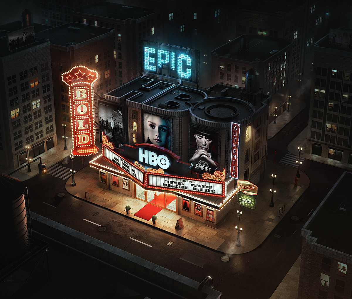
The artist that I want to look at for his computer 3D graphics is Peter Nowacki. The particular piece of his that I found to be interesting was his HBO – Home of the Original. The piece itself was made in 2014, and it was part of an ad campaign for an HBO series he was publishing in Asia. The process that he followed to create the piece itself was interesting as well because it focused on lighting and shading in a way that made it pop.

Peter works for a company that specifically creates these hyper-realistic looks for other companies. A lot of brands want this look because it is very eye-catching and the 3D graphics do a good job of conveying something that otherwise would not be conveyed well.

hbo_1200.jpg
hbo_clay.jpg

Caroline Song – Looking Outwards 05

The 3D computer graphics image I chose depicts three ballerinas dancing outside while the sun is setting. I was first drawn to this image because of the way the image is made, by integrating triangles to carve out the forms. I thought it interesting the combination of using geometric, rigid shapes to describe a scene that is so airy and contains such natural forms.

I also admire this piece because of the different ways I can experience it, from both near and far. From afar, I cannot tell the triangles are making up the entire piece, and therefore, it looks like a painting or an image. But when I come up closer, I can see it is the triangles that are carving out the image, and therefore, I can experience the duality between geometric and natural forms.

Image result for am time the great destroyer
“Ballet” by Kai Lawonn and Tobias Günther

I suppose the algorithm used to create this piece of art had to do with the optimization of the triangles and the way each triangle is set to a single color, and together with all the other triangles, this creates the piece.

Another part of this piece that I am intrigued by is the artists’ use of when to show the outlines of the triangles and when to not. It seems that they made the choice to show the outlines in a gradient, as the far right showcases the lines most prominently and from there, as the viewer’s eyes move to the left, the lines fade. I believe this shows the artists’ artistic tendencies because the placement of the triangles themselves needed to be intentional and attractive, based on what the artists wanted to be shown. In this case, I think they wanted to show the light contrast from one end of the piece to the other, which is so prominent through the triangle outlines, and may not have been as noticeable otherwise.

Joseph Zhang – Looking Outwards – 05

https://maikool.com/transit/

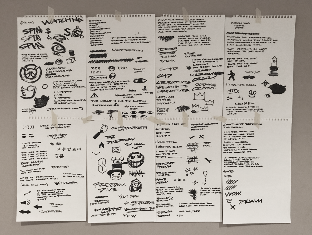
This week, I looked at 3D graphic artist Michael Kim and his project “Transit.” At first glance, the image looks like an ordinary photo, until you realize the rendering and texturing process that went behind building up this reality. Kim began the process by collecting references from his rides in NYC subway trains. From there, he began clay modeling the interior structure of the subway train, in Autodesk Fusion and Cinema 4D. After contacting him, he said the modeling process took 5 days, 4 hours a day.

From there he hand drew all the graphics he wanted on paper and used them as a graphite textures on the surfaces.

Much of his process was dedicated to UV mapping, which is projecting 2D visuals onto a 3d surface. If you look closely at the details, Kim created every individual surface imperfection, which includes, fingerprints, smudges, dust particles, and wear on curvatures.

Besides Cinema 4D and Autodesk Fusion, Kim also used programs such as Substance Painter, Marvelous Painter, and Adobe Photoshop.

I think what really compelled me to this piece was the process and procedure that Michael underwent. From a surface level glance, the final product is incredible but, ultimately it was talking to him and understanding the process he went through that really attracted me to “Transit”. His artistic sensitivity is very evidently seen in his attention to detail, and the subtle references, such as the “Mailkook Express”, his logo, and just all the texturing.

Jamie Park – Looking Outwards – 05

Kilimanjaro’s “Peeling Therapy (2019)” on youtube

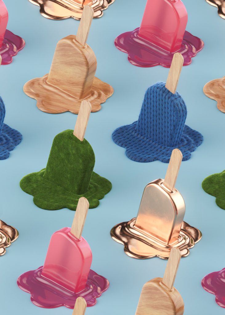
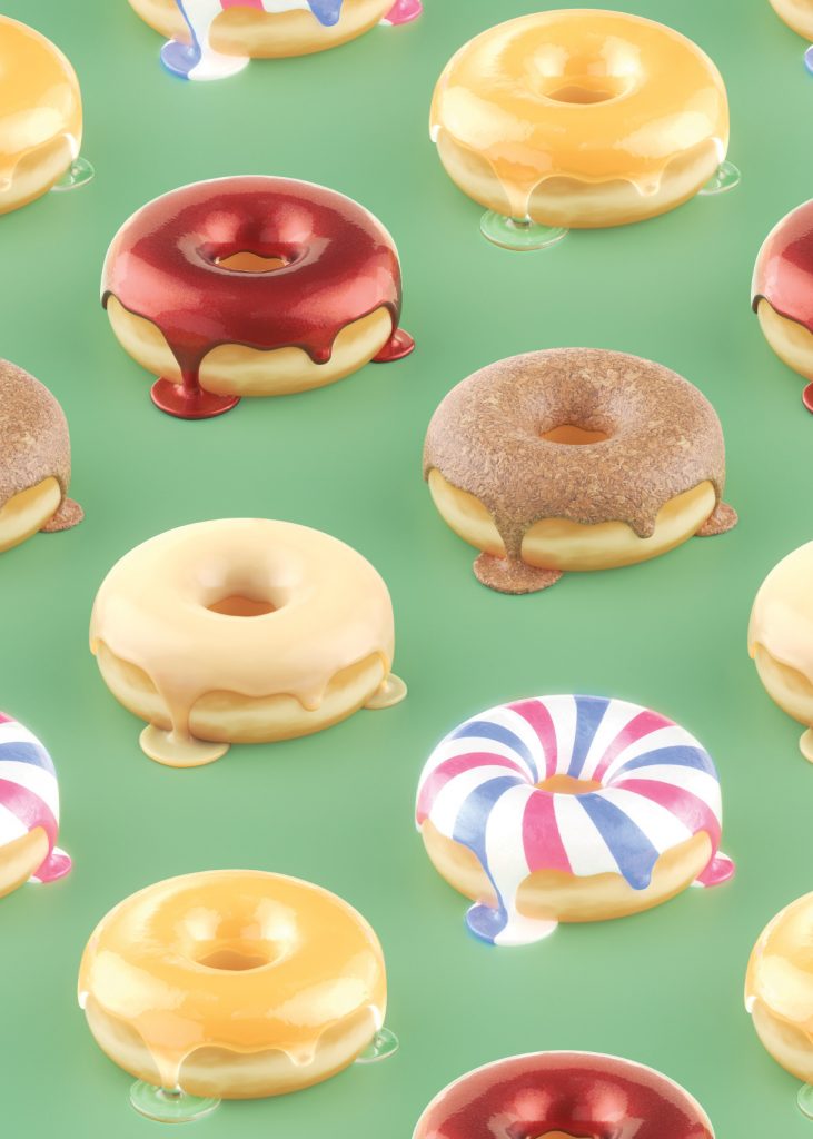
Roger Kilimanjaro is a professional 3d computer graphics artist based in Paris, France. Based on my research, he creates videos and 3d renderings of common everyday objects. He renders and makes videos of cupcakes, ice cream, donuts, and boxes. Although the pictures are not in this post, he also rendered donuts for an advertisement of Krispy Kreme.

Based on my research, he uses cinema 4D to render his images and videos. This means that he uses a software that has been coded by other people to achieve his goal. It’s cool that one can do something completely different and creative using a software coded by programmers. I wonder if the programmers knew that one could create nice images like those using their software.

The artist’s creativity and sensibility is heightened when assessing the colors of each image. The overall graphics are very well rendered and nice to look at.

Zee Salman- Project 04 String Art

Click on the art to take away night mode.

sketch

//Zee Salman
//SECTION E


function setup() {
createCanvas(600,300);   


}

function draw(){


    if (mouseIsPressed) {
    	background('pink')
	    for (i = 0; i <= 2000; i+=30){
	    //blue horizantal lines
	    stroke(0,0,255);
	    line(i,mouseY, i/2 ,height);
	}
	    for (i = width/2; i <= 2000; i +=20){
	    stroke(177,89,139);
	    // bottom right 
	    line(mouseX, 500 - i, i / 2, height/ 2);
	    // bottom left 
	    line(5 - i, i * .2, 1000-i, mouseY);
	    

	}

		for (i = 0; i <= 60; i++){
    	//red vertical lines
    	stroke(255,0,0);
	    line(mouseX, i * mouseY,width / 2 ,height/2);
	    }
    }

    //night mode
  	else {
  		background('black')
  		for (i = 0; i <= 2000; i+=30){
	    //white horizantal lines
	    stroke('white');
	    line(i,mouseY, i/2 ,height);
	}
	    for (i = width/2; i < 2000; i +=20){
	    stroke(177,189,100);
	    // bottom right 
	    line(mouseX, 500 - i, i / 2, height/ 2);
	    strokeWeight(0.75);
	    // bottom left 
	    line(5 - i, i * .2, 1000-i, mouseY);
	    

	}

		for (i = 0; i <= 60; i++){
    	//green vertical lines
    	stroke(55,187,10);
	    line(mouseX, i * mouseY,width / 2 ,height/2);
	    }
    	
  }


}

*Grace Day*

While doing this project, I definitely went for random and exploratory lines, it was really fun also I wanted to experiment with movement in many ways so when you hold the mouse it changes color as well as movement from the drag of the mouse.

Zee Salman -Looking Outwards – 05

*Grace Day*

I really find this kind of art very interesting, It really gives us a look into HCI and like intereaction design. I also like the different colors that presents itself during the activity. I like the different strokes also that appeares in the picture itself. It kind of acts like a mouse move or hover with some sort of drag. Also, it seems like the pitch it generates is based on the location of the  hand. Similar to a piano almost and I find that pretty cool. There are definetly some for loop statements.

Looking Outwards – 04

A rather unconventional way of generating sound digitally I have seen many times throughout the past through years is actually the composition of music through the use of a level creation engine in the game Super Mario Maker released in 2015. After many programmers discovered how certain objects functioned, they learned to manipulate them to create music. A specific item that can be placed in a level called a note block makes a different sound when each different object type in the game makes contact with it, and as the screen follows the main character, the blocks are generated, making music. Based on where vertically the block is placed, the pitch will change, and the tone is based on what is placed above it. This has been used to create compositions up to a minute long.

https://www.youtube.com/watch?v=j20wi8-Wlq4